


Poniverse Logo Review
Entry posted by Dark Qiviut
4,806 views
![]()
After seeing Feld0 at BronyCon, he wondered when I was going to post my review for the Poniverse logo (both the original and revision) that I promised to publish. The following is my review.
Overview
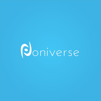
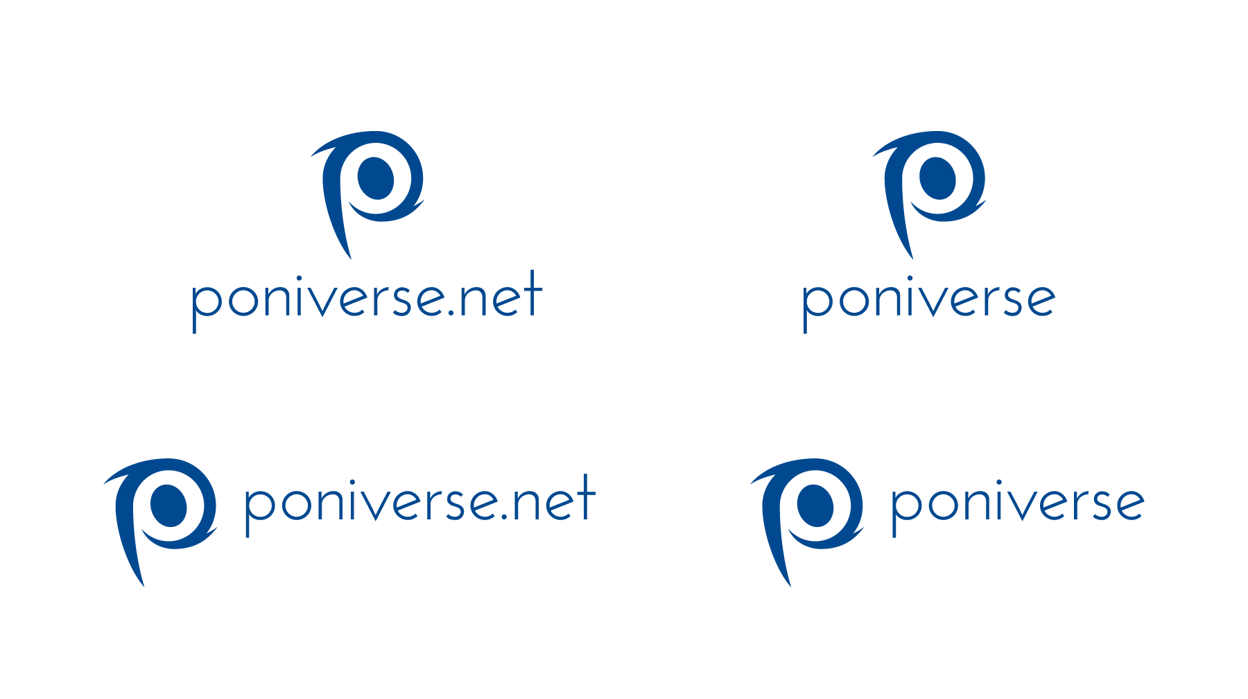
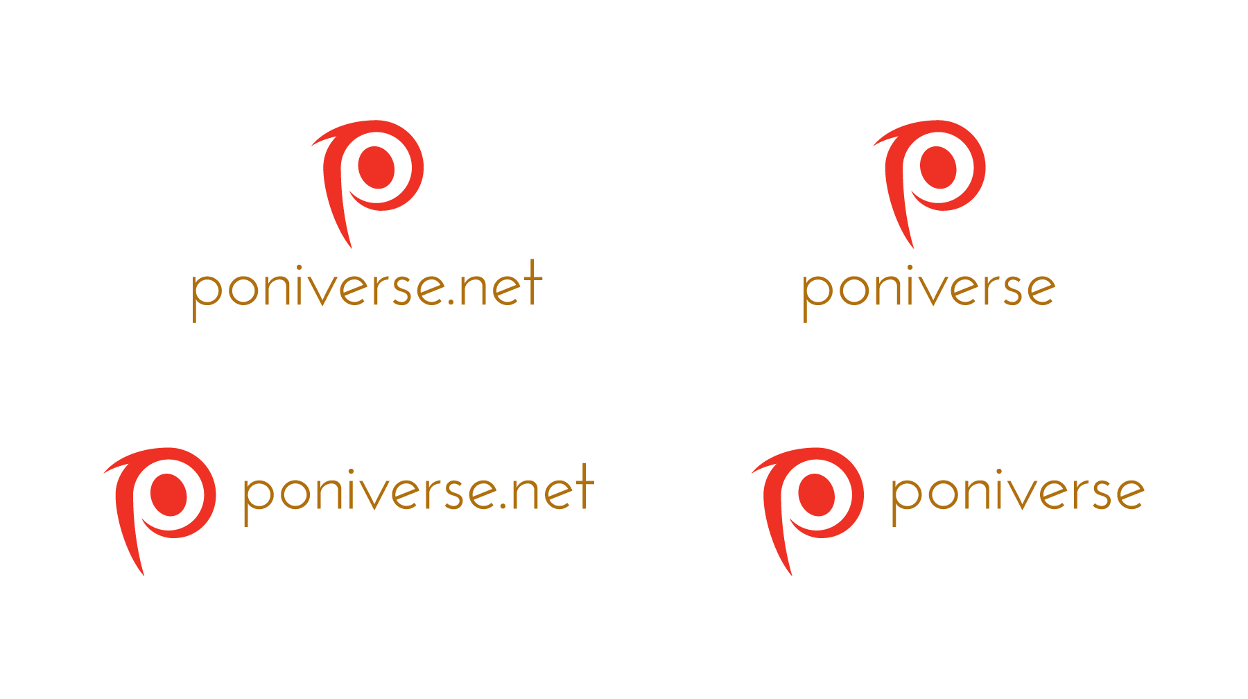
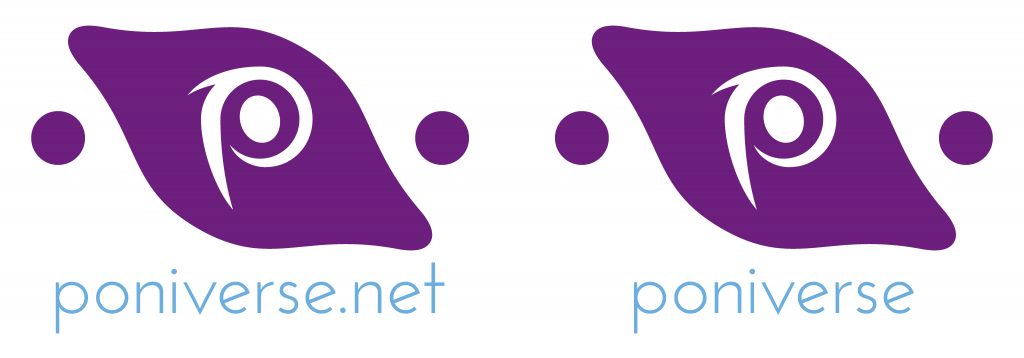
This logo's intended purpose is to integrate multiple networks into one supercommunity. "Poniverse" is a portmanteau of "pony" and "universe," so a theme of "universe" follows in the signature (the term to describe the trademark-wordmark combination). The trademark is a stylized "P" in the abstract shape of a pony's head (the oval being the pony's eye). Surrounding the head is an abstract galaxy, rotating at high speed. In the revised version, the trademark is separated from the wordmark, and a graphic symbol encompassing the trademark are multiple circles (satellites) surrounding one huge hub (a star or galaxy), indicating how several networks are merged into one.
Josefin Sans Light, a sans serif type style, is used to make the logo the central focus. The typeface uses simple, organic shapes akin to the show. To make the supercommunity more easygoing for multiple audiences, the "p" in "poniverse" is lowercase, capturing the casual, light, happy-go-lucky nature of My Little Pony: Friendship Is Magic and its respective networks. Lastly, the revised wordmark uses cyan — a very light, pastel blue compared to sky blue above it — combining the feeling of corporate, loyalty, and fun in one hub.
Trademark
A lot of elements signatures have is called a trademark, which is the main symbol that defines the brand. Examples of trademarks include:
- NBC's peacock
- Chevrolet's bow tie
- Toyota's stylized "T" (made up of three rings: the customer, the company, and the big ring wrapped around the "T" for unity)
- Dunkin Donuts's coffee
- Baskin Robbin's BR (which hides the "31" for "31 flavors")
- CBS's eye
- The Pepsi smile
- Microsoft's four colored windows.
Some companies only use the trademark like:
- Apple's bite of the apple
- Nike's Swoosh
- Starbucks Coffee's mermaid
- McDonald's golden arches.
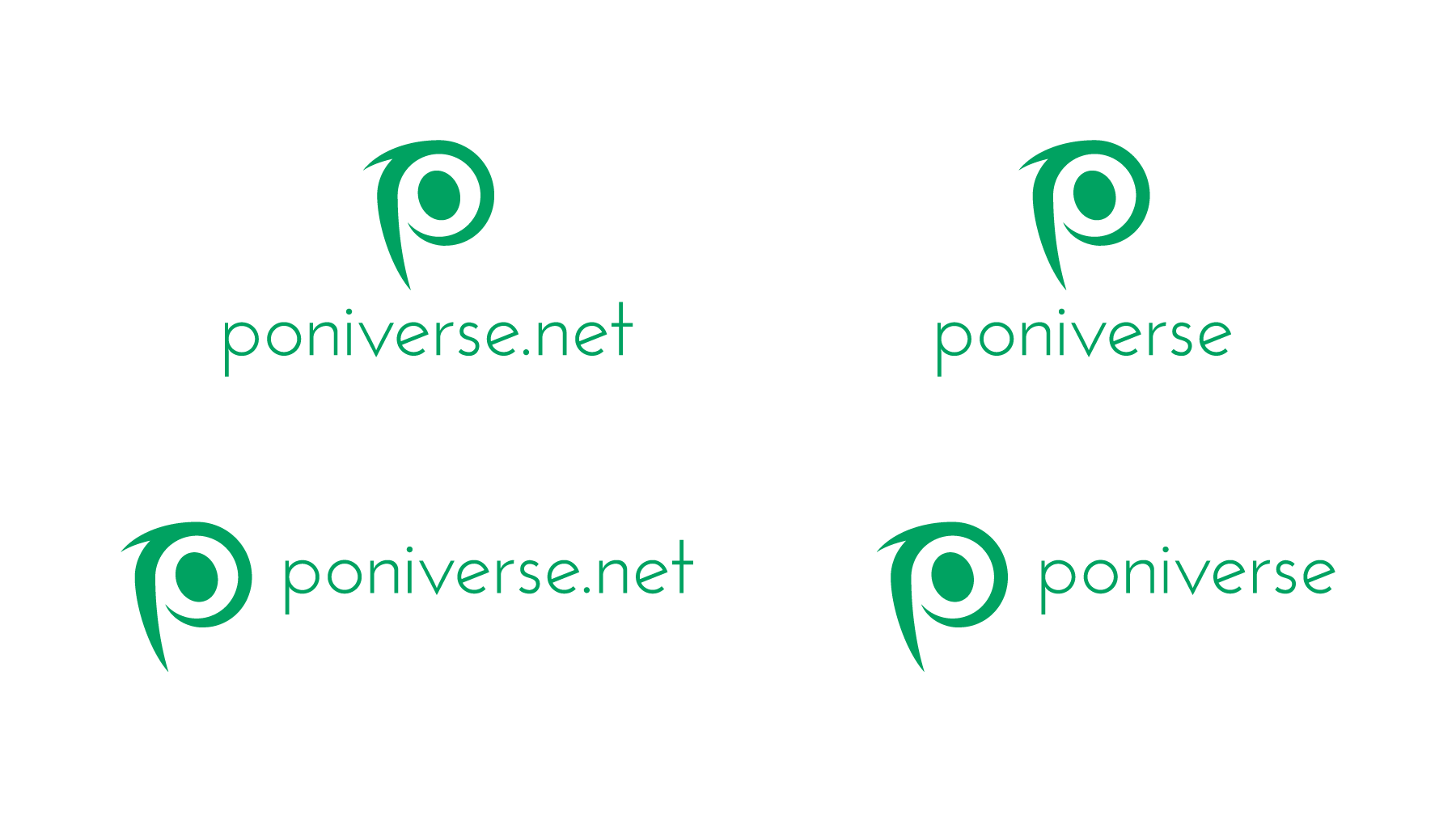
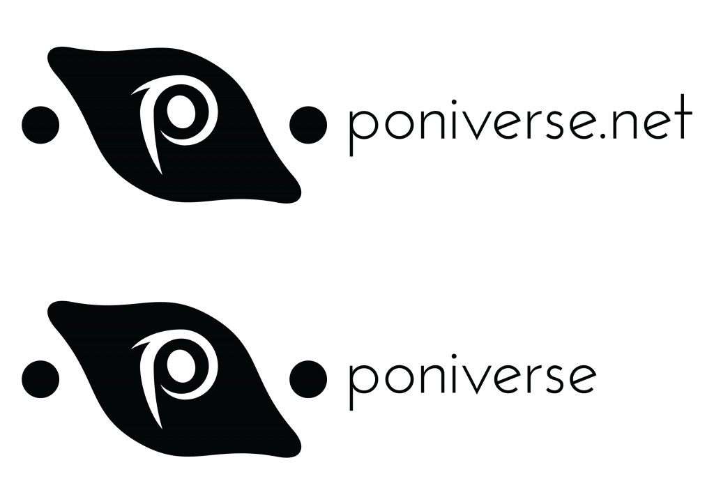
Poniverse's trademark is two galaxy clouds of dust swirling clockwise, positioning in a form to where it looks like a "P." However, there are several issues with it.
- It doesn't look like a "p." While it's supposed to be abstract, there's abstract and then there's going too abstract to the point where the Prudential rock looks like a triangle instead of a rock. When I first saw it, it looked like the galaxy was designed to where it looked like a squished "O." It also doesn't help when the human eye looks from top to bottom instead of the other way around. Just flip the vision, and it suddenly looks like a "d" instead. This accidental double meaning hurts the abstract trademark's message. More definitive shapes are recommended.
- The pony head looks way too squished. When you look at ponies from their bases, you notice that each part of their anatomy is consisted of circles, triangles, ovals, and rectangles (minus the eyes, mane, tail, wings, etc.). A pony's head consists of one circle (or egg from frontal view). However, this pony's head looks like a rectangle, gave it really rounded corners, and then rotated it a few degrees clockwise. The head looks inorganic and doesn't fully scream "pony head."
- The lines that make the abstract "p" are way too close to Nike's Swoosh.
Here's the Swoosh:
Rotate the Poniverse trademark, and you'll get this:
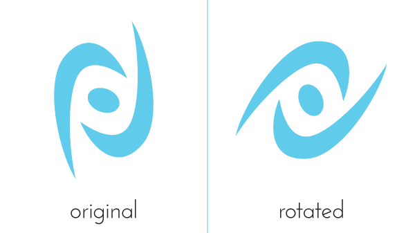
People can and will catch that if it stays around long enough. I noticed it the second the winners were announced.
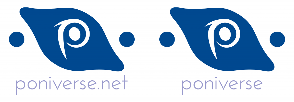
Wordmark
To make the wordmark (the distinctive lettering for the signature) connect with the trademark yet not disturb the eye, the typeface Josefin Sans Light is selected. It has a lot of qualities similar to other great Art Deco typefaces like Futura, Kabel, and Avant Garde, but with minute differences in stroke, angles, and weights to make it unique.
The choice fits wonderfully. When viewing the trademark, you notice how heavy it looks. Each shape is very thick and easily visible whether big or small. Josefin Sans Light is a beautiful contrast in the form of light anatomy. Even in a small size, I still notice the typeface's anatomy. Furthermore, the size of the type compliments well with the trademark. It's also a great choice making "poniverse" lowercase throughout, making the entire wordmark readable and mentally accessible for a general audience. And as My Little Pony: Friendship Is Magic uses mostly simple shapes (for both the characters and atmosphere like the houses and mountains), Josefin Sans Light is extremely in character.
That said, while the typeface, size, and weight work, it still needs some cleaning up. Here is a small demonstration.

Look closely at black lines in between each character. That indicates the space between each character. Space in between each character is called kerning (while the total amount of space for each word, line, sentence, paragraph, or document is called tracking), and good typography in logo design pays close attention to the kerning so each letter looks even as you read it.
Each space in between the characters is irregular. For the first example, the "o" in "poniverse" leans too much to the left, leaving a big gap between the "o" and "n." There's also a little too much irregularity between the characters from the "o" to the second "n"; extra polish would clean it up. However, the tracking in "net" is tight, showing inconsistency in the typography. When it's one line like "poniverse" or "poniverse.net," either keep the tracking loose or tight. Don't do both.
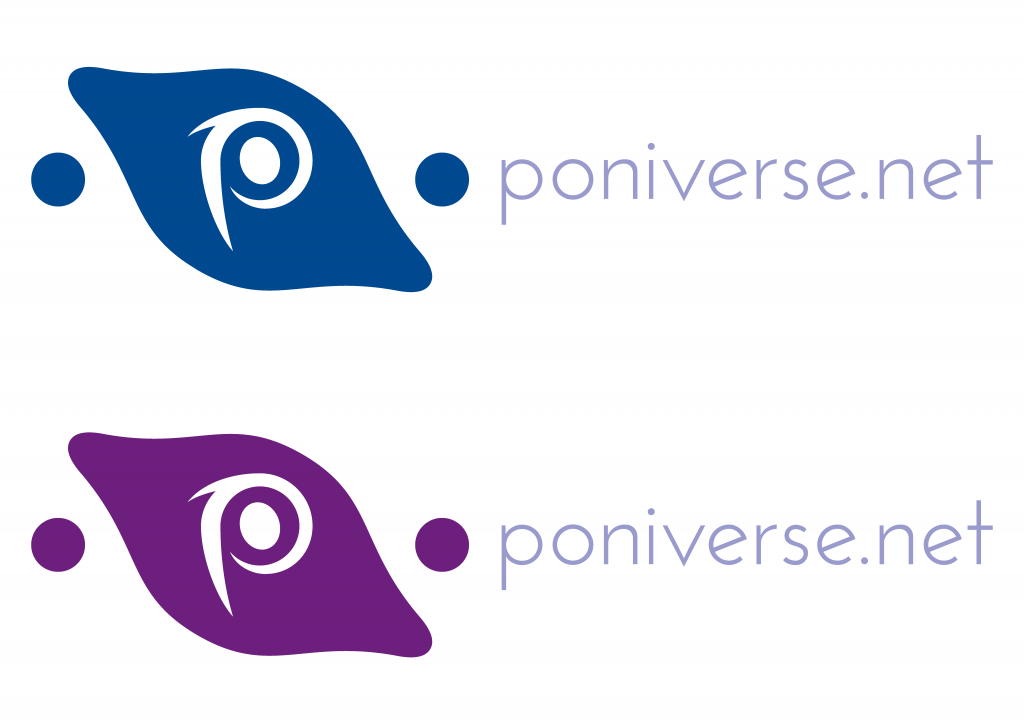
Graphics
Besides the trademark, there is one main graphic: the circles behind it. One big circle (basically a star or large planet) is surrounded by several smaller ones (planets or moons), either via overlapping or approximate distance, sending a message that several smaller communities is operated by one gigantic hub.
The message of the big supercommunity operating smaller communities is clear in itself, but there are two big issues.
If you want to see it, review the Skype icon here:
![]()
- The background graphics for Poniverse look way to similar to Skype. A big circle encompasses the "S," and two smaller ones orbit around the main hub or caller. For Poniverse, you have several small circles orbit Poniverse.
- The blue color, which symbolizes loyalty, is also too close to the Skype logo, which also uses a brilliantly sky blue.
Suggestions for Improvement
- Clean up the kerning and unify the tracking. Instead of using two sets of spacing, use the same amount of space throughout. If you want the space between each character to be crowded, make it crowded. If more open, leave it all open.
To see if the space between the characters look evenly distributed optically, alter the size for the wordmark. Look at it in a big point size like forty-eight, sixty, or seventy-two points or higher and at a small size like eight, ten, and twelve. - Choose a brand new background symbol. Currently, the bright blue and coordination of perfect circles give unsuspected audiences an impression that the logo ripped off the Skype icon.
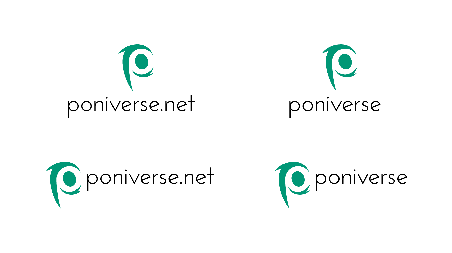
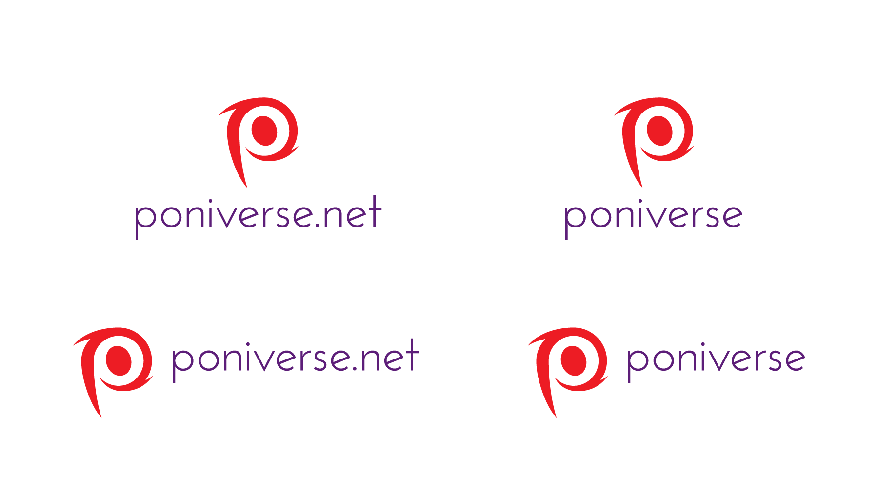
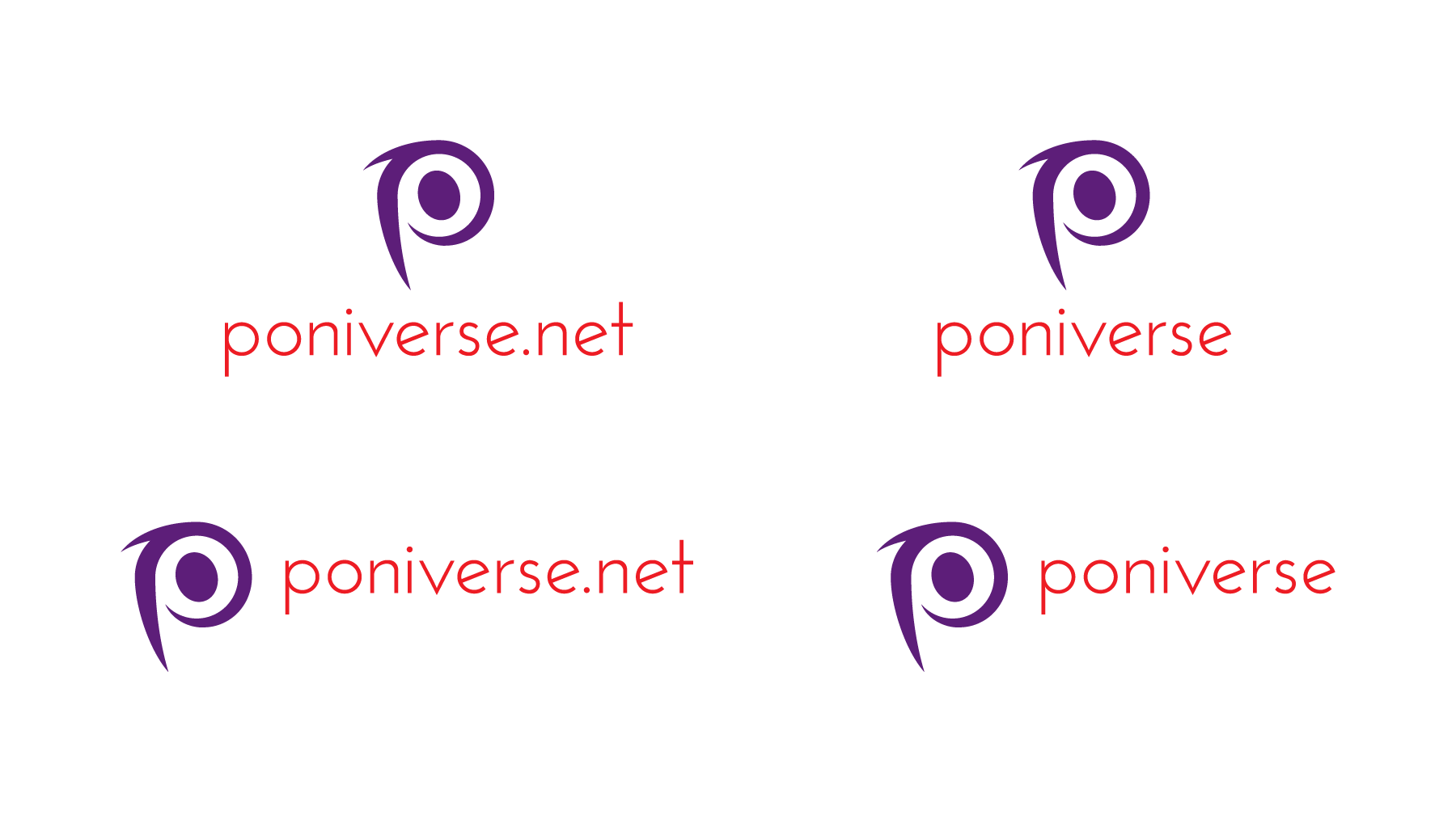
An idea is a galaxy (with some hubs on either side), for they're one of the most recognizable masses in the universe and the trademark plays off one in the form of a spiral. - Choose a brand new color for Poniverse. Currently, when I see that light cyan, I think of Skype, which is a communication company. Try to think of another color besides cyan, and there is a very wide palette. Suggestions include:
a. Scarlet — a calm red. Symbolizes empowerment, brightness, defiance, and enthusiasm.
b. A soothing green like emerald or jade — make it too light like lime, and you make it look like it's unprepared.
c. Orange — a bright, warm orange, which can enhance socialization. However, this may cause problems: AT&T uses orange to both honor Cingular Wireless (the company AT&T bought) and accentuate its globe trademark.
d. Brown — warm and creates a sense of security depending on its saturation. Be careful not to make the brown look like chocolate brown, or people will instantly think you're a candy bar organization.
e. Purple — luxurious, but also wise, creative, and exotic.
f. A deeper blue — darker and not light like cyan, but retains the same messages.
-----
Don't be afraid to not combine colors to capture the feeling of My Little Pony: Friendship Is Magic, Poniverse itself, creativity, inspiration, and majesty.
If you're going to use a blue in the same range as cyan, my suggestion is twofold:
a. Dull it with a little bit of magenta or black so the color isn't as bright.
b. Use it as a secondary color. In the official logo, cyan is the primary. Maybe you can use a sky blue as the color for the wordmark. - Redraw the trademark. A stylized "p" in the form of a galaxy is a great idea, but the triple messages and the way people view compositions risk confusing people and muddling the trademark's symbolism.
For the stylized "P," how about making the spiral galaxy look a little more like a "P"?
If you haven't done it, take your revised signature and see it in black only. Black is neutral and bold, which forces you to view the logo from a compositional standpoint (the trademark, wordmark, placement, and logo/typography relationship), the foundation for any great logo. If you review it in color only, then your brain gets tricked into thinking the best way to show off your logo is to tweak the color. Once you have the composition complex, then add the color.
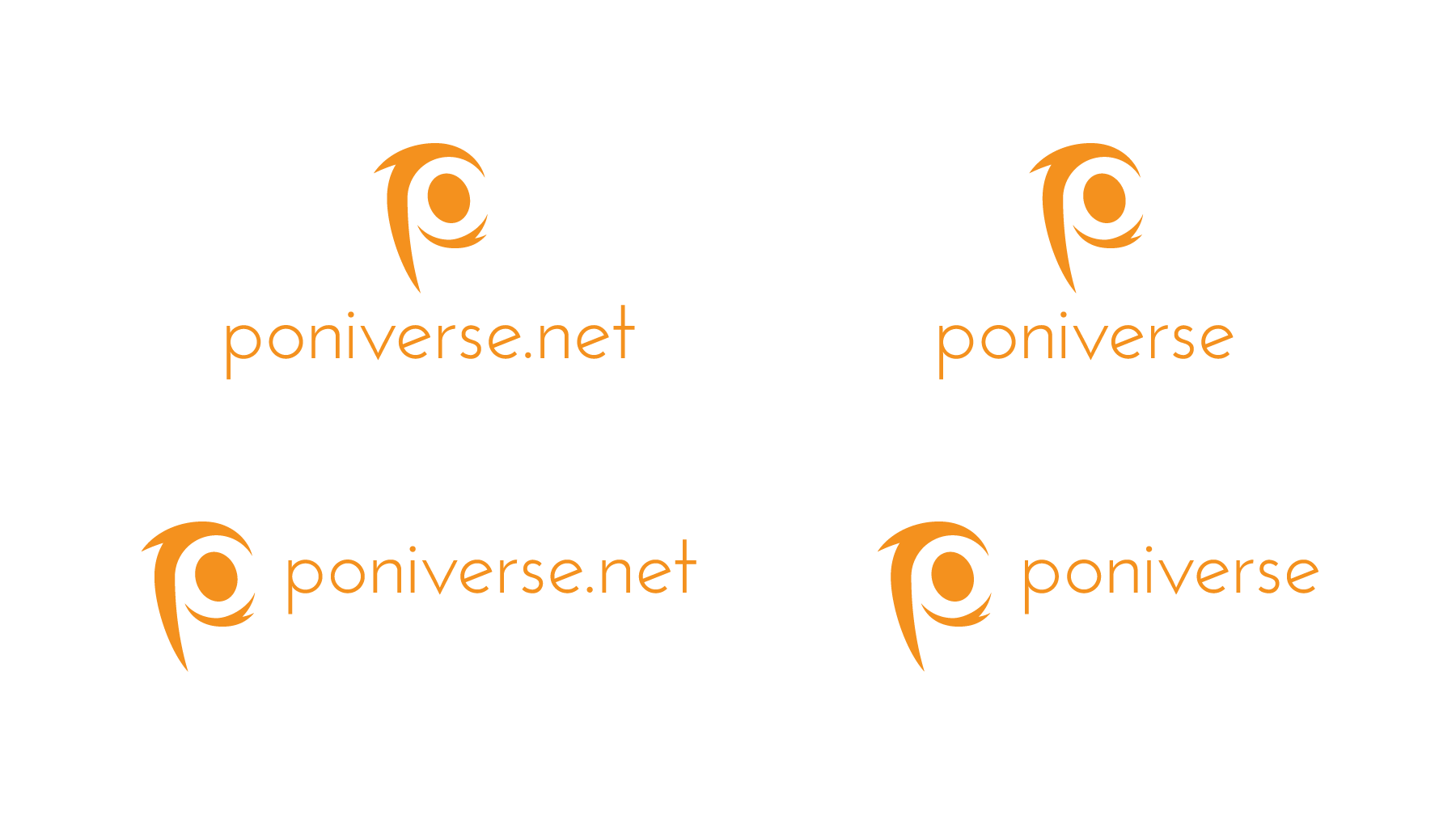
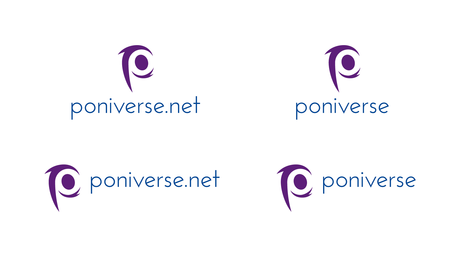
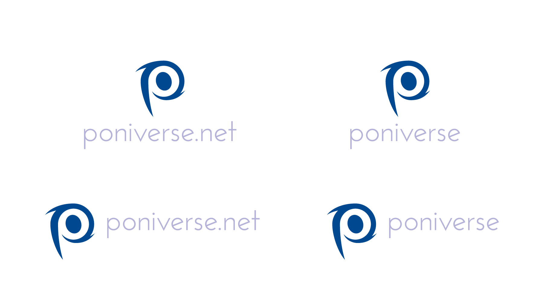
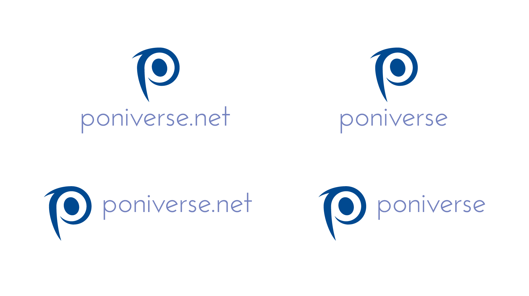
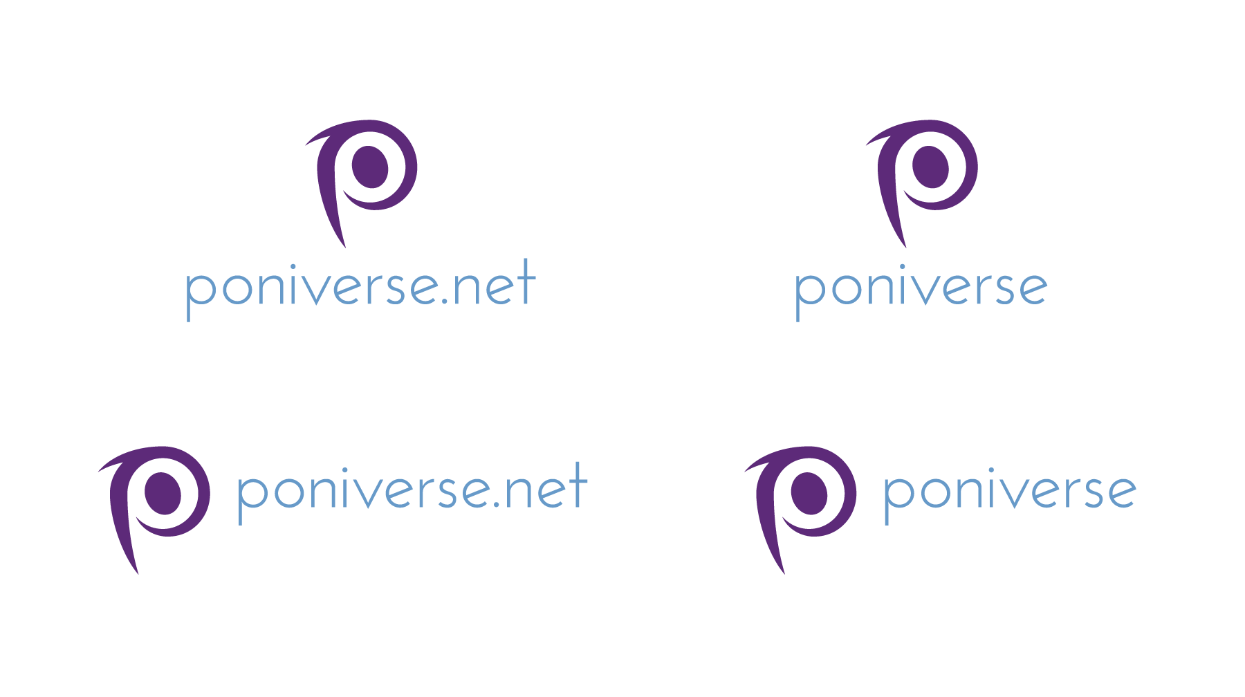
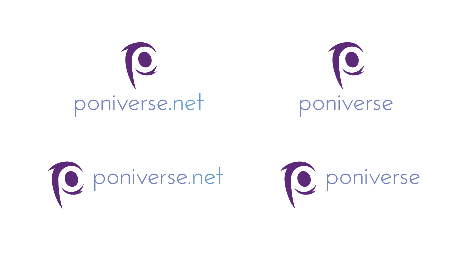
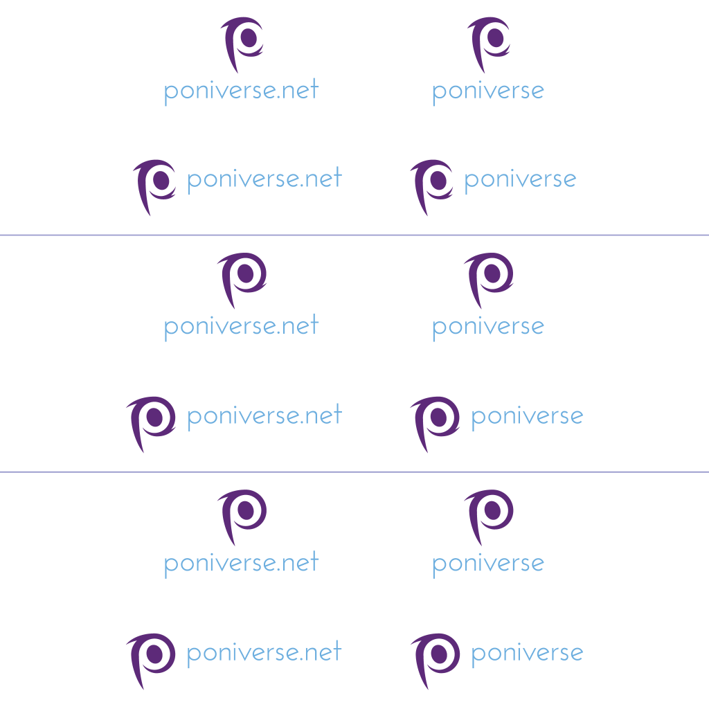
The Poniverse Revised Logo: Step-By-Step
I have some suggestions for the revised logo, but instead of telling how to do it, I'll show it step by step process, from the black vector to the completed graphics. Click the "spoiler" to view them and the explanations.


-
This is a trio of suggestions with some minor differences. Each signature contains both the trademark and wordmark. Josefin Sans Light is still being used, but cleaned up with some semi-wide tracking to make it accessible big and small better. The wordmark is placed both below and to the right of the trademark, each one containing the ".net" address and without. Plus, each signature is in black to review the composition before advancing to color (which I'll show next).
But the big difference is the galaxy. Poniverse's official trademark has been altered to where it officially looks like a "p" instead of a combination of a "p," "o," and "d." The trademark has three variations.
- The "p" is sliced into two separate pieces. The bottom of the bowl is separated from the top with the intention of the eye connecting the rest of the letter. Two small arms make up the outer edges of the spiral galaxy.
- In the second and third, the "p" is connected from the bottom of the bowl to the rest of the letter. The only difference between the two latter options is the extra arm below the bowl is missing in one of them.
Instead of a squished head, the inner-body is a perfect circle, commemorating the organic shapes of the letterforms, pony's bodies, and atmospheric graphics. There is an oval eye, slightly slanted, as most of the pony's eyes are an oval shape.
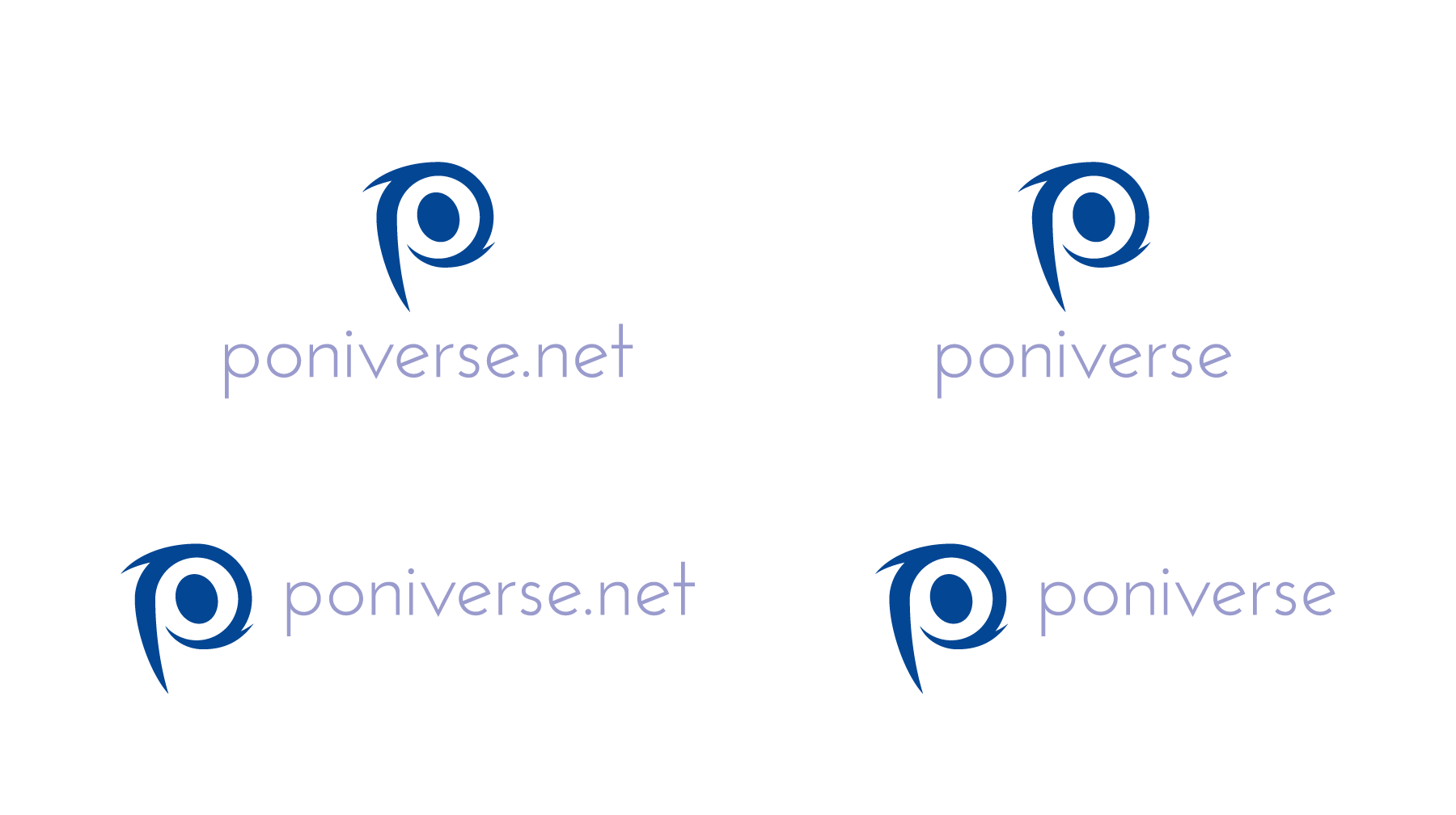
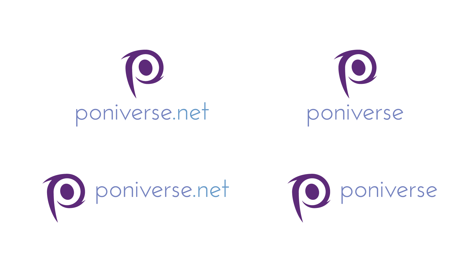
-
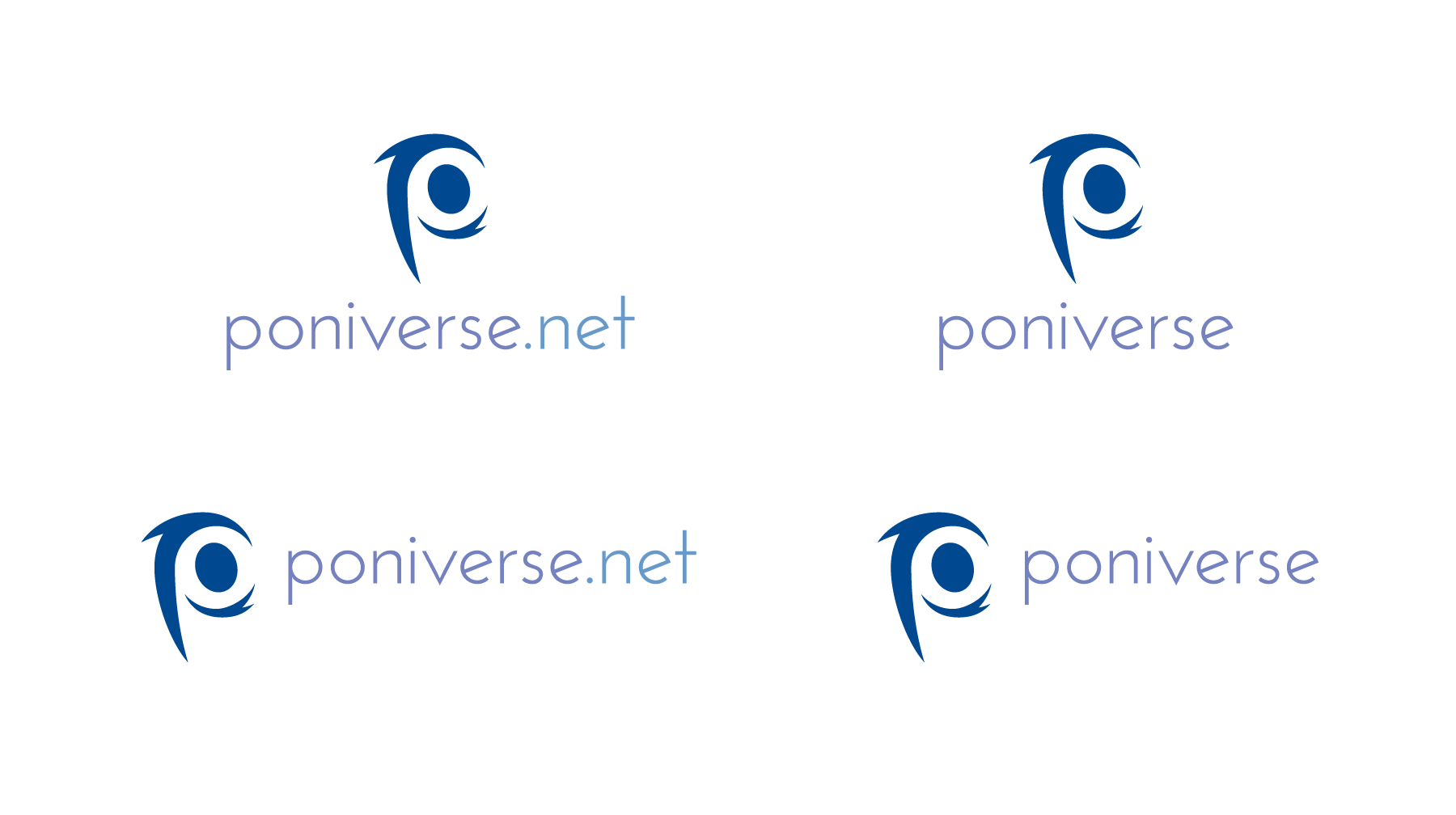
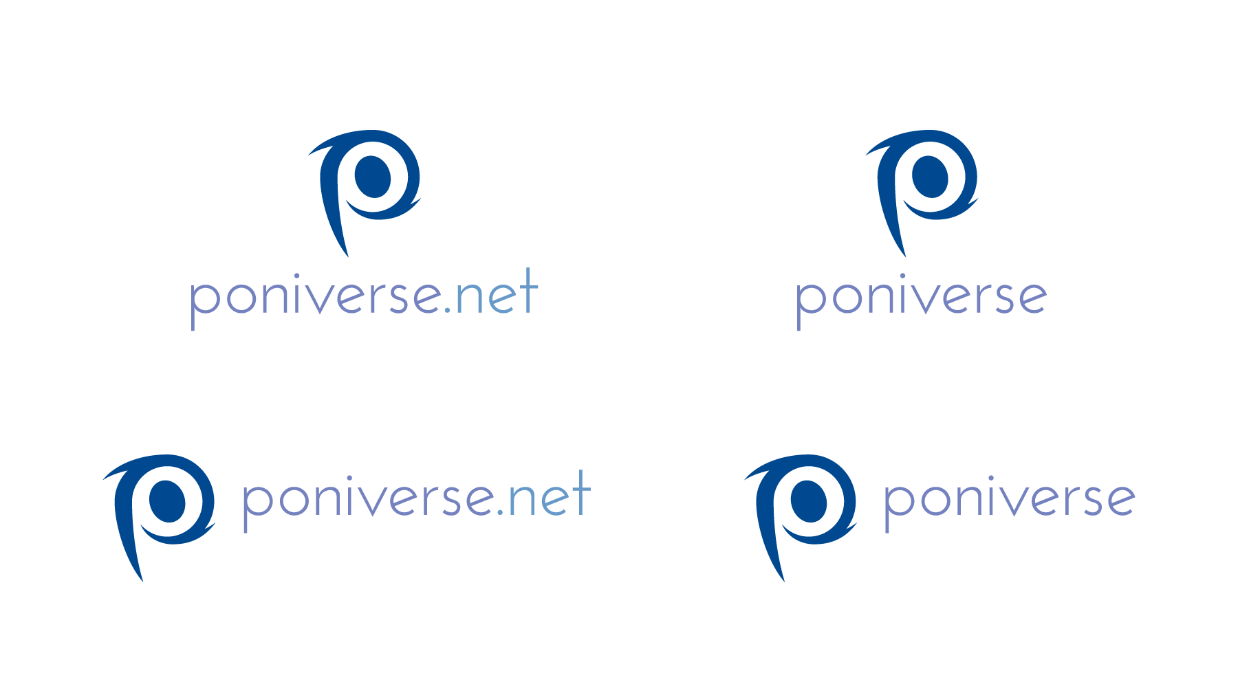
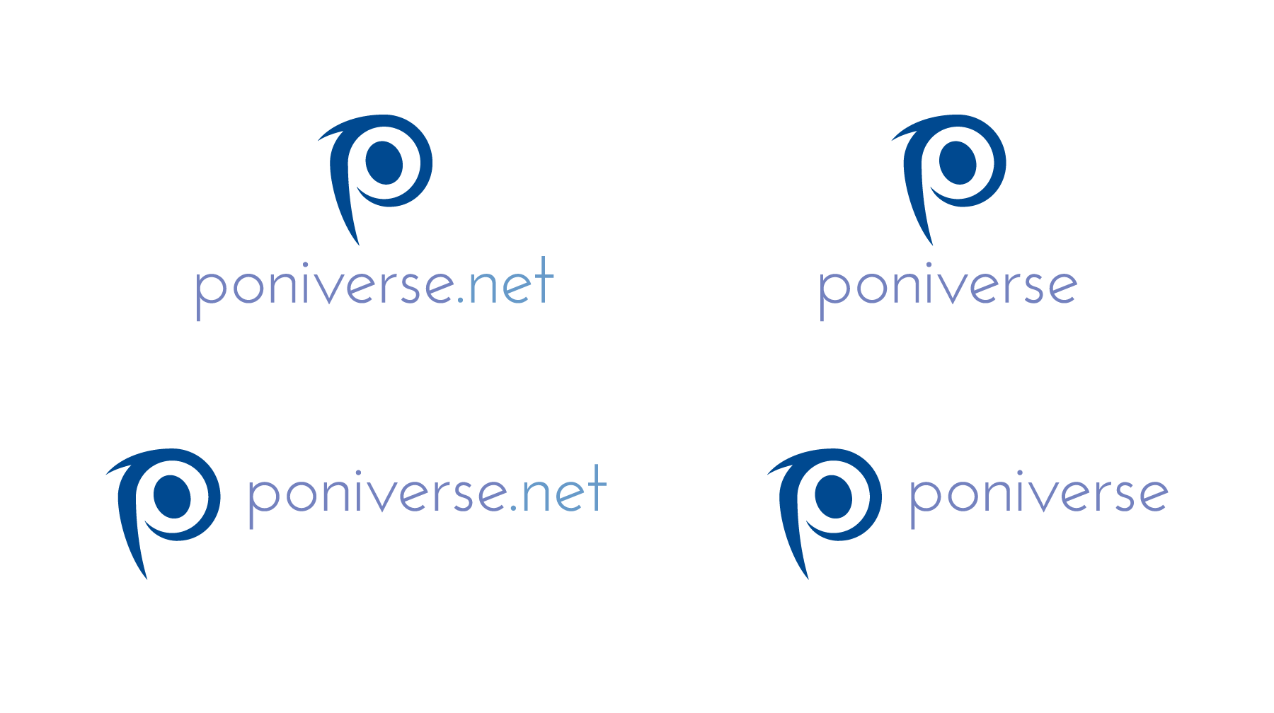
Another suggestion, in color, is below:

-
With these in color, I can start making out what the main signature would look like. Here, I have bronze, two greens (one is lighter, the other an emerald green, which symbolizes an uplifting well-being and creativity), orange, brown, two purples (one darker, one lighter), scarlet, and navy blue.
One element that I use for my logos is Pantone Solid Uncoated or Pantone Process Uncoated. Those are CMYK (cyan, magenta, yellow, black [a.k.a., the key plate]) formulas blended into one color. In My Little Pony: Friendship Is Magic, every character has a combination of Pantone colors, including the mouth. The logo retains the usage you see from Friendship Is Magic, meanwhile sending a message to your competitors that you own that color by association.
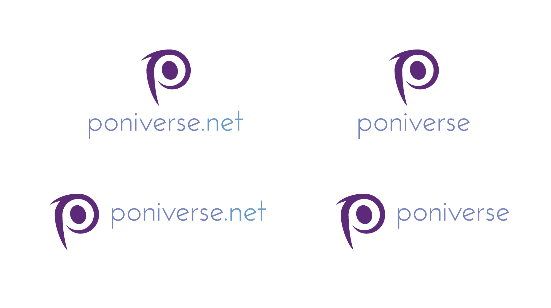
-
However, each example uses one color for the entire signature. How about using more than one to see if the colors contrast nicely?
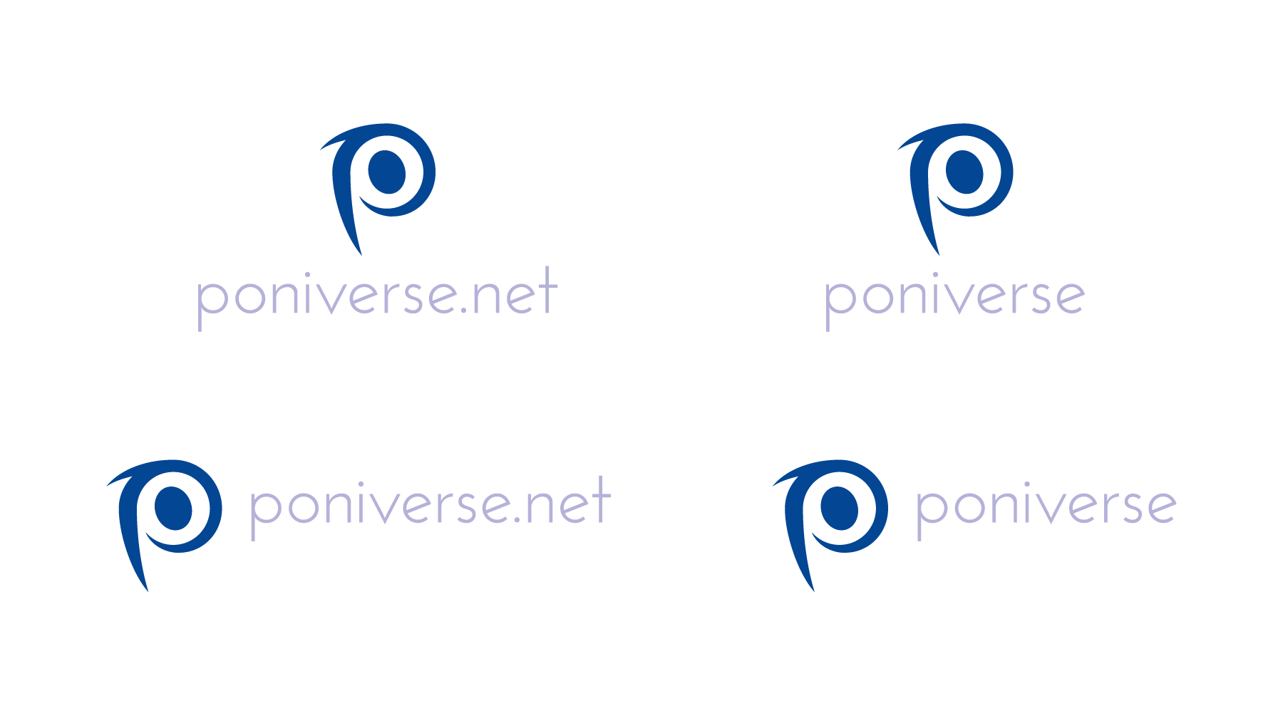
-
Now you see how the logo is coming together more. With a combination of colors, you send more and more messages as to what Poniverse will feel and tell to your audience.
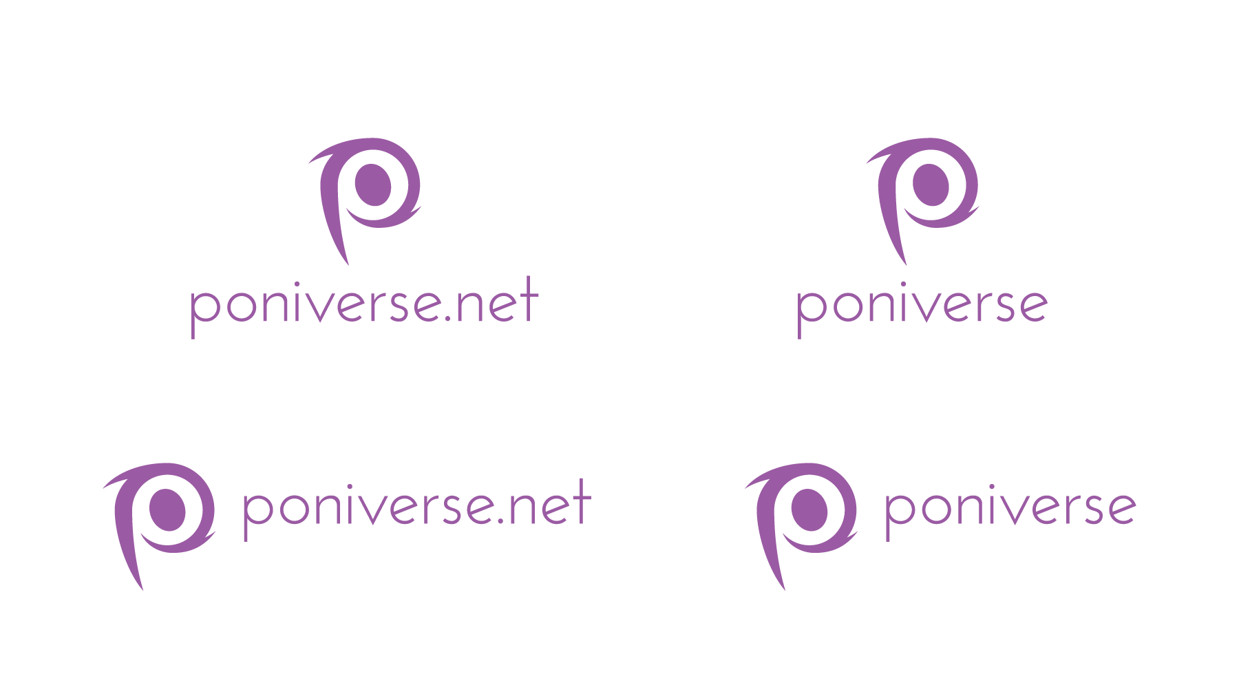
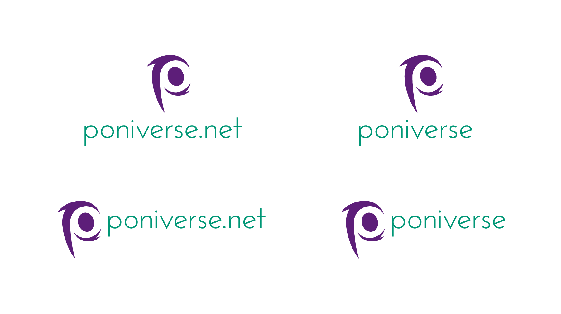
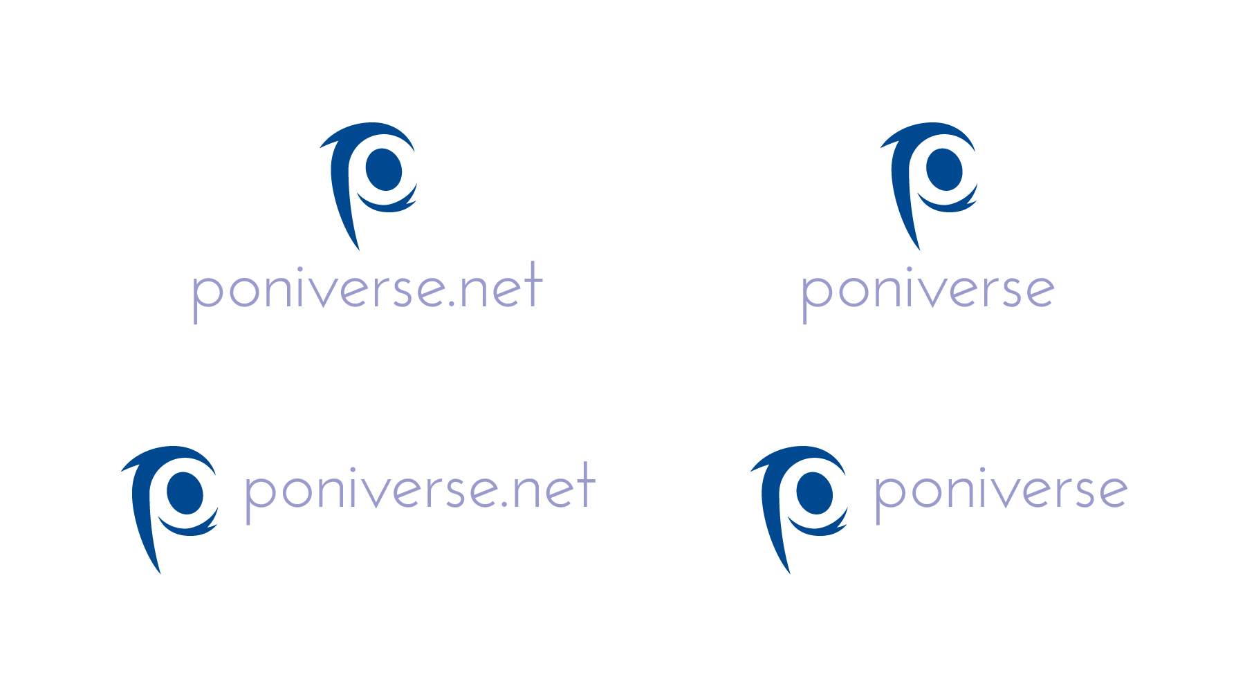
Now, of the colors presented here, we can begin narrowing them down. So far, the ones that work most are purple, navy blue, lavender, and periwinkle. Emerald and bronze are on the border. Scarlet, brown, and black don't work.
Purple and navy blue are creative, bold, and full of life. Purple is one of the most complex colors because it hosts multiple emotions. Navy blue is still blue, but it doesn't stick to the cyan scheme, where people will immediately think of Skype. Furthermore, it still stimulates creativity, passion, and will to work at your best.
The newest colors in the edition are lavender and periwinkle, which are tints. Periwinkle is the lighter tint and is more to the blue hue, while lavender is darker. These colors are warm, comforting, and a bolster for creativity, but aren't as bold as the darker siblings, giving the trademark its much needed focus. Plus, the pastel colors still remind people that this is brony- and MLP:FIM-related.
As you work with the colors, you begin to develop the color palette: the main and secondary colors used for the Poniverse brand. (The brands within Poniverse can wait temporarily, and then the colors can be slightly adjusted depending on Feld0's and Poniverse Staff's desires.) Part of the palette will be on the main logo and graphic symbol for Poniverse.
Now you can begin thinking about the colors on the border.
- Bronze is a medal used commonly in the Olympics, with gold and silver above them. Bronze is more of a dirty gold in appearance, but it can lead to an impression that they're very relaxed and don't set a standard for creating a great supercommunity. Therefore, you can eliminate bronze (along with gold and silver) for the main logo.
- Emerald or jade is about wisdom, purity, and generosity. But when you think of Poniverse, you think of pony and universe. Emerald, like green, is more earthy, and we're trying to attract a wide audience from multiple cultures, not just one. Emerald is a more singular color, so emerald/jade won't work for the signature.
At this point, you now have four colors: two dark, two light. But now you have to think which colors best symbolize and promote the Poniverse brand in the form of the logo?
This leads to the next spoiler below.
-
-
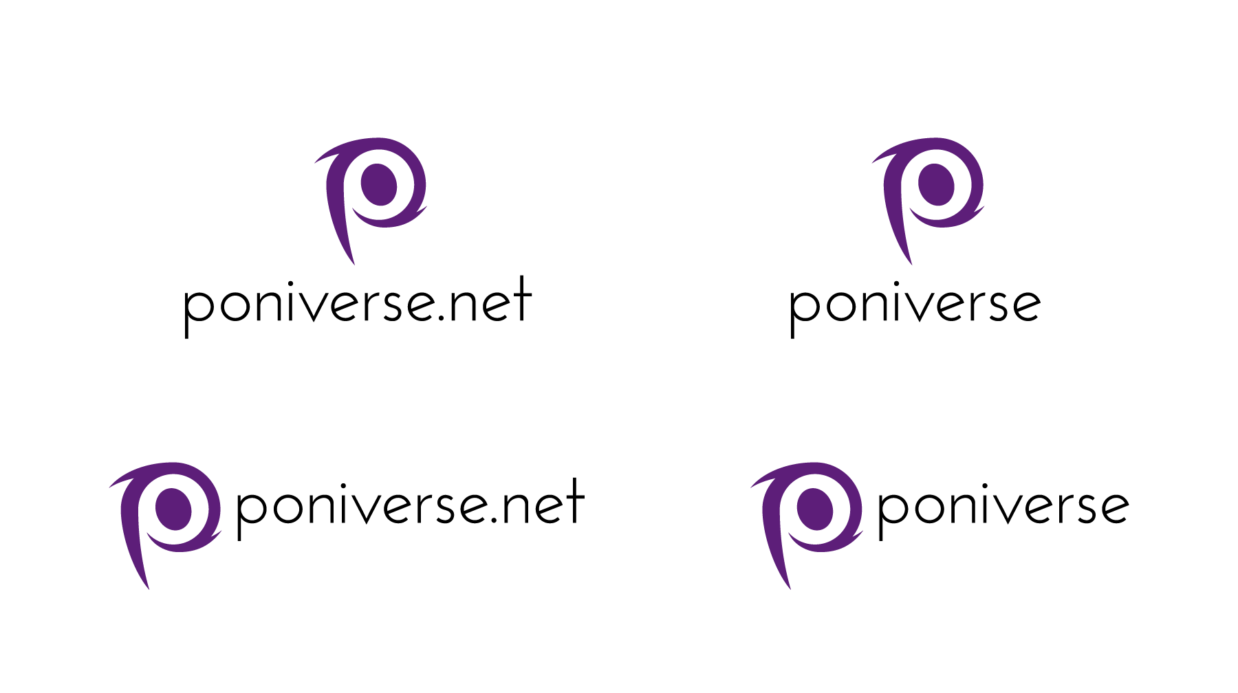
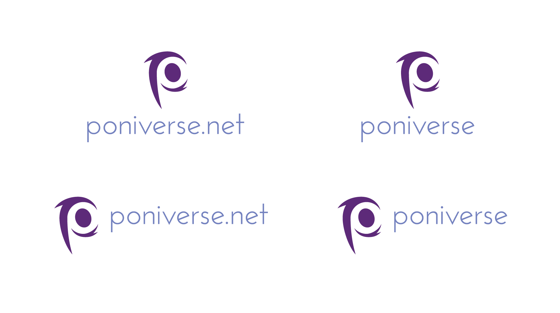
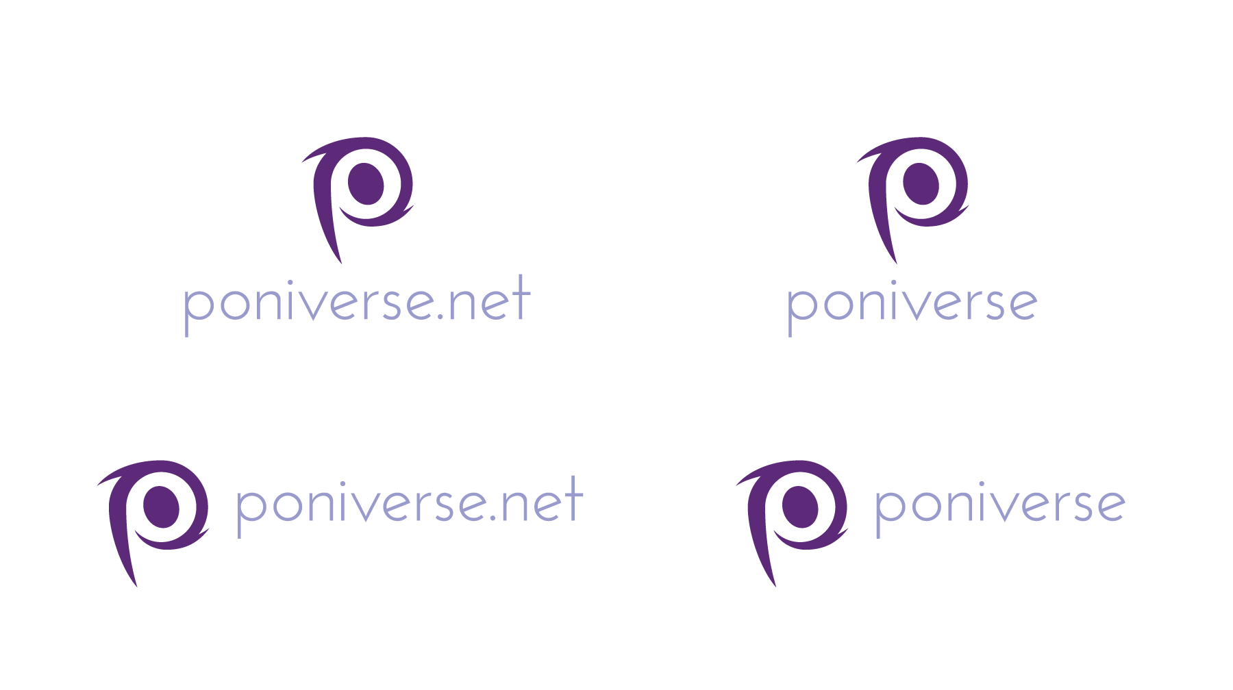
The revised logo has several options, but one thing is consistent: either purple or navy blue for the trademark.
The signatures with the blue trademark have various shades of lavendar in the wordmark: light, medium, and dark. The ones with the purple trademark have two shades of lavender and dull blue in the wordmark (a new color into the mix).
But scroll down, and you'll see pairs of logos where the trademark is paired with a dual-colored wordmark, where "poniverse" is in lavender or periwinkle and ".net" in a dull blue. The difference makes it differentiate, but also blend with the "poniverse" portion of the wordmark.
However, my senses tell me the two colors in the wordmark don't work.
- It makes ".net" appear tacked on and has no purpose other than telling people, "Hey, I'm a Website only."
- ".net" is stuck on an island rather than actually be a part of the overall signature.
With that, I can cross off the three-colored signature.
Also, the dull blue doesn't fit the message Poniverse is trying to achieve. Instead of trying to be a proactive community, the blue looks gray and implies a morbid mood. So the blue goes, leaving behind the four colors again. However, the light blue as a spectrum may still be used as a secondary color to accentuate the trademark.
This leads me to the stage where I suggested to combine the galaxy-like graphic with the trademark and wordmark. Click on the next spoiler to access it.
-
![]()
The process begins again by making the graphic symbol and wordmark black, but have the trademark variations dropped out (in other words, being white or the color of the paper). There are two circles beside the elliptical galaxy, one on each side, to indicate smaller communities wrapped around Poniverse (the supercommunity). I have the galaxy tilting from the upper-left-hand corner to the lower-right-hand because the logo is intended to be read from left to right and up to down.
With the graphic symbol structure finalized, I can drop in the color combinations that are located below.
-
-
Above are a group of suggestions of what the colored graphic symbol-trademark-wordmark logo relationship would look like when stacked. The primary color options are navy blue and purple; the wordmark options are a light blue, a light lavender, and a dark lavender. I brought back the blue for the wordmark to balance the rest of the secondary logo without it being so bright and hindering the hierarchy, yet not so dull to confuse the audience's impressions.
-
But what about an option where both the graphics and wordmark are positioned across?
http://i107.photobuc...raphics-2-1.png
For another suggested placement, both the trademark-graphic symbol combination and wordmark ("poniverse.net" for one, "poniverse" for the other) are placed side by side. The outer width of the bowl (i.e., the "o") is aligned with the outer curve of one of the outer circles (representing subsections of the community). Also, instead of copying and pasting the same trademark styles, I took one of the marks instead.
-
Two of my favorite colored options are located below.
http://i107.photobuc...t-sidelogo1.png
http://i107.photobuc...t-sidelogo1.png
One of the pictures has the wordmark in the light lavender, the other with a dark lavender besides the blue graphics and the light blue mark besides the purple graphics.
And as one tiny adjustment, to make the purple more pure, I replaced the previous Pantone color (which uses all four colors from the CMYK gamut) with one that uses cyan, magenta, and black only.
-
After this tedious step-by-step process, my most favorites are the following:
http://i107.photobuc...l-5A_Page_1.png
http://i107.photobuc...l-4A_Page_3.png
http://i107.photobuc...l-5A_Page_2.png
http://i107.photobuc...l-4A_Page_4.png
-
For the top two, navy blue is the main color to stimulate creativity. While it's a very cool color, it's also the one that sends messages of sincerity, trust, confidence, and will to communicate. To provide contrast, lavender provides the inspiration, three-dimensionality, and life to the audience. When the trademark and graphic symbol are merged, the trademark is dropped, using the white background as the color.
(The white trademark you see in front of the galaxy graphic apples to all of the other trademarks. I chose my most favorite of the bunch, but whichever one you like most applies to you.)
As for the bottom pair, it's in reverse, with purple as the primary and sky blue/azure as the secondary. Purple is the most complex color, but with it shifted more to the magenta side, it symbolizes life, creativity, and imagination. With the purple clean, it doesn't muddle the message. Sky blue is a very calm, comforting color, inspiring the audience to be creative despite not being the central focus.
Why the contrast?
Several reasons:
- Poniverse is designed to be a powerful, fresh, willful supercommunity. One of bronydom's strongest points is the ability to socialize via social networking. The word-of-mouth advertising from one brony to another spread the messages of not only the show, but the brony community altogether, too. Poniverse is a hub to unite as many supercommunities as possible without having to separately join each one, from forum-browsing to uploading music and so on. It's an extremely bold idea, and the two main color options are presented very boldly. You have a bold message, hence the bold primary trademark colors.
- Meanwhile, Poniverse is centralized behind the theme of My Little Pony: Friendship Is Magic. One of its strongest elements is the bright, pastel, warm colors. The lavender and sky blue retain the messages the original, bold colors provide, but it's softer and pastel to remind people that this is a brony/MLP:FIM supercommunity instead of merely a supercommunity in general.
- The two obvious contrasts provide a balance. You have the bold trademark colors as well as the softer, brighter pastel colors. When you have the logo consisted of one color throughout regardless of strength, then the logo becomes extremely overwhelming and uninviting. You make everything one tone/hue/saturation, you risk muddling the overall message and may make people choose something else. When you have two contrasting colors, you can marry the entire logo as one instead of risking the two separate parties divorcing.
If you want one official example, look at the NBC peacock with the NBC wordmark below it. The six feathers (representing the six separate departments at the time of the logo's release in 1986) are the main colors of the rainbow. The black wordmark balances the composition out.
The contrast in the final Poniverse logo ideas balances the parties and strengthens the composition. Blue and purple are next to each other on the color wheel and help guide the eye rather than taking one very sharp, bright color like red and slapping it into the composition. - When it comes to the composition with the galaxy graphic symbol, the elements being stacked on top of each other allows the viewer to see the logo scaled in multiple sizes while providing more effective real estate for other mediums like letterheads, business cards, envelopes, print ad campaigns, and apps. When the signature is across, it takes up a lot of room and real estate regardless of size. You can have the logo be about an inch high, yet six to eight inches across, and that's a lot of room. However, the stacked format puts the signature in a near-perfect square, which allows the designer to scale it in multiple sizes without losing the identity.
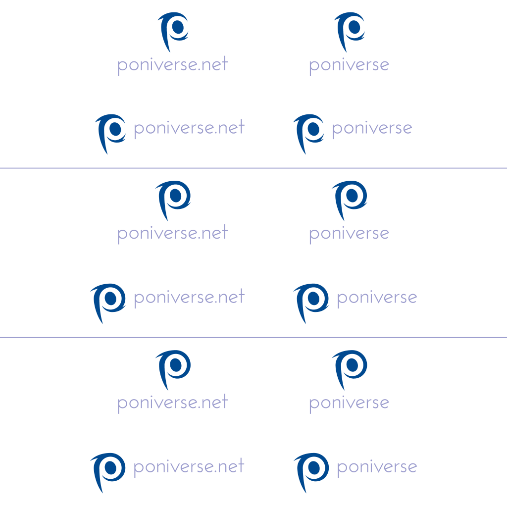
If anyone's curious, here's a sheet with the logo (with the graphic symbol) scaled in multiple sizes, starting from one big size to the smallest possible without it being unrecognizeable.
Conclusion
Poniverse is a supercommunity with the purpose of congregating several smaller communities under one hub. It is a bold idea that we haven't seen before in the brony community, which means a bold logo that encompasses everything into one. The stylized "P" in the form of a galaxy is an excellent idea, but design issues in the trademark, color, and graphic symbol jumble the message. The critiques in this review and process to make a revised logo hope to fulfill Poniverse's bold, creative, imaginative messages to the brony community and beyond, while not replicating another company's logo design.
-
 15
15
8 Comments
Recommended Comments
Create an account or sign in to comment
You need to be a member in order to leave a comment
Create an account
Sign up for a new account in our community. It's easy!
Join the herd!Sign in
Already have an account? Sign in here.
Sign In Now