


Silverwisp the Bard
-
Posts
2,103 -
Joined
-
Last visited
Content Type
Profiles
Forums
Character Archive
Frequently Asked Questions
Equestrian Empire Character Archive
Golden Oaks Memorial Library
Pony Roleplay Characters
Events
Blogs
Everything posted by Silverwisp the Bard
-
Looks good so far. Maybe desaturate the hooves juuust a bit to avoid the drawing the eye away from the face. As for a cutiemark, maybe some celtic knot or spiral design? I feel it would go well with the Character as well as the whole "one with nature"angle. We did get some deer culture in the recent comics. Not canon, alas, but a nice source for inspiration/headcanon.
-
SkyBound's Scratches, Scribbles and Sketches
Silverwisp the Bard replied to SkyBound's topic in Visual Fan Art
The CMC. The Gguar becaus of my personal interest in ponies in armour and how different artist approach it. The pairing... not entirely sure. I do have a weak spot for pairings that include a height difference (Sparity, Shovel and Shield Knight etc.). It just works for me, I guess. Zecora: I do like this a whole lot more than the Big Mac piece. The white spots are still a bit irritating (do you have the means to photograph your works? It might work better for the colour pieces). -The line of her mohawk looks a bit odd; I feel witrh her head at that angle, the lower part of the comb should be further into the rotation. -The loak looks a bit to shiny to me (though this is mostly because I alaways imagined it to be roughspun, your interpretation could vary). -The lower white part of the comb seems a bit too bright compared to the upper one. If you're still planning on doing a background, maybe a somewhat stylized forest scape in ark greens? All that nagging side, I really like this, hope you can find the time to do more. Twilight vs Twilight (2nd version): Very cool piece, kudos on the perspective. -I feel the curve of Twilight's neck could be a bit closer to the first version -Twi's right wing could be a bit more outstretched -it looks like Tirek is looking juuust apast her Rainbow Dash: Awwwww Love it! Maybe attach the wing a bit lower on the body. Cadence: :wub: Royal Sisters: :wub: :wub: Celestias hindleg seem a bit too far apart for a standing position, -
Looks great. Maybe shorten the right foreleg a bit.
-
Looks very nice. Kudos -The elbow joint on the right foreleg could sit a tad higher -maybe tweek the right antenna a bit, taking into consideration how it attaches to the head - Maybe add a tiny bit of blue to the wings to make them look a bit more organic
- 35 replies
-
- 1
-

-
- breezie
- fortune flair
- (and 1 more)
-
Heh, Fluttershy with a German accent would be adorable. Also, agreed; please do more art.
- 10 replies
-
- 2
-
-
- fan art
- fluttershy
- (and 2 more)
-
Silverwisps Big Old RP Resource Thread
Silverwisp the Bard replied to Silverwisp the Bard's topic in Visual Fan Art
Bump! Cleaned up the categories and added some new stuff. -
And back again. This year has not started well for me. Here's hoping that it will get better.
-
A while back I did an armoured version of Celestia, so I thought it's only fitting that Twilight should get a turn as well. Vaguely based on an idea for a fanfic/RP that might or might not at some point see the light of day. R&R welcome.
- 1 reply
-
- 7
-
-
-
-
As a rule of thumb, a fire should always be brightest at it's core. I think taking a look at the gren fire Chrysalis used on Twilight might give you some good pointers.
-
I meant if you were into drawing anything specific before (manga, Disney etc.). You're pretty darn good then, respect.
-
SkyBound's Scratches, Scribbles and Sketches
Silverwisp the Bard replied to SkyBound's topic in Visual Fan Art
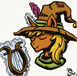
Love it Looks great, though at first glance I thought it was Trixie. I guess I can chalk that up to Sunset'hair walking far better on a human. Come to think about it, are you planning on doing human versions at some point? Love the expressions. Cheerile looks maybe a bit too thin, not helped by the perspective. :wub: :wub: This is the only one I can't quite enjoy; the ointy nose in combination with the weak chin makes Mac look kiinda shifty/rodentlike. Also, this colouring doesn't really work for me; all the white spots make the whole thing look way too cold (maybe that's the scanning progress?). I don't know how good you are with digital colouring, but I think a Disney-esque cel shading would look absolutely great for your style. Looks great so far. You'll want to watch the perspective/curvature on the neck rings. -
So, due to my forced absence from the forums I haven't gotten the chance to post these around here yet, so I'll just dump them here. See if you can guess the references. Day1: A pony posing Day2: A pony moving it Day 3: A pony in the snow Day4:A pony stepping it up Day5: A pony falling Day6: A pony larger than life Day7: A pony taking a break Day8: A pony caroling Day9: A pony sledding Day10: A pony decorating/wrapping up - Day11: A ponystretching on thin ice - Day12: A pony by the hearth - Day13: A pony family Day14: A pony celebrating Day 15: Any of the previous themes - As you can see, I haven't gotten around to all just yet, though I'm planning to cor#rect that soon. Anyway, I encourage anyone willing to improve their skills to do these. And if you have already, drop me a link, so I can take a look
-
Holy moly, that's some pretty great show accuracy there. Only thing I could point out is that the fiery parts of the leg need some desaturation/achcentuation, but I assume you're still getting to that. Also, I'd get rid of the tiny swords; they look to overdetailed to blen in with the rest of the pic.
- 28 replies
-
- 1
-
-
- midnight
- original character
- (and 3 more)
-
Well, if you don't make him too GRIMDARK, he certainly has potential. I do rather like the idea of something in the Everfree messing with dead bodies. Maybe some variaton on what Timberwolves are? I'd suggest you change the mane though; black and white hardly ever works for ponies. As for your sketch, the technique looks pretty good, but the anatomy looks more like a dog than a pony (unless that's intentional). Also, if you're still looking for an OC to draw, would you mind giving Muspel a try?
-
Nice job on the colouring, especially on the mane. The heartshaped shines in the eyes are a nice touch too. For the future, consider making the wings' outlines in pencil rather than marker.
-
I like the design; the colours go really well together. Some suggestions (feel free to ignore): -try desaturating the mane just a little bit -consider adding just a bit of green to the coat -brighten up the green in her her eye a bit PS: Does she have a backstory?
-
IGotta say, that's one intriguig style you got going there, looks almost carved. May I ask what your artistic background is? Anyway, my only real critique would be that the shaded areas of Pinkie's ears look a bit too flat for me. Also, I feel at this level of detail you should put in the nostrils, but that's personal taste. I hope we'll get to see more of you in the future
-
Okay, I'm back. For those who are wondering, 2014 has not been a great year for me and it ended with quite a bang. But now that I am back on my feet (and once again in possesion of a reliable internet access) I do intent to keep up with the forums again. Also, I finally got started on taking a proper drawing class (should be interesting). Speaking of drawing, I've quite the backlog build up, so this thread will see regular updates for a while: Thanks.
-
-
-
Might not be entirely appropriate; enjoy with caution:
-
-
Silverwisp rates your OC
Silverwisp the Bard replied to Silverwisp the Bard's topic in Original Character Help
@@DexterousWings, @@Soldier Surplus, Archean Gene: