Jump to content
Banner by ~ Ice Princess Silky

Which of the Mane Six do you find least aesthetically pleasing?


Azureth

Out of the Mane Six, which one do you feel is the least aesthetically pleasing?  

46 users have voted

  1. 1. Out of the Mane Six, which one do you feel is the least aesthetically pleasing?

    • Twilight Sparkle
      2
    • Rainbow Dash
      12
    • Applejack
      15
    • Pinkie Pie
      10
    • Fluttershy
      2
    • Rarity
      5


Recommended Posts

(edited)

I would have to say Rainbow Dash, honestly. :pout: In my opinion, the best character designs have a "color limit," if you will. Ideally, there should be about three or four colors on a character's design; Dash has pretty much all of them. The thing about colors is that they convey a mood; the reason so many villains wear red and black is because those are two very ominous colors. Red inspires violence and aggression, and black is know for being mysterious and depressing. When you go overboard with a character's color scheme, their overall identity becomes amorphous; the only thing saving them is their overall design outside of the colors, and the character's personality. 

That's just my opinion, anyways; you're welcome to disagree. :grin:

Edited by The Recherche
  • Brohoof 3
Link to comment
Share on other sites

(edited)
13 minutes ago, SwitchGuy2018 said:

What do you mean by that? Not everyone knows what least aesthetically pleasing means.

To call something aesthetically pleasing is in essence to call it beautiful, or pleasing to the senses. Aesthetics is how something looks or appears. I am actually surprised you've never heard the term as it's quite common in the English language, but there you go. ^__^


Hm, I think the only one that's really sort of odd or clashing to me is Applejack? I like Applejack, I just don't like the orange I guess. And even though I do like Pink, I just think that Pinkie Pie is TOO pink sometimes. Not a lot of colour variation. But it's more of a nitpick that I wouldn't bring up unless prompted.

Edited by Memento Mori
  • Brohoof 3
Link to comment
Share on other sites

I'm tied between Applejack and Rainbow. Where Rainbow's colour palette and hair model is too chaotic, AJ's is a contrast being too boring.

When choosing between too chaotic and too boring, I'd prefer chaotic since it's more intresting to look at. Sorry Applejack. :wat:

  • Brohoof 1
Link to comment
Share on other sites

AJ's, Fluttershy's and Rarity's colors are the more soothing to me, Pinkie's and Twilight's jump right away but are still consistent, Dash has a strange combination with a soothing coat color and a jumping rainbow in her mane.

Dash has a great design to turn your head and look at her (exactly what kids need to stay focused) but too attention demanding for my taste.

  • Brohoof 1
Link to comment
Share on other sites

Rainbow Dash. Too many colors clashing on this pony especially when you pay attention to her mane. The color Rainbow as it stands out may look nice and pretty, but if a character had that as their color then it becomes jarring to find it aesthetically pleasing to the naked eye IMO.


Plus, her mane is absolutely messy and dreadful with zero style compared to the rest of the ponies. Being a tomboy doesn’t excuse her awful mane design. Applejack is just as much of a tomboy as her and sporting a simple yet decently appealing mane style. So why can’t Dash?

  • Brohoof 1
Link to comment
Share on other sites

Pinkie. The amount of pink just hurts my eyes on a personal level. Plus the mane, oh dear the mane. It's so horrendous for me :< guess as a devoted follower of Rarity you could NOT expect me not to pay attention to it.

RD reminds me of a prism light, and I like colors in general.

AJ has those cute ponytails and a hat.

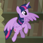
Twiligt has really lovely streaks in her mane and I enjoy her color scheme.

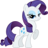
Rarity captivates me with that beloved touch on her eye makeup, plus white is one of my favourite color.

Fluttershy is a bit bland to me and she doesn't make me go yey when I look at her.

But I just have issues looking at that unkempt mane of Pinkie and her single-colored scheme :/

  • Brohoof 2
Link to comment
Share on other sites

That's a really hard question, as all of them are cute and attractive in their own way. But if I had to choose, I think Dashie is my pick. Don't get me wrong, just look at my sig and you'll see her cuteness can be overwhelming, but in terms being attractive, I think she falls a bit short

Link to comment
Share on other sites

I would have to say Pinkie Pie, she just has too much of one color......... pink. I also don't like the design of her mane, it's too floofy and messy and just....... doesn't look very nice. I think I'm a little biased though because Pinkie Pie is one of my least favorite characters of the mane six anyways :please:

Link to comment
Share on other sites

(edited)

It's ironic that the fashion pony (rarity) is the one that I find the least aesthetically pleasing. I'm not a massive fan of her colour scheme or her mane/tail style. Just personal taste though.

Edited by Nightfall Thunder
  • Brohoof 1
Link to comment
Share on other sites

I am a huge fan of Apple Horse ... but orange and yellow aren't my favorite scheme so I'll have to go with that. Rarity and Twilight would be tied as the reverse by nature of purple .... which is best color. 

  • Brohoof 1
Link to comment
Share on other sites

I'd have a hard time choosing because I honestly like the way they all look.

For example, I might have found Pinkie to have a boring design because she is all pink, but her crazy poofy mane and tail are just super adorable to me. 

I don't typically love yellow or orange, but both Fluttershy and AJ are cute.   I love Fluttershy's long pink mane and it's actually a really nice combo with the yellow. 

AJ is very unique looking and I like her mane and tail style.  Her green eyes are also very striking and pretty. 

Rarity is just gorgeous and classy looking all around, especially because purple is my favorite color. 

As for Twilight well, again, I love purple, and her streaks of pink are a nice combo.

Rainbow Dash is a neat design too.  I like the look of a blue sky with a rainbow.  

With all that being said,  I guess if I HAD to choose one,  I'd choose Rainbow as being the least aesthetically pleasing, simply because I like the other designs more.  


  • Brohoof 1
Link to comment
Share on other sites

Rainbowtwat looks like someone spilled buckets of paint, and just said "SCREW IT WE HAVE A CHARACTER!!".
Plus, she's a huge twat, and I just hate her overall.

Link to comment
Share on other sites

Pinkie Pie, because her base design is completely monochromatic. I don't think it's bad ofc, but I like the others better.

  • Brohoof 1
Link to comment
Share on other sites

It's out of applejack and rainbow dash with me... surprising like most people are saying. Rainbow just simply have to many colors going on and apple jack yellow on orange isn't the greatest scheme either.

Link to comment
Share on other sites

It's honestly hard for me to tell whether or not I dislike Applejack's looks based upon them objectively, or if that dislike at least partly influenced by how much I don't like her character. I'd like to think it's a fair assessment of my own opinion anyway - her design is just boring. That and whole "country blonde" really rubs me the wrong way.

Link to comment
Share on other sites

It's interesting people are saying Rainbow's attention grabbing design is a flaw, and yet doesn't match her character - her character IS attention grabbing. It fits her well.

I like all their designs, I couldn't pick a least favorite. I think Lauren Faust did a great job designing them.

  • Brohoof 1
Link to comment
Share on other sites

Create an account or sign in to comment

You need to be a member in order to leave a comment

Create an account

Sign up for a new account in our community. It's easy!

Join the herd!

Sign in

Already have an account? Sign in here.

Sign In Now
×
×
  • Create New...