Jump to content
Banner by ~ Ice Princess Silky

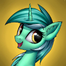
critique wanted [Feedback wanted] I drew a Glimmy


Ganaram Inukshuk

Recommended Posts

I couldn't decide on a single emotion, so I went with two. Take the symbolism with the kite however you want.

I'd highly appreciate feedback on what I can do better; I always think I'm doing something wrong. (Yes, I did see the feedback from last month's thread; I just never made a proper reply to any of them.)

mlpfim_i_drew_a_glimmy_happy.thumb.png.83c93ea759a267ef58148c7c78ab01c7.png

mlpfim_i_drew_a_glimmy_sad.thumb.png.00e649b6d7db6779ff912aa37c010671.png

  • Brohoof 4
Link to comment
Share on other sites

Gad, it touched me immiediately. The only thing I noticed is missing are pupils and iris in Her eyes, but the rest is just amazing performed by very well simplified picture! Keep it up!

Edited by Iam
**
  • Brohoof 1
Link to comment
Share on other sites

Nice job! You are constantly getting better with use of colors and shading. I really like this picture of yours, both the story it tells and the way you have made it
^_^

As I said recarding your earlier art post, that tree trunk in the front and blurred outlines of it and kite make the picture look more lively and give it more much needed dept. Adding that little darker part/hill under the tree is really nice touch too. Way you drew Starlight is little more relaxed than usuall, she looks less like those paintings in ancient Egypt and more like a living, breathing creature. Well done you! :mlp_wink:

  • Brohoof 2
Link to comment
Share on other sites

On 9/11/2018 at 11:33 AM, Iam said:

Gad, it touched me immiediately. The only thing I noticed is missing are pupils and iris in Her eyes, but the rest is just amazing performed by very well simplified picture! Keep it up!

I think the lack of pupils might be deliberately stylistic.

I personally think the horn should be a little bigger. Don’t ask me why. I’d give a reason, but this time I think it’s just one of those gut things that I think would improve it.

The background is impeccable for the style you’re going for.

Edited by ShadOBabe
  • Brohoof 1
Link to comment
Share on other sites

Apologies for the extremely delayed reply; try driving 600+ miles, having two dental appointments unrelated to the 600+ miles of driving (one of which is unplanned), and getting a suit all while trying to pack up for university when moving day is literally next week.

On 9/11/2018 at 9:33 AM, Iam said:

Gad, it touched me immiediately. The only thing I noticed is missing are pupils and iris in Her eyes, but the rest is just amazing performed by very well simplified picture! Keep it up!

On 9/13/2018 at 5:26 PM, ShadOBabe said:

I think the lack of pupils might be deliberately stylistic.

I personally think the horn should be a little bigger. Don’t ask me why. I’d give a reason, but this time I think it’s just one of those gut things that I think would improve it.

The background is impeccable for the style you’re going for.

If you know what Kurzgesagt is, you'll know why my style is like that; that's basically the style I've been refining ever since... 2015? My biggest concern is that people will find the style oversimplistic and uninteresting, which is why I've never shared any of my work until now (plus all the feedback I tried to get prior never gave me anything I could actually learn off of).

On 9/11/2018 at 10:20 AM, Divine plywood said:

Nice job! You are constantly getting better with use of colors and shading. I really like this picture of yours, both the story it tells and the way you have made it
^_^

As I said recarding your earlier art post, that tree trunk in the front and blurred outlines of it and kite make the picture look more lively and give it more much needed dept. Adding that little darker part/hill under the tree is really nice touch too. Way you drew Starlight is little more relaxed than usuall, she looks less like those paintings in ancient Egypt and more like a living, breathing creature. Well done you! :mlp_wink:

Colour's been the hardest thing for me to do since I had no sense of colour up until now, actually. I honestly don't like it when I'm told I'm supposed to use RYB when it's just yuck to me (and I've effectively been colouring exclusively with light for nearly ten years, so why not stick with it?). There's something called the HSL/HSV colour model which not only works on top of RGB/CMY, but enhances how I work with shading; for example, a shadow on an orange ball should actually be darkened desaturated red and the ligthing on it should be brightened saturated yellow.

Then there's the thing where things towards the horizon become progressively more washed out with the background colour and how things towards you should be darker and how the most important subjects in the photo should be the most saturated things and this one parallax experiment that I tried to do where things that are super-duper close-up should have a blur added to them because that way it directs your focus to whatever it is that isn't blurred.

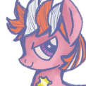
Heck, I did this blur thing once before, back when my art style was at version 1:

Spoiler

mlpfim_atg_231_famouspony.thumb.png.8e803fb9dc39ab68b9bfc5721dd1d72f.png

(I think I can safely say my art style is at version 3 now.)

On 9/12/2018 at 7:28 AM, RaphLuna said:

I love your Message


On 9/13/2018 at 4:54 PM, Rawzy said:

That's a very edgy and deep glimmy.

On 9/13/2018 at 5:25 PM, Totally An Admirer said:

I felt this and in fact I am feeling like this right now, and top this there is even raining outside. 

On 9/13/2018 at 5:45 PM, A.V. said:

And you succeeded at said Glimmy.

My original plan was to literally hide one image inside the other; something about conveying a message about suppressed feelings, but the way I had it only worked with transparencies and I don't know enough steganography to properly pull it off.

This version relied on using Discord's light and dark themes to reveal the hidden image; if you were to steal this image and post it anywhere on Discord using dark theme, it will appear as happy Glimmy, but because of the white background here, it's sad Glimmy. My plan was to fool those using light theme into seeing an image that was completely different from those using dark theme. 

Clicking on the image for the enlarged preview kinda almost sorta works, but since the grey in that enlarged preview is different from Discord dark theme, both images will end up bleeding through.

mlpfim_i_drew_a_glimmy.thumb.png.e240ac838d75f47a56a3814d951ed95f.png

Edited by Ganaram Inukshuk
  • Brohoof 1
Link to comment
Share on other sites

Create an account or sign in to comment

You need to be a member in order to leave a comment

Create an account

Sign up for a new account in our community. It's easy!

Join the herd!

Sign in

Already have an account? Sign in here.

Sign In Now
×
×
  • Create New...