Jump to content
Banner by ~ Ice Princess Silky

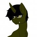
My First Vector Ever!


GeekBrony

Recommended Posts

Not bad! The edges are a bit rough; you could've spent some more time rounding the curves. Aside from that, though, you did a very good job for your first vector.

Link to comment
Share on other sites

I remember the time I tried vectoring... You're way ahead of what mine turned out to be. Keep at it and I'm sure you'll become great at it!

Link to comment
Share on other sites

wow! now that is really good for a first try!! did you do it by mouse or do you have one of those fancy shmancy graphic tablet thingies....

I used just a mouse, and the pen tool in photoshop. :P Took forever but it was worth it.


Not bad! The edges are a bit rough; you could've spent some more time rounding the curves. Aside from that, though, you did a very good job for your first vector.

Yeah, I wish I could have done that, but lesson learned!
Link to comment
Share on other sites

Looks pretty good, certainly better than I could do. I tried vectoring once and it was just a disaster. tongue.png


But anyways, The lines are a little jagged, and could be more straight, but keep on practicing and you will improve on that. :3


And one last thing... you may want to use the DA tags instead of linking to your DA for ease of use, like this (Without the spaces):

[ da]"deviant number at the end of the web address"[/ da]

Yours would look like this:

[ da]360120987[/ da]
  • Brohoof 1
Link to comment
Share on other sites

Wow X, you did great for a first time vector! Although I've seen this before, I still say you did a great job! Keep up the good work X86!img-1284996-1-biggrin.png

Thanks DX! Since that was my first, I am striving to attain better ways to do it, as in programs, hardware, etc.

Next I will work on the edges more!

  • Brohoof 1
Link to comment
Share on other sites

Thanks DX! Since that was my first, I am striving to attain better ways to do it, as in programs, hardware, etc.

Next I will work on the edges more!

Cool, just keep me posted to see it! I always like to see the work other bronies put out, I usually don't care it it's bad, the fact that they tried is good for me! 

Link to comment
Share on other sites

(edited)

What I absolutely adore in this has to be the exact thing that some of these guys have picked up on.  The way in which the lines have that 'imperfectness' to them REALLY (and even that comes as an understatement) enhances the whole deal!  It actually restores the mortality to this piece which sadly seems to fade as more of these digital artworks are released.


What I will say is keep practicing your trade!  But please, PLEASE keep this element of imperfect/roughness (subtle roughness really) in your work.  Not only does it set the whole thing apart, but it adds SO MUCH MORE to the piece.  if you were to completely smooth and polish everything, it would simply be that vector we all see over the internet everywhichway we turn our heads.  Instead, you've kept what natural input you could and produced a much more interesting piece.


Bloody well done, my son wink.png

Thanks Ballistic! I might actually keep this design! I actually liked that it was like something drawn on a drawing tablet (I don't have one that has that feature on it. :P) Then I will keep my originality by doing this.

Edited by x86cam
Link to comment
Share on other sites

*Smart-ass designer comment*


Correction! There's a difference between a "Vector" based artwork and a "Pixel" based artwork. Vectors are typically made using Adobe Illustrator. Pixel-based artwork are typically images, and drawings made in Photoshop (others include MS Paint, GIMP and simple drawing programs). Vectors are usually hi-res, and when you zoom in, you won't see pixels. You can tell the difference between a Vector and a Pixel-based artwork if you zoom in...and see pixels or not. So in your case, the artwork you made is not a vector, but a pixel-based artwork :)If you want to make actual Vectors, I suggest you use Adobe Illustrator (this goes out to everyone who's interested in making pony-drawings). 


But enough of that. Whether Vector or Pixel, this work of yours is awesome. I specifically love how the outline is very rough. It gives off the vibe that it's hand-drawn and traditional, as compared to the typical digital pony-art. I suggest you keep it rough, and you'll look original :) maybe you could make it even more rough, like how I'd draw mine. I suggest, too, that you get yourself a tablet! Bamboo has an affordable price :) Anyway, good job on this! Cheers!

Link to comment
Share on other sites

You did great with that FS. Well done. BTW, I've been wondering, what exactly is a vector? Some kind of digital drawing or what? Anyway, please do more. My eyes are delighted :)

Link to comment
Share on other sites

Wow guys, thanks! Didn't think I would recieve any feedback when I posted this :P. Oh btw, I used the PEN tool to select all this then I used all of the paths and colored them. That explains the jagged and somewhat "pen" drawn edges.

Link to comment
Share on other sites

Create an account or sign in to comment

You need to be a member in order to leave a comment

Create an account

Sign up for a new account in our community. It's easy!

Join the herd!

Sign in

Already have an account? Sign in here.

Sign In Now
×
×
  • Create New...