Jump to content
Banner by ~ Ice Princess Silky

Artsy Dreamscapes Redesign


Arylett Charnoa

Recommended Posts

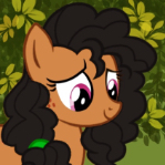
For a few years now, I've had my ponysona's design mostly fleshed out. Minus a few modifications that evolved as a result of drawing style. (You wouldn't even be able to tell the difference.) But now, after all this time, I've decided that it was time for a bit of a change. To make her more consistent with my recent redesign of my fursona.


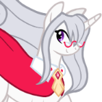
And thus I present to you... the new and improved Artsy Dreamscapes! (After many hours of torture with a broken tablet >>) She changed her manestyle, had some minor tint changes in color you won't notice unless you're a crazy design bucket like myself, and got an awesome new necklace from her boyfriend Klopp.


(As usual, I will tell you that this is NOT a vector except for the cutie mark. Which was vectored almost exactly from an original picture I made thanks to someone else. Otherwise, all hand-drawn craziness going on here.)


Oh and one more thing: it's a sneak preview for a bigger project I'm working on which will involve this very picture of Artsy.


FIXED:


post-809-0-99868500-1387881369_thumb.png


OLD:

post-809-0-76316100-1386218645_thumb.png

Edited by Arylett Dawnsborough
  • Brohoof 13
Link to comment
Share on other sites

For a few years now, I've had my ponysona's design mostly fleshed out. Minus a few modifications that evolved as a result of drawing style. (You wouldn't even be able to tell the difference.) But now, after all this time, I've decided that it was time for a bit of a change. To make her more consistent with my recent redesign of my fursona.


And thus I present to you... the new and improved Artsy Dreamscapes! (After many hours of torture with a broken tablet >>) She changed her manestyle, had some minor tint changes in color you won't notice unless you're a crazy design bucket like myself, and got an awesome new necklace from her boyfriend Klopp:


(As usual, I will tell you that this is NOT a vector except for the cutie mark. Which was vectored almost exactly from an original picture I made thanks to someone else. Otherwise, all hand-drawn craziness going on here.)


attachicon.gifArtsy Dreamscapes Redesign.png


I really like your choice of colours here. All of them go well together, and, as such, I think it goes without saying that I also like your OC.

The flower behind her ear is a nice touch. I'm a hippie and it pushes all the right buttons in me. ^^

  • Brohoof 1
Link to comment
Share on other sites

Pros:

  1. The color of the ponysona's fur is much bolder and more saturated. It feels something like I would see in the canon. Your previous design's fur color was more muted and dull.
  2. The choice of color for the hair works really well. You have the red to indicate passion and the brown to balance its intensity. The fire lily, for that matter, gives the unicorn a sense of pride, beauty, and self-confidence.
  3. The mane and tail are cleaner and smoother.

Cons:

  1. Your previous mane has a more unique design, both the bangs and back. Currently, the revised character's bangs look very similar to several other canon characters, particularly Trixie and Fluttershy. If we ditch the color and focus on the black-and-white shape only, then they'll look so alike. The back of her hair gives me plenty of Pinkie Pie vibes with the endless circles, while your previous mane has a nice flow up to the balled up end.
  2. The same critique applies to your tail, both your revision and past design. I sense Pinkie Pie a little too much with the multiple bouncy circles.
  3. The chain and necklace have a bit too much detail. If we reduce the size of the unicorn any more, then that hard work can easily become lost. I would treat this similar to printing a logo: simplify the chain and necklace.
  4. The cutie mark is quite big in scale. It covers literally both ends of the back leg, touching the stroke.

Suggestions:

  1. Simplify the chain. Instead of at least a dozen links, have maybe half that much instead.
  2. Simplify the design of the necklace. Instead of all of the intricate details, have a couple of them instead.
  3. Reduce the scale of the cutie mark. Leave some real estate so the leg can breathe a little.
  4. Revive the old design of your bang, and simplify your mane and tail. Maybe have the hair flow smoothly up to the end where the hair curls up into a couple of balls, one brown, one red. Something similar to the back of your ponysona's old mane (for both the mane and tail), but as smooth and clean as your revision.
Edited by Dark Qiviut
Link to comment
Share on other sites

(edited)
 

I really like your choice of colours here. All of them go well together, and, as such, I think it goes without saying that I also like your OC.
The flower behind her ear is a nice touch. I'm a hippie and it pushes all the right buttons in me. ^^

Thank you very much. I'm glad I... pushed all the right buttons. Whatever that means. XD


Pros:

  1. The color of the ponysona's fur is much bolder and more saturated. It feels something like I would see in the canon. Your previous design's fur color was more muted and dull.
  2. The choice of color for the hair works really well. You have the red to indicate passion and the brown to balance its intensity. The fire lily, for that matter, gives the unicorn a sense of pride, beauty, and self-confidence.
  3. The mane and tail are cleaner and smoother.

Cons:

  1. Your previous mane has a more unique design, both the bangs and back. Currently, the revised character's bangs look very similar to several other canon characters, particularly Trixie and Fluttershy. If we ditch the color and focus on the black-and-white shape only, then they'll look so alike. The back of her hair gives me plenty of Pinkie Pie vibes with the endless circles,while your previous mane has a nice flow up to the balled up end.
  2. The same critique applies to your tail, both your revision and past design. I sense Pinkie Pie a little too much with the multiple bouncy circles.
  3. The chain and necklace have a bit too much detail. If we reduce the size of the unicorn any more, then that hard work can easily become lost. I would treat this similar to printing a logo: simplify the chain and necklace.
  4. The cutie mark is quite big in scale. It covers literally both ends of the back leg, touching the stroke.

Suggestions:

  1. Simplify the chain. Instead of at least a dozen links, have maybe half that much instead.
  2. Simplify the design of the necklace. Instead of all of the intricate details, have a couple of them instead.
  3. Reduce the scale of the cutie mark. Leave some real estate so the leg can breathe a little.
  4. Revive the old design of your bang, and simplify your mane and tail. Maybe have the hair flow smoothly up to the end where the hair curls up into a couple of balls, one brown, one red. Something similar to the back of your ponysona's old mane (for both the mane and tail), but as smooth and clean as your revision.


Pros Responses:

For your first one:  Funny you say that... I actually didn't change any colors whatsoever except the red. And I DE-saturated them. :P Unless you're talking about my avatar, which is by no means no judge of the actual colors as I scraped on some filters. But thank you.


Cons Responses:

I see your suggestions, and I raise you this: the entire point of the redesign was the mane itself. The old mane was a pain in the ass to draw, had no real flow, looked... nothing like hair to be honest, and looked very much unlike my actual hair. The entire point of the ponysona is to look as much like me as I can muster. By redesigning it as I have, I pretty much resolve all of these problems. And actually, I was intentionally basing the mane on Trixie and Fluttershy, as I thought they looked most humanlike and like my own bangs for the frontal part. I'm not really seeing the Pinkie Pie though. O_o If anything, I'd say it looks more like Sweetie Belle.


It's something I spent a lot of time and thought on, and it's one thing I'm not really willing to change. I'm quite satisfied with the way it looks, and think it is much improved to the old one. Thank you for your suggestions though.


As for the complexity of the necklace, I've foreseen that problem. I'll have to do some more work and more thought to simplify it as much as I can (whenever my mind isn't dead from sleep deprivation, like it is now @_@), whilst simultaneously allowing it to resemble its real counterpart. (Which is MY necklace.) But the heart part of it is pretty much staying as it is, as I have seen in the shown that gemlike objects can resemble that in the show and I quite worked hard on that bit. It's actually one of my favorites.


Overall, my intention wasn't really to be original or unique. But to make this pony more ME. I think I have at least succeeded in that front, even if the execution was riddled with small flaws.


Lastly, the cutie mark was large out of a fear that if I made it too small, it'd be difficult to see. I've actually seen it in different sizes and didn't really... like how any of them looked. But I suppose it could stand to be a bit smaller. It's an easy fix for sure. I'll go fix it up right now.


Now, to end this off: I'm not brushing you off or anything of course. Criticism is something I do appreciate. I have taken what you've said into consideration, probably more than you know. Just some things that I'd rather not change, and some that I am willing to. So I do hope you don't take it that way, and I truly appreciate you taking your time to write something lengthy and detailed as opposed to a two word sentence.

Edited by Arylett Dawnsborough
Link to comment
Share on other sites

(edited)

Le fwomph! I have made some designated changes and have determined that the one thing bothering me about the entire picture was that little mane top there. I knew it was something. (Such an obsessive fudget I am) Behold:


post-809-0-06404400-1386415175_thumb.png
 
Thanks again to DarkQivuit for his criticisms. That one about the mane top there made me realize how... wrong it was after having a think about it.
Edited by Arylett Dawnsborough
  • Brohoof 1
Link to comment
Share on other sites

  • 1 month later...

The top mane definitely looks better with the added red. Overall a very nice design, probably the best cooursheme I've seen on an OC thus far (I think haven't had the chance to tell you yet).


-unless that ne

necklace attaches to the back of her head, you probably want to lower the chain (also unless she's moving rather fast shouldn't it hang a bit straighter?)

-The neck could use some slimming where it attaches to the head

-the bulb just above the tip of the upper mane looks a bit odd


Also, and this is personal taste so feel free to ignore, the gap between lower and upper mane seems a bit big, possibly move the lower part up a tad.

Link to comment
Share on other sites

Create an account or sign in to comment

You need to be a member in order to leave a comment

Create an account

Sign up for a new account in our community. It's easy!

Join the herd!

Sign in

Already have an account? Sign in here.

Sign In Now
×
×
  • Create New...