


Minty Beam
-
Posts
70 -
Joined
-
Last visited
Content Type
Profiles
Forums
Character Archive
Frequently Asked Questions
Equestrian Empire Character Archive
Golden Oaks Memorial Library
Pony Roleplay Characters
Events
Blogs
Posts posted by Minty Beam
-
-
THIS COMMENT IS BROUGHT TO YOU BY MY LIFE! ITS NOT THE WORST! BECAUSE IT DOSNT EXIST!
-
THIS REPLY IS BROUGHT TO YOU BY AUDIBLE.COM! THE #1 BEST SOURCE FOR ONLINE AUDIO BOOKS! TYPE MINTY AND GET YOUR FIRST ORDER 10% OFF!
-
Oh shoot! I never saw this question. I'll answer it now.
You see, there are birds out in this world that are assigned to delivering babies by certain times. When it's time for a baby to be born, a delivery bird will arrive at the doorstep at your house and deliver your baby all wrapped up in a blanket at your door.
seems legit
-
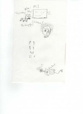
What is the best ad that you can think of, that has nothing to do with the product in any way shape or form?
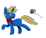
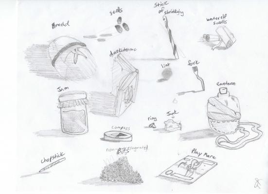
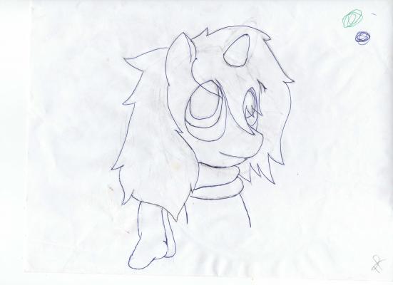
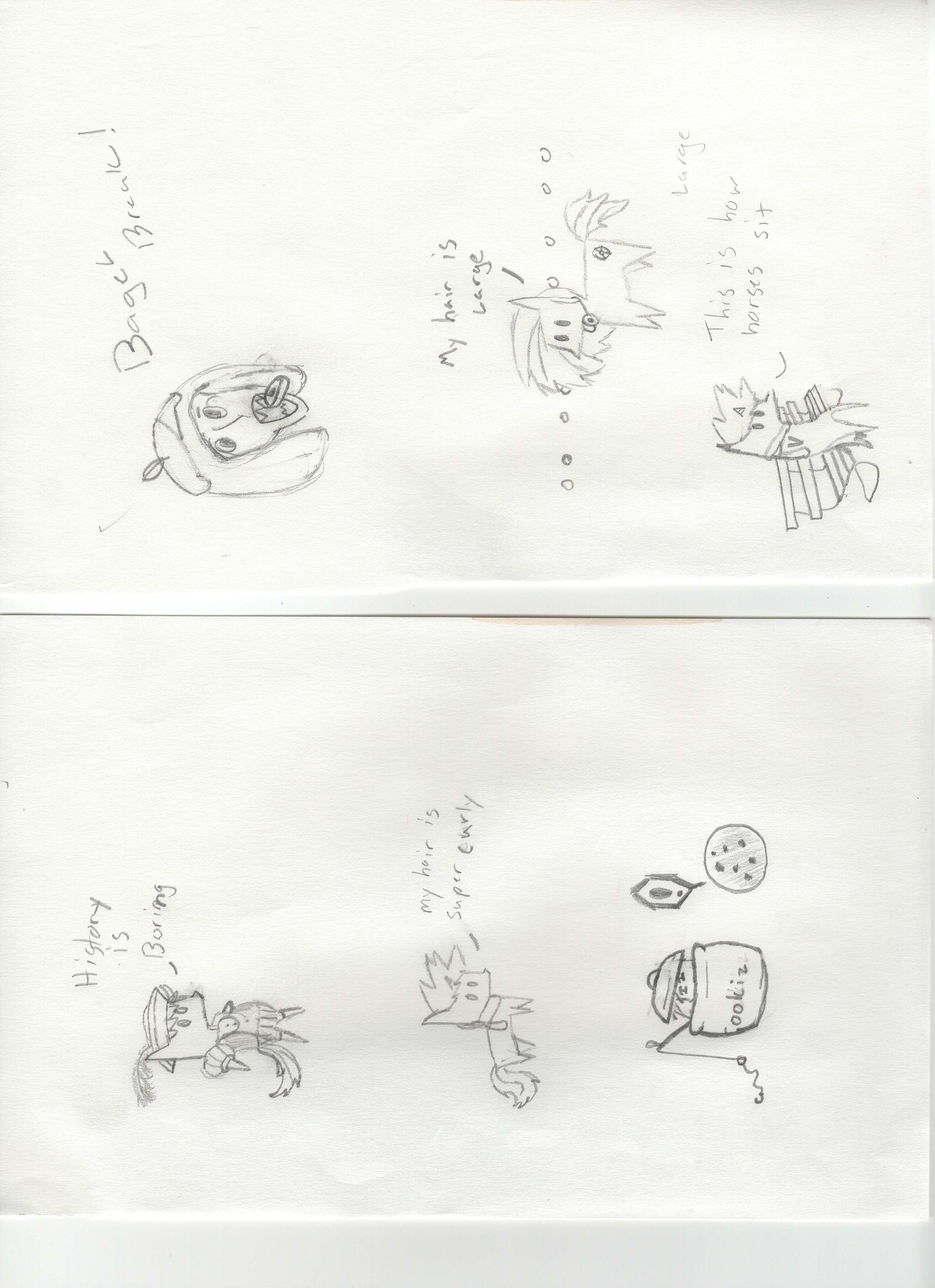
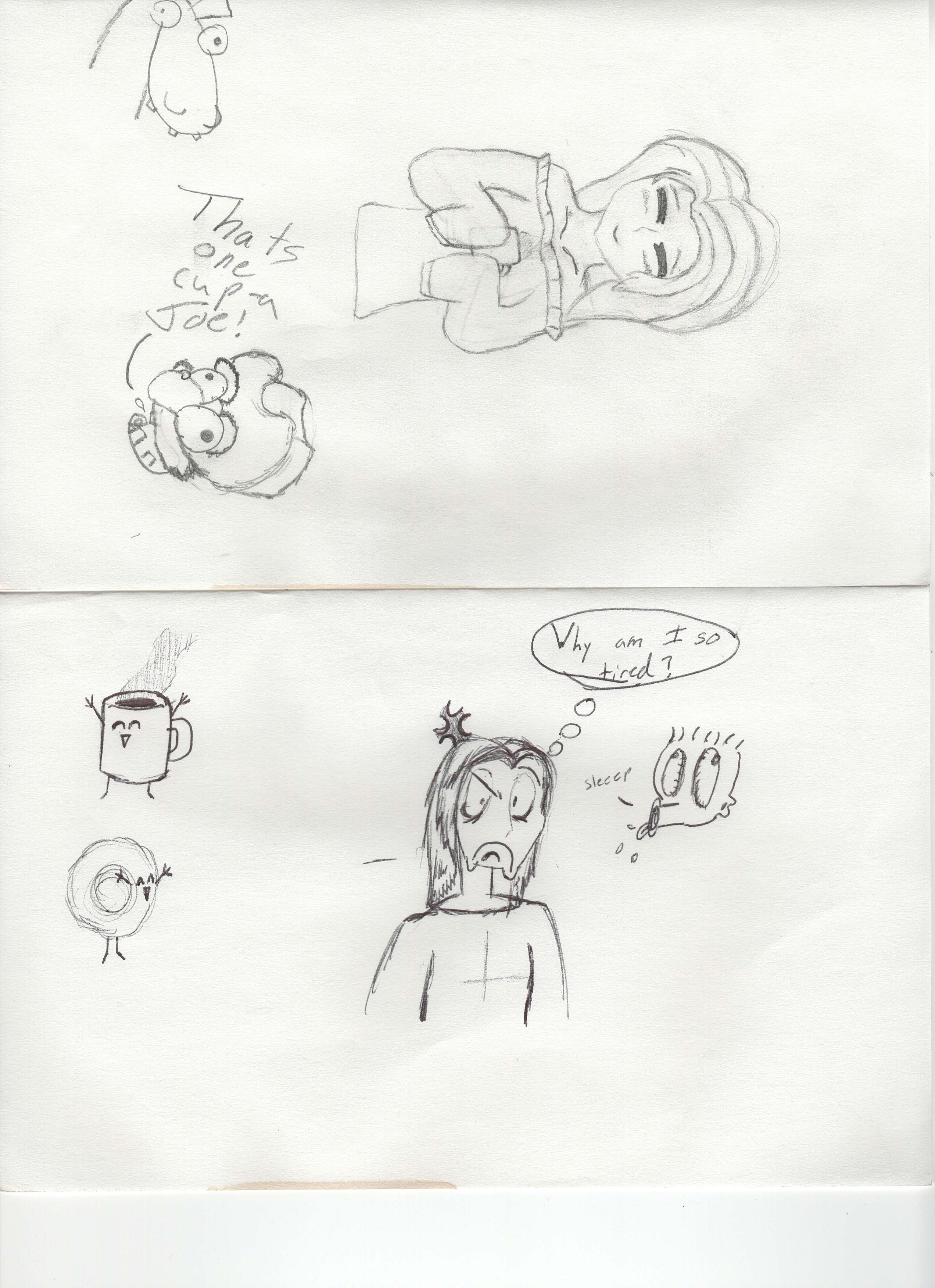
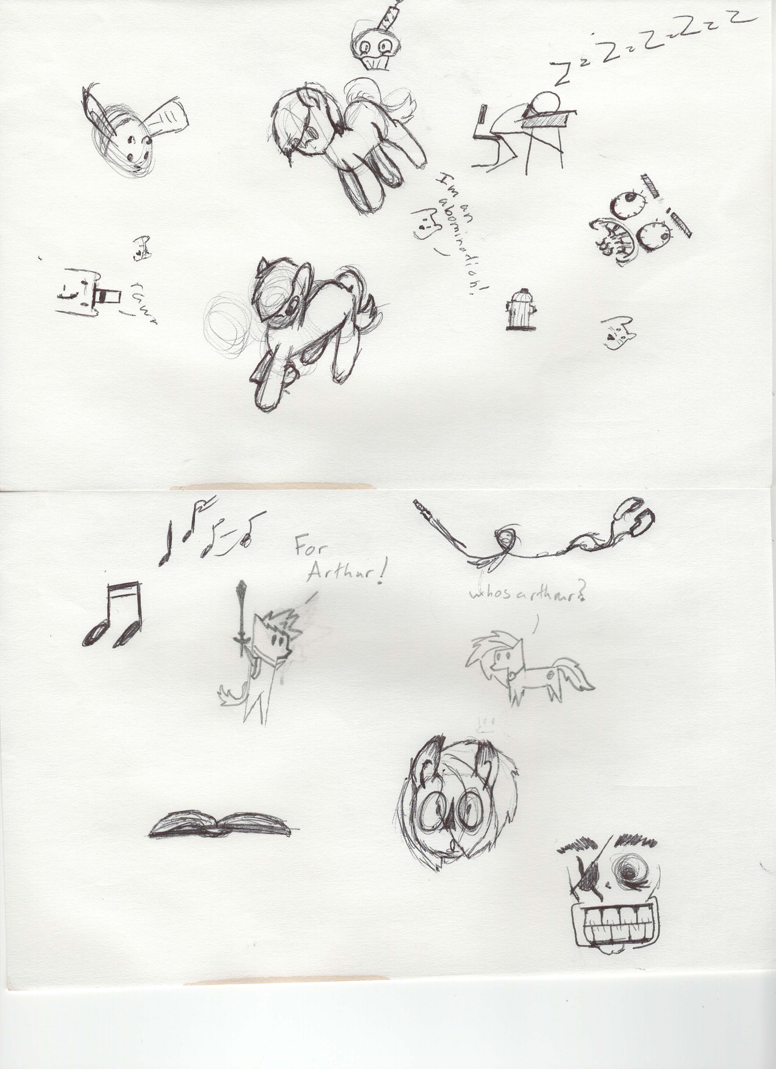
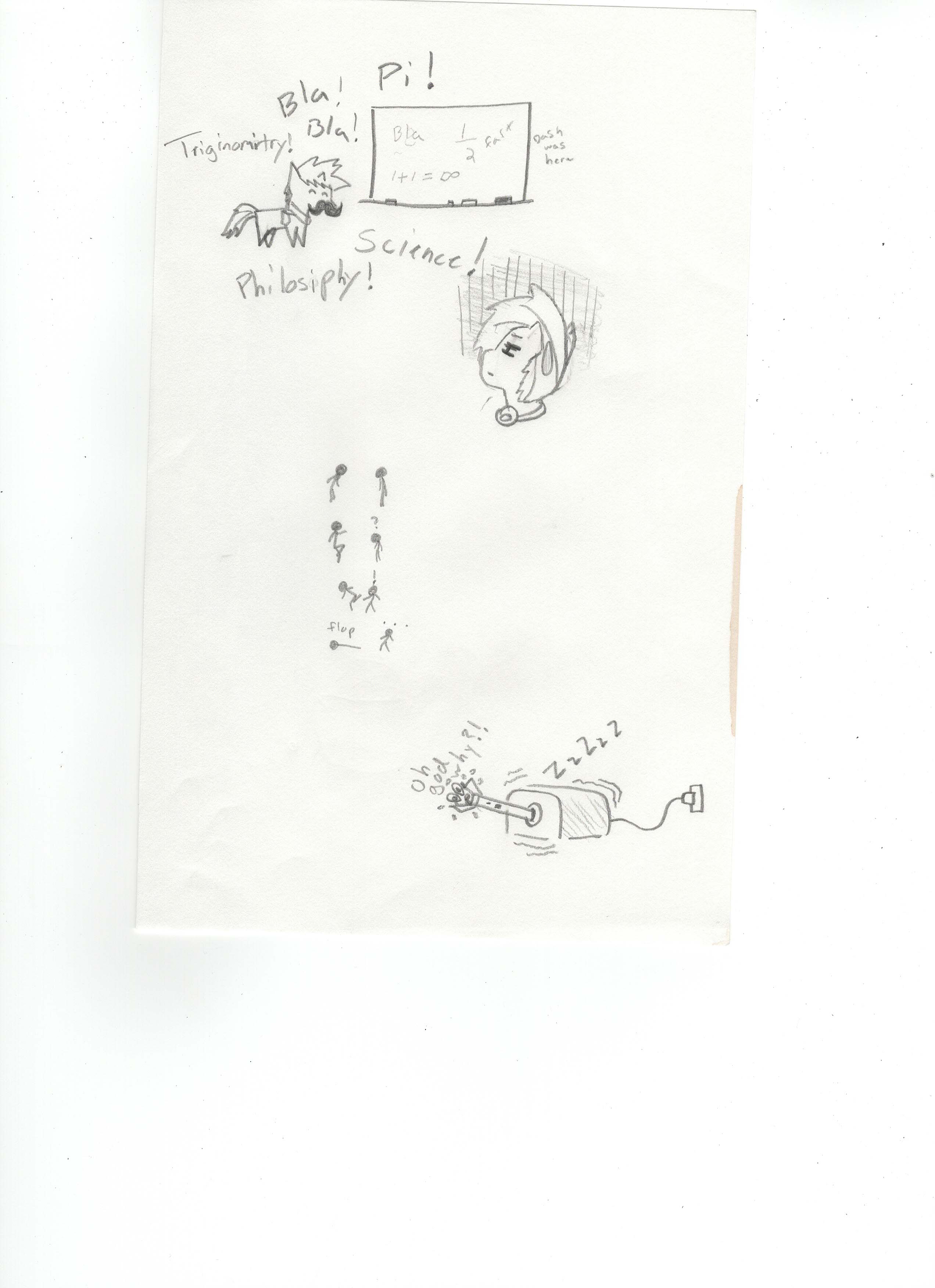
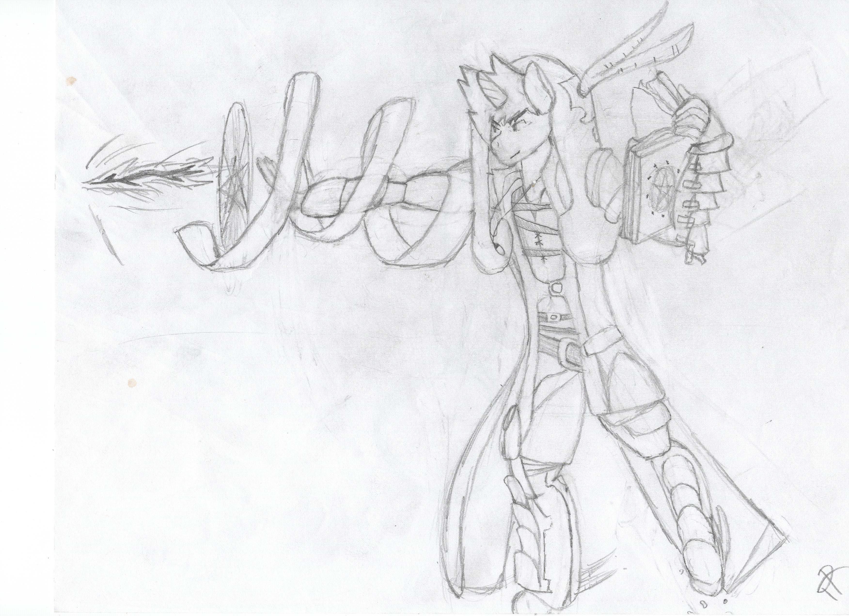
also have a random pic
-
 2
2
-
-
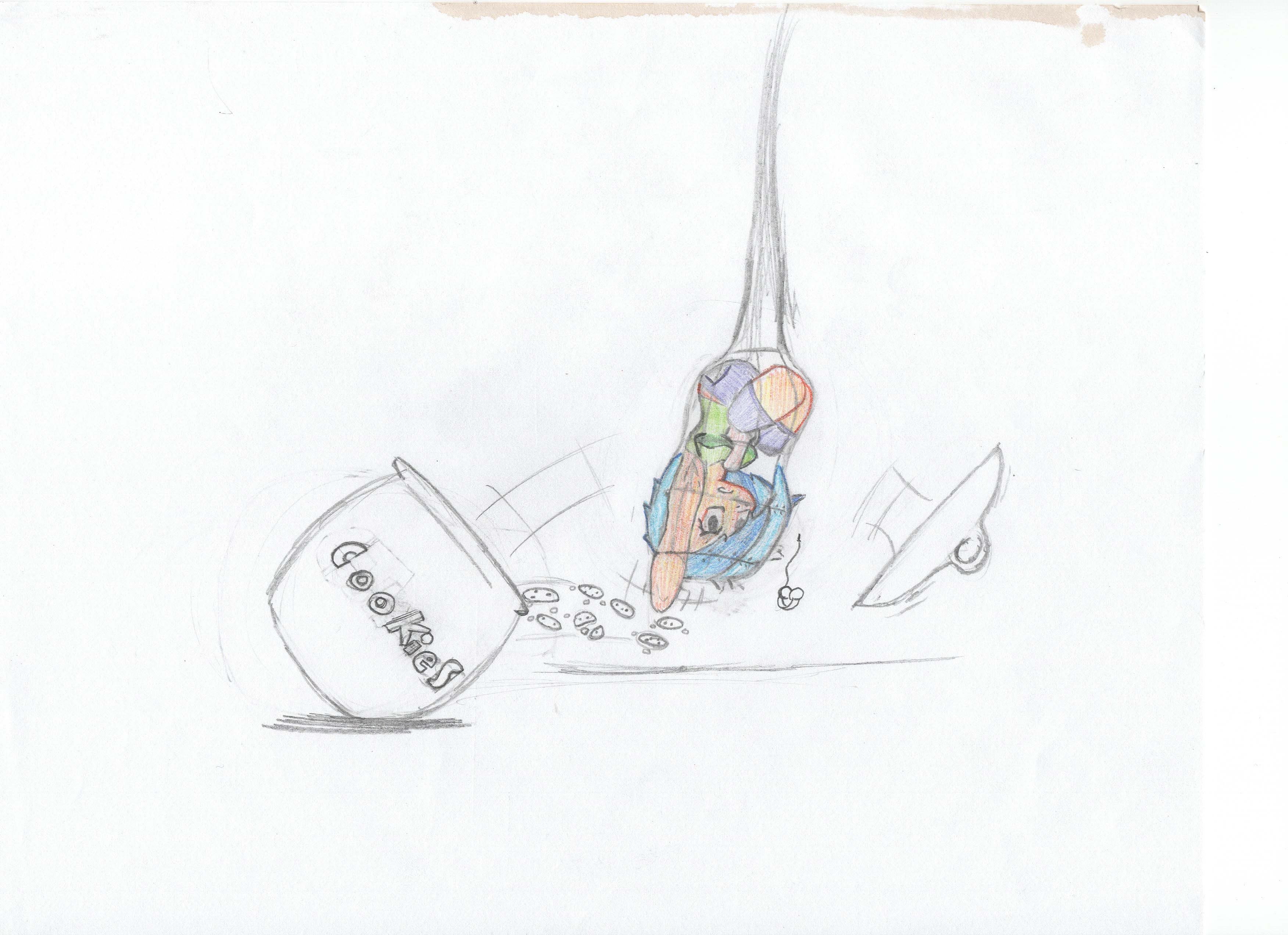
IVE BEEN SPOTTED! I must lay low until its clear to come out
-
1
-
-
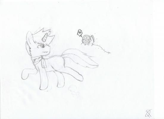
it is a nice piece, however the belly seems to stand out alot making her seem somewhat bloated to me. I am also picking up some confusing shading as she seems to be shaded as if there are multiple light sources, but at the same time it is shaded as to be a single light source.
Keep up the good work!
-
2
-
-
the downward flap seems jerky, that just my opinion tho, keep up the good wor mr animator dude!
-
1
-
-
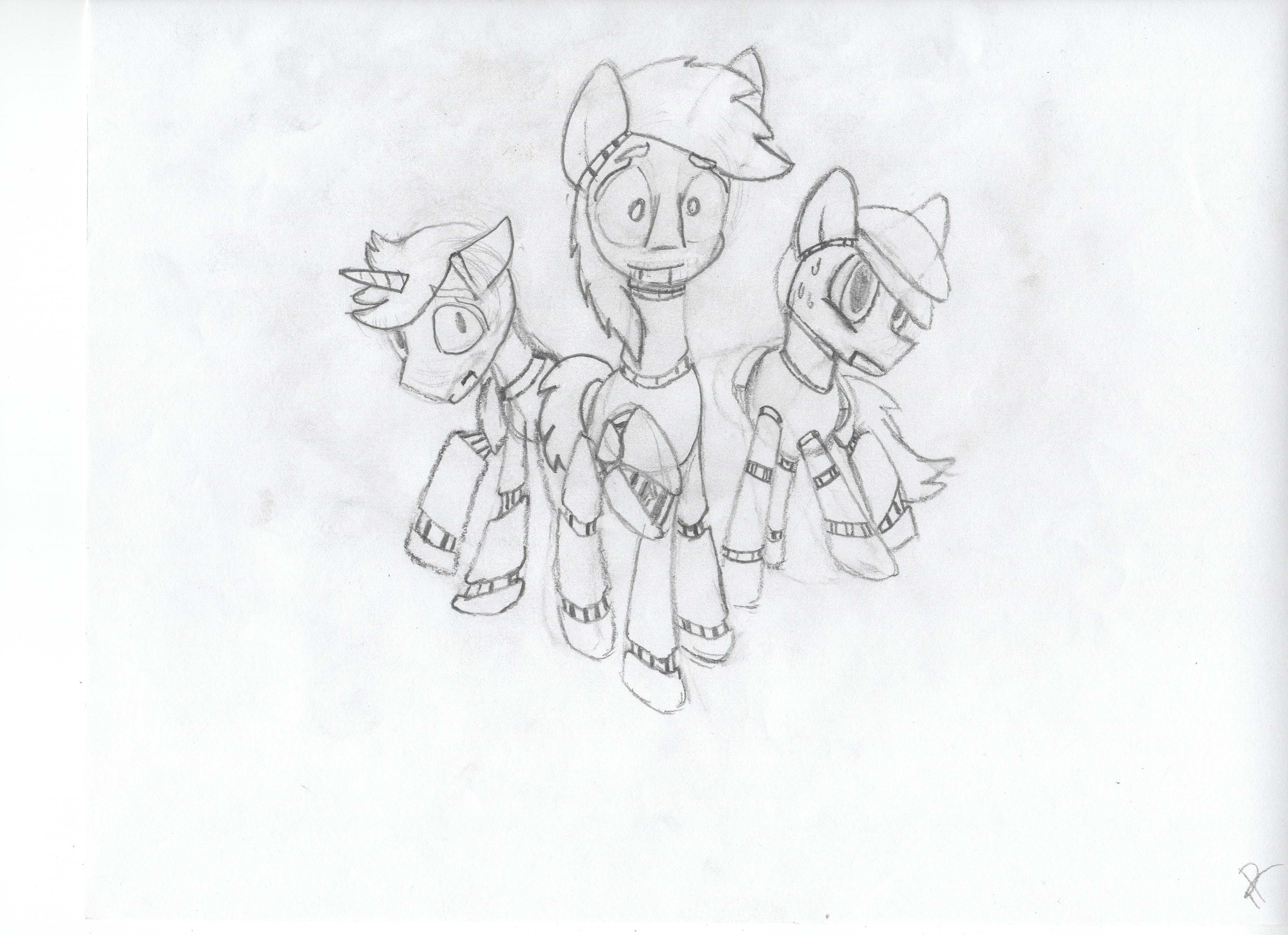
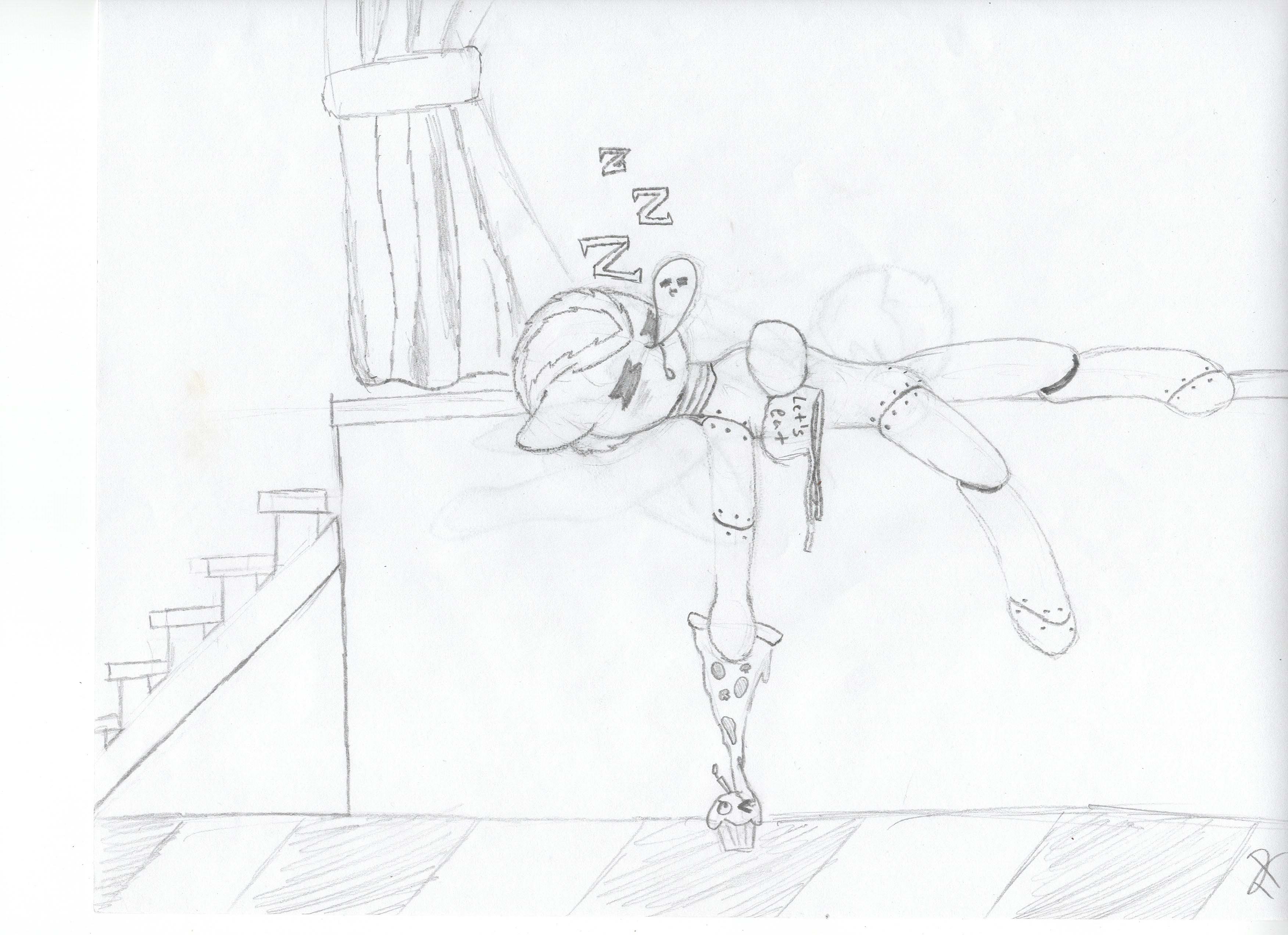
Artsies and doodles from days past
also my partner in crime, Dj Neon may post her art dump here as well
so yeah... there you go
-
Im looking to buy a drawing tablet for my computer and am unsure about brands and quality. If anyone could lend a hand and tell my any models and brands and what not. Im looking for somthing good for a beginner and not too pocket emptying
-
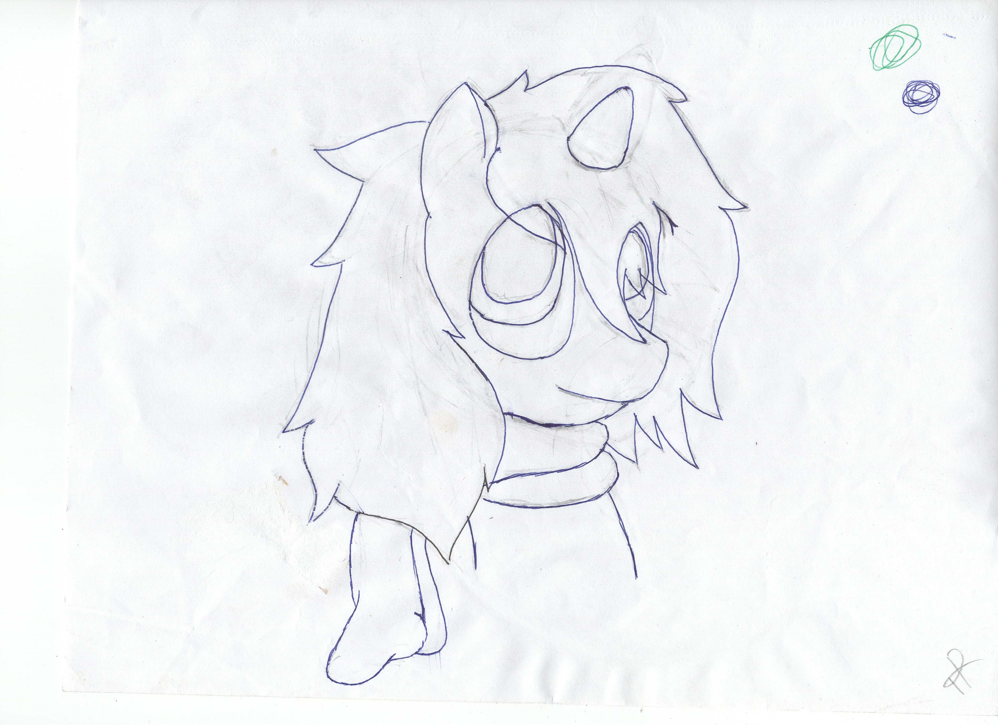
eyy no problem, some people just use generic bases to practice specific things on the pony. i used bases to get eye positioning better in my pieces
-
2
-
-
d-did i hear full metal alchemist? Edward... Ed- Brother? ;^;
-
you should practice making a mane and tail on bases, since this can help in the design as well as draw the depth perception.
you should also work on the legs, they look stiff and out of position.
-
1
-
-
AAI SENPAI!!!!
a big tip I have for you is to be more confident in your line strokes and practice proportions. your lines are fairly wobbly and look like you were over cautious when drawing, drawing a line quicker can yield much better results in comparison to slow movements.
-
1
-
-
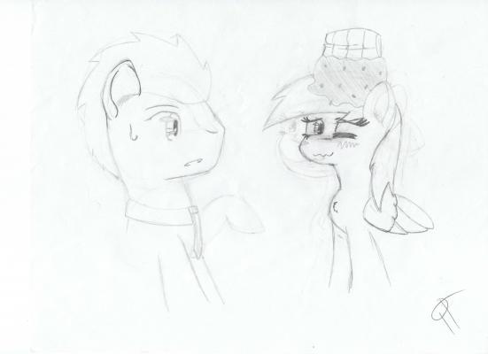
Hey thanks for the input! I must say, I feel like this would've turned out better if I didn't use line art, but since I began it with line art I didn't want to ditch the time put into it! I feel sort of "locked" when I do line art, unfortunately.
I understand about the shading, if you see in the speedpaint I actually attempt to add more, as if the lighting were coming from behind her. I didn't like how this looked as I don't work with black very often and instead wanted to focus on the light that might've reflected onto her coat.
I'm not quite sure what you mean of weightless, but she is supposed to be something of a myth, taller, very long hair and horn, rarely seen. I didn't realize she came off as that, but if she does, I really don't mind!
Thanks! [:
I always keep the original sketch scan file when I go to make line art, so I can redraw something if it seems off. As for that sort of shading, it would essentially invert the light and dark, making the light creep over the edges and the darker shading dominate the body, while using a different light source to show her face and other key points of the art. Not only does this create a seductive tone for the piece, but it also shows a sort of diamond in the rough characteristic for the main attraction.
By weightless I mean that an alicorn is fairly large, and her wings are quite big as well. The weight of the body should show pressure of the hooves on the ground, however this does not, you drew her to look practically weightless, while this concept is great for otherworld creatures, spirits, and goddesses, Weight can drag the art down if not used correctly.
This piece does well to show the character to be a graceful yet powerful pony, and the hair as well as the setting compliment the body and face.
-
1
-
-
yes, yes you can my gud sir
-
1
-
-
yes, however you must have access to the picture file
-
multi circles only express the tier of magic, and someone using a higher tier then they should would end up sacrificing their life to compensate for the magical energy they do not posses, however a soul is a soul regardless, and only a soul worth of energy would power the circle. This logic is what keeps people from dieing to created mass destruction. So someone like luna would be able to use 7th tier magic while someone like rarity could use 1st or 2nd tier.
The tier goes from 1 - 9, 1 being the weakest and 9 being the strongest. However tenth teir magic is possible but breaks and destroys the body of the caster if they do not have the resolve, willpower, and magic ability to surpass a 9th teir caster.
The double ring in a summoning circle represents life, death and magic, magic being in the middle (that's why the words are also in the middle) life on the outside (to bring the summoned creature through) and death on the inside (to send the soul of the creature back to its body upon death).
But like I said the more rings a circle has the higher tier it is, and the additional rings shrink into the central circle
-
ah, a summoning circle, and as for creation, it is commonly called alchemy. alchemy circles usually have two outer circles that are very close to each other while the inside while the inside is a shape, with a corner or point for each element needed to create the object, no circles to surround the elements or items as they do not empower the circle. However, you do need to write the spelltext between the two outer rings as it is this that gives the instruction to the circle on what to transmute. the elements should be just inside the outer circles and never outside, as that is a negative matter magic, something used to create negative matter transmutation.
the above circle is fairly close to a summoning circle, although you can only summon live creatures through them, these creatures are somewhat like phantoms, they fully interact with the world as if they are real, and take orders, but upon taking damage that would kill them they would dissipate. the circle has 2 rings, one out and one center, a shape is used to hold the elements you need to summon. it is common to use a 5 point star as it uses the 4 major elements and then a sacrifice point (a drop of blood is most commonly used, as casters prick or bite their finger and drop a bit into the sacrifice circle). The points on the star or shape should poke just outside the outer circle leaving a point, this allows the circle to draw in the energy to construct the summoned creature. the element circles are placed in the farthest corners of the shape and the center circle would touch the edge of each element circle. the center ring Is where the creature would be summoned, the larger the overall circle, the larger the respectful summon would be (so a mouse wont become the size of a house regardless of the size of the circle, but a cow cant be summoned from a circle smaller then it). Earth, Water, fire, and a form of air would be placed in each element circle and the drop of blood from the caster would drop into the sacrifice circle.
-
I have been told to hold up on my critique as it has been intense lately. so tell me if you want me to lay down some tips and whatnot, this will be the last art thread I will critique for the week.
-
while it is a nice pice, the mane and tail need some work. The tail itself looks as if it is flowing in the wind, yet the curls curve forward to a such a degree that it makes it seem as if there is no wind at all.
The mane looks as though it is being pushed forward yes at the same time strands are heading in the opposite direction. The curls in the mane hold a strong form, causing it to loose a silky look for plastic.
The horns size and length should be factored in when deciding head tilt as it shows there is little or no weight when there should be.
the tufts on the hooves should also sway not only with movement but with any air currents as well.
Her body seems to lack the look of weight, I don't know if this is on purpose, but the way she carries herself puts her to look extremely lightweight.
for art made for the night, the shading should be more dramatic as the current light shading causes a daytime effect for light heartedness, night time shading should show a larger flow of dramatic scenery and lighting.
All in all, I don't have to tell you your art is nice, as you seem confident in yourself. The strokes seem strong and fluid, and that shows you can be a respectable artist. It makes me happy to see an artist with confidence in their work, so keep it up!
-
1
-
-
i am confident in my art, i believe i can draw beautifully, my confidence is what drives me to higher quality! Your art is your own, be proud of it dammit! If you can claim your creations are beautiful you may never get better, be confident and your skills will increase in strength!
eh, sorry, I'm watchin anime atm and got caught up in the moment
-
1
-
-
if your art is physical, scan it using a printer or any respectful device you own or can use. You upload the file you wish to use onto your post using the "Upload Files + More Reply Options". If you cannot use that button, find an image hosting site such as "TinyPic" and use the insert image button in the thread or reply box. Paste the URL from the hosted pic into the image insert box, or the BBcode.
-
you should put the names of the elements of harmony on the outer edge of the outer circle, but in a text form like your signature
the 3 leader circles should have a text circling them that identifies them, however they should be the opposite of the major text that powers the main circle. Such things that empower the main body of magic but do not drag it down, such as loneliness to power friendship, and loss to empower charity. the triangle also serves to further the traffic of magic however it is used for defensive spells, while circles are used as offensive.
the 2 circles show the tier of magic the more circles the higher the tier, the tier of magic represents its strength while a star shows the resolve, a star draws power from the elements that create the main circle and the lines that cross over the points from the triangle go to further its efficiency if they are empowering it, allowing the caster to use less magic energy when initially using the spell. If your resolve is not of that to match the spell then the magic will be weak and the star might actually nullify the spell itself.
anime magic logic ftw
-
shade in layers, if the fur is white there in no need to colour the lightest spots. shading from lightest to darkest helps the layers blend more smoothly.
To make a layer of shading darker, you should only have to add an extra layer of colouring to that specific region as a sudden rush of dark (such as on the neck) makes the light seem harsh or excessively bright.
This thread brought to you by Reese's Peanut Butter Cups!
in Forum Games
brought to you by MetLife