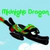
Midnight Dragon 264 April 29, 2014 Share April 29, 2014 (edited) I made this yesterday. I know, there's some mistakes...but it still turned out pretty cool I think! EDIT: Sorry, forgot to credit http://www.obsidiandawn.com for the sparkles and stars brushes/textures. Edited April 29, 2014 by Midnight Dragon http://youtube.com/user/AuroraKnuxhttp://visigoth101.deviantart.comhttp://auroraknux.tumblr.com Link to comment Share on other sites More sharing options...
SasQ 1,382 April 29, 2014 Share April 29, 2014 (edited) Well, if this is your first attempt at vector art, then sure, it looks nice, and you're better at it than lots of beginners I've seen. But if you want an actual feedback about what could still be improved, then here it is: (+) The overall proportions seem to be OK at first glance. (+) Nice shading, eye glow and magic effects. (-) Head shape is somewhat strange and unnatural. (-) Contour lines are a bit too thin. (-) They are flat-ended or round-ended. In the show they rather end it sharp by gradually making them thinner. This way they resemble pen strokes. (-) Try to make the contour lines more dynamic and smooth, as if they were pen strokes. (-) The background seems still too simple and repetitive. When training your drawing skills, use reference images from the original show as much as possible. Vectorize them by hand. This way you will get familiar with their style and these little details which make them look more show-accurate. With time you will notice that you don't need the references anymore, since you can clearly picture them in your head already and your brain will be able to imagine different poses and facial expressions for ponies, even those not seen in the original show, but still fitting its original style. For the outlines, I usually do them as shapes instead of lines. (Or I start with lines and then convert them to shapes.) This allows me to make the finer details of how these lines end gradually. Then I make a copy of them and move the path a bit, so that it goes in the middle of the outline's shape, and delete the nodes of the other side of the line to fill the shape. This way I have the fill and outline as separate shapes, one over another, and then I group them to be able to move them both together. Here's my recent work, where I use these techniques: (But ignore the background, it's just a placeholder. I'm still working on it. Just the characters are pretty much finished.) For this, I didn't have to draw my vectors over a reference image anymore. I pretty much vectored it from my imagination. I just needed a look or two at some facial expressions or little details to make sure they are show-accurate. And I can already reuse expressions of one character when drawing some other: I took Twilight's expression and changed some details & colors to make it Trixie's expression you see in the picture. Twilight's expression is a modified version of Pinkie Pie's eating a cake, but from a different angle, recolored and adjusted to look like Twilight's face. Edited April 29, 2014 by SasQ My best posts list Recent post: Language Exchange Link to comment Share on other sites More sharing options...
Midnight Dragon 264 April 29, 2014 Author Share April 29, 2014 Well, if this is your first attempt at vector art, then sure, it looks nice, and you're better at it than lots of beginners I've seen. Er...I'm not sure what you mean by "vector art". This is just something I drew and colored... http://youtube.com/user/AuroraKnuxhttp://visigoth101.deviantart.comhttp://auroraknux.tumblr.com Link to comment Share on other sites More sharing options...
SasQ 1,382 April 29, 2014 Share April 29, 2014 Oh, then you've made me intrigued. How did you draw it that it looks like it were vector graphics? I mean, the lines don't seem to be hand-drawn, they're too "mathematically precise" at some places. Most of them are made of straight lines. My best posts list Recent post: Language Exchange Link to comment Share on other sites More sharing options...
Midnight Dragon 264 April 29, 2014 Author Share April 29, 2014 Oh, then you've made me intrigued. How did you draw it that it looks like it were vector graphics? I mean, the lines don't seem to be hand-drawn, they're too "mathematically precise" at some places. Most of them are made of straight lines. Well, the way I always do my digital art is to first sketch it on paper, then scan it, then trace over the lines in my art program and then color everything in. Then I can add some details and/or effects if I want to... http://youtube.com/user/AuroraKnuxhttp://visigoth101.deviantart.comhttp://auroraknux.tumblr.com Link to comment Share on other sites More sharing options...
SasQ 1,382 April 29, 2014 Share April 29, 2014 (edited) That's even more interesting. Can you post your original hand-drawn sketch then for comparison?As to the digital version: I didn't notice at first that this is just a thumbnail of a bigger version. Now, when I enlarged it, I see more clearly how you did it. Unfortunately, it looks a bit worse, since it is more clearly then that it is made of straight line segments, and it looks a bit crude.Some of my advices for you still apply: those about outlines and their endings. Just the method to get it is a bit different for digital painting. If you have a drawing tablet, it is easy to draw lines of different thickness depending on how hard you press the stylus. But I, for one, don't have tablet, so I use a special technique to get the effect of lines of different thickness: First I draw normal thick lines on a separate layer with transparency (same as you), and then I use the eraser tool to shape the lines and their endings so that they become thinner and thinner at the end. It also allows me to correct all these hard edges and straigh lines into something more smooth. Then, since I have the contour on a separate layer, I can paint the fill color below it and it won't damage my contour lines. Here's an animated GIF which shows this technique: Edited April 29, 2014 by SasQ My best posts list Recent post: Language Exchange Link to comment Share on other sites More sharing options...
Your Nightly Spectre 1,061 April 29, 2014 Share April 29, 2014 I think behind her should be a lot of explosions and people burning to death. ...It is not like I am the only one that thinks that... right? ...right? D: My lil' art thread. - My OC - Profile pic by myself. ~ Link to comment Share on other sites More sharing options...
Scoots and Dash 208 April 29, 2014 Share April 29, 2014 I like it. All art doesn't have to look exactly like the show. Sure there are some points for improvement, but in general as a drawing it's really nice. I do agree the background is a little repetitive though. Maybe have it where she's levitating above a hill in the background? Also I think the only time we've ever actually seen her eyes go white is when she's using the elements of harmony and I think it also happened when she was a filly and the sonic rainboom caused her to successfully hatch spike... lol . Could be wrong though but I'm pretty sure I'm right. Thanks to )O( Scarlet )O( for the signature! Count to 1,000,000 with us! Click here! Link to comment Share on other sites More sharing options...


Recommended Posts
Create an account or sign in to comment
You need to be a member in order to leave a comment
Create an account
Sign up for a new account in our community. It's easy!
Join the herd!Sign in
Already have an account? Sign in here.
Sign In Now