


Arcus (Silver Lining) Wind
-
Posts
825 -
Joined
-
Last visited
Content Type
Profiles
Forums
Character Archive
Frequently Asked Questions
Equestrian Empire Character Archive
Golden Oaks Memorial Library
Pony Roleplay Characters
Events
Blogs
Posts posted by Arcus (Silver Lining) Wind
-
-
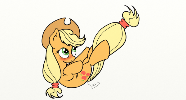
Niceeee, Applejack is awesome, and so is this!!! The blush looks just fiiine an' dandy to me!!! Good job on this, Applejack looks cute as ever!!!
It's kind of funny but when I started doing the sketch for this I didn't even know which pony it was going to be. It was also suppose to be standing upright.
-
 1
1
-
-
Could you do my newest OC Melody her picture and bio are in the link under my siggy. If you could do her singing that would be awesome.
Annnnd here it is. After an eternity of waiting, I've finally got this vector done. Sorry for the delay. I really didn't mean to keep you and everybody else waiting. Hope you like it. Please tell me what you think.
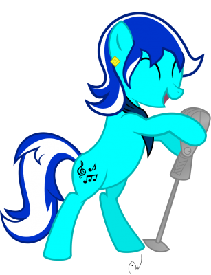
And as I've done for the last few here is one of just the cutie mark.

-
I decided to continue the AJ from the sketch dump I posted A little while a go. Link
I think I might have gone a little heavy on the blush though.
-
12
-
-
Not bad. Pretty good, really. I do have a little difficulty finding mistakes. Kind of odd for me

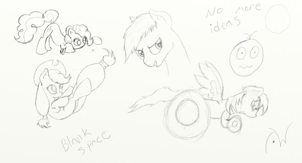
I like the face the you made about no more ideas. Nice touch there.
Thank you for your comment. I think I might continue with line art and coloring of the Pinkie Pie one, and the Apple Jack one. The Wheely Bopper one didn't turn out like I'd hoped.
-
I've been less than inspired to draw or be creative at all as of late. Did a few really quick doodle sketches to see if I could get back in to the swing of things. Are any of them worth continuing?
-
5
-
-
So this is what it's come to? We've gotten so attached to these tiny horses that we are seeing them in of food. You can not resist the Cheeto Empire!
For Cheez-lestia!
I regret nothing!
-
4
-
-
Bravo! Bravo! Great job with the shading and I love the expression on Pinkies face. The only thing I have to say is that the neck seems a bit wide but I see someone has already pointed that out to you. Good job and I would love to see more of your work!
Thank you. I'm glad you like it. And thanks for your comment on the shading. I don't usually do that with my sketches. If you want to see more I made this one of twilight. http://mlpforums.com/topic/64131-sketchy-twilight/ Or you can always check out my DA page or Tumblr.
Both are in my profile.
-
Huh, pretty well done art sketch if I may say so!
She has the looks and designs as well as you intended to.
If I may criticize, her tail looks a bit extended than usual, and her neck does seem a bit wide, but other than that, great sketch my friend!
Yeah I made the same mistake with the neck with a Twilight sketch I did recently.
It's a pretty good sketch! I just feel that Pinkie's hair looks a little bit too big for the head so if you made the head just a smidgimeter bigger I think it would look perfect
") .
.I was actually going for over sized hair. Trying make it more poofy than the show.
-
Does the red light mean it's recording?
-
1
-
-
Did this one a couple of days ago and forgot to upload it. Please leave a comment and let me know what you think. Helpful critiques are appreciated.
-
5
-
-
I'm sorry it took me forever to get to this. But sometimes life just gets in the way. Anyway, I hope you like it. Let me know what you think or if anything needs to be changed.
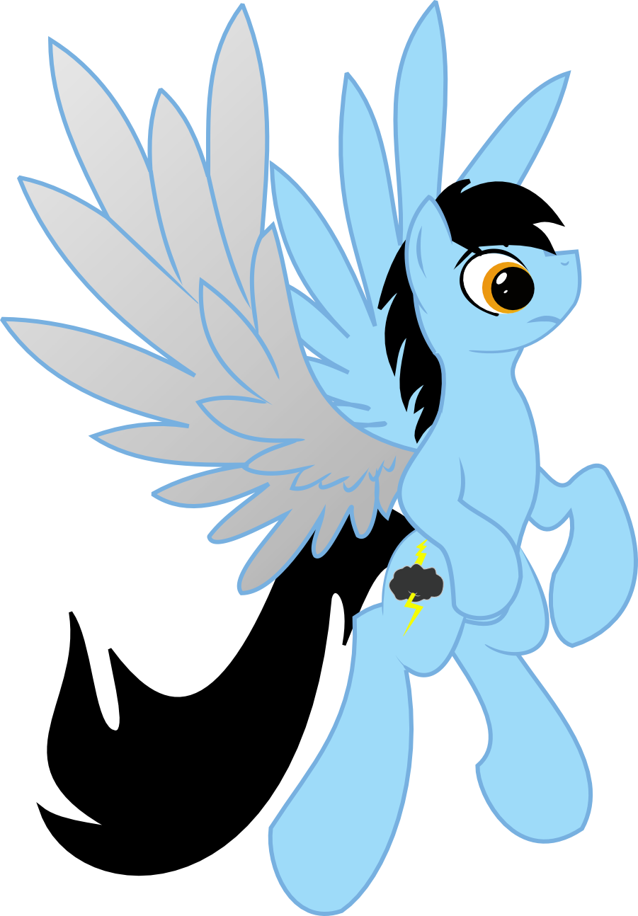
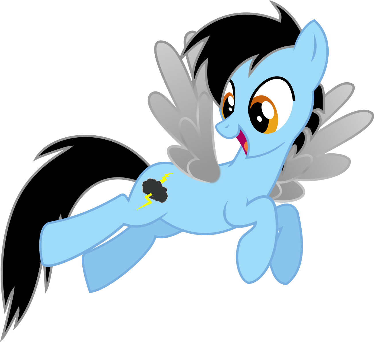
Also here is a .png of just his cutie mark. Just in case you wanted it.
-
Back round and color:My Cutie Mark (my prof pic) and some ice
Foreground and color:My Poneh (Below)
Text and color Cloud Flash in Arial Font in the color Black
Wow! It's been forever that someone had a request here. Good thing I check the 'my content' section. Otherwise I wouldn't have seen this. I can do this for you when I find time. Hopefully that will be soon.
Hi! could you make a signature that is Appleloosa- related? I find its better to leave an artist with alot of room to work, so ill keep my request at that. Thanks!
Yes. Yes I can.
-
The drawing is good overall. But, I see one tiny mistake. Twilight's face is a little more longer, steeper and a tiny bit chubbier. I would give it a:
9/10
Twilight's face looks like this:
 See the difference?
Thank you for taking the time to comment.As for her face, it's mostly a style choice.I'm not going for show accurate. Not to mention this is just a quick doodle/sketch.
-
I really like it!
Only, her hooves are too big, and I don't think she has that little chip in her wing.
But on the whole, I think this is a great sketch.

Thanks. I'm glad you like it. As for the clip in the wing and her hooves, those are just style chooses. Although I think I might change the legs a little bit.
-
the wings are really good and so is the mane and tail but the hooves are a little but wide at the bottom but otherwise it's really good
Thanks. The wider legs are kind of a style I'm going for. Though, I think your right, it needs to taper more instead of being wide mostly at the hooves.
I for one LOVE IT! its great I really hope you do more! If many, you should do a Luna
 I'm mean come on now you did twilight sooooo damn good I'm sure you could do a very sexier Luna!
Perhaps I will.
I'm not sure I can offer any useful artistic critique, but it looks great! She does kind of have a bit more of a serious look here than the typical "adorkable" twilight, so I do think a similar drawing with Luna could work really well. Maybe it's something in her eyes that make her look more serious, I'm not exactly sure.
Could be the eyes. Or that I didn't draw a mouth so it's hard to read her emotion.
Cute style you got going on there, would love to see more of it.
-Hooves look doughy at the moment doe to squiggly outlines, you might wanna fix that
-The neck is a bit thick, slimming it down would also free up some room between wings and mane.
Why thank you. I'm not sure what you mean by doughy legs. You're right about the neck. I've been told before that I made them to thin. Guess I'll have to try and find a middle thickness.
-
-
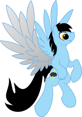
Eh, sure why not. I suck at coming up with back stories for characters so you'll just have to rate him on his looks. This is my OC. I can't decide whether to name him Arcus or Silver Linings. Maybe you can help me out with that to.

-
1
-
-
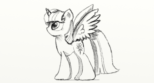
I don't know what I'm doing. I start to sketch a random pony and it's not till I'm almost done that I decide who it is. Have a random Twilight. Please leave a comment.
-
12
-
-
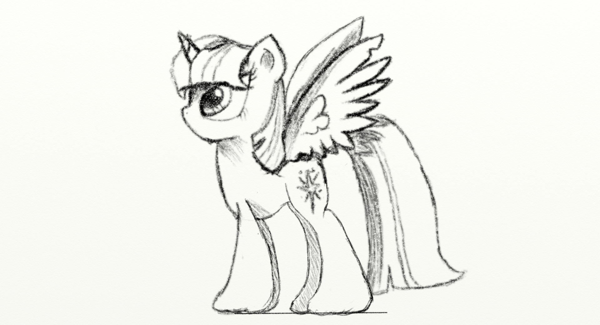
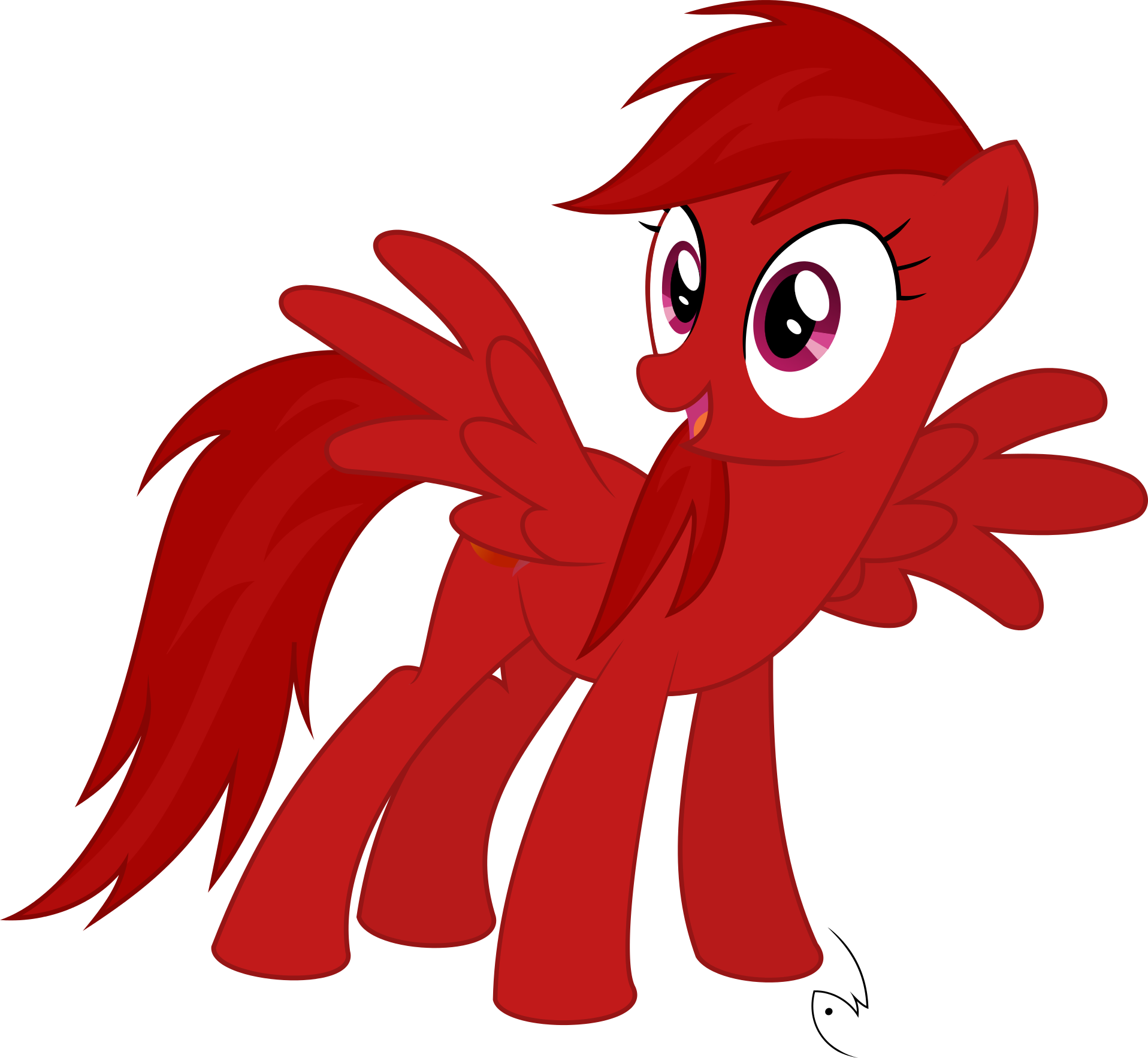
This is obviously a very rough draft but what would you think of something like this? Also if you were to pick this after I got it all drawn up I would make a vector of it for you.
-
This is gonna be hard...

I'm so sorry I'm ugly. Dx Everypony else looks great. Heh, I look horrible. Well, at least I posted.. at least I have the courage to do this :3
I think you need a new prescription for those glasses. Because they're obviously blurring your vision. I have excellent eyesight and I can see that you are not ugly.
-
1
-
-
-
Okay, here it is. Sorry it took me so long. I got distracted with life and stuffs. I hope you like this. Let me know what you think.
 p
p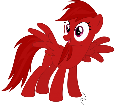
-
-
they are a peach colour as well. make them either slightly darker or lighter than her body colour though
") thanks for doing these
thanks for doing these ")
okay. I hope this is good. I had some trouble with the mane butI think I made it work. I hope you like it. I also included a .png of just the cutie mark.


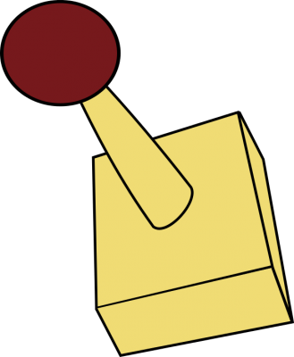
Blushing AJ
in Visual Fan Art
I put this up on the MLPdrawingschool reddit, and got the same suggestion. That it needed a backround to give it some context.