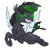
Lost Profile 644 October 28, 2012 Share October 28, 2012 i saw a T-shirt that was words that made a picture... so i thought id give something like it a go.... and why the hell not make it pony related... lol what do ya think? 14 Link to comment Share on other sites More sharing options...
Fubz 300 October 28, 2012 Share October 28, 2012 It's a little hard to see the facey area, but you can tell it's rarity becaue of the hair. I like how you've highlighted the words to make a message. It's a nice touch! Link to comment Share on other sites More sharing options...
Motion Spark 7,811 October 28, 2012 Share October 28, 2012 I love it, I love it, I love it! I'm not gonna get picky on this one because I can picture myself wearing it on a t-shirt, just I would prefer that the bigger words were purple like her mane 2 My OC's: Motion Spark || Beat Spark || Rosebelle Sorry, I don't take REQUESTS! Link to comment Share on other sites More sharing options...
Lost Profile 644 October 28, 2012 Author Share October 28, 2012 never though id get a popular star from just posting this... lol i know i could have done a better job... but i was pressed for time... but wouldn't this make an awesome T - shirt? if the word had more color in the right place... and showed rarity better? Link to comment Share on other sites More sharing options...
Puddlejumper 1,649 October 29, 2012 Share October 29, 2012 I always love text based imagery, but there are a few things I'd do differently to make it easier to picture. The shadow area for her mane/tail needs some wording in it, maybe a dark grey or something so that the shape is easier to see rather than looking chopped up. The face needs to be separated more. Best way to do this and sticking with this style would be to tweak font sizes and use different words within the eyes, mane, tail, body, etc. so that each portion is easily distinguished from another. Most of the time with this style, the words that are highlighted to make the sentence are in larger font than everything else. Basically this style is kind of a puzzle and you have to place words of different sizes wisely and in certain places so they stay tightly packed, but still make it look random, all while keeping the image subject easy to see. This is why you have too much "dead space" in spots between words. You could do like this with the colors and still use differing font sized words with the message being in the largest font. Either way, great job for a first attempt at this style. Hope I didn't come across harsh or anything, just trying to provide some constructive feedback. http://i74.photobucket.com/albums/i241/girsmj86/MLP/124343-animatedanimated_gifgifTrixie_zps4aa82173.gif WTB: Luna, Trixie dog tags & AJ blind bag | This fandom needs more Mane-iac! | AJ, Rarity, and Trixie trot into a bar. The Dreamcast didn't fail, we failed the Dreamcast Link to comment Share on other sites More sharing options...
Lost Profile 644 October 29, 2012 Author Share October 29, 2012 Either way, great job for a first attempt at this style. Hope I didn't come across harsh or anything, just trying to provide some constructive feedback. i was rushing... and i didnt really want to put time into it.... but ya... if i had LOTS of time.... then i would have made it 20% cooler! XD XD XD Link to comment Share on other sites More sharing options...


Recommended Posts
Create an account or sign in to comment
You need to be a member in order to leave a comment
Create an account
Sign up for a new account in our community. It's easy!
Join the herd!Sign in
Already have an account? Sign in here.
Sign In Now