


Bugplayer
-
Posts
224 -
Joined
-
Last visited
Content Type
Profiles
Forums
Character Archive
Frequently Asked Questions
Equestrian Empire Character Archive
Golden Oaks Memorial Library
Pony Roleplay Characters
Events
Blogs
Posts posted by Bugplayer
-
-
Well better type this before I HHHNNNNNNNNGGGGG *dies from excessive adorableness*
Nah but seriously really great job.

I'm starting to feel like murderer, too many people got heart attacks because of me

Haha! I'm please to hear you like it! ^^
-
She= so adorable I want to squish her! Good job! Now please excuse me whilst I allow myself to be sucked in by her cuteness.
D'aww.
Bravo, I say, bravo, Tavi would be proud you made her so cute.
Awwwwwww This deserves to be in the cute awards
Thank you guys! I'm glad I was able to make something you find adorable ^^
A while ago I would have never though that would be possible coming from me

-
So cute! The only thing that sort of bothers me is that the shadow doesn't move, but still SOOOOOOOOO CUUUUUTTE
^.^ I though about it actually. And it's not really complicated to do, but I didn't think it would really matter.

-
 1
1
-
-
But I'm allergic to cuteness.... X.X
Then, the mlpforum is a dangerous place for you :3

HNNNNNNNNNNNNNNNNNNN--
Oh god, that kind of disturbing haha! ^^
This is so cute
 Well done! it's amazing
 Thanks Turtle! I'm glad how it turned out

-
1
-
-
Whoa thank you so much for this! It really means something to me

I'm pretty much feeling like this right now ^.^
-
1
-
-
AAARRGGGHHH! The HEART ATTACK!!! HNNNNNGGGGG!!! *Dies from cuteness overload*
Naw seriously, excellent work!
Nnoooo!!! What have I done?! D:
Haha thanks my friend! ^^
Hey, that's pretty good!
It's also cute as hell.
I'm glad it is with the time it took me to make it! At some point I was afraid how it would turn out. Glad how cute it ended
That's quite good! Animation is pretty tough, takes a lot of time to do, but it was worth it in the end.
Nice job!
You bet it was worth it
I'm happy you think so! -
Haha
So adorable. Nice work, bro :3Thanks! I'll admit, I think she's pretty cute myself

I like how it turned out as well. xD Very nice.
I'm glad I didn't wasted all that time haha!

That's too fricken cute to be real

^^ But it is!
Can't believe I pulled that one :3 -
1
-
-
Hai everyone!
Oh my god, this has to be my biggest project up to date x.x
You see, I've been interested to make something like this for a long time, and I finally decided to try it!
And I'll admit, I didn't though it would take that long D:
It has a total of 11 frames. So that means it need 11 sketches, 11 inking, and coloring, which is much simpler.
But still! It took me around 45 minutes each frames, so that gives you an idea the time it took me
I love how it turned out though
It gave the occasion to practice my inking and anatomy on the trip.So yeah, that was an awesome experience!

Source: http://bugplayer.deviantart.com/art/Giddy-up-Octavia-Gif-426022810
Dayum!
I though adding some backgrounds, which was either a dance dance revolution under her hooves with lights effect on her hooves, or a cello bow from Vinyl Scratch as a gift. But It seemed pretty weird to have a motionless objects in front of a pony that can't seems to stand still!
So Octavia alone will do the trick
-
24
-
-
That's adorable. There really isn't much to criticize here; the anatomy is a bit loose in places, but it really fits the playfulstyle.
I guess you could make the eyelids/lashes a tad darker and/or simplify the ball a bit to blend in with the overall level of detail.
Her anatomy does need a bit of tweaking, especially her hing leg, which is kind of awkward.
Also, I tried make her eye lids so that it doesn't stand out too much, but yeah, it needs to be darker! :3
-
Apologies, "milestone" means a new stage you've advanced to in your skills or progress in something. In this case I was referring to your not using a reference and inking/outlining for the first time, definitely a big step for you I'm sure (at least you seemed to suggest it was).
Haha okay then! Thanks for the support in that case
That's such an adorable picture
. I love it, and I'm also looking forward to more if you decide to make another one . Great job!With you people around, be assured that I have other things on the way! ^.^
-
1
-
-
Oooohhhh your style is so cute~ And that kitty smile /)^3^(\
Haha! Well I wouldn't consider it as ''my style'' since it's the first time I make something like this. But I'm probably going to make more like it! :3
Adorable work as usual Bugsy, thanks for sharing with us, and congrats on the milestone!
Thanks Batbrony! And may I ask, what to you mean by milestone? ^^ My english isn't perfect, and I can't seem to replace that word
-
2
-
-
Hai everyone!
I usually don't do these kind of things, but I just migrated from Photoshop Cs5 to Cs6, and since I couldn't make gifs before due to some corruptions in the program, I decided to make....
A gif mashup!
Don't know why, but I had to do it ^^
If you get a nice synchro at the beginning, it usually doesn't go out of beats until 1 minute or so.
-
2
-
-
Wow! This is sooo cute!
I love it! Keep up the good work!Yay! I'm please you like it
-
1
-
-
Exceptional. Very well done! Pony cats...Y U NOT EVERYWHERE!?!?! I mean, those two things are like...95% of the internet. Why not make a fusion?
Oh yeah, antitrust law. Dang. Then there would be no pony puppies

I considered to make a special mane six in this style. It may be interesting, and time consuming. Yay!
I'm super happy you like it though!
YYYEEEESSSSS noses are necessary! this is cuter than before!Haha I still think it's kind of weird. But it does make more sense now ^^
-
I think it is cute and well made. Plus I love cats too
Thanks! ^^
awww shes so so so so cute!
Haha I'll be honest, I think it's one of my cutest drawing up to date
octavia is mah best pony, cats are my fav animal... togheter + high dose of cuteness = me dead of diabethes man.. you just killed me..... no serisuly IT'S BUCKING AWEEEEEESOME!!!!!!!!
Nooo don't die!
^^ Thanks you my friend
come on! cute pony cats?
CUUUTE AS BUCKING HELLL!!!!!
very well drawn but.....
Noses. they matter
I didn't planned to make a nose because, well... That's how I decided... Hum
But I'll admit it's a little bit weird without it, and they usually a really important part of a living being. From past experiences, ponies usually have one of them :3
come on! cute pony cats?
CUUUTE AS BUCKING HELLL!!!!!
very well drawn but.....
Noses. they matter
Screw it, just made an alternate version ^^

-
2
-
-
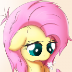
This is so cute~
Especially Sweetie Belle's big eyes peeking over Fluttershy's mane~I personally think she's the most adorable of the party
-
1
-
-
Hello everyone!
Like I said in the title, this is the first time I try to make a drawing with inking, or outlined... Or anyhow it is called...
Seriously how is it called? x.x
Soooo, instead of focusing on the shading, which takes a lot of time, I wanted to make something adorable
And I must say, I didn't though I would make something that fast!
And for the first time, I didn't used any references, hurrah! I'm glad I'm getting more and more comfortable with ponies anatomy ^.^
Here it is:
Source: http://bugplayer.deviantart.com/art/Octavia-just-enjoying-being-best-musician-424295424
It may not be prefect, but with how much less time it took me than usual, i'm pretty diggly pleased with the result!
I love cats...
I would love to know if there's something wrong. If you notice something, tell me
-
14
-
-
you are going to be good and i would love to see more when you do more
Well I sure hope I'll be good ^^ It's so much fun!
-
its cute and funny at the same time, i love it
Thanks! Tried to mix those two. Gave pretty interesting results! :3
Yes, fluttershy, you're a tree, and I want that TREE!
Btw, nice artwork
Haha I'm glad you think so ^^Aweee that is so adorable! ^3^
One thing I want to say is that I think Flutterhy's muzzle is just a bit small and short.
But overall this is pretty awesome!
Tree. So punny. .3.
Yes! thanks for noticing. I though her face was kinda weird. But wasn't sure why. Gotta keep that in mind
-
1
-
-
I think I'm the most original person ever...
Happy new year!!! ^.^
And also, I think I never made more senses in any of my drawings...
Well except for my Sweetiepede maybe

This took a little bit longer that I expected, probably because there's multiple ponies in a single picture, and I always spot a little something that needs to be tweaked.
Also, I tried to add more details in their manes. Which I just noticed, should have made them more visible, gotta try darker next time.
But I love the result!
Never made multiple ponies since my cmc in a box, which was looong ago...
Here it is!
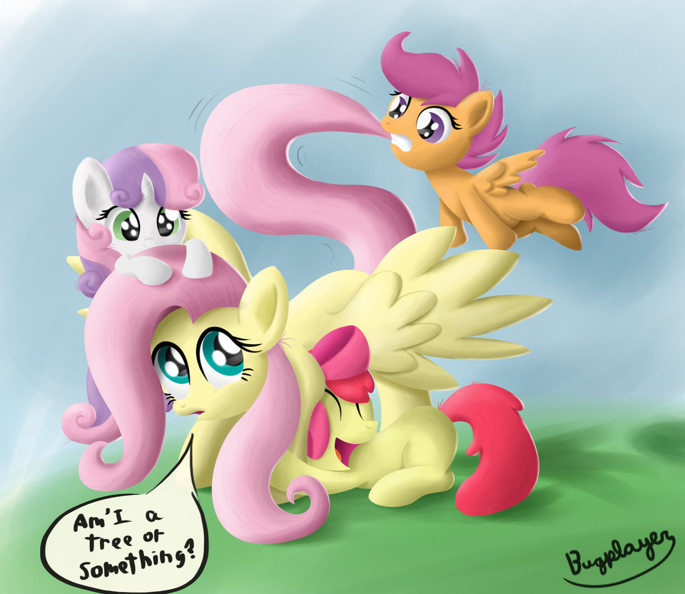
Source: http://bugplayer.deviantart.com/art/Fluttershy-tree-423911143
I think Fluttershy's wing could use a little more shading, but I guess i'm done on this one :3
If you feel giving any critics, go ahead! I love when peoples notices things that could be improved, it helps me getting better
-
8
-
-
Well I'm certainly glad it makes you feel happy (which it should), but seriously, don't shortchange yourself buddy! You're a phenomenal artist and I truly meant it when I said I do think you're one of the forum's premiere artists. You only continue to improve, and each drawing you share with us is better than the last! Merry Christmas and Happy New Year Bugsy!!!

Aww thank you so much my friend! *hug*
It so fun to see how I improved since when. I even realize between my drawings how much easier it gets each time, and how more comfortable I get.
I'll day it again as well, happy Christmas! It's great to have people like you around here Batbrony!
-
Just realised I never replied to any of you, what a shame! D:
Hello, Bugplayer keep this artwork up maybe you can enter a My Little Pony Welovefine.com contest awesome !
I didn't even know it exist... Maybe I'll give it a try! any idea when the next one is up? :3
That is simply adorable!
Keep up the great work Bugsy, and congratulations on continuing to refine and improve upon your craft! You are truly one of this forum's premiere artists by now (at least in my opinion you are), you know that, right? Thanks again for sharing this with us! One of this forum's premiere artists? Really?!

You just say that to make me feel happy, which works ^^ I'm sure there's many more around here which are even more talented than me!
Hmmm, for you, I'd recommend doing a single layer painting. I think that task would help you the greatest.
Simply put, do the entire drawing on ONE layer. No making temporary layers for effects or anything like that. All on one layer.
Additionally I'd recommend trying out some planer analysis when shading. The best way I've found to do this is to use a square brush on 90% - 100% opacity and no smaller than the tip of your pinkie finger at any given time. This forces your to draw the overall color rather than attempting to draw each color.
Also increase the contrast on the drawing by like
20%80% and no I don't mean the contrast setting. Try painting it in black and white first.Reasoning:
It seems like you're focusing too much on what you THINK should be there rather than what is actually there or in this case what would actually be there. Cartoons are a bit tricky in this instance. You smooth every color which is leading to a very... glossy/smooth look add that to the low contrast and your shading just looks like 1 color.
GL, yo!
Ahhh! that where that post was! Got it by email but I though it was on my other post and... Well forget it!
I really should try that ''paint in black and white first'' thing. It looks complicated though. You should have color theories and stuff like that, which I don't
But that sound really cool... Probably going to try it someday
I want this as a plushie and I want it NAOO!!!!!!
Oh god, as a plushie... That would be so awesome!
-
1
-
-
IT IS SO VERY AWESOME!!!!!!! ARG!
Arg! You're so very awesome yourself!
Looks so awsome! I've been reading the comic too, and I can't wait til issue #14 hits the stores.
Yeah, It's gonna be a blast! ^^
yes I just read that issue the other day, its definitely one of my favorites.
I know right? I think it's at the same level as the chrysalis one. It's keep getting interesting ^^
Also, Fluttershy is adorable
This is awesome a pirate rainbow dash
keep up the work
You can be sure I will
-
Simply amazing! Do you do commission or requests?
Thanks my friend! I'm glad you like it ^^
Well currently my commissions and requests are closed, because there's a couple thing in my head that I want to draw. So I'll stay to canon characters for the moment
I'm so happy you're interested in my stuff though!
Very nice! I swear I've seen this "Pirate RD" concept somewhere. Either way, this is quite well done!
So for critics, there's not much things that are off in here, the things that bugs me with the anatomy is her right fore leg. I think it could be a bit longer and more edgy. Foreshortening is quite tricky so keep practicing! (I can't do foreshortening properly too lol)
Her tail seems to be a bit "floaty" if you know what I mean. It's a bit stiff as of now. (Plus the base of her tail seems too thick, I just noticed that)
For the tech-y stuff that could be improved -
Composition - The subject of your image seems to be a bit into the center. The horizon line can be lowered to give an Ant's eye view. You can use the "Rules of Thirds" as a reference to make your picture a bit more eye catching and interesting. While not exactly necessary in a simple single character picture, it's nice to know how composition work so you can apply it to your bigger projects.
This is a really nice guide to composition (and it covers the Rules of Thirds too, go check it out!)
http://www.deviantart.com/art/The-Secret-to-Composition-272036625
Lighting - Looking at your 2 light sources (the one in front, and the one from the back causing the ambient light) there should be 2 overlapping shadows. In this case, the shadow should cast behind the character, not in front since the light source from the front is stronger.
Shadows can be more darker on RD's chin to show separation of her neck and her head.
Also, you can also use a mixture of soft shading and hard edge shading to give more depth to your art. This is very important since real objects aren't all round and pillow-y.
Hope that is even a little helpful! Keep up the great work! c;
I way be familiar, it's from the comics, Issue #13 page 16 ^^
I kept the posture, while applying a few modifications. Especially her wings and her tail.
Her front hove does look weird haha! That bugged me as well. But I spent way to much time on this one, I had to move on :3
And yes, the base of her tail does look thick, Thanks for noticing, I'll keep that in mind!
Also, never hear of that ''rule of thirds'' That sound very interesting. Having a few theory about it will certainly helps to make the whole thing pop up. Even tho I usually makes single character without backgrounds. Thanks for that link, i'm sure it will come in handy
Though, there's was supposed to be only one light source... I'm still learning about them so it may not be perfect, and kind of confusing, gotta tweak that.
Thanks for the great critic!
Your art is very detailed and colorful.
Very well done
Rainbow Dash sure helps getting drawings colorful ^^
its really good. it made my day
could you draw a cute twilight sparkle for me if you not busy ?
thanks
KEEP UP THE GOOD WORK
-tim
I really should make something of twilight!
I guess I could had it to my list. I never drew anything about her. Well except for my first drawing ever, which was hum...Something that I shall never speak of again
Seriously, it was ugly XD
Thanks for the support! ^.^
Giddy up! Octavia Gif
in Visual Fan Art
Aww come here you! *hug*
I wouldn't consider her as my favorite, because I love them all! But she would fit in my top 10 at least ^^