Episode 72 - UI/Appearance Changes
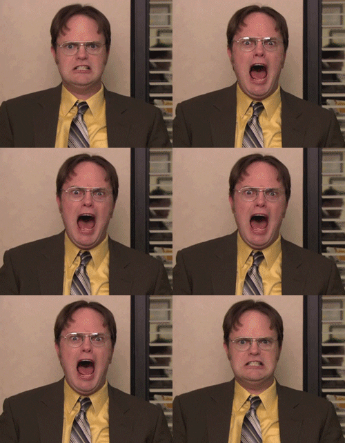
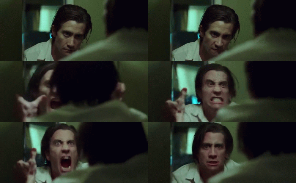
Hey. Y'know what really grinds my gears? THIS. THIS F*CKIN' SH*T. Logging into the forums to find it looking completely different. I know I already did an entry on change in general, but I just had to do this one. I cannot describe how much I hate UI and appearance changes to things when they were fine the way they were and we were all used to it. I HATE adapting to appearance changes in software. I hate logging into to something I use regularly like this and feeling totally disoriented and discombobulated when it looks totally different.
WHAT WAS WRONG WITH THE WAY IT LOOKED YESTERDAY!!??
I'll tell you what. Not a Celestia-dammed thing, that's what!
*Sigh* Not trying to rip on the people who probably worked very hard on the design. Not trying to make you feel bad. But I just hate adapting to unnecessary changes like this. That's why I feel a horrible dread in the pit of my stomach every time I update any software. All I want are bug fixes, stability improvements, etc. I HATE adapting to appearance and UI changes. I HATE IT!

And what's with the new category bullsh*t?! Why is that mandatory?! None of my other entries have a category. I DON'T WANT A DAMNED CATEGORY! It's all one category! WHAT REALLY GRINDS MY GEARS!! There aren't SUB categories! Why can't I leave it blank?!! WHY IS THIS FIELD REQUIRED??! F*CK THIS! I just wanted to pop in here for five minutes and check my notifications, and instead I end up spending an hour trying figure out if I can make this category thing go away! I. HATE. THIS.

Okay, temper tantrum over.
Edited by Justin_Case001
-
 1
1


1 Comment
Recommended Comments
Create an account or sign in to comment
You need to be a member in order to leave a comment
Create an account
Sign up for a new account in our community. It's easy!
Join the herd!Sign in
Already have an account? Sign in here.
Sign In Now