


"MLP Forums" logo review
Entry posted by Dark Qiviut
3,910 views
![]()
When entering the MLP Forums, one of the first things you see is the logo on top. The rounded letters, playful positioning of the typeface, and quirkiness of how the logo is placed and played with. Every banner has the MLP Forums logo somewhere, and it easily makes the MLP Forums look recognizable not merely as a forum, but as a brand. Feld0 has stated occasionally here that he treats this forum as such because the way the forum is designed and the thread titles are typed. But the logo itself is the centerpiece of the brand. Logos give a first impression to the audience what the atmosphere of the brand is; the MLP Forums logo is the leading, and personally most important, piece of the forum's brand.
The MLP Forums logo, given by the typefaces themselves, represent relaxation, casualness, and fun. "MLP" in the MLP Forums is the Cheeseburger typeface. My Little Pony: Friendship Is Magic succeeds in capturing the whimsical, fun atmosphere and colors of the animation. The background designs aren't always organic. They're crazy and fun. Cheeseburger's anatomy is playful and casual, just like the show itself. In addition, the approach to reading it is comfortable. However, the kerning (the space in between tow characters) in between the "L" and "P" is a little too tight; look at the closest space between the "M" and "L" and compare it to the "L" and "P." You'll notice that the "M" and "L" are a little tighter. A recommendation is to nudge the "L" to the right slightly to make the kerning more optically even.
"Forums" is typed in the typeface called "Gilligan's Island." Just like "MLP" in the "MLP Forums," the font is playful and casual despite its usages of serifs (which translates into a level of elegance on impression).
But while it supposed to come across as playful, it doesn't mean that's what the results translate to. There are three big problems with it that bog down its message.
- The kerning is lousy. While the kerning in "MLP" merely needs some adjusting, "Forums" is overlooked, particularly two places.
- The first location is the space between the "o" and "r." Compared to the other subsequent pairs, the spacing is too tight, almost touching.
- The spacing between the "F" and "o" are completely the opposite. There's WAY too much space between the two letters. If you put "MLP Forums" side by side, then instead of "MLP Forums," the kerning between the "F" and "o" makes the logo read as"MLP F Orums." The "F" is stranded on an island, and that's NOT how good logos make.
[*]The font is fighting with the "MLP" half. As a logo designer, it's important that you want to send an impression to your audience. Sometimes, you want to incorporate as many messages as you can. Truly successful logos do NOT do that. They take one central idea and go along with it; extra smaller messages come naturally. Simplicity is key. Based on the weight of the CheeseBurger typeface and positioning of the stacked logo, it's obvious that "MLP" is the main focus and "Forums" is secondary. But both fonts are trying to carry the same message regarding in how the typefaces are designed, and that's too much. This is why I have the MLP Forums logo on top in black rather than fuchsia; it forces you to review the logo from a design perspective.
[*]The font, Gilligan's Island, is a very poor typeface of choice. The first time I saw the "Forums" part of that logo, I seriously compared it to this typeface.
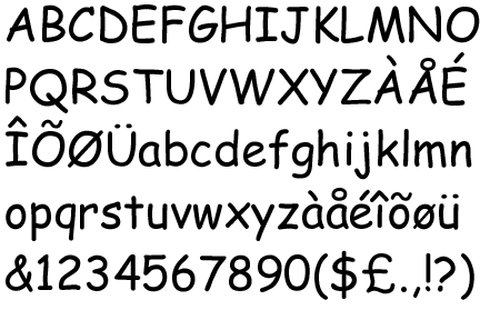
Many of you might recognize it, but for those who don't, this is Comic Sans, a sans-serif computer typeface designed to replicate the casual, fun, comic-like personality of childlike typefaces. However, this font isn't very good for several reasons.
1. It comes across as forced. Instead of playful, it's mechanical and dull.
2. It's extremely difficult to borderline-impossible to adjust the kerning and tracking of the characters to make the text comfortable to read. The characters and numbers are designed so poorly that no matter how much you try to adjust the spacing, characters tend to stick out on an island.
3. The structure of the letterforms are inconsistent. No two are ever the same, and that makes the font an even bigger pain to read.
4. It's easily recognizable based off its anatomy and shape. This is completely opposite to what typefaces should do. A typeface's purpose is to make the font look comfortable, quiet, and blended in. Stick out, and it makes people question your design skills.
5. There are too many little pieces of detail in the typeface. Keep the font simple; too much is overkill.
Compared to Cheeseburger, Gilligan's Island has little consistent structure in both the uppercase and lowercase characters. It tries to come off as playful and fun, but the poor anatomy of the characters is forced. It's inorganic. Take a look at the font page, and you'll see how some of the uppercase letters are also used as lowercase.
And suffice it to say, the font is out of character of My Little Pony: Friendship Is Magic. When looking at the background settings and the way the characters are drawn, they're designed to be simple in shape, but recognizable as those creatures in design. Besides the hair, tail, muzzle, and eyes, a pony's anatomy is consisted of several circles, eight rectangles, one square, and one triangle merging with each other. Zoom in at the actual characters in the Gilligan's Island typeface, and you notice so many extracurricular details in the characters. It contradicts the simplicity of the Friendship Is Magic universe and anatomy of the ponies themselves.
- The first location is the space between the "o" and "r." Compared to the other subsequent pairs, the spacing is too tight, almost touching.
What I suggest to improve the logo are as follows:
1. Adjust the kerning in the "L" for "MLP." Nudge the "L" a little to the right to make the space more even proportionally.
2. Ditch the Gilligan's Island for a completely new typeface. One that is organic, simple, and conservative. "MLP" is its strong suit, and the current font is fighting with "MLP." You want a balance, yet have "MLP" be its focal point in the logo. My suggestion is to use a typeface that's geometric, simple, and much lighter in weight, either one you can find or self-designed; and several examples are located here. Sans serif or serif is up to you, but I'm more inclined to sans-serif for two reasons:
The MLP Forums established themselves as not just a forum discussing My Little Pony, but a brand within the fandom, too. Instantly, whenever someone sees this logo, it is instantly recognizable. With refinement, the MLP Forums logo can stand out as an even better brand with an ever greater logo.
-
 7
7
4 Comments
Recommended Comments
Create an account or sign in to comment
You need to be a member in order to leave a comment
Create an account
Sign up for a new account in our community. It's easy!
Join the herd!Sign in
Already have an account? Sign in here.
Sign In Now