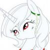
Sinivar 12 July 29, 2012 Share July 29, 2012 (edited) I figured I'd put these here. I'm not really doing art at the moment since I need to finish a few things up elsewhere, but when that's all settled, I'll start drawing stuff again for folks that don't mind my style and actually might want one despite my artistic shortcomings. Although if you ask with Fluttershy or Applejack eyes, I probably will draw you sometimes anyway. Just can't resist their faces. Pale Spiral: This is the first pony I ever drew for someone. I was thinking it might have been fun to do images with ponies framed by their mark, but seeing how varied they can be, that just never panned out. I also started, out of habit, by making everything lined in black which I attempted to change much further down the line. Pepper Paws: This was the second I ever did and I think it was a bit better. Although I still cringe when I look at the golden retriever pup. He looks like he's going to topple over any second now. XP Froufrou: This one was third and I actually really liked how she turned out apart from the tail. Mostly because I thought I was going to have a far more difficult time with that hairstyle that I did. I was expecting to spend hours tinkering until it looked right. Heart's Desire: Here's the next one and these kinds of poses always drive me nuts. I'm always unsure where the belly should be, or if it should even be visible, or how much of it. Blahh...I wish I was better at doing horns, too. I just freehand everything in pencil then go over it again with gimp but everything is always wobbly and uneven due to the mouse. Then I sit there and fret over where the horn is on the forehead. Shining Armor: Here's the first and so far only canon character I've ever drawn. A cosplayer wanted one so I figured, why the heck not? First ever stallion, too. So it was a bit of a double doozy. I like it alright, but I lament not starting on the spear lower down by his arm. I felt like I had to break the line of the pole just so it looked like it wasn't coming out of his mouth. >_< Panacea: This was my first ever attempt at my own character, Panacea. But unfortunately she is a pillbutt and hates letting me draw her. So to me it looks very wonky and not really in character for her. (considering she actually looks potentially pleasant in this image and that's just not Pan) Toxic: This one was a doozy. Them swirlydoos took forver to look accurate-ish. And the wings and the shoes and good gravy, just all of it was hard. I do like how the wings turned out at least, though. I was expecting much worse. Snake Oil: This one was easy enough apart from the fact that at this point it was quickly dawning on me that when you're not drawing G$ style, unique poses are a little bit hard to come up with. (part of why I started just settling for just plan standing in later ones) This was just a doodle I made of Panacea's family. Nothing special apart from trying to put some detail into the little ice sculpture her father was making. Homesar: This was just me being a goofball that loves Homar. Edited July 29, 2012 by Sinivar 4 Link to comment Share on other sites More sharing options...
VladmireV.S.(Crank) 1,096 July 29, 2012 Share July 29, 2012 these are all beautiful. nice job! hope to see more of your work in the future m'am! i especcialy like the last one! Link to comment Share on other sites More sharing options...
Sinivar 12 July 29, 2012 Author Share July 29, 2012 (edited) Let's see if this works. Clover Frost: I really like how this one turned out apart from her mark. I made it too darn big. Just too much mark and not enough bum. >_< Jackie Trade: Here's another I think came out alright. The gal wanted her OC to be pudgy so it was learning a whole new body type. Jack: This is the first seapony I ever did. I wish it had come out better, but it was good for practice concerning the tail. Summer Song: This one was hard. The dark red and dark brown and darker color in the hair just threw me for one heck of a loop. Allure: I loved doing this one's hair. To the point I wanted the pose to be all about her hair since I liked it so much. I think the face suffered a bit for it though. Still love that hair. Radiant Star: I can never understand why my normal ponies come out tall and tall-designed ponies give me such a hard time. But by golly this one did. I like the sheen of her hair though, at least. Oromo and Devlin: This was another major first. A zebra and a gryphon at the same time. x_x Still not sure how I managed. Summer Song and Big Mac: I guess i told a lie since this does include a canon character. The gal a bit higher up wanted one with her and Big Mac giving each other 'the look'. Why is his harness such a pain in the butt but the way? I was doing okay until I got to that thing and it still looks so wonky the way I did it. Edited July 29, 2012 by Sinivar 1 Link to comment Share on other sites More sharing options...
VladmireV.S.(Crank) 1,096 July 29, 2012 Share July 29, 2012 Let's see if this works. I really like how this one turned out apart from her mark. I made it too darn big. Just too much mark and not enough bum. >_< Here's another I think came out alright. The gal wanted her OC to be pudgy so it was learning a whole new body type. This is the first seapony I ever did. I wish it had come out better, but it was good for practice concerning the tail. Thank you! I really appreciate it. I've never been very confident in my work so it makes me really happy! Hopefully I can keep improving. I'm hoping seeing all of them together will help me feel like I've gotten better along the way so I don't get disheartened. Wow, it's going to take me a while to get used to how this places does quoting. O . o oh no, thank you! i love seeing beautiful art! it always makes me feel so wonderful!!! thank you for sharing your art with us! Link to comment Share on other sites More sharing options...
SrFrog 928 July 29, 2012 Share July 29, 2012 Although they seem to more closely resemble the old style of the series, I've gotta say these are a whole lot more aesthetically pleasant. "Never give no manipulative bitch the benefit of the doubt" - Compa's grandpa... Link to comment Share on other sites More sharing options...
Sinivar 12 July 29, 2012 Author Share July 29, 2012 (edited) And then one more for the Zebra/Gryphon duo since they wanted some little hybrid babbies. Soft Paw: This one came out so sketchy since I just didn't have time on hand to smooth the lines for a quickie doodle, but now that it's done, I kinda like the sketchy look. Flooftart: This was the first one I ever did colored lines on since it was a fluffly Llama character. I liked it so much that I started expermineting with it later which will become pretty obvious. Kinky Rice: Good gravy the maroon color was so hard to work with on this one. I like how the expression came out at least considering she was supposed to be flirty. Bugs me that her tail got cut off, though. I really need to fix that sometime. Although they seem to more closely resemble the old style of the series, I've gotta say these are a whole lot more aesthetically pleasant. You think so? I'm really glad someone else actually likes the older look. It's all I can really draw when it comes to ponies but it seems like nobody ever seems to like the older look these days. So I just figured I'd just have to settle for being a fossil among all the FiM styled stuff. Why in the world does it attatch a quote to a past post? O_o;; Moonshine: This one was interesting to do since I'd never really done this kind of body markings. Timid Dreamer: I made this one waaaay to tall and the face was too chubby and the tummy too thin and just...blah. I like the scarf though. XP Silver lining. Copper Heart: Now here is the first return to using colored lines rather than black. I did it again because this is a shaggy pony, but...I sure did like how it turned out, too. So a lot after her are in colored lines. Lily: The person who made her hadn't given her a name so I just call her Lily. She was the first time doing a normal, non-fluffy/furry pony in colored lines. i think it came out okay. I was happy with her face and the way the mark came out. Gloomy: Lack of interesting poses struck again and I thought I'd do something a smidge different with this sleepy pony. That part came out okay-ish, but I really really wish I had made the muzzle better. Not so stubby. Edited July 29, 2012 by Sinivar 1 Link to comment Share on other sites More sharing options...
Hazardus_Havard. 480 July 29, 2012 Share July 29, 2012 There's no problem having them lined in black, it just needs to be done in a way that doesn't hurt the image. Your first posted image was one such a way it hurts it; the lines feel very thing and don't hold the picture well. While the third image posted is the better way to do it; nice thick lines in certain areas that better give the image more flesh. Also, when you make a post, try only uploading a few images, like around three to five is perfect. Having too many images drowns out any responders to a topic and makes it hard to respond in general from all the inflow of each and every image. Just upload additional images later on. This way you'll get better critiques or just people in general to like your art. Practice makes perfect; but if nobody's perfect, why practice? http://hazardus-havard.deviantart.com/ Art http://www.fimfiction.net/story/70801/an-alien-walks-amongst-us Story Link to comment Share on other sites More sharing options...
Sinivar 12 July 29, 2012 Author Share July 29, 2012 (edited) Morning Star: My face when I had another request with an OC covered in those swirly lines. Did it anyway, but gosh those things are rough on me. At least the dark purple body wasn't has hard to work with as I thought it would be. Flash Bang: Another rare stallion. He's okay, but I wish I'd redone the lines on his wings. I can barely see them. Super Nova and Archivist Ink: This was hard for many many many reasons. I've repressed most of the harships making it due to hand destroying pain so I won't elaborate further. Mania Muse: I like the tragedy of this one and was really glad when I was approached to draw it. Mania's story was that she draws people obsessively in the hopes that they'll love her. But instead she is even more alone due to people being freaked out by her. Deep Fry: And this is the last one I've done so far. I couldn't find paper or pencils due to a five year old sentient hurricane, so I just freehanded it on Gimp and hoped for the best. Fry is a changeling in disguise who happens to like the pony life and wants to stay that way. There's no problem having them lined in black, it just needs to be done in a way that doesn't hurt the image. Your first posted image was one such a way it hurts it; the lines feel very thing and don't hold the picture well. While the third image posted is the better way to do it; nice thick lines in certain areas that better give the image more flesh. Also, when you make a post, try only uploading a few images, like around three to five is perfect. Having too many images drowns out any responders to a topic and makes it hard to respond in general from all the inflow of each and every image. Just upload additional images later on. This way you'll get better critiques or just people in general to like your art. You're right now that I look at that first one. I think with the first one I didn't go over it again and just left the pen lines. That's a good idea though. I've already put up all I have for now with that last post, but do you think I should go through and try to spread them out? Major issue I'm having is the way posting seems to work here. O_o;; I thought they would be automatically seperate little posts when I made a new thing and didn't edit an old one but then it started connecting them anyway. So I wasn't sure when it would actually make a new post or just slap it on the tail of what I already did. Watch it do it with this, too, knowing my luck. I quote the post and it's going to paste it right up with those images for some reason. Edited July 29, 2012 by Sinivar Link to comment Share on other sites More sharing options...
Hazardus_Havard. 480 July 29, 2012 Share July 29, 2012 Morning Star: My face when I had another request with an OC covered in those swirly lines. Did it anyway, but gosh those things are rough on me. At least the dark purple body wasn't has hard to work with as I thought it would be. Flash Bang: Another rare stallion. He's okay, but I wish I'd redone the lines on his wings. I can barely see them. Super Nova and Archivist Ink: This was hard for many many many reasons. I've repressed most of the harships making it due to hand destroying pain so I won't elaborate further. Mania Muse: I like the tragedy of this one and was really glad when I was approached to draw it. Mania's story was that she draws people obsessively in the hopes that they'll love her. But instead she is even more alone due to people being freaked out by her. Deep Fry: And this is the last one I've done so far. I couldn't find paper or pencils due to a five year old sentient hurricane, so I just freehanded it on Gimp and hoped for the best. Fry is a changeling in disguise who happens to like the pony life and wants to stay that way. You're right now that I look at that first one. I think with the first one I didn't go over it again and just left the pen lines. That's a good idea though. I've already put up all I have for now with that last post, but do you think I should go through and try to spread them out? Major issue I'm having is the way posting seems to work here. O_o;; I thought they could be would automatically be seperate little posts when I made a new thing and didn't edit an old one but then it started connecting them anyway. So I wasn't sure when it would actually make a new post or just slap it on the tail of what I already did. Watch it do it with this, too, knowing my luck. I quote the post and it's going to paste it right up with those images for some reason. Well if I were you, I'd have chosen art samples that fit best. Such as pieces that you'd like critiques on and don't feel finished (like the first one in that) or other groups that better organize your art. Afterwards, make one new topic and place those images there, stating what you have on the art such as any information on them or if you need specific critiques on them (though I tend to still critique images anyways) Making each topic to a limited three pictures is probably the best. Having a single image even better because then the topic is all about that single image. You could, for instance, make a topic about an image you have, have people look at it and discuss, and then later on post another; though I'd give it time to each new topic made. As for posting more pictures on top of more like you are now, it really drowns out nearly all the images and makes it hard to say anything in specific or any real value other than "good job!"........ Although posting an image like a progression type is perfectly fine, like uploading a sketch, then the cleaned art, then a colored, and then final image. Just try to make sure your art isn't all lumped up as is; even if you have awesome art it makes it hard for people to look at it all. Plus a lot of people are on all hours of the day, by uploading topics in certain times you get different people to look at your work and to better discuss it in a whole. 1 Practice makes perfect; but if nobody's perfect, why practice? http://hazardus-havard.deviantart.com/ Art http://www.fimfiction.net/story/70801/an-alien-walks-amongst-us Story Link to comment Share on other sites More sharing options...
~Chaos~ 3,973 July 30, 2012 Share July 30, 2012 Whoa, these a wonderful, I really love your art style, I love them, you've done a really nice job on them! Link to comment Share on other sites More sharing options...


Recommended Posts
Create an account or sign in to comment
You need to be a member in order to leave a comment
Create an account
Sign up for a new account in our community. It's easy!
Join the herd!Sign in
Already have an account? Sign in here.
Sign In Now