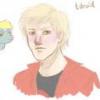
Tdroid 234 September 2, 2012 Share September 2, 2012 (edited) Added drawings: #4, #7(new) So I have posted quite a bit of my work here and I decided to make a thread where I am going to post all my work from now on, as well as include a link to the previous ones. Whenever I post a new drawing I will include the post number in the OP. But first: On to the opening drawing to my thread. Note: Don't mind the title too much, I don't mean to insult anyone or demean myself too badly. It is mainly to draw attention Galleryof all my MLP drawnigs, included to have all in one place. DeviantART for the new drawing. All feedback, good and bad, is encouraged. The more feedback I get the more encouraged I get to keep doing this, Edited September 6, 2012 by Tdroid 2 I like to do requests. Please, if there is something you want to see me, an amateur, draw for you, just send me a PM with the details and I'll say yay or nay. Most likely yay. Link to comment Share on other sites More sharing options...
PonyEcho 1,610 September 2, 2012 Share September 2, 2012 (edited) o_O after look at that picture many things are running through my mine.... very nice piece of art the only flaws i can see are the text and the eye.. text seem like a last edition and over dramatic and the eyes (for Twilight feel emotionless due to the lack of detail, Celestia however looks good, you get a bro hoof now i just need to get the image of what happened before you're picture out of my head *gets out a hammer* Edited September 2, 2012 by PonyEcho my DA http://heavyecho.deviantart.com/ check my stuff out the Anime Club http://mlpforums.com/topic/48196-the-anime-club/ plz join us Link to comment Share on other sites More sharing options...
Pix3M 607 September 2, 2012 Share September 2, 2012 I find the picture to be grainy. You might like your work a bit better if you fill in all of the little white spaces you create trying to fill in those shapes. Coming from a pixel artist who's developing a finer eye for tiny details though. My deviantArt page Link to comment Share on other sites More sharing options...
Tdroid 234 September 3, 2012 Author Share September 3, 2012 o_O after look at that picture many things are running through my mine.... very nice piece of art the only flaws i can see are the text and the eye.. text seem like a last edition and over dramatic and the eyes (for Twilight feel emotionless due to the lack of detail, Celestia however looks good, you get a bro hoof now i just need to get the image of what happened before you're picture out of my head *gets out a hammer* Yeah, I just noticed that Twilight's eyes didn't turn out too good, though I stick with my choice of dialogue. It was intentionally overdramatic, meant to be an insult from Twilight to her mentor.When I get better at drawing, maybe I'll make a prologue to it so you can see what happened with your eyes and not just in your mind I find the picture to be grainy. You might like your work a bit better if you fill in all of the little white spaces you create trying to fill in those shapes. Coming from a pixel artist who's developing a finer eye for tiny details though. Yes, I should probably have paid a little more attention when I colored it. Thanks for pointing that out Second drawing that is added to the thread, this time it is Fluttershy, which may or may not be the Rightful Queen of England. DeviantART for the drawing. I like to do requests. Please, if there is something you want to see me, an amateur, draw for you, just send me a PM with the details and I'll say yay or nay. Most likely yay. Link to comment Share on other sites More sharing options...
Pix3M 607 September 3, 2012 Share September 3, 2012 Yes, I should probably have paid a little more attention when I colored it. Thanks for pointing that out Second drawing that is added to the thread, this time it is Fluttershy, which may or may not be the Rightful Queen of England. DeviantART for the drawing. The grainy texture isn't as 'in-your-face' as the picture is a lot lighter so the contrast between the color and the little white pockets makes it more difficult to see, but yeah, makes me wonder if we can take it a step farther and make it a perfect solid color. I haven't worked with colored pencils that often, but I've made really solid colors with very little white spaces with higher-end pencils before. Some of the best pixel art I've seen aren't immediately obvious that it's pixel art. Some of the best vector art I've seen aren't immediately obvious that it's vector art. Some of the best drawings I've seen aren't immediately obvious that it's a drawing, but I confused them as a photo. Just a thought. My deviantArt page Link to comment Share on other sites More sharing options...
Hazardus_Havard. 479 September 3, 2012 Share September 3, 2012 Top Drawing - Twilight's neck appears to be a bit long, you should scoot her body over to accommodate for that. Add in additional hair streaks near her eye, try not to make them all triangle tipped though. Finally the word "falls", well the letter f in the word looks like a t so I got confused and that she kept saying Equestria "talls". Took me a good five minutes to figure that one out. Second Image - Her cutie marks should only be slightly seen since they are on her flank, you have it as if she took her behind and warped them to the front in a very painful looking manner. Also her hair looks a bit flat, almost deranged Pinkamena style hair. Try swooping her hair at the top in and around her, also take the streaks in her mane and make them not so straight down in her hair to add more personality to her character. Practice makes perfect; but if nobody's perfect, why practice? http://hazardus-havard.deviantart.com/ Art http://www.fimfiction.net/story/70801/an-alien-walks-amongst-us Story Link to comment Share on other sites More sharing options...
Tdroid 234 September 6, 2012 Author Share September 6, 2012 The grainy texture isn't as 'in-your-face' as the picture is a lot lighter so the contrast between the color and the little white pockets makes it more difficult to see, but yeah, makes me wonder if we can take it a step farther and make it a perfect solid color. I haven't worked with colored pencils that often, but I've made really solid colors with very little white spaces with higher-end pencils before. Some of the best pixel art I've seen aren't immediately obvious that it's pixel art. Some of the best vector art I've seen aren't immediately obvious that it's vector art. Some of the best drawings I've seen aren't immediately obvious that it's a drawing, but I confused them as a photo. Just a thought. I try to get better everytime I get good feedback, but I find it to be neat impossible to get the color entirely solid with the current supplies I have now, which is actually just a small box of pencils bought at the local grosery store. Of course, this is not an excuse for the flaws, but I think I need better drawing supplies. Of course, the feedback is appreaciated. Top Drawing - Twilight's neck appears to be a bit long, you should scoot her body over to accommodate for that. Add in additional hair streaks near her eye, try not to make them all triangle tipped though. Finally the word "falls", well the letter f in the word looks like a t so I got confused and that she kept saying Equestria "talls". Took me a good five minutes to figure that one out. Second Image - Her cutie marks should only be slightly seen since they are on her flank, you have it as if she took her behind and warped them to the front in a very painful looking manner. Also her hair looks a bit flat, almost deranged Pinkamena style hair. Try swooping her hair at the top in and around her, also take the streaks in her mane and make them not so straight down in her hair to add more personality to her character. Thank you, I will keep that in mind for the next drawing Did another Fluttershy drawing, this time in Black'n'White. Please let me know what you think about it DevaintART for the drawing. I like to do requests. Please, if there is something you want to see me, an amateur, draw for you, just send me a PM with the details and I'll say yay or nay. Most likely yay. Link to comment Share on other sites More sharing options...
Pix3M 607 September 6, 2012 Share September 6, 2012 (edited) Ever thought about drawing from references? In case you really want to have your art resemble the 'real things' even more, it may be useful to look at a pony and try to draw exactly what you see. You'll eventually draw a lot better from memory when you do this. Plus, the way I see things right now, if you try to think of their bone structure, that doesn't exactly make the most sense. Edited September 6, 2012 by Pix3M My deviantArt page Link to comment Share on other sites More sharing options...

Recommended Posts
Create an account or sign in to comment
You need to be a member in order to leave a comment
Create an account
Sign up for a new account in our community. It's easy!
Join the herd!Sign in
Already have an account? Sign in here.
Sign In Now