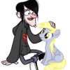
Flicker 141 March 21, 2014 Share March 21, 2014 So I decided to try out a new style of art today, and I'm not sure what I think of it. It's kind of rough and sketchy, which I like better than my clean-cut style I used to use, but it's also a bit messy. The "Pinkie" in the picture is the Pinkie's Boutique line which always struck me as hilarious, so that's why her mane is colored differently. Also, I can't decide on a villain name for her. She's the antagonist in my Iron Dash tumblr, and I can't think up a name to save my life! But enough of that, here's the picture. Solar Flicker, http://mlpforums.com/page/roleplay-characters/_/solar-flicker-r1972 Wind Whistle http://mlpforums.com/page/roleplay-characters/_/wind-whistle-r2867 Link to comment Share on other sites More sharing options...
Adorkable 2,737 March 21, 2014 Share March 21, 2014 Um, let's see! ^^ Well, it's a little messy, but I'm sure touching up on it wouldn't be a problem at all! I see you were going for Pinkamena, which totally fits her...dark style! ^^" I like the camera design you put on there. ^^ It kinda looks like she's doing the news, is that intended? ^^" Overall...it looks good! ^^ Just do a little touching up on it, I would recommend for a cleaner look to it. ^^ 1 Link to comment Share on other sites More sharing options...
DJpon-3 56 March 27, 2014 Share March 27, 2014 It looks a little flat to me. Personally I like sketchiness over the overly refined stuff. The anatomy also needs some work. I think if you practice then you will have a nice style. Link to comment Share on other sites More sharing options...


Recommended Posts
Create an account or sign in to comment
You need to be a member in order to leave a comment
Create an account
Sign up for a new account in our community. It's easy!
Join the herd!Sign in
Already have an account? Sign in here.
Sign In Now