


Entry posted by Dark Qiviut
2,369 views
Author's Note: Because the Poniverse Logo Contest is running until May 14, I revised my blog entry. If you want to read my old entry from last year, click here.
Logos are the little symbols, names, and/or combination of the two. They tell us what the company is, what the company stands for, and what it does. The way the logo is arranged, designed, and colorized communicates a message to the consumer; its design can actually convince someone to buy the product or (if it all goes wrong) stay away. Also, logo-designing is a long, painstaking process, taking up to one year to effectively execute and (for Fortune 500 corporations) costing millions of dollars. For example, the Pepsi logo cost approximately $100 million and took six months to develop.
Currently, many companies aim to go for simple, but unique and effective. It's been like this for the past ten years or so, and it's really being researched and considered. Two examples from 2012 are the Microsoft and Twitter logos.
Why are they doing this?
- Simple is catchy to the eye. The less cluttered the logo, the quicker the person sees it.
- The simpler the logo, the more memorable the logo becomes. The brain takes so much information at once, but they don't keep it. A simply designed logo allows the brain to process the messages and composition faster and better.
- The simple logos also allow companies, if they're memorable enough, to bear it down further to just the trademark (the corporation's symbol). For example, Nike, Apple, McDonald's, the Boston Red Sox, and Starbucks had both the trademark and the logotype/wordmark combined into one (called the signature). To make the trademark more memorable, these five companies ditched the wordmark to display only the trademark.
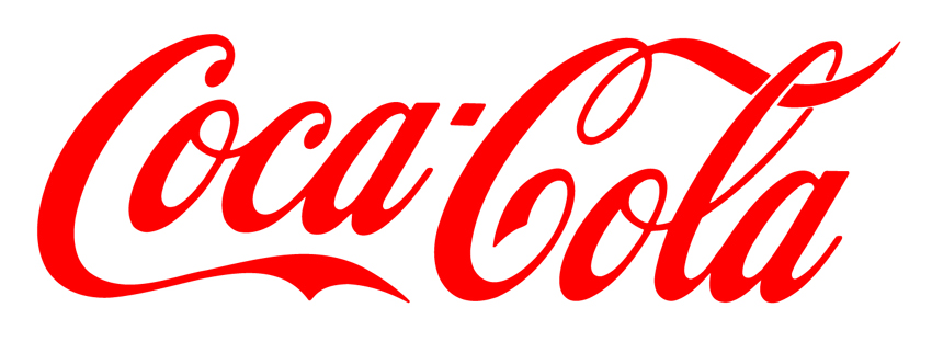
[*]Most of the best logos come from being simple. Motorola, FedEx, Coca-Cola, Apple, McDonald's, NBC, and CBS are all logos that are more than a decade old, and they're iconic. Motorola, Coca-Cola, and CBS have retained their trademarks since at least 1955. Coca-Cola's logo — a writing style called Spencerian Script — is more than a century old, dating back to 1885, to attract customers as a contemporary form of medicine. Simpler logos tend to be around much longer, and they have a great track record.
[*]Simpler logos are more versatile and are easier to scale across multiple media. One tip when making an effective logo is if it's easy to see and versatile in print as well as interactive like TVs and the Internet. You want your logo to be good on Mount Everest and on part of the business card.
Now how do you design them? I'm going to tell you how based on my experience.
Firstly, develop a Creative Brief. Also called a Product Proposal, it's a legal document proposing a product or service. Lawyers review these documents so that the ideas follow country regulations. In addition, the creative brief provides regulations on how to develop an ad campaign, product, or any kind of brand.
Creative briefs contain the following categories:
-
Background: Either an existing one or one that's coming to fruition. This tells you what the company is about and what they're looking for. It may be one paragraph or up to two pages depending on the length, type size, and leading.
-
Audience: Who are you targeting? Is the target audience family-friendly, informal, formal, young, old, a specific age range, a race/gender/nationality/etc.? Research of the audience's annual income is located here, sometimes as its own category or combined.
-
Objective: The intention behind the creative brief. What do you plan to do with the brand? How will you communicate the audience with your design? What are your goals when creating your logo?
-
Additional Objective: Any extra goals.
-
Message: How can you sum up your goal and brand (or re-brand) in one sentence?
-
Competitive Framework: Who is your competitor? How will you make your logo stand out amongst your competition?
Other options include operating a budget to creating the logo.
The great thing about the brief is that it serves as a guide. It tells you exactly what your brand is and reminds you of what you're looking for as you're developing the logo. Always refer to it, especially if you get confused or stuck on your idea. Remember, that proposal you wrote is there to help you. Be as thorough and convincing in your writing as possible without gloating.
Secondly, research. Take a look at your audience, competition, your brand's history. Review them via the computer (market research) or from the environment of your brand or competition (field research). Take a look at what they see, do, and say. Take notes. Tally the notes. I also recommend researching outside your competition so you can get some more ideas.
Also, research how to develop your logo. Look at color, pattern, design, culture, and typography. Review other successful logos. Analyze how they became memorable and use them as inspiration for your logo. Take a look at pictures, buildings, animals, and the like for the same reason, for at least one of these categories may become part of the logo, either as part of the logotype or a trademark.
Typography and color are especially key. Each typeface carries a distinct voice, and they each have a specific purpose. Helvetica, for instance, is a casual, readable sans serif typeface. Bodoni, on the other hand, is a Modern serif typeface that have huge contrasts between thick and thin strokes. Regarding color, red is the quickest color to catch the human eye: Depending on the context of the signature, it can mean a warning (like the Red Cross) or a way to tell people, "Hey, I can feed you!" like McDonald's and Coca-Cola. Blue is a very corporate color and is most commonly used because it's calm and pleasant; IBM, Prudential's simplified Rock of Gibraltar, the old Bell logo, and the AT&T globe are three famous examples.
Researching is the longest process besides developing your logo comps, and it can be the most expensive step besides execution.
After collecting all of the evidence, draw the comps. Review your research and begin drawing comps according to the research you gathered. If you see something from a picture and want to crazily draw as many concepts as possible, do it. Don't leave one out. It could be your future logo.
You can develop them on the computer if you desire, but it's better if you sketch thumbnails in a sketchbook. Use a black or graphite pencil to draw. Concentrate on the pressure you put on the paper so you can present tonal values. Moreover, sketching the concept by hand allows you to draw it out without spending too much time on them. Just sketch and move on to the next one. If you have the commitment, you can finish with as many as 100 comps in a matter of days.
When I took my Senior Project class to develop my pieces, what we all did is glue the research on one page and draw the logo comps on the other. Having the research beside you forces you to review your research and toy with as many ideas as possible. This si something you don't have to do, but it's a good idea to hammer as many concepts as possible before moving on to another collection of research and comps. But if you fill your page with those concepts and want to draw more, turn to the next page and draw more until you can't brainstorm.
Once you sketch enough ideas down, develop your best ones on the computer. Clean them up using vector software. This means programs like Inkscape or Illustrator.
Don't use raster programs like Gimp or Photoshop. Those two programs produce raster files. They have a limited amount of space and a maximum number of pixels. Raster files have fixed resolutions, while vector files do not. In a raster file, you can decrease the resolution and size, but you can't increase it without making the logo look muddy and pixelated. Vector files, on the other hand, have an infinite ability to scale, big or small. For vector files, you can have the same resolution for a half-inch logo and a one-mile one.
One extra piece of advice when developing your computerized comprehensives: Do NOT develop them in color. Only develop them in black and white. If you jump into color too quickly, you may focus on how to get the color combinations right when a great logo comes from the foundation. Once you got the foundation (or composition) down, then jump into color.
Once you revised your concepts and clean them up to make them simple and effective, take your best computerized black-and-white ideas and add color if you choose to. This is where your research of color comes into play. Develop your ideas further and play with as many color combinations as possible. But make sure your colors fit into your objective from the creative brief, for choosing the wrong colors can mean sending a completely different message than what you intend.
Afterwards, the client will choose which logo he likes best. With that, you got your logo. Hopefully, he or she will choose the best one.
Now, to give you some extra tips and reminders when designing the logo:
- Follow the brief. Use it as your guide as you research and execute your concept.
- Keep your logos simple. Don't insert too many ideas in one piece. Remember, the simpler the logo, the quicker the audience will see it and understand it.
- Do NOT put in too many small details. If part of your logo gets difficult to see in a small size, then maybe you should simplify it further.
- When developing your computerized comps and final drafts, choose your BEST ideas. Don't further develop any ideas that you know won't work. The last thing you want to see, as a designer, is something like this as your final execution. Be careful not to have your logo look phallic or carry extremely gross, adult messages.
- Don't develop your logo in a raster file. Use vector programs only. Raster files have pixels, and they contain a fixed resolution. You can scale the image down to a smaller pixel-per-inch capacity, but you can't increase it and have it look crisp. Vector drawings, on the other hand, are easily scalable. No matter how big or small the vector shape is, it will always look sharp.
-
Never use a photograph for your logo. Photos are raster files with fixed resolutions.
- When developing a logo, use flat shapes. Don't use any gradients or special effects like transparencies, glows, or drop shadows. These effects can be easily transferred on multimedia platforms, but they're extremely unpredictable to print. It's an even bigger pain if the logo requires you to print on metallic packaging like a metal thermos or embroidery (such as a baseball cap or any stitched patch). Also, using these effects give the indication that the designer isn't very confident in his design and is trying too hard to create his message. Remember, be simple. If you want to do highlights and shadows, use flat shapes, and let the human eye create that illusion for you.
- Make sure your logo is easy to read, particularly in multiple sizes.
- Add color LAST. Focus on black and white first. Once you got the black-and-white idea down, then add color.
- When you're developing your logo, make sure you have a good symbolic reason for your design. NBC's peacock uses six colored feathers to reference their six divisions. Enron chose red, green, and blue for their logo because they're the primary colors of light. Don't add any more information just because you want to or because "it's cute." Those answers are completely unacceptable in the logo industry. Make sure your details relate to the company's image, location, and personality.
- When choosing your typeface, use a print font. This means ones like Helvetica, Univers, Didot, Caslon, Baskerville, Palatino, or Futura. There are millions of print fonts. Find one that fits the brand's image. If you can't, draw your wordmark yourself.
Avoid computer fonts like Arial, Verdana, and Georgia for your wordmark. They don't read well in print because some of the letters differ in size and appear to be inconsistent in shape and length. Spend the time and money reviewing and using the actual print fonts. You'll get more credibility that way.
And unless your reason make sense, do NOT use Comic Sans for your wordmark! It's a widely despised font because it tries to be kid-friendly, but looks machine-like. Furthermore, it's typically the go-to font if you want your font to appear comic-like. Designers and clients expect you to review your font ideas and think critically about which font to go to. Don't just go to the default, and fonts like Comic Sans and Papyrus are defaults. If you see another font that fits Comic Sans's personality, review it and see if your reasons make sense.
If you want to see examples of logos, whether they are great, good, okay, or plain bad, there is a logo thread in this forum, which you can find here. You can find several of my critiques of professional logos there, too.
-
 6
6
2 Comments
Recommended Comments
Create an account or sign in to comment
You need to be a member in order to leave a comment
Create an account
Sign up for a new account in our community. It's easy!
Join the herd!Sign in
Already have an account? Sign in here.
Sign In Now