In lieu of my Poniverse Logo Review, I'm laying out my concepts for the Pony.FM logo.

In keeping the theme of Poniverse, Josefin Sans Light is retained with the entire wordmark lowercase, but having pony.fm being a boring wordmark, it needs more musical personality. Something well-associated with music and musical compositions may be included.
My idea is to incorporate common anatomy from musical notes into the typography, a list that you can find here. A common example here is stylizing the "n" to make it looked like a horseshoe and then drop in the note head at the bottom of the stems.
With the exception of the tracing of the "o" above, the logo examples will be in all black to focus on the composition first.
The rest of the examples are located in the "spoiler" boxes below:
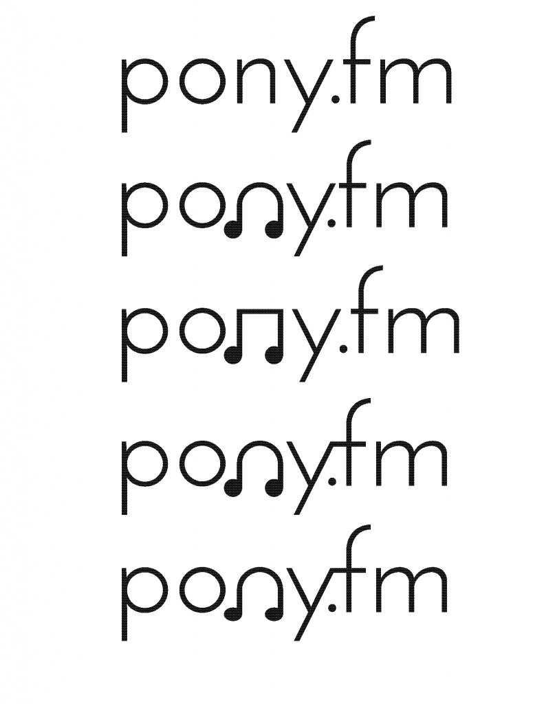
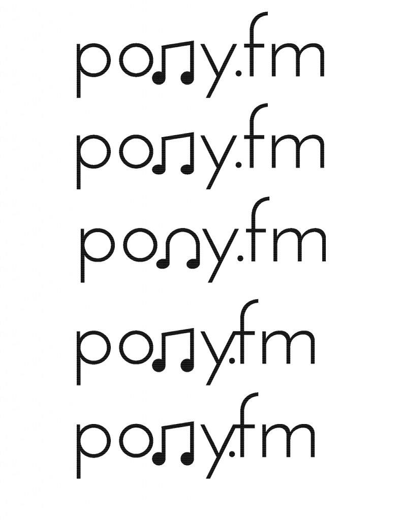
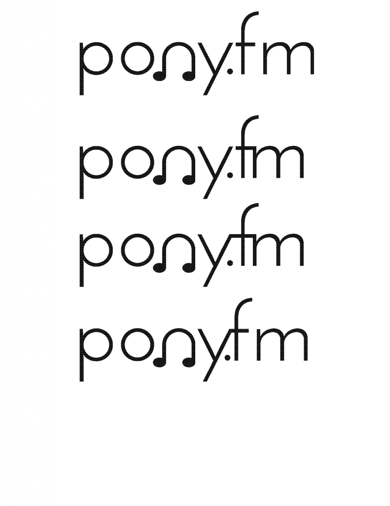
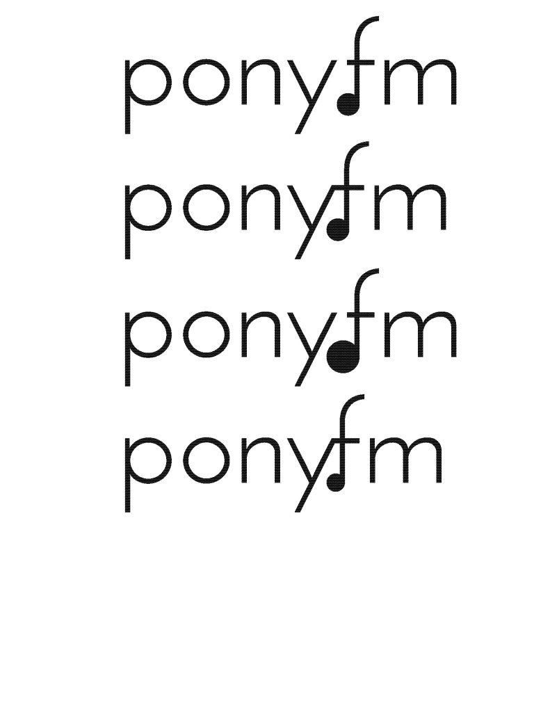
-
What you see above are concepts for the Pony.FM logo. All of them are in lowercase and Josefin Sans Light to remain consistent with the Poniverse corporate identity and to tell people passively that Pony.FM is a community within the supercommunity.
For most of my time, I played with "n," the dot in between the "y" and "f," and the space between the "f" and "m." I started with the simple "pony.fm" wordmark and then began to play with the trademark infusion.
Because the y, f, and m make very unique negative spacing when the letters are closed, I played of making typographic ligatures. There are various examples in many OpenType typeface files like Caslon, Garamond, and Myriad Pro.
For the "n," it provides a very unique opportunity to convert the octave into a letter, which in turn can become the logo's trademark for cross-media icons and avatars. My personal favorite is the horseshoe Octave because it gives the wordmark a trademarkable identity, something the traditional octave won't do. Some of the "n" octaves have circular or oval heads.
But before I decided to submit it for public viewing, I got the idea of using the dot between the "y" and "f" into a musical head. So I combined the bottom of the "f" and dot to make the ".f" its makeshift note. I didn't make the "n" and "f" notes simultaneously because it would be overkill. When you put the same message over and over again, it tells everyone you're trying too hard. (I still haven't abandoned ligaturing two or three letters quite yet.)
Submit your thoughts below and provide extra ideas to develop the pony.fm logo. ![]()
-
 3
3


2 Comments
Recommended Comments
Create an account or sign in to comment
You need to be a member in order to leave a comment
Create an account
Sign up for a new account in our community. It's easy!
Join the herd!Sign in
Already have an account? Sign in here.
Sign In Now