


Gaviera
-
Posts
41 -
Joined
-
Last visited
Content Type
Profiles
Forums
Character Archive
Frequently Asked Questions
Equestrian Empire Character Archive
Golden Oaks Memorial Library
Pony Roleplay Characters
Events
Blogs
Posts posted by Gaviera
-
-
Hey, really sorry to respond so late. Thanks for taking your time to give this a critique.
BLUH, I completely missed those bare spots and forgot about brush direction (Still pretty new to actually having a direction when brushing! It's a cool painterly effect, but I gotta get used to it.) I definitely feel like gravitating towards cleaner work, and am trying to go more towards this type of cleanliness as well as color mastery (and expression in form and hella creative thought, though that's not really covered in this work, this one is just a color study).
True! It does look separate, somehow the lines were harsher. I think it might have been attributable to using such low values in a particularily delicate parts of the palette, especially referring to his chest bands. Adding shadow to the arms would have also been useful, it kinda looks like a tattoo of an actual arm in retrospect, lol

Also, I actually really like the idea of using colors to imply shade more than a higher value contrast! It's a lot more subtle, I think the artist that I linked above does it a lot better. It's one of those kinda goals,
Thanks broseidon
-
Let's have another go at it.
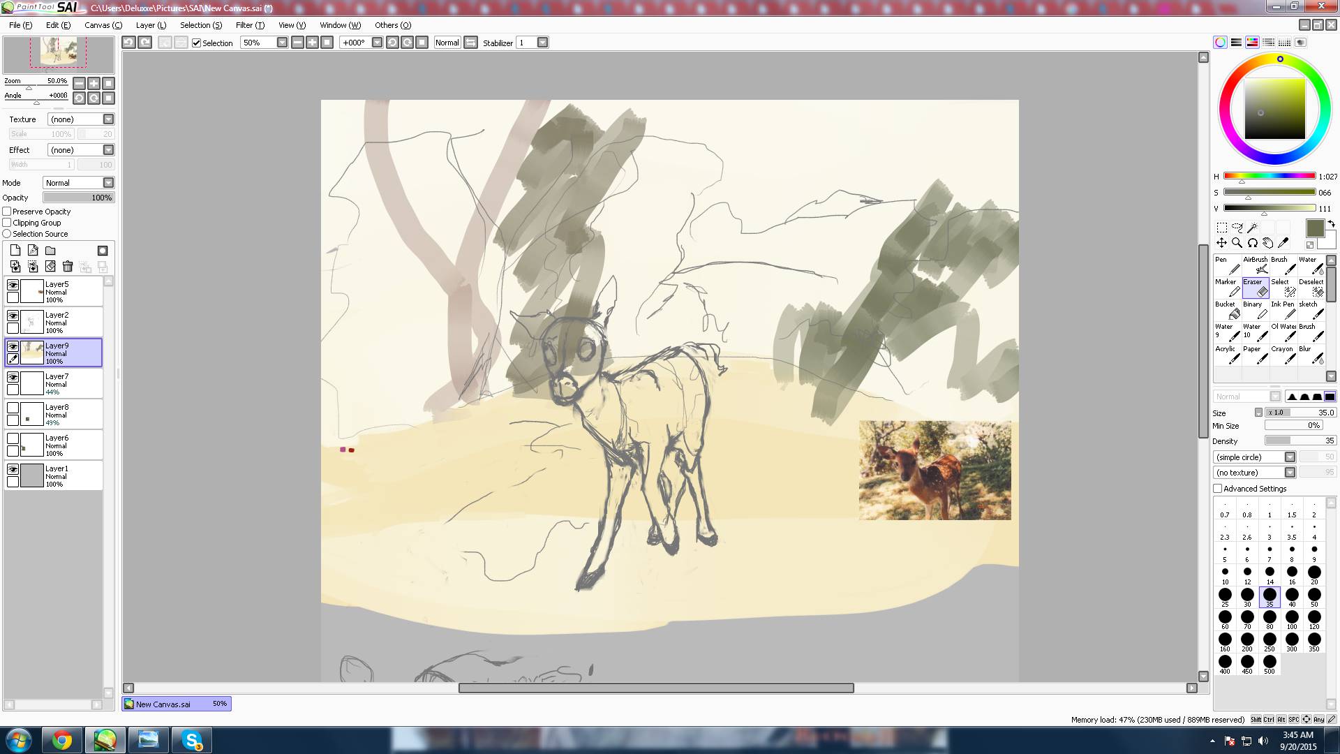
This is a bit of an experiment- I've been playing around with colour theory and techniques and have finally been able to manage something worth looking at. I'm still green with colours, (kek) so, I'd like to know what you think. I don't quite have a set technique down, but what I did and will try playing with a bit more, is setting up a base colour under the sketch, painting basic colours over that (same layer, so the brush blends 'em), then airbrush some more colours into the whole thing and colour pick from there with my painting brush. I'm thinking the beginning layer with the base colour (In this case, red.) could actually be skipped, and then I could add it later in the airbrush phase. I think the colours would end up the same... maybe? Maybe. Probably not, actually.
A little observation I had was that making new linework, as opposed to my last image, which I basically just carved my final image from the sketch, is very difficult. It's also very difficult to get a good colour, as sometimes the lines could be too subtle or too harsh, or I could have just messed up a curve or something. Maybe difficult isn't the right word, maybe it's a little frustrating, is all. Stabilizers feel too awkward and clean, though.
Also, cleaning up was a mess, but with airbrushing, I feel as though the technique is more intended towards images with backgrounds, so the colours blend nicely.
-
Really sorry I didn't respond earlier, either the message didn't get to me despite following the topic, or I probably accidentally skipped over it.
Since the time I posted the topic, I have finished it and left it here. I should probably mention, I was advised not to use the colour selection tool on the actual reference, early on in using color, or I might develop a habit of using it as a crutch. I found it really hard to keep colours consistent, and the blending was real pain to manage.
Since I finished it, I've also managed to get a grasp of what hue, saturation, and value were and how they were different through this color study, and have been reading up on this thingy to act as a sort of guide.
My initial question when I started this topic was along the lines of: How should I proceed? To learn, I mean (and also, techniques 'cause I need to actually apply it). How I planned to proceed when I thought no-one would reply, and still now, are to keep studying that color theory link and apply the knowledge learned from there.
The painting was extremely awkward by the way, I just spammed layers until it looked vaguely okay
.What sort of questions? Also, what do you mean, by shape control?
-
too much swagger to forget this
https://soundcloud.com/californiaexempt/no-diggity-blackstreet
no diggity, no doubt.
-
Hello. Gaviera here. Was working on a drawing, just sketching things out, and marking the scenery with basic flowy lines, and nailing down some anatomy, when I thought I would whip up some colours to take up space, just see how it would work, kinda like how I put those loose, flowy lines to indicate generally where something would be and how it would work. But then I realized, I have no idea how to use colours. I just plain never used them. All I know is the colour selecting tool, and that's it. I don't even know where to begin with colouring.
It all looks like a mess of solid colour when I tried it, and didn't really help quite the way those loose lines do. I know it's something better artists use, though, a kind of sketch for the colouring phase, just laying out the foundation, but I just plain don't know where to even start. Could any artists out there give me a little help here?
As a reference, the type of things I really want to learn to do and apply to my own artwork
I really like lines, you see. Anyway, like I said, I could really use some help from any of you artists out there. Thank you.
-
 1
1
-
-
Just getting caught up, I stopped on Amending Fences, and Moondancer totally had a crush on Twilight. No diggity, no doubt. I ship it forever.
-
catching up on episodes, and, though I kinda hoped that Moondancer would actually have a different problem that led to her being that way, and not having it be all about Twilight, they did show the other friends to show that moving on isn't usually that big of a deal, like it was to Moondancer, so it's more about the character and how she was affected. I really liked her. Moondancer.
Also, you can NOT tell me she didn't have a crush on Twilight come on that is the most obvious ship the show could have spoon-fed to us. This is leagues above the AppleDash tension in that Falling of the Leaves episode.
[Rainbow Dash]: "Ready for another pony ride?"
HUEHUEHUEHUEHUE
-
2
-
-
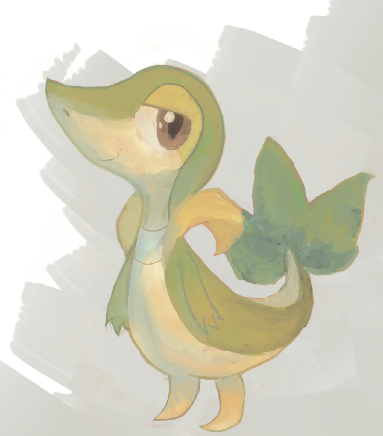
The best designs go beyond the show style, and play around with different types of bodies, different builds based off different types of real life horses.
Also, clothing, and hair and tail is pretty important, as well as expressiveness, if we're talking different styles here. Markings are kinda cheap if you don't have good story to back it up. Tattoos are a bit of a rarity, but could probably be executed well by someone that knows what he's doing. Otherwise, it looks like another cutie mark,
Show-style MLP OC's get pretty boring pretty fast. It's like an assembly line.
But, bottom line, OC's have to, at least, follow basic colour theory, if nothing else.
-
1
-
-
brush that messy mane
-
I'll be honest, you're probably not going to like this.
I'll give you a hint
it's-
(or I Got a Name by Jim Croce)
-
Right.
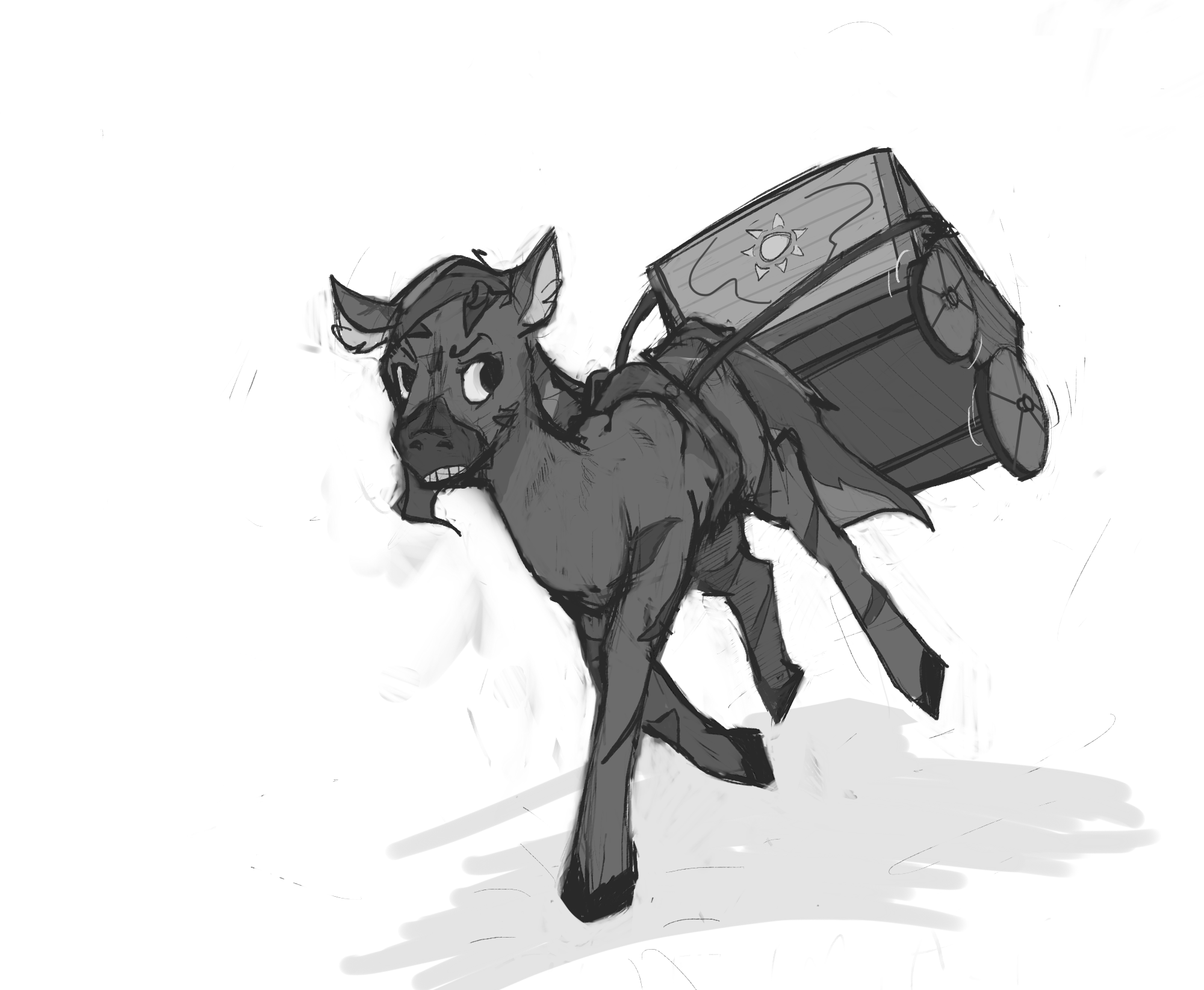
My biggest issue is with the back legs. The joints don't really match up, especially at the hock and below. On his left leg, it's pretty far up, almost in line with his stomach, while on his right, it's almost halfway down the length of his leg. Meanwhile his left leg is about 2x the length from there down, and seems to possess another joint? I dunno, I think that's just worth brushing up on in terms of anatomy.
Next point; his left shoulder--the line around it more specifically. While the bone structure looks great and hints at a good grasp of anatomy (in my opinion), the dark line around it is just a little too thick, and gives it the look of jutting out far too much, almost as if there's a big crevice between his shoulder blade and torso. I think that's just a subtle touch of the line art that went the wrong way here is all.
Another thing that struck me, is that the eyes and muzzle seem to be at different angles from each other. If I ignore the nostrils, and draw a line down what I think is the center of the muzzle going off the eyes, I run into his right nostril rather than cut between them.

Those are honestly my biggest. The rest are just minor nitpicks.

- I think if you had his right front leg kicked to his center less (like, if it was it's own layer, basically scale it horizontally so it's closer to the left side of the image), it'd fit the perspective of the image a little better, as it seems a little sideways in space.
- The mouth looks a little flat; I'd need to see more of your artwork to judge better if it's a fitting stylistic point, but having only seen this image, it looks a tad off (especially since no bottom lip is visible).
- I think you could add a little more interest to your back legs if you curve one or two backwards more; they look a bit too parallel and straight, and while the overall look is great, I think you have a chance of mirroring the staggered gallop of a real horse and making similar images even better.
- Cart wheels are a bit different in size. Extremely minor nitpick at this point.
Sweet! Critique. Aight, let's hop to it-
-True, though I was gonna argue that it's more a trouble of me trying to force perspective, though, it turns out they were BOTH slightly misplaced. I drew some redlines to indicate how the legs should have gone, probably, with the difference being less dramatic. That mystery joint, though, that was scary. Just me trying to look cool, I guess
-At first I didn't understand, but I applied some unsaturated blue to thin down the line some and oh my god that looks so much more natural than it did before. Good catch! That mistake was probably a result of my process where the sketch layer would eventually become the lineart layer. Very messy, but also very fun.
-At first I didn't quite understand, and I'm not really sure if I do, but the redlines showed me that there was a bit of a distance issue with each of the nostrils to the center of the face- is that what you were talking about? I corrected it, either way.
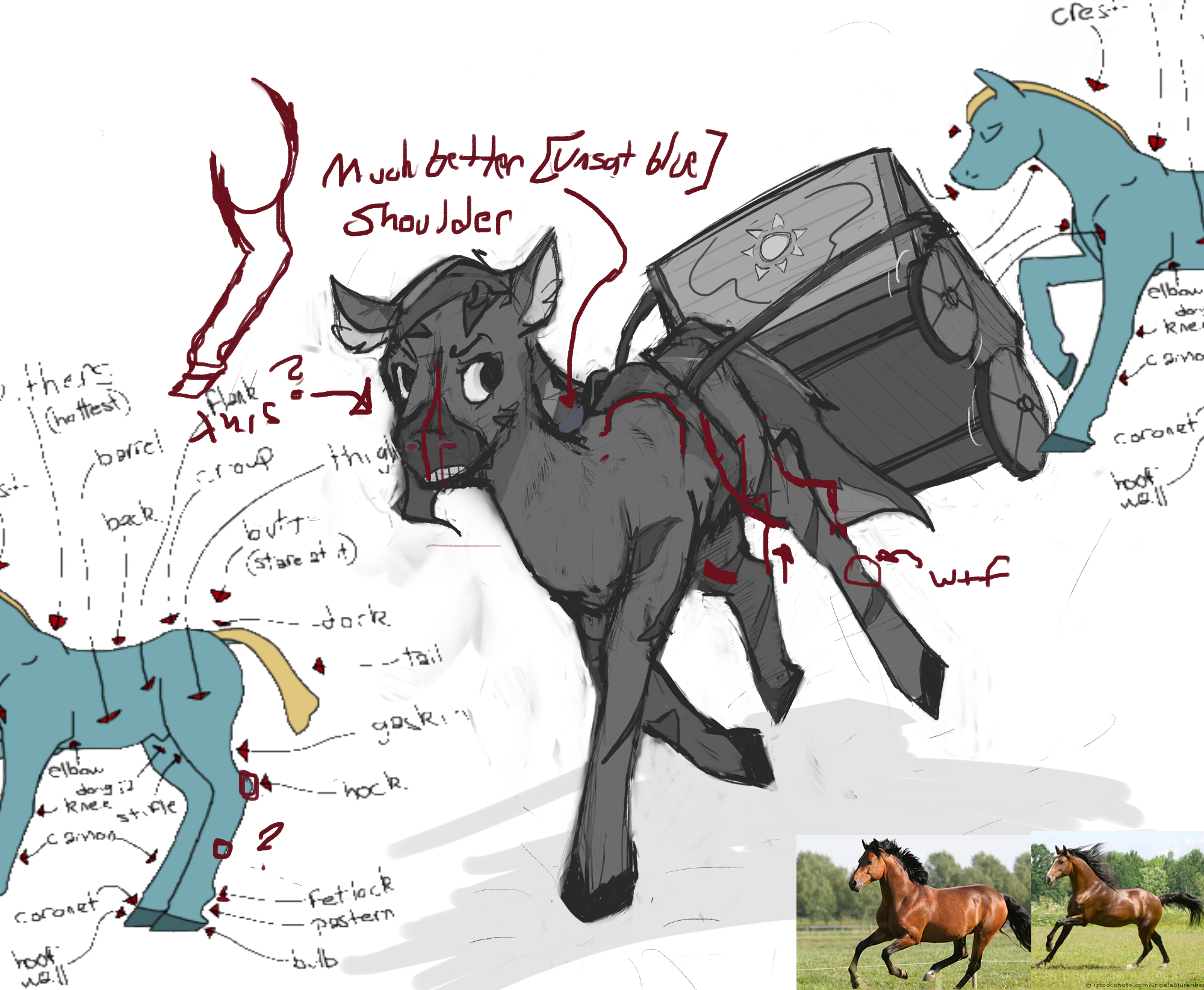
-Made some edits, to the front and one of the back legs, keeping in mind proper anatomy and perspective a little more closely. It does look a bit better, the gesture!
-Mouth being flat was my only cop-out in the entire work, if you forget me forgetting to plan a background. It's not really reminiscent of the style I want to be chasing, but I didn't want to get too specific about how equine mouths look and move the skull after I had already done linework and forgot to add a gahdamn mouth
-It was... kind of on purpose? I had this reference image open, but really, the cart's body doesn't match the one in the reference, so it really has no business having differently sized wheels like that. And no, I wasn't going for a wheel with spokes like that one, It's just supposed to be plain old cylinders

Anyways. Done with looking at potential areas to work on. I want to restate that I really do just love your style. :grin2: Like I more or less said, it seems to capture a lot of the liveliness and charm of sketches, while also keeping a higher level of polish and depth. I think a good bit of it is in the lineart: it is extremely rough, but bold and pretty solid at creating form, so it has a natural interesting variation without losing clarity. I also like that a lot of your joints and body parts have the feeling of a structural component underneath; like, with the back hips, shoulders, and front legs in particular, they feel like joints made of muscle and bone. While I can find little hiccups here and there elsewhere, it's still a great thing to see--I think what issues you have can be ironed out with more practice, and maybe studying reference images more.
 You really do have a great thing going though, for sure. Awesome stuff!
...Also, another positive I wanted to mention: I like the small locations of shading. It adds a great touch of depth in places like his midsection and underneath his jaw, but it's still sparse enough to not really draw much attention. It's a minor thing that helps the image as a whole stand a little more solidly.

Aw yis. Thanks, mate! I especially appreciate that you think my work has real "feel", the things in art I love the most are good design,comprehensible complexity, and what I can't find another word for but immersion, and that is a significant chunk of that last one. As well as several other things, but those are pretty big in my book.
Also, reference image practice is the best. I'm thinking of using some photography and using it as reference to practice colours as well as for the draws.
Yup. Shading is a must. Can't go without it. This type of shading is a bit easy, just a bit of hatching to imply form here and there (and just a little bit, since hatching the whole thing is usually hell), and a solid, darker grey. Without shading, it would seem a lot more boring. It's quick, it's easy. It's a good way to create some interest. Can't call something done without it. Unless it's on purpose.
-
1
-
-
My name is Gaviera and I fully endorse pirating Paint Tool Sai
-
what up
There seems to be a lot of critiquing here but not much exchanging. I'll drop by sometime and see if there's anything I could chime in with, eh?
Anyway,if you don't mind me giving you even more work, I made this here thread with a little more info, asking for critique before even coming across this one. Wanna give it a shot? Here's the image:
Thank you for helping artists out, by the way, that's really great of you to do!
-
1
-
-
I'm not really used to getting criticism, or even posting work online, let alone even use a forum, but, hey, I want to use everything I possibly could to get better. Anyway, onto the drawing.
Let's see, this is from my Request Guild thread. I wish I had made a background for this, but unfortunately, it wasn't planned for in the early stage, so I didn't add it later, and it's also missing some colour, which I also want to learn, but some other time. My primary concerns are lack of efficiency and cleanliness, though I am sure there are more issues. Also, still a little green to tablets.
Also, by lack of efficiency, I of course, mean, with lines, too, though I AM a fan of complexity, but I mean more about the glaring issue that this took me literally 15 hours
If any of you artists out there can find anything else worth mentioning, please do, and thank you for examining my work.
Here's the image.

-
1
-
-
What up
Cool music! You seem to get around a bit, with all those collabs and features! I recognized your name from one or three songs I'd heard before. Anyway, glad to have you visit. Welcome aboard.
-
Dear Princess Celestia, today I learned, I'm patient, but no way beyond hell am I efficient.

Got 'em
Sorry for the lack of background, I was going to add it, but I hadn't planned it since the beginning and that rarely goes well. Also, nuoice OC. Good. Interesting. Stuff. Words. -
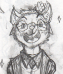
Name: Gaviera
Gender: Male (I think)
Country: Mexico, Monterrey. (Taco Land)
Interests: Animation, drawing, graphic novels, manga, comics, film, adventure, and the novels of that genre, cinematography, furries, pones, I suppose. FoE is also pretty coolio, especially Project Horizons. Also, a whole bunch of music.
Dislikes: Distractions and wastes of time like videogames, and let's plays. Not a fan of conformity, Gotta keep busy. I dislike people that are dicks. You can tell when someone's a dick. Don't be a dick.
Info: I wanna be the verrry best, like no-one ever waaassssss (animation and sequential art.)
@@Kothen Drawing? yooooooooooo
-
3
-
-
Yes.
Any bass drops. That's Dubstep,D&B, Hip-Hop, (less trashy Hip-Hop), Electro, anythin'!
And guitar solos are also cool. Power Metal (my fav for guitar solos), Rock, Blues, any genre is good. MUSIC IS GENERALLY COOL, SHIT IS AWESOME
-
A few:
"THAT'S SOME GOOD SHIT RIGHT THERE" x99, with the word order switched around every time, getting more and more hype.
"oie zi"
"Bitch." As a way to end a conversation, or punctuate a particularily badass statement, after a second of silence.
-
Struttin' with this song.
-
Banned for being slightly aggressive and opinionated.
-
Banned for supporting McDonalds and their insanely crap, but affordable food.
-
1
-
-
Discipline before inspiration or motivation. You just do it, and you keep doing it. Motivation isn't bad, but it'll leave you a lot more easily than proper discipline will. You want to be good? You work at it, do it as well as you possibly can, and do it with consistency.
Also, have fun.
-
Fuck yeah, went to class with 'em on too. Fun day.
Ive been drawing for 1.5 weeks. I have my pencil art, and lineart made of it....
in Photo Finish's Magics (Visual Art)
I'm afraid that my limited knowledge is more based around digital painting than vector art, which is a lot more of a cell-shaded look. Hopefully this can help you, though! It's obviously geared more towards Photoshop, but most of that should carry over onto any program that lets you vector.
(Unless you DO happen to have a tablet and have an interest in digital painting, I could introduce you to some basic concepts I learned as a beginner, though I am by no means a master or even an expert.)