


Pix3M
-
Posts
585 -
Joined
-
Last visited
Content Type
Profiles
Forums
Character Archive
Frequently Asked Questions
Equestrian Empire Character Archive
Golden Oaks Memorial Library
Pony Roleplay Characters
Events
Blogs
Posts posted by Pix3M
-
-
The way I see things, Pinkie's head shape is a little squished, flank area is too round, and the size of her mane and tail appears a little big, and the ear should be more elongated. Heck... I wonder what happens if we put a transparent layer of pinkie in this exact pose over this drawing?
 (Something I've done as a last ditch effort trying to figure out why my drawing doesn't look right)
On top of that, you can always have smoother outlines.
-
I absolutely do not mind, a constructive discussion of what more can be done is something I'm always looking for because without it I really can't get any better. There's a limitation to how much you can improve just by making a self-criticism.
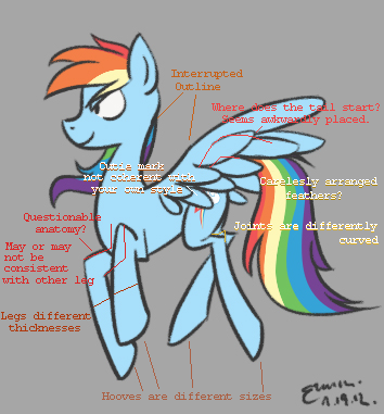
I intended to point at anatomical inconsistencies, but I found other stuff that might be worth pointing out.
As for the questionable anatomy note, I'm not sure if it's as inconsistent as I thought. The outlines area appeared to be placed too high for me.
About the carelessly placed feathers, last I remember avian wings, their feathers are well organized for flight.
I believe the issue with not being able to draw something consistently enough at least partially comes from not establishing minor details like the size of hooves among other things. I wanna say that more attention should be paid to anatomy despite how you're clearly disregarding show-accuracy for your own style, but I'm not sure how much effort you're giving on your part :x
-
 2
2
-
-
Yep. Definitely an interesting style that stands out from other works.
While you're trying to be able to draw things consistently, it's a little funny that I can see potential inconsistencies from just one picture. Mind if I Point them out though? I also don't know my horse anatomy well enough to describe the exact areas I want to describe, so I may have to doodle notes on your work.
-
1
-
-
He looks very cute and this looks pretty well done especially sine you used 95' ms paint. Good job

Last I remember using windows 95 MS Paint, it's not that much greater than newer versions. It still has the same infamously basic tools.
I dunno about 'well done for MS paint'. As a program for digital painting, sure. There's definitely effort put in to try to make use of what little MS paint can offer, but I believe that making great art has more to do with working with what you're given, not what you're given. This *could* have been more than a pony at a cliff with clouds. Maybe there could have been trees, or anything else we could come up with to make the piece less empty.
Considering how basic MS paint's tools are, it's best used for creating pixel art, and pixel art is a medium that works with the very basic tools that MS paint is infamous for only providing. Wanna make something awesome with MS paint? Learn pixel art. Look at what I made for instance

-
... how eerily this pony represents you? I'm probably drawing the line differently, but I'm not seeing how a RL person could look like a pony
-
Now that is one thing i do not have, but it is worth a try.
If you ask me though, the first sprites I ever made were very small-scale. Only VERY recently, like a couple of months ago, I started attempting pieces in excess of 100x100 pixels big. Besides, I believe that small scale is what beginner pixel artists should try out anyways, and it can surely build confidence for larger works that demands a lot more micromanagement with pixels.
-
1
-
-
Ms Paint
Haha.
Video related:
http-~~-//www.youtube.com/watch?v=D-geaXexeqg
No tablet? You could try your hand with pixel art if you're the patient type.
-
1
-
-
>Attracted
Why then?
-
Yeah I used my Pony Creator Pony as the base of the vector to learn the dimensions ect
Eh. I find pony creator images to be very boring because of the usual uninteresting pose you see very often. See what happens if you trace a more exciting pose as a base and add your OC's design?
I hardly know anything about vectors so I can't tell what's a great attempt versus a poor attempt, but if there's anything I can point out, the back rear leg doesn't appear to be curved correctly as it suggests your OC's flank is meatier on one side than the other. That's about the only thing I can say, so I guess it's a good attempt by my standards.
By the way, going by what a vector artist once told me, I hear that fancy gradient effects such as the one you see on the cutie mark are an issue with vectors though, issues involving compatibilities and such. It's also not very true to a show-accurate style and it shows as you don't really see effects like that used at all. Just sayin'.
-
It looks a lot like a pony-creator image O_o
-
(ones like #MLP-FiM and #PonyPixelIcons are some examples, the latter of which I think PixMeister is even a maintainer of)
At this point, the group is kind of running itself and since I'm usually preoccupied, other contributers are usually the ones accepting group submissions.
This is very true. dA is a nice community, and while you'll run into trolls every now and then, most of them are pretty lame and you can opt to either mark their posts as spam or mock them for wasting their time trolling over ponies. I generally do both, though most of them aren't worth the time so I just mark 'em as spam and move on. PixMeister loves to have a blast with them however

That only happened once. Maybe twice as I was notified of an art thief but taking it through notes =v
And on a final note since no matter what I do this will probably be a wall of text I'm going to agree with Pix about the importance of disecting other's works, looking for problems, making note of the techniques used, and what makes the piece "work" and note anything at all that you feel doesn't make it "work". Personally I've gone down Helm's gallery and disected two or three of his works for an hour or two each, I'm currently going over this one:
(Probably one of my favorite pixel pieces ever) Less impressive to me for "super largeness" and "super duper complexity" factors as it has neither, but the style and colors used make it incredibly impressive to me, especially the illogical geometry that somehow actually works really well; Not so much to learn about pixel technique from this one as there is the "creativity aspect" and the genius of the elements used. You should definitely be going over other people's works to see what makes them so great, and learn as much as you can from them.
IMO, I would imagine the process to be comparable to my own process for doing hair. For all I know, the artist got the basic shading down first, then the next steps would be manipulating the shape of the pixel clusters to create an intended effect but still adhering to the original basic shading.
-
...I've been thinking of opening a dA account, but there's one small thing stopping me.
I'm afraid to show anybody my sprites, cause, well, I'm afraid better spriters will mock me. What do you think?
Will anyone mock me because I do ultra-low-res sprites?
Trust me. Most people do not leave nasty comments. People tend to have a 'if you don't have anything nice to say, don't say it' mentality, so if anything, you'll either hear kind words, or nothing at all.
-
Ah, got it. I just don't want people to think I'm Oryx.
He's way better than I am.
Also, is this the Iso Castle?
It's pretty awesome. And I don't usually like really high-res.
Hence the sheet of Oryx' sprites I'm modelling my ponies on.
Yes, that's the exact one.
-
Oooh, I just saw it! That's really nice!
Actually, what I was thinking of was a starry-eyed, bedazzled face. Very similar to the Rarity smiley face we have on this forum! Kinda like when she says "REALLY?? Like the eyes here, but with the whole face, smile and all:

Hmm, sounds like a fun change to attempt at a spriting technique used for animations.
Feeling a little iffy on the composition of that example though. Think I could get away with tilting the head just a bit if I ever get started?
-
Oh, god, I just realized I didn't put a note until just now stating that I'm not the 'Oryx' who made that first sheet. I just love the dude's style.
I figured that you didn't make the sprite sheets after giving it a second thought. I only addressed you as Oryx to indirectly ask if you were the artist of those retro-styled sprites, haha. People will just naturally assume that a work is yours if you just present it to people.
One day, I had am image editor opened up editing a work done by a guy who goes by Fool, one of the greatest pixel artists around. His isometric castle piece caught my eye, and the artist left comments that heavily implied that there were flaws in the work, and I was curious to dissect the work and see if I can get past the impact of how awesome his work was and find flaws that he neglected to fix. I was doing this in a computer classroom, and one guy said behind me "Sir, you have waay too much time on your hands". I had to explain that I was not the original artist. I am kind of flattered that I could be mistaken as somebody that good simply because I was working on one of his works.
-
Let me know when you start taking commissions. I'd gladly pay for a custom Rarity avatar!
Kind of funny as I've already made one (you can dig into my dA if you wanna see). I don't think I'd mind making multiple ones for the same pony with different expressions though in case the expression I went for isn't something you want.
-
And Ashbad, I'm not limiting my pallette simply because if I do, then you won't be able to tell the difference between 2 ponies with similar colors. I.E. two red ones with blue manes and cutie marks.
I believe that the comment could also be applied to the non-pony works you showed us.
(To think that the NES can only handle sprites with 3 colors plus transparency.) -
You work is AMAZING!Just AMAZING did you use MC paint?
I did not use MS paint for these. I use a different program called graphicsgale, which is basically MS paint with animation frames (each coming with their own set of layers), better support for restricted color palettes plus alpha channel, and customizable keyboard shortcuts. I work much faster with that than MS paint.
-
1
-
-
For a larger worker? I'd be willing to do, like, $25 for a larger work.
Not sure about larger works. I don't even know how much time it takes to make bigger stuff. I think I'm gonna stay working smaller scale for a bit and keep making avatars as pixel art is one of the more time-consuming forms of digital art.
-
I'll have to confer. It might be possible. How much are we talking?
At least $10 USD, possibly more as I don't even know how hard I'll be flooded once I open them back up after I make one last one for Rainbow Dash
-
THAT was done in paint? You would be a god with a tablet.
Lol you don't even need fancy motor skills to make pixel art.
Though maybe I should try out digital painting some time anyways...
-
I would be happy to make a comission, but I have no idea how to transfer the money. I have a bank account, but no Paypal, credit card, or debit card.
I have a paypal set up, so yeah, if you ever commission me in the future, that is how money would be transferred.
-
MS PAINT...
CHALLANGE ACCEPTED.
She is beautiful! Hahahha
Seriously though, I can't understand how it is possible to just.. Make awesome art in that program. NO LAYERS. :L
You can't understand? Didn't I just make a video showing the EXACT process to make stuff on MS paint?
-
Amazing! Do you take requests?
Requests? No. I'll get too many requests piled on top of me if I took them.
I want to see your art
in Photo Finish's Magics (Visual Art)
Something old and could be majorly improved:
Source: http://fav.me/d4z6q85