


Pix3M
-
Posts
585 -
Joined
-
Last visited
Content Type
Profiles
Forums
Character Archive
Frequently Asked Questions
Equestrian Empire Character Archive
Golden Oaks Memorial Library
Pony Roleplay Characters
Events
Blogs
Posts posted by Pix3M
-
-
I think you completely misunderstood what i said. I took the reference image, zoomed in as far as i could, and rebuilt it pixel to block manually in minecraft. That green picture is a top-down screenshot in McEdit of the map with the pixel art. By "pixel art", i dont mean the screenshot, i mean the 50 thousand manually placed blocks in minecraft.
Gaah, I jumped immediately to the McEdit as it's difficult to see the actual pixel art from a screenshot of a 3D game. Sorry. All I saw was the single-pixel noise in the cutie mark and the misplaced pixels in the front of RD's front leg and saw it in the McEdit, and thought the McEdit was the exact copy.
Even then, putting aside the McEdit screenshot, I still doubt you actually spent 15 hours on this. How did you build the entire thing in the second screenshot (manually too) just to decide "oh, I think it's too big." Did you really go through all this trouble?
-
You could sell that, yes, but I doubt an art professor would say it was talented or "good". We can't truly know on that point, so instead consider this. She now uses a tablet. Here is the difference. There are many things about that arial drawing that are amateurish and she was definitely helped by her strong traditional background.
Aside from anatomical issues like the exaggerated size of her forehead and such... anything else amatuerish about that piece? Just thought I would learn something along the way.
-
You did not manually place every pixel. There are a bunch of jagged lines, and there's single-pixel noise in the cutie mark. The inconsistent line thicknesses of the outline of the cutie mark clearly suggests that you scaled the image with nearest-neighbor interpolation to try to make the image at a more suitable size. I cannot imagine why a human being would decide to do any of these, so I'm inclined to think that you got some computer to attempt to convert the reference picture into pixel art. It's like tracing, except even lazier.
At least be honest, okay? I don't like seeing people lower the quality of images already in existence call their work 'pixel art'. =/
If it's useful, here's the sort of smoothness a real human being can achieve. This is a very quick and dirty edit. There are going to be mistakes, but it's far smoother than careless scaling with nearest neighbor interpolation.

If you ever wanna go deeper into pixel art, it's always helpful to pay attention to the placement of every pixel to make something appear as refined as you want it to be. Also, a friendly warning... you still need to be able to draw to make great pixel art.
-
Ever thought about drawing from references? In case you really want to have your art resemble the 'real things' even more, it may be useful to look at a pony and try to draw exactly what you see. You'll eventually draw a lot better from memory when you do this.
Plus, the way I see things right now, if you try to think of their bone structure, that doesn't exactly make the most sense.
-
He's meant to be hated.
Also, I find it hilarious that the topic title is cut off on the list of recently updated topics so it almost looks like a thread bashing on a forumer named Blue.
-
Absolutely! I'd love to see your insights and notes on the drawing, so feel free to do that. I'm sure it'll definitely teach me some new things.
Alrighty.
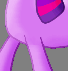
Notice how extending those outlines make the legs pop out of the chest as if it's in front of the chest.
Also be aware the ponies have joints and bones. I've drawn a line starting where I believe a pony's shoulder should be, which should be located behind the neck. My knowledge of anatomy of real horses are probably not the sharpest around, but either way it probably wouldn't hurt to imagine the internal skeleton of ponies to avoid placements that might seem off to some people.
The back legs also seem a little lopsided. It appears that the lower part of the leg is longer, so I did a quick sketch of what the shape of that back leg should really be to stay consistent with the other leg. The legs are also spaced inconsistently; Twilight appears to have her body in a side view but the leg placements suggests something more 3/4ths.
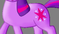
I'm also seeing an area which this GIF should show, which looks to me as a flat area. Lately, I've been trying to imagine areas of solid color as a flat area to help me grasp shading, and that's what I end up seeing. I believe a little more precise shading can help make the chest and flank pop out a bit more. Maybe lighten the area in front of the flank, and darken a bit of the area behind the chest.
I also hear that a much better way to shade for beginners is to cell shade, which in a nutshell is using transparency effects like multiply to darken areas instead of actually changing the colors of what you're drawing. I don't really do digital paintings as I work with a totally different medium so I can't offer you much more advice on that except maybe look at whatever tutorials are out there on cell shading are on the internet.
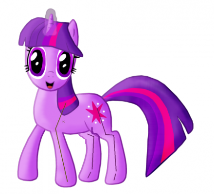
Then, there's the colors. Twilight's hair is actually a shade of blue, not a purplish color you picked. The low hue contrast from the hues being too similar makes your piece seem... really wishy-washy (for a lack of a better term). From experience, colors tend to be really big on making an impression (at least for me), but this is probably coming from somebody who's been told has a really great sense of color.
Good luck with your next piece!
-
 1
1
-
-
Mind if I make annotations on your works? Some things will be a little hard to describe with plain English, and I think you'll find what I see to be very interesting.
One thing I can describe though... if you look at your own eyes in the mirror, the circular area defined by the iris is going to be covered by the eyelid, unless you open them really wide as if you are feeling shocked. For this reason, that's how the animators for MLP draw their pony eyes; partially covered but shrunken in times of emotional stress.
-
1
-
-
It has more to do with how you use what you're given, and what sort of medium you want to work with. I'm a pixel artist and I've made something that dropped people's jaws with MS paint.
Chances are you want digital painting though, but people will probably tell you that a tablet is a must-have for that. If you wanna stick with a mouse, pixel and vector are other possible options.
-
1
-
-
Ever wondered how turning some really good pixel art would turn out on perler beads? I'm almost curious.
-
I would have never given the show a chance to begin with. Seeing how many people like something is often a useful heuristic to know if something is good.
If you go to say... newgrounds, would you seriously try a game that has an average rating of 2 stars hoping that it's something that's actually worth something rated 5 stars? I would rather focus on the higher-rated ones so make the best out of my time. If by accident I'll love a 2-star game as much as another 5-star one, it's very unlikely as my opinion of that game is most likely going to be the same as everyone who voted so low.
Even then, if people said it was horrible, I would look at it and wonder why it's bad. In this case, I wondered why it's good, and ended up getting deeper into this fandom.
-
1
-
-
I'm the lead artist for the small team I'm in. The tree I drew on my avatar will be something used in the game, though if anything it will probably only appear in a special scene as chances are we're better off with something less detailed for background work.
It's an RPG, with tactical elements. Who's the main hero of the story? Essentially, the hero will be an OC with no personality, just like Link from the Zelda series and they player characters in pokemon.
The project leader currently wants a game to take place in the MLP universe; not the mane 6 universe. Pretty much, nobody except one person is objecting to the idea of an OC game taking place in the MLP universe. This one person suggests that because it's essentially a MLP fan-game, it has to make sense to make the mane 6 major players in the story. However, this runs into several concerns as in order to stick with the gist of the story line and keep the hero and the villian, it will involve major conflicts with what is canon. We also eventually figured that because of potential game balance issues, it may be better off to leave them as 'easter eggs' to try to find in the game universe.
After a while, the project leader decides to slam the hammer:
"Yes, that's the thing. Why can't we just tell the players 'No!' You get to play somepony new and do new things not limited to the mane six would do? New things! Try them out, player! For christ's sakes, it's the MLP universe, not the mane six universe! That's kinda how I feel."
So pretty much, here's the basic pro and con:
RPG game starring OC's:
Pro:
Much more creative room.
Con:
Harder to get people to care about the game (Possibly a very big one)
RPG game starring OC but having mane six as major players:
Pro:
Easier to have people care about the game (Again, possibly a huge one)
Con:
Restricted creative room
Much, much more difficulty with balancing every character (This is a game we are making!)
Possibility of conflicting with canon
It may be best to ask for input from the MLP fan community instead of keeping the discussion within a small group of geeks who happens to be virtually unanimous about being okay with an OC game. How do you guys feel about this?
-
1
-
-
Yes, I should probably have paid a little more attention when I colored it. Thanks for pointing that out

Second drawing that is added to the thread, this time it is Fluttershy, which may or may not be the Rightful Queen of England.
DeviantART for the drawing.
The grainy texture isn't as 'in-your-face' as the picture is a lot lighter so the contrast between the color and the little white pockets makes it more difficult to see, but yeah, makes me wonder if we can take it a step farther and make it a perfect solid color. I haven't worked with colored pencils that often, but I've made really solid colors with very little white spaces with higher-end pencils before.
Some of the best pixel art I've seen aren't immediately obvious that it's pixel art. Some of the best vector art I've seen aren't immediately obvious that it's vector art. Some of the best drawings I've seen aren't immediately obvious that it's a drawing, but I confused them as a photo. Just a thought.
-
I find the picture to be grainy. You might like your work a bit better if you fill in all of the little white spaces you create trying to fill in those shapes.
Coming from a pixel artist who's developing a finer eye for tiny details though.
-
Thanks for the advice Pix3M but I don't have a very good level of english it seems you want to tell me something about some problems with the graphics but I can't understand you, sorry
It's something anyone should really know when if they have ever tried making a game. The right way to make the graphics bigger is to have the game draw all of its graphics on a surface, have the game automatically resize that surface to be the right size, then draw it on to the screen.
If you wanna get deeper into making game graphics, it's always helpful to know some programming to know what is happening on the coder's side of the work.
-
Thanks to everyone who gave me feedback. I have many answers, one question, and another piece. My question is Where might I find a good free vectoring program?
No experience with vectors, but inkscape is a program I hear all the time for vector work.
-
People can look at me as a good brony for having talent. On the other hand, people can look at me as a bad brony for making ponies a hobby that takes up the majority of my days. There are also some points I disagree with.
At this point, I'm just gonna say this good vs bad brony will involve a lot of poop-slinging from different people as people are going to have different preferences on what sorts of people they wanna associate with.
-
Huh. I'm seeing something a little differently from most people here.
It's already pretty difficult to draw something entirely show-accurate, but I'm probably not that much better as I dunno if I can draw them very accurate from memory just yet. Comparing this from memory from show-accurate proportions, their bodies are shorter, all legs are thicker, jaw and flank is a little more rounded, and the ear is larger. Wings might also be awkwardly placed as the far one appears to be connected in front of her shoulder, while the closer one appears to be placed behind the shoulder instead. I have a hunch that their eyes are also slightly larger.
Just what I'm seeing. Disregard my opinions if you want.
-
1
-
-
Don't let what you think you are capable of doing hold you back.
I can probably speak from experience. That tree avatar I drew on a pixelling program... Those are probably the first tree tiles I have ever made, and probably the second tree I've ever spent serious effort on.
Trying something a little different every time.... I find that it gets you places
-
1
-
-
Stuff like this might be better if you went with a vectoring program. If you wanna do more cool logos like this, vectors are the ideal medium for that.
-
Your GIF is really nice, and the detail is very beautiful. The video gives a very nice demonstration of how it was done.
As for how you never got a response, my question is did you write "ART" as a prefix in your subject? If you did, and they didn't reply, it might mean they possibly didn't see it. If you didn't write "ART" in your prefix, chances are EqD will ignore it because they'll consider it spam.
Yes, I did.
-
Word of advice - you probably do not resize your game graphics to be bigger. You set the game resolution to be bigger. The latter results with smaller file sizes, lighter memory load, and is much more polished.
-
9/10 John Joseco is best Joseco
Cropping might be a bit odd though, but shouldn't be a huge deal.
-
Come on guys... Afraid of dirt? She once stuck her face into a trash can full of nasty stuff just to avoid an uncomfortable encounter with Pinkie. If anything, what's Rarity really scared of is ruining her reputation. She's always concerned with how she presents herself.
If any of you guys get deeper into the art community and start looking up to artists that you really like or is highly respected, you'll quickly find yourself very nervous when you're around people more influential than you are, or just people you respect. I've had experience with both ends of this; I've been pretty skitty around artists better than I am, and people are the same when I am around them. If you guys are an artist like Rarity, you'll know that feeling when somebody with a real reputation says something nice about your works.
-
2
-
-
I can't do that right now, but I will when I get the chance. And why shouldn't I use black? I guess it's something I don't quite understand.
You don't have to use black, but instead, consider using a color that seems black, but not quite as it has a little bit of color in it. You can also reconsider your choice of gray using a different gray that seems gray but not quite (e.g. having it slightly yellow tinge like Octavia's coat or something). You'll have much less boring colors, unless boring is what you want.


First OC drawing in GIMP
in Visual Fan Art
I probably should have looked for the actual drawing instead of judging from the first seconds into the video.
http://fav.me/d15fj4r
I'd say you're entirely right, and I notice some mistakes that you didn't mention either. No disrespect to the artist of course as she's gone a long way ever since that drawing.