


Pix3M
-
Posts
585 -
Joined
-
Last visited
Content Type
Profiles
Forums
Character Archive
Frequently Asked Questions
Equestrian Empire Character Archive
Golden Oaks Memorial Library
Pony Roleplay Characters
Events
Blogs
Posts posted by Pix3M
-
-
I never bragged or considered myself an expert or artist of any sort. Now you on the other hand are the master in my eye. I love your work and I'll never be as good as you.
Am I a master? I'm not even as good or experienced as some pixel artists out there.
I also wouldn't agree with never being as good as I am. I didn't even know I would become good enough. You simply gotta do a little research about the sort of stuff you can do with pixels, and you gotta try something new once in a while. I got where I am because I try new things. Knowing how to draw is also a huge plus; if you can make it look great with pencil and paper, you can surely make it look great on a grid.
-
yes i have the first one is a reference drawing but the second one was from memory i am currently drawing another one but its full body still no color though
I'm curious. What picture did you exactly reference? I'm seeing a lot of things that makes this not look show-accurate. Not that you should beat yourself up because you get things wrong as I hear that it's extremely rare for an artist to do this perfectly, but here's what I'm seeing for the first pic.
Compared to what I remember of show-accurate proportions...
The size of the nose is greatly exaggerated. The nostril is placed too far in front, and the mouth is hanging on RD's cheek. I also never recalled seeing a mouth's outline hanging all by itself for a 3/4ths perspective. The eyes are smaller and does not appear to have that slight 'tilt' to the side; when wide open, the very top and bottom of the eyes do not align in a straight vertical line but is actually slightly skewed. Rainbow dash also does not have a black outline under her eye (Celestia and other ponies do, however). The body is also longer than show-accurate proportions, and the wing doesn't belong in the middle of the body but belongs behind their 'shoulder'. The large, lower section of her back legs are also shorter (but to be fair, they are closer to RL horse proportions). Her ears are also smaller and less round. The legs are also thinner.
I might have an eye that is a lot more discerning than most forumers here, but don't beat yourself up. Some of the first ponies I drew were also really off.
If you're interested in more accurate referencing, there's the grid method to give you a lot of fail-safes. It was something I had to do myself in order to get something that resembles something from the show a lot more.
-
Spiderman one is entertaining. Your other gif's are the same old desktop pony edits that I've seen everywhere so they aren't much to brag about.
Also, I don't think you're supposed to have pixels smaller than the largest one you have. It's just weird to see big fat pixels along with normal sized pixels in those cutie marks.
-
 1
1
-
-
Have you considered the possibility of drawing from references, i.e. looking at a pony and drawing what you see)? You'll trip over less mistakes doing so.
-
I don't recall seeing a pony vector with this pose, so you probably drew this from memory. You could supposedly draw from memory, but you can easily draw them rather inaccurate from the show as memory can only go so far. I would suggest drawing from references so you can get show-accurate proportions into memory.
However, if it's useful to know...
If you try a pose that's more interesting (but more difficult), remember that ponies have joints and bones. Don't forget that they also have a shoulder so you can avoid placing the front legs a little awkwardly. I see it as placed too far in front.
Hair also seems a little boring. If you were to exaggerate the curves, your work might be more interesting.
The wings should not be placed in the middle of the body. They are placed a little behind the shoulders.
The size of the nose is greatly exaggerated, as well as the length of the body.
If you try to imagine the outline on the top of her head which her mane is covering up, it doesn't make much sense.
Her eyes are shaped like upside-down U's, but their eyes are actually a more oval. SInce this is a 3/4ths perspective, both eyes should not have the same width. The eye that's farther from us should appear narrower due to the curve of the face.
The feathers are also not long enough. I remember show-accurate feathers as longer and very rounded at the ends. Wing shape is also a tad incorrect, but it's difficult to describe with words =/
-
1
-
-
i tried using a picture of roseluck upside down to try doing what you said and one thing i noticed is that i'd tend to exaggerate the curves when the picture is upside down. in the end i got so dizzy i flipped her right side up again

Hmm... what other tricks do I know...
I know of a trick of drawing the space around an object (to try to shift your focus to what a shape actually is), and there's always the grid method which gives you a lot of fail-safes.
-
That is bucking gorgeous!!! Do you take commissions or anything like that?? D: That is just... magnificent. Stupenda! Amore! Etc etc! You're so talented!
I no longer take them because they take a disproportionate amount of effort to make for the money they're worth. It's pixel art... one of the more difficult mediums in a sense that there is a ton of manual labor invested in them.
If anything, I'm probably gonna shift my focus away from making these and focus more on game graphics. Cursory internet research suggests that it has a much more generous pay. Afterall, pixel art isn't all that practical for fine-art given the amount of time it takes to make them, unless you want something really beautiful.
I'm volunteering for a game project though... I'm still pretty inexperienced so I can't really promise much right now if I offer myself for game developers.
-
1
-
-
dunno, shouldn´t the pixels be more visible for pixel-art (herp- di- derp), but I like your profile picture a bit better, very fine and detailed
Don't let the name confuse you. If you do not use ANY tool that changes the color of your pixels out of your control, it's pixel art.
I'd pretty much side with this guy's definition of pixel art: http://www.pixeljoint.com/forum/forum_posts.asp?TID=11299
-
1
-
-

Just wondering... can people tell that this is pixel art to begin with?

-
9
-
-
I once heard of a trick to try to reference something up-side down. It works by making your brain to draw what it looks like and not what it thinks it looks like as pictures tend to make no sense when they're upside down. Wanna try it out?
-
1
-
-
Well all I can say is how the Sniper from TF2 would say
"HOLY DOODY"
That's actually good, although I have no idea what face Rainbow Dash is doing in there
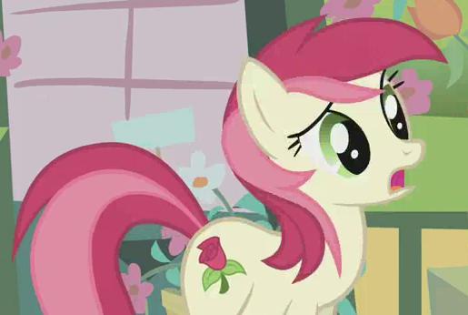
That face came from a screenshot from the cider episode when one of the brothers squished her face. While talking about how ponyville was a little short on cider.
Oh yeah, forgot to mentioned that I did a little referencing.
-

How did I do?
-
2
-
-
If you didn't make them, then who did? Somebody must have made them with an intent of using them. I wouldn't use it for the sake of common courtesy.
-
Your wish has been granted good sir. (Even though it's still in beta....I think. You can still download it and play it though.)
You'll find that the fandom will/has created a lot of this kinda stuff.
At their point of development, it's not even an MMO. What that game is right now is an RPG (which can't even run on my computer). I also heard a rumor that they do not plan on getting a central server so it might never be an MMO if it's ever completed, but who knows.
-
Any game project aiming to make a pony MMO is most likely going to die in the end and never be released due to poor planning and poor organization. Just sayin'... coming from somebody who recently resigned from one of those projects because of those reasons.
Think about it... how often do you see indie MMO's being made?
-
I do hate backgrounds. I find them daunting to draw with my tablet. Those forests were worse than my average bg, but no, I'm not very good at them. I used the pathing tool from GIMP and then scaled it up because I was too stupid to think ahead, but the process is still very tedious. If you have a better method or some advice for just drawing backgrounds that'd be a huge help.
I think the only advice I can give is to just practice. You'll eventually find larger projects to be less daunting, then you'll work at a faster pace when you get used to it.
See my avatar? I drew it pixel-by-pixel. It's kinda funny that I took so long to make really small game sprites around the beginning of this year, then now I grew to have the guts to spend 14 hours or so to make something as large and obscenely detailed as that. (Even then, I still gotta learn how to work faster if I wanna start professionally offering my skills for people). Just remember that some of the best pieces out there took a long time to make.
-
Hello, everypony, I've been making comics for a few months now and figured I should try and get some feedback from a wider audience. There is suprisingly little of it on DA if you don't get some exposure, in my experience...
It seems to work in reverse on dA. There is so much 'crap' out there that people with a discerning eye won't have the energy critiquing everything you see. Everybody there is only there usually to try to get attention themselves, not give attention to artists out there. If they are in a mood to give attention, they're most likely going to give it to one of the more popular artists.
Anyway, http://mole-y.devian...-face-325512852
This'd be my most recent comic.
The rest can be found on my tumblr if you care to look. http://ask-moley.tumblr.com/
My goal basically boals down to trying to get one posted on EQD. I'm well aware that I have a decent amount of ways to improve still but... I sort of feel I more than close if not already there to at least get something posted... But I don't even get replies to the emails so oh well. Anyone have some advice or something?
They once declined featuring my work which got a DD on deviantART. (first world problems *sniff*) Just sayin'
Anyways, before you start reading further, this is coming from a guy who's taken the time and found flaws in this work which itself also got a DD: http://fav.me/d195pka If I sound too harsh, don't take it too personally as even some of the greatest works can have flaws.
I'm more of an artist than a writer, so I'll mostly comment about the art style (which IMO, can really break an otherwise good comic).
One thing that sticks out the most is that your pony anatomy doesn't resemble the actual show enough. Avoid drawing from memory if you can help it, at least until you got pony anatomy down. Look at a pony and draw what you see - it will greatly prevent you from tripping over numerous mistakes. You can do this many times for practice until you got accurate pony anatomy firm into memory.
For example, in the first panel, Fluttershy's eye is shaped like a diamond. It could have had a smoother curve. Her nose also reminds me of the simpsons as it's so rounded. Pony noses mainly curve up and don't curve that much at the tip. The outline that defines the bottom of her head also stops to curve along the neck, which makes her look flat. If you extend that outline so it doesn't turn to start defining the neck and have it go deeper, you'll create an illusion of having her head in front of her neck a little bit so it more closely resembles a pony. Her front leg that she is holding up is also not bending right as she's missing a first joint. Her back legs appear to curve in front then curve back. Pony legs actually only curve back when they're standing up right. Those legs also seem disproportionately fat.
I also noticed the weird quality of the backgrounds. Did you draw them on MS paint and scaled them up with cubic interpolation? o_O I can clearly see square jags especially on those tree trunks which are pretty characteristic of aliased lines. I particularly do not like aliased works like these carelessly scaled up with algorithms that only acceptably work on photos and other pictures of similar quality.
IMO, looking at this, there's quite a way to go until it's something I can enjoy without noticing all these oddities that makes them look very different from their show-accurate counterparts. Other people might not see everything I see, but you can be surprised with what sort of errors people will catch that you won't catch yourself (I once saw an error that Harwicks didn't see. No insult to him, he's still awesome enough to make me stop, absorb his work, and notice such a mistake to begin with)
You also have to be careful with people who don't really have a discerning eye giving you praise. They won't help you very much when you're trying to improve.
-
1: Clopping
He thinks its sick that thousands of people masturbate to a kids show. I eventually convinced him out of thinking that every brony clops. Then he says that its a girls show and why i would watch it. I start telling him that it "Doesnt matter if its for girls as long as its good show" But hes still not convinced.
Bringing up rule 34 is self-defeating. There's much worse stuff for pokemon which people seem to have no problem with. I also once lol'd at one skyrim player who based on MLP for its rule 34 when looking that stuff up to see waht sort of weird stuff skyrim fans made, they aren't any better either.
-
2
-
-
Clearly there is no difference whatsoever. So, I think both of them look just fine. My suggestion is that you stop worr..... The one on the right.
It's okay. Not everyone gets to have good vision to be able to enjoy all of the beautiful details of pixel art. I'm a bit near-sighted myself though, so I can't relate.
.

-
i do see that the one on the right does have a slightly different color tone to it, lol had to look pretty close for some differences if i do remember so, the one on the left is the one from the pokemon series so i choose left!
Sounds like a superficial way to decide what looks better to you. They're both the exact same pokemon and their characteristics are very similar.
-

I am familiar with a number of possible mistakes regarding techniques with pixel art (staircase banding, etcetc). I've made sprite edits and either made it better or worse on purpose with those techniques in mind.
I'd thought I'd ask this place for opinions of everyday people. That is all. -
I know and agree with what you said, except i absolutely suck at drawing, so no real way of getting any "original stuff". Then again, school just started and the classes are booring. My drawing skills might get better soon

I once saw a really good book that you should consider looking around for. It's called drawing on the right side of the brain. It explains that there are right and wrong ways of thinking when trying to draw. If you're serious about improving your art skills, that might be worth your time.
-
I see what you mean. Now that i look at it, it does look quite awkward. As i said in my reply to ThatBlueChicken: "...mostly because i am inexperienced at making these."
Anyways, fixed the leg and the cutiemark, heres another ss from McEdit. Tell me if you see any other major defects.
Anything other 'defects' are gonna be minor or not an issue at all, especially to everyday people who are probably not gonna be the biggest art critics ever. There isn't much to critique to begin with as it's basically a really simple piece done in a game where your color choices are so limited that you can't even begin to try out any antialiasing. The only other thing is to try to make sure those line segments change at a more consistent rate to achieve smoother lines (i.e. instead of going from 2-3-2-2-3-3-4-6-5-7, it could go 2-2-2-3-3-3-4-5-6-7)
As for legitimacy, i guess ill just have to record and upload a video doing the whole thing next time... Preety stupid, but it seems to be the only way to avoid this...
I think another alternative is to try creating original stuff so people can't doubt that you made it if they have never seen it before. Stuff like this looks so show-accurate there's a chance that somebody like me will wonder if they used programs to cheese through the process.
Speaking of show-accuracy, you're never going to make the most out of pixel art by sticking with show-accuracy without second thought.
If you're working smaller scale, you cannot unthinkingly borrow colors used by the show or you'll get really bad contrast and boring colors (see how my avatar uses a grayish-blue outline to make her pop out. You're also not going to have show-accurate proportions as you're confined to a grid (try drawing a 8x8 chess board on a 12x12 canvas, lolol)
If you're working larger scale, pixel art starts becoming silly to use as you're likely better off doing vector art for something show-accurate.
-
Im not sure exactly what you mean, but the second screenshot is identical to the first, just from a different angle (you can see the npc village in the lower left on the first screenshot).
The jagged lines are simply due to minecraft limitations, and the single black pixel in the cutiemark was actually my fault, because i was doing it line by line from bottom to top without looking or thinking about the entire picture, and the lines were too thin so i judged them to be white (minecraft has a very limited color pallete, so making edges is mostly based on deciding where the colors A and B split, you cant fade it like in the reference)
Also, i built it from bottom to top, and when i reached the maximum building height allowed by minecraft (265) i couldnt build up and had to roll it over in McEdit to continue the work.
In the context of aliased lines like what we have, what you do instead is pay attention to the lengths of your line segments. Paying attention to what the curve actually looks like is something you gotta be able to do before you begin trying to manually antialias with your pixel art anyways. Let's look at RD's front leg again. From the top, it starts with line segments that are most about 1 or 2 pixels long before the line jumps on to the next column to convey an angled line. As you go to the bottom you get a really long segment that's suddenly interrupted by a very short segment only two pixels large, then it jumps back to start curving the other direction. Those two pixels create a jag. Two possible solutions could be either removing them, or making them much longer. Am I explaining this clearly enough? =/
My Applejack Drawing
in Visual Fan Art
To add on what everyone's saying, her eye that's closest to us is too small, and spaced too far from the other eye.
I think I remember seeing a vector of this pose. Whatever that vector was, I don't really like it as it's not entirely show-accurate. You could probably get something that resembles the actual show a lot more if you referenced something from the actual show.