Gigapony 650 July 23, 2013 Share July 23, 2013 (edited) Been meaning to make a thread like this so I stop cluttering up the forum with so many threads whenever I make something new. I could've used my original thread, but I wanted to start clean. So basically, in here I will put all my pony drawings, vectors, OC's, and everything else pony-related I make. I will be updating it any time I make something new, so some double-posting is to be expected (I hope that's OK in this case!) I'll start by posting the latest thing I made, which is a vector in my ongoing trek to vector all my OC's. This time Short Fuse gets the treatment. She's probably the OC vector I'm happiest with so far. I wanted to make her more show-accurate so I borrowed Twilight's snout and Dashie's wing rather than vectoring them off my original sketch. Everything else is off the old sketch. And for completion's sake, I'm also reposting the vectors for Wind Shear and Fallout: More to follow~ EDIT: Newer version of these vectors uploaded. Edited July 23, 2013 by Gigapony 14 Link to comment Share on other sites More sharing options...
SparkBrony 379 July 23, 2013 Share July 23, 2013 Wow, these are really good! You wouldn't happen to take requests, would you? My favorite is the last vector of the pony in the hazmat suit. 1 ~SparkBrony The Brony Who Does Way Too Much Stuff! Check me out on Fimfiction! Link to comment Share on other sites More sharing options...
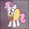
Silverwisp the Bard 2,354 July 23, 2013 Share July 23, 2013 This time Short Fuse gets the treatment. Looks good, left foreleg's position and angle are a bit unfortunate, makes it look a bit detached, eye's outline could be a bit thicker, Fallout: Love it, very show-reminiscent. Left fronthoof looks a bit too pointy and the left ear might benefit from some repositioning and enlarging. 1 My Art Thread, updated (almost) daily Tomorrow will take us away, far from home No one will ever know our names But the bard songs will remain. Link to comment Share on other sites More sharing options...
Gigapony 650 July 25, 2013 Author Share July 25, 2013 (edited) Wow, these are really good! You wouldn't happen to take requests, would you? My favorite is the last vector of the pony in the hazmat suit. Thanks! Sadly, as much as I'd like to take requests (good for practise), I'm afraid I can't, at least for the moment, as I'd have no time to fill them all. Looks good, left foreleg's position and angle are a bit unfortunate, makes it look a bit detached, eye's outline could be a bit thicker, Agreed on the eye lines, they were bugging me a bit too and you gave me the push I needed to fix it. They're a bit thicker now (matched to Rainbow Dash's eyelines), though granted the helmet covers most of it (I really should do a no-helmet version of her... hmm..). As for the leg, I see what you mean. I filled in an originally empty part under her leg by her chest, which hopefully makes the leg look a bit more 'complete', let me know what you reckon. Love it, very show-reminiscent. Left fronthoof looks a bit too pointy and the left ear might benefit from some repositioning and enlarging. Thanks for that! I was worried his overall lines might not be so show-like given his different design. Good call on the hoof/boot, I went back and rounded/thickened it up and I like it much better, makes him look bulkier which I want for him. Interesting thing about the ear, after reading your post I went to see how I could best fix it, so I looked up generic "base" vectors for stallions to see how the ear should go with no mane, and pretty much NOBODY bothers to draw the ear that's (normally) hidden by the mane. So I had to do a bit of guesswork on where to best reposition it. I think it looks about right now, but do let me know if it could be better. I've updated the first post with the new versions for Fallout and Short Fuse. Cheers for the constructive crits, mate! NEW POST: And the next in line to get vectored up is Baton Bleu. She was probably the most labour-intensive one so far, mostly because of the hat, and the fact I kept modifying her design whilst vectoring her. Her manestyle is different than her original sketch. Like with Short Fuse, I wanted to trade sketch-accuracy for show accuracy, and so Rarity provided her modelling services for BB's head and face (which I was pleased to see were already surprisingly close to the sketch), as well as her right front leg (simply because I preferred that pose to the original one). She wasn't easy, but I'm very happy with the way she came out. Aaaagh, I hate double posting... x___x I swear the next one is always more labour-intensive than the one before. Anyway I did a vector for Nurse Ironcross now. Also my first go at doing the unicorn "magicky" effect around the horn. I was going to vector up her syringe (the reason for the magic effect), but I was feeling really tired/lazy after vectoring her and decided not to. Might do one up later. As always, commentary is appreciated and welcomed. Edited July 24, 2013 by Gigapony 5 Link to comment Share on other sites More sharing options...
~Silver Essence~ 2,625 July 25, 2013 Share July 25, 2013 These ponies. They are amazing. Truly one of the uniquely inspired that I have seen in a while. Excellent work on them, they look fantastic. Link to comment Share on other sites More sharing options...
Silverwisp the Bard 2,354 July 25, 2013 Share July 25, 2013 Baton Bleu Turned out very good,looks a lot less like a Trixie ripoff than I feared she would: Thte sling on the baton should be longer, its meant to push a hoof through -eyebrow lines seem a bit thin -hindlegs are a bit stretched, not critically so, but might look better a bit shorter -the one spike of hair on (our) left side of the horn looks a bit odd, maybe curve it/add a second spike/scrap it -that one eyelash curving down looks odd Nurse Ironcross Looks good, if a bit starved for colour. -the forelegs need adjusting in relation to each other in how they attach tto the body -eyes need to be brought to one uniform size (or the upper side of one flattened to indicate it being squinting -again, eyebrows sem too thin to me -the armband (legband?) is a bit off perspective wise, same for the lettering -neck seems a wee bit too thick My Art Thread, updated (almost) daily Tomorrow will take us away, far from home No one will ever know our names But the bard songs will remain. Link to comment Share on other sites More sharing options...
Gigapony 650 July 25, 2013 Author Share July 25, 2013 Turned out very good,looks a lot less like a Trixie ripoff than I feared she would: Thte sling on the baton should be longer, its meant to push a hoof through -eyebrow lines seem a bit thin -hindlegs are a bit stretched, not critically so, but might look better a bit shorter -the one spike of hair on (our) left side of the horn looks a bit odd, maybe curve it/add a second spike/scrap it -that one eyelash curving down looks odd I'm glad! I was holding off on redesigning her mane as I was hoping that colour would resolve the Trixie similarity. I'll mess with the eyebrows a bit. Hindlegs I might leave as is, only because with the way I make these vectors, something like that'd be difficult to adjust. The spike of hair I'll admit was kind of an afterthought, I added it to make her mane even more unique from Trixie's. I might modify it or cut it off if it starts to bug me. The eyes were traced directly from Rarity's eyes, but the stray eyelash isn't essential so I probably will nix it (plus adds uniqueness). Looks good, if a bit starved for colour. -the forelegs need adjusting in relation to each other in how they attach tto the body -eyes need to be brought to one uniform size (or the upper side of one flattened to indicate it being squinting -again, eyebrows sem too thin to me -the armband (legband?) is a bit off perspective wise, same for the lettering -neck seems a wee bit too thick Yup, starved for colour is the idea with her, she's meant to be as drab and grey a pony as they come, like an old photo come to life. Her whole body (minus the head, which is Rarity's) was traced from a screen of Twilight (as the sketch proved unsuitable for vectoring). The legs I'll see what I can do but they suffer from the limitations I mentioned above. The armband and eyebrows I can mess with. The eyes here were modified from the Rarity face I used as a base but their sizes are like that in the original (it's hard to tell but her head is bit tilted) but I'll see what I can do on those. The neck is actually what I most wanted to hear about. The Twilight pic I used had the neck that thick, and once I saw the finished pic it did look off to me (and her mane exacerbates it), but I opted to leave it as is and change it later. That I should be able to fix relatively painlessly, so I'll be messing with it a bit and get it thinned out. Link to comment Share on other sites More sharing options...
Lily Pad 15 July 25, 2013 Share July 25, 2013 Your OC designs are really neat! I LOVE Short Fuse. Specially the little touch with her tail. That's adorable. Very cool, and far more creative than anything I've come up with as far as names/themes go! :3 I need to try and use vectors. They scare me XD I'm so used to working with programs that don't support vectoring and having to ink by hand for hours. 1 Link to comment Share on other sites More sharing options...
Gigapony 650 July 25, 2013 Author Share July 25, 2013 Your OC designs are really neat! I LOVE Short Fuse. Specially the little touch with her tail. That's adorable. Very cool, and far more creative than anything I've come up with as far as names/themes go! :3 I need to try and use vectors. They scare me XD I'm so used to working with programs that don't support vectoring and having to ink by hand for hours. Thanks! I will admit, I was very frightened of vectors at first, and I will further admit that I still don't know how to "properly" vector. These are not actually "vectors" in the literal sense, since they were made in Photoshop with the pen tool. They can't be sized up like true vectors can, but for my uses I don't need them to do that. You might try doing it that way if you're a Photoshop user. This method is one I've used for ages, but I used this tutorial to get a better grasp on using it for ponies. It can get a bit tedious at times (especially hooves!) but it's also a lot of fun to do. Link to comment Share on other sites More sharing options...
Gigapony 650 August 1, 2013 Author Share August 1, 2013 (edited) OHHHHOHOHO, WOW! DOUBLE POSTING ALL THE WAY ACROSS THE SKY! WHAT DOES IT MEAN? Well, in this case it means I made summat. To be specific, I made a Changeling. Always wanted to vector one of these little bastards. I find them adorable and their designs are neat. They're such little badasses and they remind me of Zerglings. Not much to see here, just your standard Changeling drone. They're fun to vector, and easier than regular ponies since they consist mainly of simple curves and sharp angles, the only tricky-ish bit is the holes in their legs. That, and finding a decent picture to vector off of. I combined three different images to create this Changeling, so he's slightly unique. One other reason I made this lil' guy is because I'm thinking of (maybe) adding a Changeling to my repertoire of OC's. A bit of a hypocritical move for me, as I'm generally iffy about Changeling OC's, but hey, I'll try to make it work. Edited August 1, 2013 by Gigapony 1 Link to comment Share on other sites More sharing options...
Gigapony 650 August 4, 2013 Author Share August 4, 2013 This topic is DEEEEEEEAAD Anyway here's the last of the minions. Her name was Trabant but I changed it to Nachtwache to better fit her role. She was very tricky to vector. Like Ironcross, I couldn't use her original sketch as a base, so I had to find a suitable screenshot of a sitting pony which turned out to be easier said than done. Eventually I settled for a screen of a sitting Twilight which I had to modify extensively so she'd be sized correctly, and looking backwards. 3 Link to comment Share on other sites More sharing options...
Gigapony 650 August 8, 2013 Author Share August 8, 2013 FINALLY finished the last member of my little gang here. Finished off with their boss, Red October. He's gone through some design changes. For one, after looking at his original sketch, I realised he wasn't really physically imposing enough to look like a villainous boss, so I bulked him up a bit. For purposes of the vector, I started with Shining Armour and then modified him extensively. Apart from his new body, this image also features slight changes to his uniform, and also has his new, less politically charged, cutie mark. He may actually go through more changes still, however. I'm steering this guy heavily into being something of a homage to Megatron (of Transformers fame, for those not familiar) and so I'm thinking of going as far as changing his whole colour scheme and name. But we'll see. Anyway, here's the image: 2 Link to comment Share on other sites More sharing options...
Silverwisp the Bard 2,354 August 9, 2013 Share August 9, 2013 (edited) This topic is DEEEEEEEAAD Anyway here's the last of the minions....Nachtwache Very Russian indeed Remembered she's Ironcross's sister, nevermind. I really like the logo on her hat and the coloursheme works really well. Only thing that might need work is where the back of the head meets the neck, Also consider doing some shading around the lower body and maybe make the detail lines the voicebox a bit broader. Not gonna comment on Red's design for previously mentioned reasons, though his left foreleg is a bit short. Edited August 9, 2013 by Silverwisp the Bard 1 My Art Thread, updated (almost) daily Tomorrow will take us away, far from home No one will ever know our names But the bard songs will remain. Link to comment Share on other sites More sharing options...
Gigapony 650 August 10, 2013 Author Share August 10, 2013 Very Russian indeed Remembered she's Ironcross's sister, nevermind. I really like the logo on her hat and the coloursheme works really well. Only thing that might need work is where the back of the head meets the neck, Also consider doing some shading around the lower body and maybe make the detail lines the voicebox a bit broader. Not gonna comment on Red's design for previously mentioned reasons, though his left foreleg is a bit short. Yep, Ironcross and Nachtwache are loosely based on German themes. I'm really glad you like her colour scheme, I was worried it wasn't working. I agree about the neck, the Twilight pic I used wasn't looking backwards so I had to freehand that bit, so I'll definitely go back and work on it some more and make it a smoother curve. I know you said you wouldn't comment on Red and I completely understand why, but I wonder if I can't persuade you to help me with him a bit? Specifically, though his basic inspiration is obvious, I want to change his image a bit and remove some of the "red scare" from him and make him more of a neutral dictator. Maybe keep his Russian homage (and the stache has gotta stay), but make him more of a traditional old-style military tactician theme as opposed to a straight communist theme, maybe even add some Royal Army to him. I was thinking I might change his colour scheme and uniform somewhat. Any suggestions? Link to comment Share on other sites More sharing options...
Silverwisp the Bard 2,354 August 12, 2013 Share August 12, 2013 I know you said you wouldn't comment on Red and I completely understand why, but I wonder if I can't persuade you to help me with him a bit? Specifically, though his basic inspiration is obvious, I want to change his image a bit and remove some of the "red scare" from him and make him more of a neutral dictator. Hmmm,, maybe model him along the lines of a 40k commissar? Just make the uniform reallyexaggerated to the to take off the edge? That's all I got. My Art Thread, updated (almost) daily Tomorrow will take us away, far from home No one will ever know our names But the bard songs will remain. Link to comment Share on other sites More sharing options...
Gigapony 650 August 14, 2013 Author Share August 14, 2013 Hmmm,, maybe model him along the lines of a 40k commissar? Just make the uniform reallyexaggerated to the to take off the edge? That's all I got. Hmm, good idea, that's more or less what I was thinking as well. So I went back and ramped up the regalia a bit (used Kaiser Wilhelm's uniform as an inspiration as well) and also made his fur a smidgen less red and here's what I came up with: I was gonna add a ton of medals to him but I didn't want to make it too cluttered (plus that'd be tedious as heck to make). I might possibly make his uniform blue rather than green (though I really like that shade of green). Link to comment Share on other sites More sharing options...
~Chaos~ 3,973 August 14, 2013 Share August 14, 2013 Whoa these are very good! So nice and crisp, definitely look show accurate! I don't know much about vectors, but you sure got it down, nice works! ^^ Link to comment Share on other sites More sharing options...


Recommended Posts
Create an account or sign in to comment
You need to be a member in order to leave a comment
Create an account
Sign up for a new account in our community. It's easy!
Join the herd!Sign in
Already have an account? Sign in here.
Sign In Now