
Unikitty
-
Posts
1,148 -
Joined
-
Last visited
Content Type
Profiles
Forums
Character Archive
Frequently Asked Questions
Equestrian Empire Character Archive
Golden Oaks Memorial Library
Pony Roleplay Characters
Events
Blogs
Blog Comments posted by Unikitty
-
-

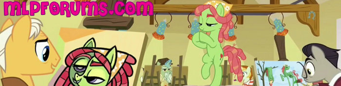
The only aspect of this logo that I find to be a nuisance is the kerning between the F and O. It does stand out, and is a little bit of an eyesore.
I quite like the font choices. -
This just killed all enthusiasm towards the way I saw my banner. ;^;
Aside from that, there were a few points I agreed upon, though quite a portion I, personally, disagreed with.
I'd found out about the banner selecting system very shortly prior to the next banner switch, so I only ended up spending about 20 minutes on this. It was built entirely for placement in the forum, so I had no need nor desire to fill in what would already be filled by other elements.
I see no problem with the text being unique. Those who are members already have a clear definition of the site, so it is unnecessary to keep the name standard and instead allow it more freedom. Members who are new to the site still have the knowledge of what the site is (having found it via alternate sources, browsed the forum itself, and signed-up), so making a visually appealing aspect has more impact than re-displaying something they have just come to acknowledge.
When I work, I don't like to contrast colours too much, and find it much more pleasing to keep within a certain spectrum. I chose to stick with a blueish scheme, and removing Derpy's heavy slate colours to give the entire banner a lighter, bubblier appeal, without placing too much focus into finding out what tones of what colours compare and contrast.
I wanted the buttons to be part of the banner, rather than on a layer above-though still noticeable.
Yes, there is more I could do to alter and fine tune this, but that would take away the entire point of the image. It was designed to be light, amusing, and simple. One that didn't need to grab every single ounce of your attention, but instead to be something that when appearing on your screen caught your eye and gave you a little chuckle.
I created it so that people would pass on into their forum business with a smile on their face. ^.^
Thankyous are like yen
in Dowlphin's Blog
A blog by Dowlphin in General
Posted
As someone who likes to show direct politeness, I disagree with this.
Words are more powerful than you give credit to. Words have impact. Even something as simple as a genuine "Thank you" to the person serving you coffee can brighten up their day. I know this, because I work in retail. You remember the people who respond positively to your assistance.
It's about what you are saying or doing. It's the fact that you are doing something positive that's important. I can't exactly hand gifts out to every person I serve.