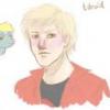
Tdroid 234 July 15, 2012 Share July 15, 2012 (edited) I did this as a request. Let me know what you think, positive or negative. Apologies for typo in the thread name. DeviantART for the drawing. Edited July 15, 2012 by Tdroid 1 I like to do requests. Please, if there is something you want to see me, an amateur, draw for you, just send me a PM with the details and I'll say yay or nay. Most likely yay. Link to comment Share on other sites More sharing options...
Finesthour 7,289 July 15, 2012 Share July 15, 2012 (edited) I will critique this in a moment, but I am forced to say this first. *Uzumaki My critique: His neck is freakishly large, as if he swallowed a watermellon. His body is shaped like a giant jelly bean. His flank is curved too highly in the air. His hooves aren't curved enough and are too straight. The intake of his backhoof is too sharp. His mane and tail are way too short. His eyes are quite nice. His face whiskers aren't right, they need to be curved. His headband is too small. He would only have one nostril showing if it was a faceshot. His head is shaped like an odd chille pepper. You need to make it smoother and more rounded. A nice attempt. 2/5 Edited July 15, 2012 by Crona The Critic 2 Link to comment Share on other sites More sharing options...
Tdroid 234 July 15, 2012 Author Share July 15, 2012 I will critique this in a moment, but I am forced to say this first. *Uzumaki My critique: His neck is freakishly large, as if he swallowed a watermellon. His body is shaped like a giant jelly bean. His flank is curved too highly in the air. His hooves aren't curved enough and are too straight. The intake of his backhoof is too sharp. His mane and tail are way too short. His eyes are quite nice. His face whiskers aren't right, they need to be curved. His headband is too small. He would only have one nostril showing if it was a faceshot. His head is shaped like an odd chille pepper. You need to make it smoother and more rounded. A nice attempt. 2/5 Indeed, it is far from as good as it could have been. 1 I like to do requests. Please, if there is something you want to see me, an amateur, draw for you, just send me a PM with the details and I'll say yay or nay. Most likely yay. Link to comment Share on other sites More sharing options...
NavelColt 22,883 July 15, 2012 Share July 15, 2012 Indeed, it is far from as good as it could have been. All the more reason to practice and perfect Now you have an outline and idea for what to keep in mind from now on. I think it's decent, I don't not agree with everything Crona said, but for a quick idea I think it's okay. Link to comment Share on other sites More sharing options...
Finesthour 7,289 July 15, 2012 Share July 15, 2012 All the more reason to practice and perfect Now you have an outline and idea for what to keep in mind from now on. I think it's decent, I don't not agree with everything Crona said, but for a quick idea I think it's okay. I give it a two because, like shank said, 2 is just about halfway. It's decent, but not what it could be. And besides, it's only my opinions 1 Link to comment Share on other sites More sharing options...
FedoraMemes 582 July 15, 2012 Share July 15, 2012 Decent attempt. Practice some more, listen to the comments and I'm sure that you'll progress much further in your drawing. The Anime Thread: http://mlpforums.com/topic/20661-the-anime-thread/page__hl__the%20anime%20thread Link to comment Share on other sites More sharing options...
pinkiedashalooo 14 July 15, 2012 Share July 15, 2012 I did this as a request. Let me know what you think, positive or negative. Apologies for typo in the thread name. DeviantART for the drawing. Thanks, I like it Link to comment Share on other sites More sharing options...
Hazardus_Havard. 480 July 15, 2012 Share July 15, 2012 I never really did care for the cartoon animation, much preferred just reading the manga over that. As for critiquing, it sorta looks a bit bland. Maybe if you had used a harder outline it would've helped that out, maybe a few line strokes in opposing color for background filler. The hair on top needs to come out a lot more, and the tail should as well. And you should bring the neck lined body part up some. Oh, the cutie mark should've been the Uzumaki spiral, would've made more sense than the Konoha Leaf insignia. On a side note, I'm surprised you didn't add anything like a kunai pouch to his legs or even a hideous orange shirt. A missed opportunity, perhaps? Practice makes perfect; but if nobody's perfect, why practice? http://hazardus-havard.deviantart.com/ Art http://www.fimfiction.net/story/70801/an-alien-walks-amongst-us Story Link to comment Share on other sites More sharing options...
Tdroid 234 July 15, 2012 Author Share July 15, 2012 I never really did care for the cartoon animation, much preferred just reading the manga over that. As for critiquing, it sorta looks a bit bland. Maybe if you had used a harder outline it would've helped that out, maybe a few line strokes in opposing color for background filler. The hair on top needs to come out a lot more, and the tail should as well. And you should bring the neck lined body part up some. Oh, the cutie mark should've been the Uzumaki spiral, would've made more sense than the Konoha Leaf insignia. On a side note, I'm surprised you didn't add anything like a kunai pouch to his legs or even a hideous orange shirt. A missed opportunity, perhaps? Indeed. I know next to nothing about Naruto myself, I drew it as a free request for another user. Since I did not receive any guidelines for the drawing I just went with a simple character pose, though it didn't turn out too good in my own opinion. I like to do requests. Please, if there is something you want to see me, an amateur, draw for you, just send me a PM with the details and I'll say yay or nay. Most likely yay. Link to comment Share on other sites More sharing options...
PonyEcho 1,610 July 15, 2012 Share July 15, 2012 i feel bad for this but that pony looks rely overweight. its a good design idea tho my DA http://heavyecho.deviantart.com/ check my stuff out the Anime Club http://mlpforums.com/topic/48196-the-anime-club/ plz join us Link to comment Share on other sites More sharing options...


Recommended Posts
Create an account or sign in to comment
You need to be a member in order to leave a comment
Create an account
Sign up for a new account in our community. It's easy!
Join the herd!Sign in
Already have an account? Sign in here.
Sign In Now