


Dabmanz
-
Posts
1,041 -
Joined
-
Last visited
Content Type
Profiles
Forums
Character Archive
Frequently Asked Questions
Equestrian Empire Character Archive
Golden Oaks Memorial Library
Pony Roleplay Characters
Events
Blogs
Blog Comments posted by Dabmanz
-
-


Top floor
Bottom floor.
-
That would be one scary Pokemon.
-
 1
1
-
-
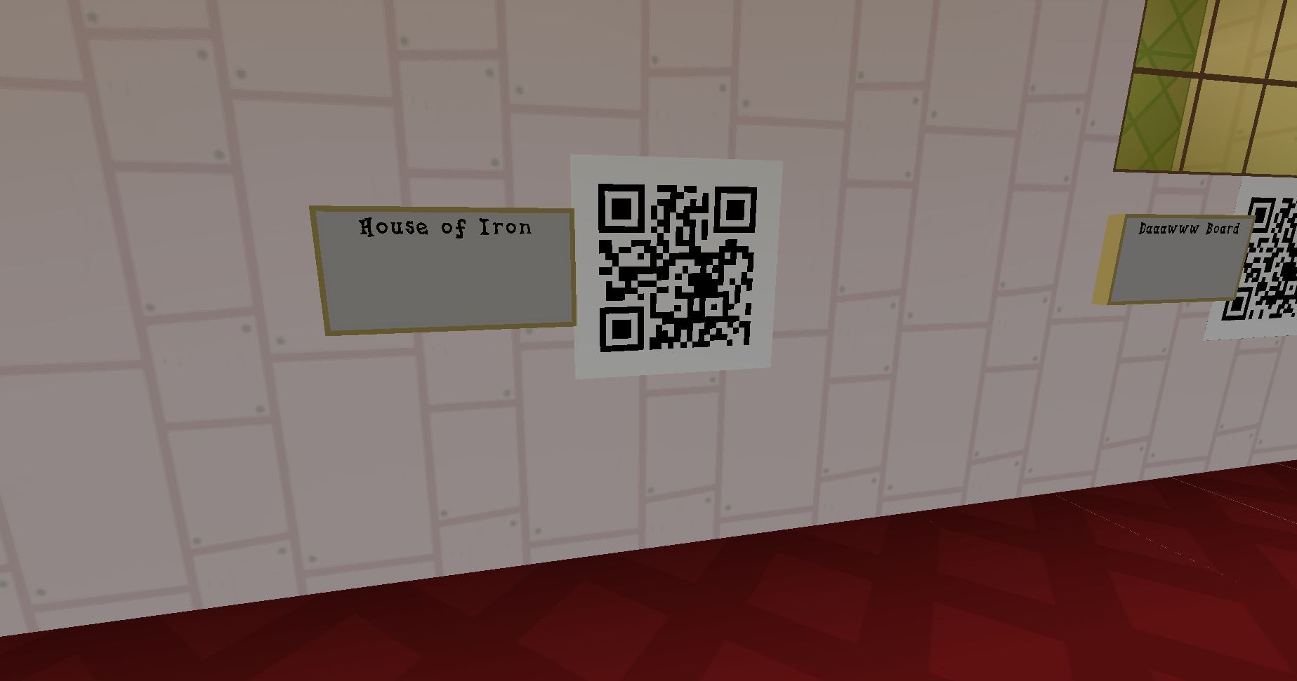
 This is on the inside of the museum with the texture pack on this is one of the qr codes with a sign next to them. This one is for the House of Iron a Building I made from Iron blocks in the old Minecraft survival map.
-
Just finished season 3 in the Mara-thon and I did comment on some of the episodes but for season 4 I will only do posts saying I have re-watched the episodes some really exciting stuff does happen in season 4 but I think I will re-watch the whole season before I make the posts saying I saw them. That way I can enjoy watching it. ^^
-
2 hours ago, Bolt Number 42 said:
Mind blowing, right? I started watching the show cold, not knowing anything about it. The first episode was amazing. I got to Princess Prom on Netflix and I saw the picture for it and thought, Catra in a tuxedo, I can't wait! Season 5 is amazing!
Yeah She Ra is awesome Have not seen season 5 yet though. ^^
-
ProfilePic.thumb.png.650945be00fc68141f0aebb9e8d6a019.png)
This is really good I leek it

-
On 3/1/2020 at 6:57 AM, StormyVenture said:
Sure, any time.
.png ":)") I'm never sure what to make of Equestrian technology, it's kind of an unfortunate hodge-podge in the sense that it's hard to place it in a real world timeline. Some things seem practically medieval (circa 1400-1500) like Ponyville and Canterlot kind feels like it should be lit by torches or at best gaslamps. And all the guards are wearing plate armor and carrying swords and spears. Oh and there are pegasus/earth ponies pulling wagons and chariots. And then other places seem somewhere between victorian and early 1900s like Manehattan. I mean they appear to have electric lighting, but you have trains run on pony power or steam/coal. And then there are taxi cabs that sort of resemble these -> https://en.wikipedia.org/wiki/Hansom_cab I think we can rule out using Discord related references but I see a couple phones here -> https://mlp.fandom.com/wiki/My_Little_Pony_Friendship_is_Magic_Wiki:Workshop/Phones Manehattan of course seems to be significanlty 'ahead' of most places.
I'm never sure what to make of Equestrian technology, it's kind of an unfortunate hodge-podge in the sense that it's hard to place it in a real world timeline. Some things seem practically medieval (circa 1400-1500) like Ponyville and Canterlot kind feels like it should be lit by torches or at best gaslamps. And all the guards are wearing plate armor and carrying swords and spears. Oh and there are pegasus/earth ponies pulling wagons and chariots. And then other places seem somewhere between victorian and early 1900s like Manehattan. I mean they appear to have electric lighting, but you have trains run on pony power or steam/coal. And then there are taxi cabs that sort of resemble these -> https://en.wikipedia.org/wiki/Hansom_cab I think we can rule out using Discord related references but I see a couple phones here -> https://mlp.fandom.com/wiki/My_Little_Pony_Friendship_is_Magic_Wiki:Workshop/Phones Manehattan of course seems to be significanlty 'ahead' of most places.
That's understandable, creating art is a lot of work.
If you're hoping for others to contribute significantly on the art end you might call that out a bit more directly; I just saw the tag on the thread today. And in that context I can see you might have been making hinting at that in the first post.
I could try modifying your TARDIS so it looks more like what I'm thinking of, but idk when I might get around to that. Tangentially I was looking at the background for the inside again and was thinking that if you want to be able to move the character around inside you'll want to slice up the image into a couple background pieces and some assets so you can draw the character in front of/behind various bits of scenery. Most of the space is pretty open but in a few spots used as a simple background you'd have the pony standing in front of something they should be behind.
Thanks sorry for the late reply I fixed the Title
Also if you get around to it you are welcome to modify the Tardis.
I did not think of moving around in the Tardis but I could have a look and test it.
-
4 hours ago, StormyVenture said:
Nice art choices there.
What's with the weirdly thick, rectangular border on the TARDIS? Is there some artistic purpose to that or is it a game engine thing? I am wondering because the original has a considerably more distinct 'box you can walk into' feel that's not quite coming across.
As it is your TARDIS looks rather flat. I do like the horseshoe motif, though you might consider giving it some gems/lights on that to kinda give the impression of the original glowing blue light. Also it would look nice to have a a pony/equestria appropriate notice sign or warning (possibly against using magic near/inside the box) and a proper door handle. On a similar note I would recommend either going with the full 3 panel + glass like the original or shrinking the overall height so that 2 panels and glass fills the door. Ideally it should feel like doors rather than rectangles. The color difference between the door and the sort of 'inset' panel is not particularly great either which leads to the impression that they are the same color and may be responsible for the 'flatness' I am perceiving. Making the surrounding edge a darker blue and introducing a center strip of dark gray/black might make the 'groove' seem more pronounced.
The sign seems a little odd to me too, given that neither pony/police nor magic/public are equivalent in any way, but I suppose what matters is that it's vaguely recognizable.
https://www.express.co.uk/news/uk/395582/Call-to-open-Tardis-police-boxes
^ nice example of the real thing here at the top of the article.
^ this is an example of a five-paneled door. this was a fairly common way to construct doors at one time
Thanks for the feedback the reason the Tardis design is like that is because I am not the best at making a pony Tardis replacing police public call box with Pony magic call box was something I though made sense due to Equestrias technology a regular public phone box seemed like it might not fit in. Also I was originally just developing most of it but did not have anyone interested in doing the art for the outside of the Tardis. If this game gets enough interest from artists I might be able to make it look better . I could try and fix the design myself though it could take a while.
-
1
-
-
Lol they must of got the person from Wendies Twitter account to do that burn

Also there are a bunch of different things like the Oscars usually these things are rigged anyway regardless of who wins. There is probably one for movies for any year in human history. Not really interested in the Oscars or the Logie awards or whatever the other ones are called. One for cartoons I might find interesting though.
-
1
-
-
Nice I think I remember seeing Battle Gem ponies featured on EQD I think the magic unicorn training was also on there at one point. It is looking awesome also I do not like the sound of my own voice either. I have thought of doing voices if I worked on any games but decided against it once I heard my voice.
-
Just now, Tacolantern said:
Good luck with the project, my friend!
 Everything's better with ponies!
Thanks
-
After what happened with EA with the Star Wars thing on reddit hopefully Gameloft and other companies can learn from it and actually balance the games they make.
I hope so because I'm level 68 and I have played for hours but there's still content I would like to be able to unlock without paying.
-

I dont get it.

Random Idea: Cthulhu as a Legendary Pokemon
in Dusky's Blog About Random Stuff
A blog by Here No Longer in General
Posted
Combine Mewtwo and Cthulu and you would get Mewthulu the ultimate pokemon.