Guirdann 129 May 28, 2015 Share May 28, 2015 (edited) Hello everyone i'm new here, and actually totally new to the drawing activity. This is my first drawing. I spend 10 hour doing this trying to make that not totally crappy. I need your critiques to improve myself because I have a big project in mind and this is not this quality of art that i would like to put into. I need you all to be as objective as possible so I can do better. Thanks Edited May 28, 2015 by Guirdann 2 Link to comment Share on other sites More sharing options...
JonasDarkmane 19,792 May 28, 2015 Share May 28, 2015 I am not really familiar with this kind of art, this style seems like your own, so I think you did pretty well. I can also see that you go some shading, so I like that as well . 1 Signature by @Kyoshi Ask Me Matsunaga Hisahide's death https://www.youtube.com/watch?v=BKT5Khp3-0U Link to comment Share on other sites More sharing options...
Guirdann 129 May 28, 2015 Author Share May 28, 2015 Thank you for the praise. I guess that what i need the most now is practice Link to comment Share on other sites More sharing options...
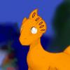
Luna the Great of all the Russias 3,223 May 28, 2015 Share May 28, 2015 (edited) For me it's difficult to criticize work that has more defined style. But I suppose I could try but requires more information. A few things I will note is that lines could be cleaner/smoother; I see various lines being a bit jagged (though familiarizing with using tablet myself I understand the tediousness of achieving that) and ends of lines being inconsistent (is it to end at a point or be rounded end). Something else that bothers me that pattern on fins on head looks unusually blurred. Light shading works if that's what you were intending though adding light areas would also make it look nice though that's dependent on style you're wanting to achieve. That's what I have to say for now. Exactly at what level of quality are you hoping to achieve? Edited May 28, 2015 by Tsaritsa Luna 2 Pony Art Thread Brony since ~25 July of 2011. Link to comment Share on other sites More sharing options...
Wicked Funky 2,956 May 28, 2015 Share May 28, 2015 So first of, This looks really good! The shadowing is perfect! There are some things you can improve though, Like the linework it's a bit jagged/ Lumpy. And then if you want to get more detail, You probably need to draw individual scales that are shadowed and has a minor reflection to them Anyway, Good job! 2 Just your avrage scrub Irelia, Poppy and Shen main. Signature banner by ~ Akatsuki ~. Link to comment Share on other sites More sharing options...
Guirdann 129 May 28, 2015 Author Share May 28, 2015 Thanks for the critiques. for the blurred patterns when I made them they where too clear and it's was a bit off so i tried to blur them a little but i think i over did it. I tried to do lighter shading especially on the head but I could not find out how to do it. And my project is an animation I have the story board ready and the deadline, approximately 30 year, since it's the first time I've been so creative i need to go all the way and in my head the art is actually 7 time better than this. 1 Link to comment Share on other sites More sharing options...
SFyr 1,982 May 28, 2015 Share May 28, 2015 (edited) @@Guirdann, In the spirit of improvement, I can try to offer what I can. I'm not a professional, really just an amateur, so take what I say with some salt, haha. Also, for someone new to drawing, it's not bad by any means. I think your effort shows, and I love your want for improvement rather than just attention/praise. Anyways, I mean all this constructively, and some of it may just be voided due to style I didn't account for, but yeah: 1.) Looking at the face first; Mentally I drew a line from between the eyes down the slanted muzzle, and into the edge of his right nostril, rather than between. I think with your angle, the nostrils/mouth would be more to the left of the image in order to better agree with the angle of the upper half of the face. (*) Drawing faces from different angles, or 3d shapes in general would be good practice to rid yourself of this problem. 2.) The fins, while the overall shape/outline looks good, they're still a little plain. But, that may be a limitation of the MLP style, honestly, but still I think improvements could be made there. (*) Doing some sketches of fish should not only give you a better idea of their general theme/look, but also how their fins look, are proportioned to the rest of their body, and have a more subtle flow/texture to them. 3.) Something about the neck bothers me a little. I think it's more just where it connects, or curves inward almost the whole way. His head has a notable amount of mass behind where the back of the neck connects, and while this is true of many creatures, this case seems a bit more so. (*) Draw more heads of different species? 4.) This is probably the area I have the least experience/strength with, but I think the background could also be improved. I get the out-of-focus effect and it seems perfectly valid, but large splotches/area of solid (unvaried) color seem to conflict with that. Also, it seems too 'blue' to me, even for underwater--not taking issue with underwater looking blue, but it tends to not be that dead-on, and other colors (especially green) seem to exist in varying levels. There also seems to be a little bit of coral coming forward, and while yes it's slightly more distinguished, the eye is drawn there (for me) and doesn't have anything solid nearby to focus on. It's like, a partial path that just stops oddly. (*) Practice backgrounds, and maybe take your palette from an underwater picture that has a similar 'look' to what you're going for. Also, just browsing pics in general related to what you're doing is great for inspiration. 5.) I feel I would have things I could point out about the body, must most of it is obscured. The line placement seems a little off, but without the rest I can't really pin how. So this is more of a comment than an actual point. Don't be afraid to work with parts you don't know fully how to do--improvement comes with tackling those difficult parts. 6.) I never figured out scales, honestly. But, I've seen what you're doing work fine for some people in cartoonish art styles, so I can't raise any real complaints. However, I still wanna at least draw attention to how they're all pointing upwards. Like the fur of most mammals, scales tend to 'flow' down a body--especially since they're basically plates fitted over each other tip-to-base. (*) Maybe experiment a bit with different ways to convey the scale texture/look. 7.) Gills look off. Even if they are to remain as three squiggly lines due to the style, they seem just a tad haphazard? 8.) Lighting seems to come from the top left on the head, and top right on the body. (*) Practice drawing 3d shapes in light/shadow, I would think. -- And also what @Tsaritsa Luna has already stated, because all that seems valid too. I totally don't mean this to be discouraging, I'm just trying to give you some proper feedback as an outsider on things you could practice with. :grin2: I love it when people strive to improve, and I think it's a characteristic of a great artist. As for some things I like: - Actually looks like something of a scene. Too often characters is disjoint, left without a background, or the background doesn't reinforce the image in any way (or does so pretty awkwardly). - You were quite a bit ambitious with this for a newbie, and put a good bit of effort into it, I know. Notable props for that. - You made a horse-fish hybrid. Further props for creativity and doing something I don't see a ton of. I kinda wish more people played around with weird ideas that aren't just demon/dragon/cooler-version-of-something. - You actually added some flare to the fins, rather than leaving them single-colored or "lined." The abstract idea honestly looks pretty good, and with some polish I think it'd be something to keep. - He's kinda cute for a fishpony, I'll admit. Edited May 28, 2015 by SFyr 2 Commission Thread | Deviantart | Poniverse Tumblr | Art Tumblr Link to comment Share on other sites More sharing options...
Luna the Great of all the Russias 3,223 May 28, 2015 Share May 28, 2015 Thanks for the critiques. for the blurred patterns when I made them they where too clear and it's was a bit off so i tried to blur them a little but i think i over did it. I tried to do lighter shading especially on the head but I could not find out how to do it. And my project is an animation I have the story board ready and the deadline, approximately 30 year, since it's the first time I've been so creative i need to go all the way and in my head the art is actually 7 time better than this. Animation you say? Then I'm not sure if you should actually make your drawing style anymore detailed because it would really make animating much more tedious... unless by 7 times better you mean in terms of how you draw figures instead of details implemented in which case I would require full body image of your drawing instead of just portrait to judge that. But what sort of drawing would be "7 times better" than what you made is vague to me. 1 Pony Art Thread Brony since ~25 July of 2011. Link to comment Share on other sites More sharing options...
Guirdann 129 May 28, 2015 Author Share May 28, 2015 I must thanks you so very much for this comment. You make me want to work harder than ever. I'm actually speechless. Just thank you. Let's go back to work To Tsaritsa By 7 time better i'm actually referring to the shading, the light management, the figure, the background and maybe just maybe add more detail. I'm not afraid off spending 24 hours on each frame if that means i'm gonna do what i have in mind and even if it's not finished when mlp has ended i will continue. 1 Link to comment Share on other sites More sharing options...
Thorn O Discord 118 May 28, 2015 Share May 28, 2015 The picture looks great, but I would suggest to make a more interesting background. Nothing that would take away attention, but something neat. Beside that, looks great. Link to comment Share on other sites More sharing options...
Guirdann 129 May 28, 2015 Author Share May 28, 2015 Thanks I will work on that too I tried the changes for the mouth and the head positioning and I think you were right Link to comment Share on other sites More sharing options...


Recommended Posts
Create an account or sign in to comment
You need to be a member in order to leave a comment
Create an account
Sign up for a new account in our community. It's easy!
Join the herd!Sign in
Already have an account? Sign in here.
Sign In Now