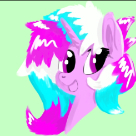
Jump to content
Banner by ~ Discord The Overlord

First time posting art here!


Kay Dreamer

Recommended Posts

I've been distracting myself from my responsibilities by drawing ponies lately. I figured I might share some. =D


If you like what you see I have a DA and a Tumblr! They're both on my profile, and the banner in my sig inks to my pony blog.


tumblr_n5ob7npSQK1taezd9o1_1280.png tumblr_n4yg13AFj71taezd9o1_500.pngtumblr_n5d05qwfD31taezd9o1_1280.pngtumblr_n64h45vMJV1taezd9o1_1280.pngtumblr_n64p1jxzWr1taezd9o1_1280.pngtumblr_n66aizWJUj1taezd9o1_1280.png

  • Brohoof 16

h3x4LLK.png

The Crystal Minstrel Pony Tumblr

Link to comment
Share on other sites

Wow, this is amazing :o i love all the patterns you put into the design, and everything about your style is just awesome! nice job :)


CWWPSmG.png

/) free hugs included (\

Link to comment
Share on other sites

@, @@BlueMoon,


Thanks a bunch guys! I've only just started drawing ponies in particular, I'm glad you think my style is unique. =)


@@Summer Greetings,


Haha, the octopus pony was drawn for a friend in jest. xD But octopi have such amazing colours and varieties, it'd be cool if there was a Sea Pony variant like that! (Though I'd settle for actual Sea Ponies in the show at this stage.)

  • Brohoof 1

h3x4LLK.png

The Crystal Minstrel Pony Tumblr

Link to comment
Share on other sites

I hear you are in search of critique, so I will give it.


Your designs are interesting, and nicely done with a good use of a watercolor-style that is subtle and light. (Except the octopus pony, but that's just my own personal bias. I've never liked seapony-type things)


For your first picture, I will say that I love that flower. But then again, I'm a sucker for flowers. Though seriously, great job with the flower, it looks really awesome and realistic. However, the eyes look weirdly far apart. In particular, I believe the one on the left needs to be moved closer towards the other eye. The ears also look kind of awkward. I think they're facing forward too much and don't fit with the positioning of the eyes. This would be fixed by tilting them to the back.


Perspective issues so far. It's all right though. Perspective is a huge nuisance. @_@ 


On your second one, I can admire the unique pose which shows this character's personality. It looks solid and stable, but still not quite right. In particular, that bent leg looks awkward perspective-wise. I can't tell which way it's facing, but I assume you intended it to face the front. This one can be fixed by taking the bottom part of the leg and tilting it more to the left. The left side of the body is also odd, because I can't see the differentiation between the neck, chest, and leg. I would suggest defining the neck a bit more by drawing a straighter line, then drawing the chest as a circle, and finally having the leg come out of that circle. That way, you can see all of the different body parts instead of this big mass.


The third one is probably my favorite. A nice brown earth pony stallion. His cutie mark is excellent and looks like he has a watercolor painting on his side. Anatomically wise, his torso is solid. However, you're having the same problem of perspective with the face as the first one. The right eye this time needs to be moved more forward. Also, his limbs are a bit too straight and need more curves. They look kind of stiff. In particular, the bend in his right foreleg is really sudden and doesn't look natural.


Then octopus pony. As I said, I'm not too fond of that design. But I do like the mane and that dreamy look in the eyes. Two problems I can see here. The front legs. The right one's upper portion is too long and it bends in the wrong place. That bend should really be higher up on the leg. As for the other one, now you have the opposite issue; the bend is too high on the leg and should be lowered. Also, both limbs are again too straight and could benefit from the natural curves that a skeleton gives to a pony. I'd advise trying to find pictures of horse/pony skeletons to see what I truly mean. I use them myself in my quest to master the tricky art of anatomy. In fact, here's one right here. Lastly, there are the ears. I think they look a little too closed up at the bottom, and it seems like it'd be really difficult for the pony to hear that way.


Your fairy pony has a nice personality-filled pose as well, and a sweet-looking face. Once again, we have a common problem that plagues all of us, including myself; the dang limbs. The forelegs look way too small, even for being bent in such a manner. They should probably be a bit longer and thicker. Then there is the elbow of the right limb, which looks more like a lump than an elbow. To resolve this, I'd recommend making the elbow bigger and longer, more defined. Your right lower leg is fine and actually quite awesome the way it hangs down naturally like that. But your left has its bending point too high; it should be lowered and protruding less especially since this leg is not in the forefront. Also, the body is kind of oddly shaped and has a weird curve that looks more humanlike than pony. Unless it was your intention to make it humanoid. But even if it was, it looks kind of awkward. I'll go on the assumption that you were trying to just make a pony shape and critique based on that. The problem is that the upper part of the torso is too thin and has this odd hourglass shape that makes her chest really unnaturally skinny. Thickening that would resolve the problem.


Lastly, the zebra. This is a very difficult pose, and I can appreciate how difficult it is to pull off. I've tried several myself and have not had the best results. For what it's worth, it's pretty good-looking overall. But there are some awkward traits. The ones that stand out to me most are the right front leg and the wing. The problems that are displayed in that leg are the same as in your previous picture: too stiff, needs more curves to look natural. The wing looks like it's being shown from the incorrect angle that she's facing, but I honestly don't know how to explain that because I don't have a full understanding of three dimensional spaces myself. And then there's the final issue; her butt. Yeah, that sounds silly. It's just raised a bit too high. If she's flying in such a direct straight pose, it should be lowered and straighter more actionlike lines should be used.


Other than that though, I really like this design. Especially the rings on the tail and the mane. You have lots of talent and technical skill here! (Even though the style isn't exactly my cup of tea, if I'm honest. But I tried to keep my critique free of that.)

  • Brohoof 1

Aether Velvet is the name of the OC in my avatar. Drawn by me. 

Deviantart

Link to comment
Share on other sites

(edited)

@


Oh my gosh, thank you so much! That's a HUGE amount to have written out of the blue like that, I'm flabbergasted. I'll be referring to this for ages, especially the link you provided to the pony skeleton.


Ah, facial perspective, the bane of my artistic life... I need to seriously start remembering to flip my sketches. It helps so much, and I only ever do it 50% of the time. You pointed out a few things which had been niggling at me for a while but which I couldn't quite put my finger on, too. (Ears, ohmygosh.)


Style, I can totally understand. We all have preferences. I naturally gravitate toward art and artists who have styles quite distinct to that of the show, which makes itself apparent in my own art. (Not to mention I've been drawing ponies in particular for a grand total of 2 months, so there's a hodgepodge of everything else I do mixed in there. I'm still testing the waters in regards to how I draw them.) Though I have to say, your reproduction of show-quality art is really convincing. Your signature looks gorgeous, I love the colour choices.

Edited by Kay Dreamer
  • Brohoof 1

h3x4LLK.png

The Crystal Minstrel Pony Tumblr

Link to comment
Share on other sites

You're talented! I can tell directly on your drawings that you're good at what you're doing. You have an unique style as well which I'm sadly not a big fan of, but don't get me wrong, they're all very good! What I noticed at first was how you drew the noses. Somehow it reminds me of cow noses, heh :P though I suppose it's because I'm unused to seeing it or something. I don't really have much complaints on the drawings themselves other than that the 2nd and 5th one seems to have a few perspective problems. Otherwise they're all amazing :) My favorite has to be the brown one!


Keep up the good work ^_^


img-2823101-1-UpBh15J.png

Link to comment
Share on other sites

@

Thanks a bunch! =)


@@Jokuc

Ah yes, the cow-like noses are something I'm aware of and which frustrate me immensely. I'm persisting with them though, because I know how I want them to look, and it's just a matter of practice to achieve that style. (I find the mlp-style too simplistic, but there's a middle ground I'm aiming for and I'm getting closer to it.) Thanks though! My favourite out of this batch is the brown guy (Dusty Haze) as well.


h3x4LLK.png

The Crystal Minstrel Pony Tumblr

Link to comment
Share on other sites

@


Oh my gosh, thank you so much! That's a HUGE amount to have written out of the blue like that, I'm flabbergasted. I'll be referring to this for ages, especially the link you provided to the pony skeleton.


Ah, facial perspective, the bane of my artistic life... I need to seriously start remembering to flip my sketches. It helps so much, and I only ever do it 50% of the time. You pointed out a few things which had been niggling at me for a while but which I couldn't quite put my finger on, too. (Ears, ohmygosh.)


Style, I can totally understand. We all have preferences. I naturally gravitate toward art and artists who have styles quite distinct to that of the show, which makes itself apparent in my own art. (Not to mention I've been drawing ponies in particular for a grand total of 2 months, so there's a hodgepodge of everything else I do mixed in there. I'm still testing the waters in regards to how I draw them.) Though I have to say, your reproduction of show-quality art is really convincing. Your signature looks gorgeous, I love the colour choices.

Anytime, man, anytime. If you would like me to critique any other works of yours, I would be more than happy to. 


For two months though, it is pretty good. I've been drawing them for a matter of years now and when it was two months for me, I was way behind there. With more practice, you could be really damn brilliant. I just know it. You already have a good design sense that I admire. And thank you for your compliments on my signature. :3

  • Brohoof 1

Aether Velvet is the name of the OC in my avatar. Drawn by me. 

Deviantart

Link to comment
Share on other sites

I must say, I was not expecting such good work, usually first time artists start out just meh but then turn into something beautiful, or start meh and just give up, and some are amazing from the beginning yet think their work is horrible and go into depression or something... but you're work is amazing! I love it, I love the mash and i am pleased with your style, you are way above "meh". keep it up, hold your head high, and don't let anyone tell you otherwise. YOU. ARE. GOOD. AT. ART. most artists don't realize that, I hope you do.


uVKnBE8.gif

Avatar by Jokuc     ~      Signature by me      ~      (Try it) War Thunder ID: ColonelWaffle

studying to be a pilot!           ~           I like planes (B-17 FTW)          ~         What's-its-face window


"Never accept the sky as the limit, we got to the moon and beyond."

- some guy with an unhealthy obsession of planes

Link to comment
Share on other sites

@@Sky Cutter

Thanks a bunch! I should point out, while I've been drawing ponies for 2 months, I've been drawing a heap of other stuff for far longer. ;P The ponies are still a little wobbly, stylistically, because I'm unfamiliar with how equines are put together or how exactly I want to stylise them, haha.


This is my first art thread on this site though! I wasn't even going to post one, but I had enough people asking me if the art in my character profiles, icon and userpage were my own, I figured there was a bit of interest.


h3x4LLK.png

The Crystal Minstrel Pony Tumblr

Link to comment
Share on other sites

Create an account or sign in to comment

You need to be a member in order to leave a comment

Create an account

Sign up for a new account in our community. It's easy!

Join the herd!

Sign in

Already have an account? Sign in here.

Sign In Now
×
×
  • Create New...