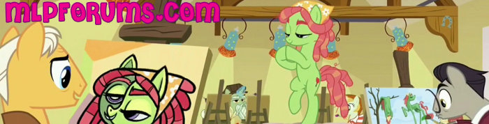
I also approve the new banner, but the logo would look better if there wasn't a drop shadow or effects. The effects make the logo come off as tacky. The dark blue from Vinyl's hair stroke for "MLP" and navy blue hair for "FORUMS" would really do the trick instead.


.thumb.gif.be6f0025548f6344f71dde68444d9981.gif)