


PickFairy
-
Posts
30 -
Joined
-
Last visited
Content Type
Profiles
Forums
Character Archive
Frequently Asked Questions
Equestrian Empire Character Archive
Golden Oaks Memorial Library
Pony Roleplay Characters
Events
Blogs
Everything posted by PickFairy
-
Oh, you can mention people? Unique And yeah, so far I've tried to post where I can. Though I'm also busy with college, and work so I come here in my spare time now. And, yeah I've been brohoofing. And thank you for the muffins! *hopes some of them are blueberry* I'll definitely add you as a friend then, and also extend the offer for you to message me any time Hehe I guess you two know each other? And yes, it's nice to meet you too. Thank you~
-
Thanks for that, but I don't do requests. I'm thinking about setting something up commission wise with the site so I can offer commissions here. And thanks again! *mega hugs* Thank you~~ Love your profile pic, so cute
-

Question about Fluttershy's friends...
PickFairy replied to Lemon Slices's topic in MLP:FiM Canon Discussion
 I wanted to reply to this, but I'm a bit confused what overall you're pointing out…. not sure… Could you please explain a bit more so that I may put in my two bits?
 -
Did Message me whenever. I'm still new to the forum, so I'mma exploring
-
Oh, sorry, I didn't follow this topic by accident so wasn't notified by the replies > 3< Thanks! I really appriecate that! I'm hoping to become another mlp analyst too!! And thank you, I may just do that. Do you mind if I add you as a friend Aw! Thank you *drinks cider* … mm~
-
I love the Oc, and personally the design to the dress. The dress is well done, along with the shoes. The mane, he already pointed out, and I think it just needs some shading to it myself. Maybe some light brown mixed into it, and then the outline with that dark brown you used. There's numerous ways to coloring it, and in the end it's up to you what you decide to do as that decision will make your "style". The magic bugs me just a little bit, I'd like to point out. The shading is alright, it's just missing that lighter outline like they do in the show. (Plus sparkles, if you wanna be show accurate) Best way to do something new is reference. Check out the Mlp Wiki, and there should be a ton of reference there.
-
First Time Making a Character Reference Sheet...
PickFairy replied to PickFairy's topic in Visual Fan Art
Heh, yeah I suppose so. The only thing I didn't do was the the back, but I guess from the angles given you could do it easily.. And yeah, you could rig it you're right. Thanks. Thanks~ I tried to include that best I could -
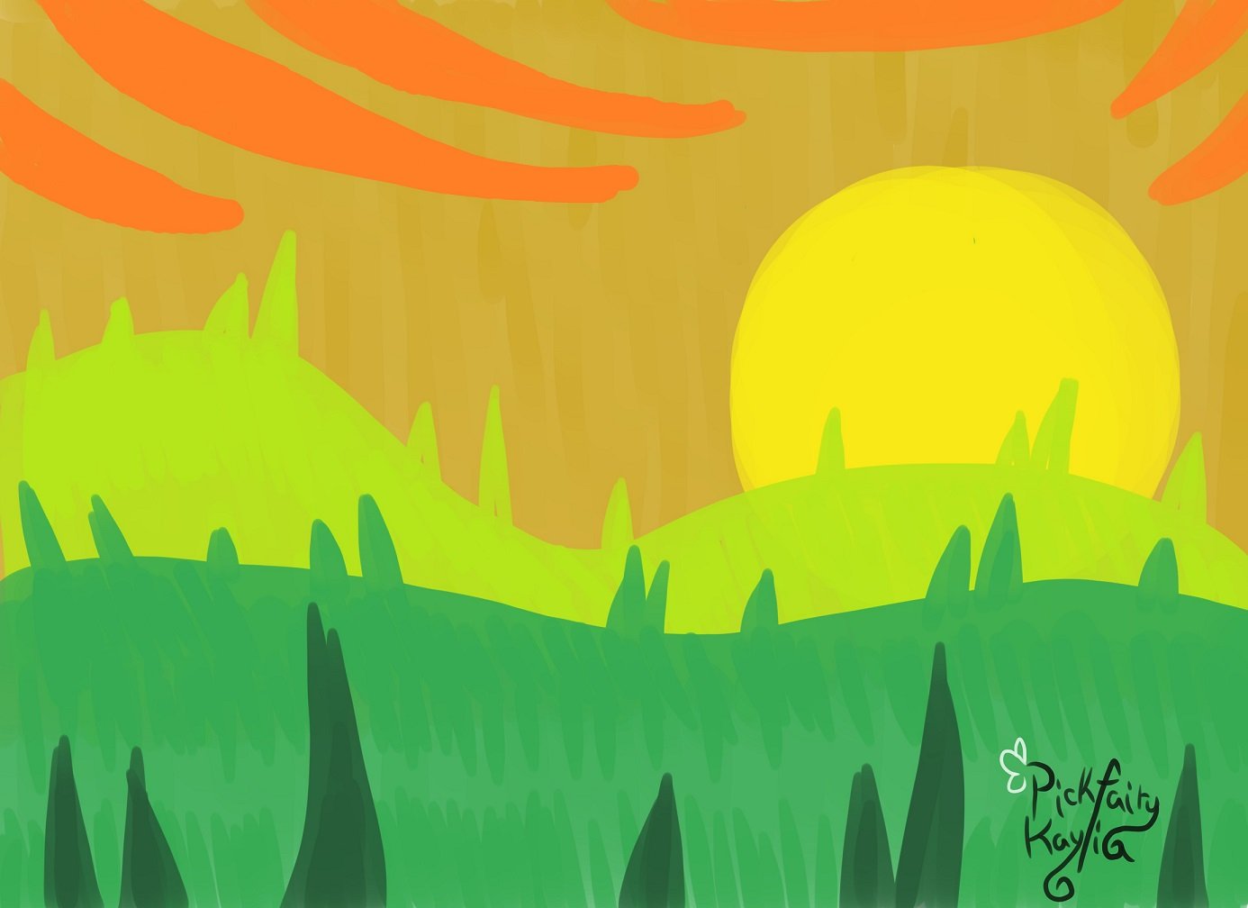
Okay so I've been in the drawing pony phase for awhile now, more than a few months.. and over a year. Thing is, I've just opened up commissions, and did gifts within this year. Recently I did this piece where it's a "character reference" sheet. I mean, you know.. it shows the colors used, and all the extra stuff. So I made one for "Regina" a pony that belongs to Thebronychef, google it for more info. (Basically the little one is lost, and it's uber sad.) And it's just.. I don't know if it looks right. To me, all my art looks strange so I have to ask other peeps how it is really.. Here's a pic…. It's pretty big, I know… but I had to fit everything... I tried to do a bit of typography in the name, and then included everything you would need in one of these. Headshots, poses, and other stuff…. like "eye style". Some have round eyes, or if they're like Rarity's they're a little diamondy. Hers was circles, and I chose the two colors from her gradient to represent her colors for her mane. That way, you could make the gradient from those two... I know how people put colors in unique shapes, so I wanted to do that. I used the butterfly shape that I used from her wing, and then did all the outlines + fills. Everything else is above what I included… and etc…. So, what do you think? Too busy? Too much stuff? Or does it look alright to you? Let me know... (And yes I'm a blank flank lol ^^')
-
I found the site randomly… and now exploring it. How did I get here? lol Who knows
-
How did you find MLP Forums?: Randomly streaming on Google… How you became a fan of My Little Pony: Friendship is Magic: My little sister showed the episodes to me and ever since I wanted to watch the show. How I got into the fandom is another story.. Hello everyone.. or everypony as some say. I prefer to use everypony, and believes it suits us. Though someone would disagree that we are "people" thus not "ponies". But, regardless, I still say hello to all of you. I am PickFairy, a brony who has planned many many projects and has only just begun on completing them. I'm an artist at heart, and true creator. I plan to become a mlp analyst and working on my YouTube channel right now. I'm on deviant art so you can check me out~ http://pickfairy.deviantart.com/ I've also had a few interviews so maybe that'll help you get to know me? Here's links ~ http://www.buzzsprout.com/16090/207582-lunar-echoes-ep-35 http://www.heavymetalhobbit.com/the-geek-mix/8-brony-love-with-pick-fairy-david
