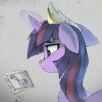
CloudsdaleCompanion 343 November 23, 2012 Share November 23, 2012 (edited) Yes, this time it's a drawing, not a sketch which means I actually took the time to color her mane. Sorry for the bad picture quality, but around this time of the year there is absolutely no sun in Germany.It's very sad but at least spring/summer is even lovelier after such a long time without any sunlight.As for the drawing: Nothing special really, just Rarity in her famous pose. I didn't get the gradient quite right but oh well, at least I tried. Edited December 25, 2012 by CloudsdaleCompanion 13 Just call me CC Lost in Everfree Link to comment Share on other sites More sharing options...
kirbyboi 588 November 23, 2012 Share November 23, 2012 I think this is a really good drawing...really! I love how you made Rarity's expression. And as I always say, Rarity's hair is such a pain to draw! But I think you've mastered her hair well, and it all just looks amazing. One tiny thing you could do is shorten the legs a bit, but other than that it's a perfect drawing!! I also like how you did the eyes.....don't stop drawing! Keep up the good work, it looks great! Link to comment Share on other sites More sharing options...
Dusty Soul 2,614 November 23, 2012 Share November 23, 2012 Really good drawing! All the proportions look correct, and the colors are also there too. I wish I could give critique on this, but I can't. Soundcloud-------------------Facebook---------------------------Youtube Link to comment Share on other sites More sharing options...
Pix3M 607 November 23, 2012 Share November 23, 2012 Really good drawing! All the proportions look correct, and the colors are also there too. I wish I could give critique on this, but I can't. Kinda funny as a lot or posts on this forum of yours aren't really the critical sorts anyways, and pretty much all of the drawers on this forum are hobbyists, not necessarily professionals let alone masters. A lot of pieces are a lot more flawed than most people realize, but sometimes it really takes another artist to point out the flaws. Personally, I wouldn't be so concerned with trying to replicate gradients. I remember this pose. From what I remember, the legs are a little thinned out on the left side to the legs are slightly skewed to the right. We end up with Rarity looking like she was tipped over. She does not appear balanced. My deviantArt page Link to comment Share on other sites More sharing options...
CloudFyre 848 November 23, 2012 Share November 23, 2012 Not bad! It's pretty spot on - the only adjustments needed are small things (and they just come with time I suppose_. All in all, it looks great! How long did it take you to draw it? Link to comment Share on other sites More sharing options...
Lightning Fluttershy 1,845 November 23, 2012 Share November 23, 2012 Looks nice. It's accurate and the colour is great. I think you did a great job. The only thing I noticed that made me wonder was that Rarity's horn seems kind of curved upwards. Other than that though it's great. Link to comment Share on other sites More sharing options...
AustralianFries 213 November 23, 2012 Share November 23, 2012 (edited) Pretty good. Pretty good indeed. Obviously there are some flaws but I mean that looks very nice. The colour is actually really good and accurate. Overall, nice job mate (: Edit: Relooking at it, the hair is actually very good. I how you did it very much. And Rarity's hair is probably the most complex of the Mane 6, so I bet you could do the others without a problem! (: Edited November 23, 2012 by Australianfries Real Life & Wallpapers | My OC Link to comment Share on other sites More sharing options...
Nixter 180 November 23, 2012 Share November 23, 2012 That expression is so wonderful! Whew that is so amazing, so proportionate and fits her so well in every aspect, great job! Also, I really like her mane! Don't Punch! Stab. Link to comment Share on other sites More sharing options...
Zygen 6,066 November 23, 2012 Share November 23, 2012 Very nice and wonderfully clean drawing! Her expression is perfect to . The only thing I can really notice is the very slightly curved horn after it was pointed about by death the kid was the only time I really noticed it though. Still a wonderful job! good work! Thanks to Gone Airbourne for the awesome sig! My Oc's, Ponysona, Bella Vocal Covers Blog, MLP Covers Thread Link to comment Share on other sites More sharing options...
CloudsdaleCompanion 343 November 23, 2012 Author Share November 23, 2012 (edited) How long did it take you to draw it? I can't remember. It was quite some time ago. I think... 1h? Perhaps 2, something around there. One tiny thing you could do is shorten the legs a bit I was wondering why she looked a bit off, thanks for the hint. Rarity's horn seems kind of curved upwards I can see it too now. Never even noticed it before. To all others: Thanks for your comments & input! I really appreciate it. Edited November 24, 2012 by CloudsdaleCompanion Just call me CC Lost in Everfree Link to comment Share on other sites More sharing options...
Dusty Soul 2,614 November 23, 2012 Share November 23, 2012 Kinda funny as a lot or posts on this forum of yours aren't really the critical sorts anyways, and pretty much all of the drawers on this forum are hobbyists, not necessarily professionals let alone masters. A lot of pieces are a lot more flawed than most people realize, but sometimes it really takes another artist to point out the flaws.Yeah I'm not usually a critical guy, but when the time comes as some know, I can be pretty critical. I know that there are flaws in the picture, but I'm not one to point it out. Soundcloud-------------------Facebook---------------------------Youtube Link to comment Share on other sites More sharing options...
Spartan 433 November 23, 2012 Share November 23, 2012 Impressive.. im lucky to be able to draw stick figures.. Ofcourse, color it in darker and well thats about it really. Im no artist, but damn thats a great drawing dude Link to comment Share on other sites More sharing options...
WindsweptFrog 52 November 23, 2012 Share November 23, 2012 I think this is a pretty good drawing, it might just be me but i think the ear could be a bit smaller, the other proportions seem about right (the legs are possibly a bit long), the colours seem spot on tho! Link to comment Share on other sites More sharing options...
CloudsdaleCompanion 343 November 24, 2012 Author Share November 24, 2012 (edited) I know that there are flaws in the picture, but I'm not one to point it out. You don't have too. As many have already said her legs really are a tad too long. Also, I messed up her body. It's way too long as well. And as WindsweptFrog just pointed out, her ear is also too long. The proportions aren't that good actually. The problem was the body, I drew it too long to begin with (but didn't notice until later on), so as I continued working on her my mind must have automatically adjusted and make me draw longer body parts to counter my mistake. Ofcourse, color it in darker and well thats about it really. It looks like that doesn't it? Luckily it's just the bad picture quality, she looks darker and richer in contrast in real life. Edited November 24, 2012 by CloudsdaleCompanion Just call me CC Lost in Everfree Link to comment Share on other sites More sharing options...


Recommended Posts
Create an account or sign in to comment
You need to be a member in order to leave a comment
Create an account
Sign up for a new account in our community. It's easy!
Join the herd!Sign in
Already have an account? Sign in here.
Sign In Now