The new DeviantArt logo is a failure.
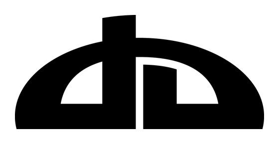
Everyone who's seen DeviantArt knows this logo:

Since 2000, DeviantArt's trademark is iconic. You have the "d" and "a" forming what looks like the roof of a house, representing unity and hominess. Despite its angles and changes over the years, it's been rather consistent. Does it look dated? Maybe, but it's a really bad idea to change an iconic logo, because you risk damaging its already established brand identity. Some have worked.
- The Twitter canary from a simply cute bird to one where the shapes have meaning.
- Nike changing from the Swoosh/oblique type to just the swoosh.
- Apple's rainbow apple and complementary wordmark to just the silver apple.
- Simplifying the Starbucks logo into the green mermaid they've used for years.
- Microsoft's flag being simplified into windows instead of adding a combination of gradients that amounted to nothing.
- NBC's peacock in 1986.
- FedEx's current logo we have today from the generic American Express from yester-decade.
- The current Poniverse logo.
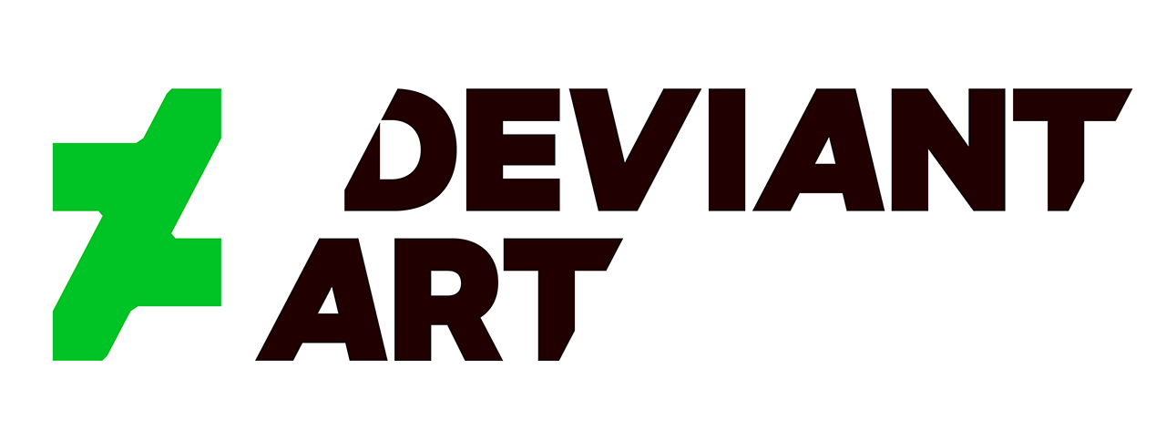
But this?

This is NOT an improvement.
I mean, let's look at the technical aspects. It's actually really good. It's extremely polished, and the sharp angles have the edge of moving forward, something we've seen in logos like Dodge. And if you're looking for a bold color, the green is a perfect balance with the black.
But there are several huge problems.
- It's way too cold. If you want to see what I mean, compare it to the current Nickelodeon logo.

Despite the casual attitude Nickelodeon presents in its wordmark, the biggest flaw here is how corporate it feels. It doesn't have the fun or energy that the old Nick splat had. It's cleaner and works well in smaller sizes, but it's too rigid.
DeviantArt's new logo is exactly that. DeviantArt's previous logo had a feeling of comfort thanks to its abstract roof and quirky design. It's way too mechanical, and its precision is actually hurting its presentation. - The trademark has one fatal look when it comes to making the logo smaller. Take a look at where the stroke and bars meet and the corners. There are little curves, which are completely opposite of the wordmark. Those little nubs will vanish the second they reach a certain size, and that decision will look like a big mistake.
- It doesn't speak as "art." There are many ways to ask yourself, "What is art?" One key reason why they do it is because it allows people to show what they can do. Art lets them feel loose. Instead, it feels like a bastardized version of the Via Rail Canada (the logo itself is a simplified rail system).
- The fact that DeviantArt had to explain the point to the audience, both by Spyed and this video.
One of the most important rules in logo design is how much can you reduce it to a point, yet still have the audience to get it without help. NBC's peacock, ABC's button, the old UPS shield, Enron's RGB block-E, the New York Yankees, FedEx's arrow, the Dallas Cowboys sheriff star, Toblerone chocolate's bear, the CBS eye, and the Swoosh are instantaneously recognizable. You don't need to explain these to the audience.
But when you ask the crowd about the new DA logo, you're going to get completely different answers. Many say it looks like a Z, an F, a don't equal sign, or two A's (my observations).
Instead, it's supposed to be an abstract dA.
DA's logo is TOO abstract. One of the biggest cardinal sins in logo design is having to explain to your audience the logo's purpose. Your audience is supposed to immediately capture the essence of the logo and recognize its visual cues. If you have to inform your audience about your logo's meaning, then your logo sucks. It doesn't matter if anyone likes it or not. From a view of objective quality, it's bad. Plain and simple.
While recreating the logo, DeviantArt user Nsio picked up another big flaw: the lack of amodal completion. Basically, the brain is able to pick up visual cues to create the shape. Here's one of the more famous ones:

Your brain is able to pick up the two triangles. The black-stroked triangle is visually connected with each other, and the same is said with the white triangle. It's a key component in graphic design, and psychology of visual perception is a required course for my graphic design bachelor's degree.
There are absolutely no visual cues with the new DeviantArt logo. You can't make out the "dA" without any help. There needs to be more with the trademark to make it look remotely like "DeviantArt."
Quite simply, the logo is a massive failure of a rebrand and the worse I've seen since PepsiCo and Arnell rebranded Tropicana's famous packaging in 2009.
-
 11
11


15 Comments
Recommended Comments
Create an account or sign in to comment
You need to be a member in order to leave a comment
Create an account
Sign up for a new account in our community. It's easy!
Join the herd!Sign in
Already have an account? Sign in here.
Sign In Now