Jump to content
Banner by ~ Wizard

Guess What... Adjusting HUD Again? | MLP:SH Devlog #14


Rikifive

3,573 views

I've bumped into something - I'll need to place BOSS HP BAR somewhere, but the current HUD gave me a bad time organizing the layout. :P 

Sooooo yeah, I've been thonking on the HUD again, because why not. :D 

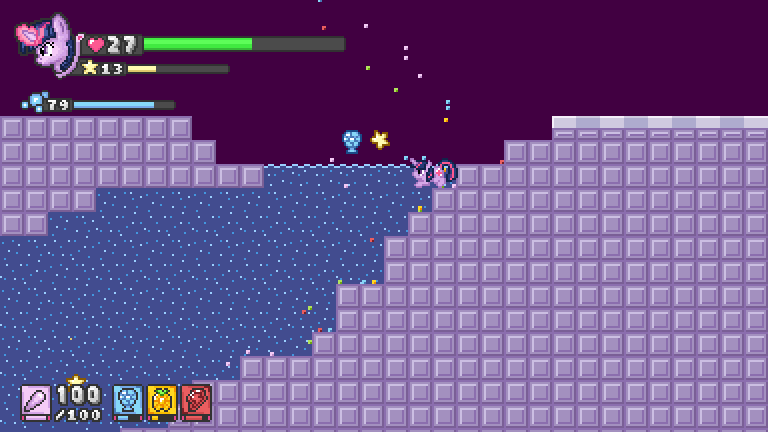
For a reference, this is how it looked like so far:
pBuA6Re.png

I was trying to put it somewhere to the right, but the screen was getting somewhat clogged up.


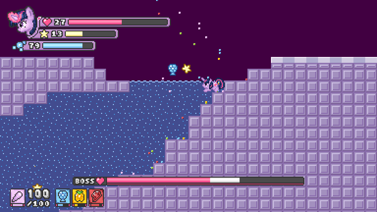
...So I've tried to place is somewhere at the bottom - the spells were on my way.
S26Jz5q.png

Also I was toying with the general design (see the top-left corner). Red for the HP Bar seems to work better, considering that other bars have colors based on the icons attached to them. :darling: The green was out of place there. :grin:


But getting back to the BOSS HP Bar---
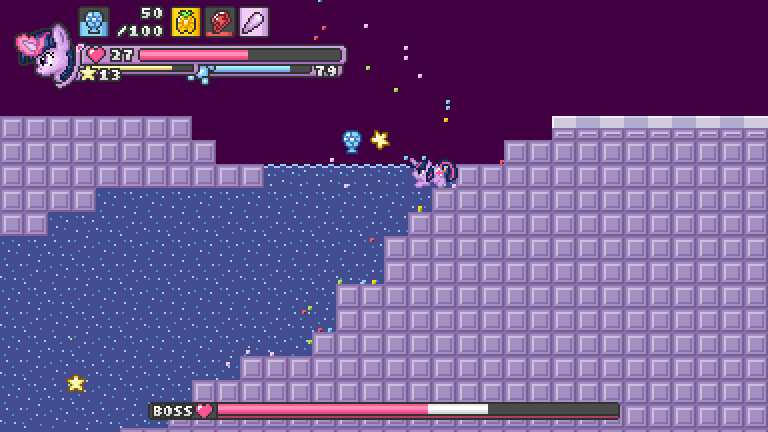
I've tried to move the spells to the top, to have everything in one corner...
pbIfYiN.png

...and here made some more science as well, to make it all more compact.

1KHxxtz.png PLEASE KEEP IN MIND, that IN ALL DESIGNS the breath bar disappears once Twi leaves water. :squee: You won't see that bar most of the time, hence why it doesn't have to be nicely attached to the rest of elements.


Also I was thinking on the spell icons - maybe instead of these little bars representing energy, they could have that in their backgrounds? That seems to be making it easier to tell how much energy do the spells have. :P 


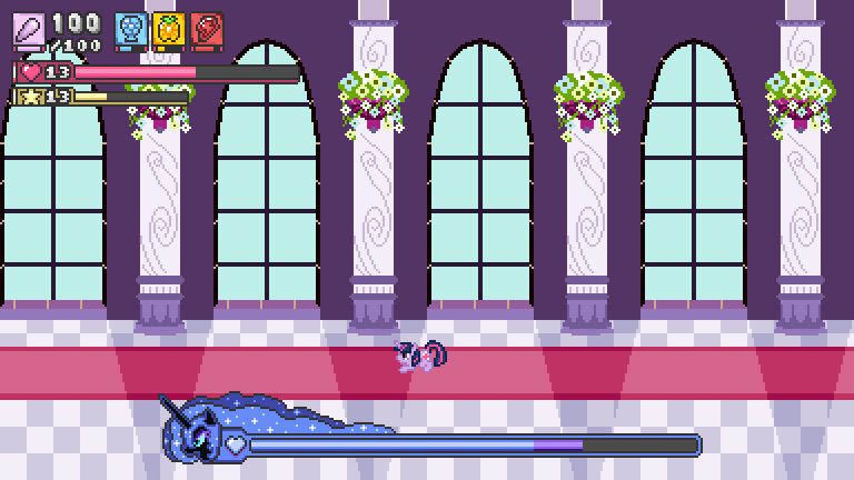
...But it still appears kind of messy, doesn't it? :P So I took a suggestion I got ages ago into consideration - that Twi's face isn't needed there. I tried simplifying the design...
S3AhLMZ.png

...and was checking if fancy boss hp bars would be a good idea... Looks cool! :yay: -I think, but it's too distracting, so I believe going with minimalist design will work better. :derp:

As for the rest--- hmm... not sure, maybe trying something different?

Let's flip some things!
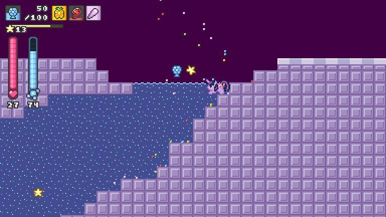
UZPo0qh.png

There,

It looks really simple, but it doesn't cover that much of space. It's just practical and considering, that there may be many things happening on screen, I think this is what I'll go with, at least for now, hah; Pretty sure I'll be adjusting things again in the future. :love:


So yeah, this is what I got lately. What do you think about these funny designs? :darling: 


That's all for now! Thanks for visiting! :ticking:

Also I'm terribly sorry for my grammar and English in general, it's past 7 AM and I'm really, really tired. Going to sleep now. :P 

  • Brohoof 9

10 Comments


Recommended Comments

I think the new one looks good! :mlp_yay: And so does the boss HP bar, though I understand your reason for not including it. :adorkable:

  • Brohoof 2
Link to comment

Thanks Taco! :mlp_yeehaa:

As for the boss hp bar, I'll try to add something fancy for each boss, but my first attempt was too fancy I suppose. ^_^ I'll be trying to come up with something less distracting. :P

  • Brohoof 2
Link to comment

I do like how you've managed to compress all that information into the corner without a loss of information. The only question I have relating to it is what happens regarding increasing health; does the bar get longer, or does it segment more?


The boss bar does look rather good, but if it's distracting then the question is why does there need to be a boss bar? So long as there is a visual cue that damage is being done (flashing white with an audio cue or whatever) the player doesn't need to know the health. Visual changes to the boss to indicate damage would be rather good, although I assume there would be significantly more work to animate the boss in the various wound states.

  • Brohoof 3
Link to comment

These are looking great! I definitely like the layout in the 2nd image, but I also love the fancy boss meter  :grin:

I have to ask: Does the drowning music play when Twilight's breath meter depletes?  :P


  • Brohoof 2
Link to comment
2 hours ago, Once In A Blue Moon said:

The only question I have relating to it is what happens regarding increasing health; does the bar get longer, or does it segment more?

Short answer: With the current design, at this very moment it does not. :P 

Long answer: It's still debatable. Read further if interested. :squee:

Now that, is a good question. Personally I love when the bar length changes along with maximum value. It gives that nice feeling, that you actually can see how your max HP is increasing, rather than just numbers getting bigger. However, with the current design I planned to give up on that feature, taking the breath meter next to it into consideration. That itself is not a problem though, I could move it somewhere else or re-design it. The problem is that HP really changes, from like 6-8 points at the beginning to more than 50 near the end (it's still subject to change, as it may be balanced in later stages of development). The gap is rather big, so if I'd plan the segments to represent a specific amount of HP, I'd have to keep in mind, that the bar's length would be multiplied by 6 - 7 during the playthrough.

For example, in this image:

UZPo0qh.png&key=f214755c041d0aa31e7e02cd

The HP bar's length is 50 pixels regardless of the amount of MAX HP. It has 10 segments, each having 5 pixels. At the moment it simply helps to determine the % of the HP. 4 segments would mean 40%, whether that would be 4/10 or 20/50 HP.

It's pretty long already, so if I wanted to make the length change, then assigning 1 pixel for each HP would be pretty reasonable. Then,  HP  27 / 60  would look like this:

Rp1aRIr.png

--which is fine, but--- at first it would look like this, for example,  HP  7 / 13  

lD1JK0Z.png

--which is now kind of funny and hardly readable. Well 13 is almost fine as seen above, but 6-8 not really. :P 

So I'd have to to do something like I had initially, for example give it around 25 pixels by default (to make it readable in small scales) and then increase its length by 1 pixel for every point or something. That however, would make the segments appear weirdly - misleading, pretty much meaningless, so it would be better to switch into a normal bar, something like:

At first ~   HP  7 / 7  Bar Length: 25 + 7 = 32

uD1yIhn.png

And later stages ~  HP  27 / 50  Bar Length: 25 + 50 = 75

9at1cuX.png


To be honest everything sounds nice and is doable, but I really, really cannot decide, so I'm open for any feedback regarding this. Having opinions or ideas? Please feel free to share these with me! :ticking: The whole HUD can always be changed, so I could even start over if that would be for the better. ^_^ Additionally, if you're having something in mind, such as designs from other games or some references, feel free to mention these as well! I'm always looking for some inspiration! :D 


4 hours ago, Once In A Blue Moon said:

The boss bar does look rather good, but if it's distracting then the question is why does there need to be a boss bar? So long as there is a visual cue that damage is being done (flashing white with an audio cue or whatever) the player doesn't need to know the health. Visual changes to the boss to indicate damage would be rather good, although I assume there would be significantly more work to animate the boss in the various wound states.

The question is, which one do you have in mind? ^_^ I was referring to the detailed designs. For example, if Nightmare Moon would be a boss, the bar would be somewhat Nightmare-Moon-Themed, like I did science there:

S3AhLMZ.png&key=051617e9a9a9da1ffee64523

It's cool and stuff, but I kinda went too far there. :D 

Boss bar is a must, I want it to be there. :P I always prefer to see how effective things are and how long the fight might be. By distracting I meant the fancy design mentioned above, not the bar itself. I can always make it simpler / smaller.

Visual changes in sprites would be really nice, but yeah, it would be some extra work. I might consider adding such feature anyway, but that's after I'll be done with the game or at least close to fully releasing it. There will be always some time for polishing later if needed.

Thank you very much for sharing your thoughts! :mlp_yeehaa:

  • Brohoof 3
Link to comment
1 minute ago, Phosphor said:

These are looking great! I definitely like the layout in the 2nd image, but I also love the fancy boss meter  :grin:

Oh now I'm even more unsure. :D I always have difficulties with making decisions. :P 

2 minutes ago, Phosphor said:

I have to ask: Does the drowning music play when Twilight's breath meter depletes?  :P

I recall someone asking literally the same question before. ^_^ I don't plan adding such thing, buuuuuuut I'll see - perhaps? :P I'll be toying with this at some point. :D 

  • Brohoof 1
Link to comment
17 hours ago, Rikifive said:

The question is, which one do you have in mind?

Oh, yes, sorry - I was referring to the Nightmare Moon one.

17 hours ago, Rikifive said:

 I always prefer to see how effective things are

I will speak up for animation and sound design here; this video shows how Hearthstone gives feedback from more damaging attacks.  

17 hours ago, Rikifive said:

designs from other games

The only other design that sprang to mind were the designs Metroid and Metroid Prime used (skip through videos to see the health change.) The health counter / bar is always 100 health, but a new one is added and represented by pips along the top or side; when a health bar empties a pip empties and the bars refill. In that context it was quite intuitive as you picked up health in energy tanks that would add an entire new energy bar; if you want to add 3 or 4 health per level then that won't be as intuitive.

The 25 + f(n) length (f a function on the level n) looks quite good to me, although I think that (potentially quite discrete) markers for 25%, 50% and 75% would be consistent, even if the thresholds changed (especially so if they were tied into wound states.)

Edited by Once In A Blue Moon
  • Brohoof 2
Link to comment

For what little my two bits is worth, I like the design with Twilight's head next to the stats if you can still keep all the information nice and compact next to it. Awesome designs though! :yay:

  • Brohoof 2
Link to comment
On 4/30/2019 at 6:40 PM, Once In A Blue Moon said:

Oh, yes, sorry - I was referring to the Nightmare Moon one.

Then, yes, its design being too detailed makes it distracting and that's what I meant - boss bar itself is absolutely not an issue and I totally want to have it there. :fluttershy:

On 4/30/2019 at 6:40 PM, Once In A Blue Moon said:

I will speak up for animation and sound design here; this video shows how Hearthstone gives feedback from more damaging attacks.  

A thing worth noting is, that in Hearhstone damaging doesn't happen that often and the amount of damage varies a lot - there's a focus on every single attack.
In my game however, players will be constantly throwing projectiles all over the place AND all spells will deal a specified amount of damage (there's even no RNG), regardless on the enemy type and strength. With that being said, a constant stream of projectiles of some sort will deal, let's say, 1 damage for each projectile on both, silly enemies and bosses. So there's simply no need to visualize that damage, as spells will have different sprites, sounds and effects on their own.

Here's an example:

Cx98Xa3.gif

In turn-based RPG, for example, that would be a pretty decent detail to include indeed, but here things happen to fast, so you wouldn't be really able to nicely interpret what the sounds are telling you.

Well, Element of Honesty would have some variety in the damage, as the outcome depends on the distance from the source of explosion, but still, this spell is AoE, so if you'd throw that at a group of enemies, it would generate a mess hard to interpret. :mlp_icwudt:

4OpqheV.gif

Displaying it visually via numbers and bars is more than enough and personally, my preferred minimum. :P 

Additionally signifying that with sounds is really nice, but not in such a fast-paced environment. :darling:

On 4/30/2019 at 6:40 PM, Once In A Blue Moon said:

The only other design that sprang to mind were the designs Metroid and Metroid Prime used (skip through videos to see the health change.) The health counter / bar is always 100 health, but a new one is added and represented by pips along the top or side; when a health bar empties a pip empties and the bars refill. In that context it was quite intuitive as you picked up health in energy tanks that would add an entire new energy bar; if you want to add 3 or 4 health per level then that won't be as intuitive.

This also reminds me of enemy hp bars in Kingdom Hearts:

srd5wrQ.png

Spoiler


It's nice, nice, but yeah, such design won't fit this game I think. :P 

Hmm.. I've been toying with it a little and I think I could reduce the gap between starting HP and the one in later stages. So, let's say I'd set the starting HP to 10 (2 segments) and increase the segments' size a little (from 5px/segment to 7px/segment), which would make it look like this at the beginning:

EDUi7oB.png

Quite tiny, but readable and it would be like this only somewhere at the beginning ~ then it would be increasing with progress. For example, here's 50 (10 segments) :

JjIIhk9.png

It would accurately represent the maximum HP, due to consistent scale. The length is nice too, so I think I could go with it


Eeeeeventually, since @Phosphor and @Totally Lyra mentioned the other design, perhaps something like this?

lfzVJ83.png

There most likely would be what I had initially, that [ base + n*level ] thing.

OR

maybe with segments too? Each segment could hold 5 HP (same as it was vertically) and have 10 pixels width each, so at first:

NRKeoqT.png

then for example, 27/50:

Ec5NDwL.png

and the breath bar could stay vertically.

also keep in mind, that there obviously will be more spells than these 4 in later stages, so there will cover half of the screen too. :P 

Oh Celestia... I can't DECIDE and it bothers me more than it should! Why, why, whyyyy I'm so dramatic about this?

VdaKNZK.png

I'll be probably redesigning it once again in the future anyway,

TNXTMxY.png

  • Brohoof 2
Link to comment

Create an account or sign in to comment

You need to be a member in order to leave a comment

Create an account

Sign up for a new account in our community. It's easy!

Join the herd!

Sign in

Already have an account? Sign in here.

Sign In Now
×
×
  • Create New...