Jump to content
Banner by ~ Ice Princess Silky

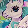
New style of shading (CRITIQUE NEEDED)


Slice0Pie

Recommended Posts

To me the shading is all blending together and not really there. I would say, don't be afraid to have some dark shading, and strong contrast that stands out and helps your character pop. Also, if we are going by the light source on her eye, and the darker bits of the hair are its shading, the light sources don't match. From her eye the light is directly in front of the character, but from the hair the light source is at her side.

Edited by Lucky Lass
Link to comment
Share on other sites

Your shading uses too much blending. I reckon you should try blending the edges of the shadows rather than blending the whole thing.

Otherwise, GJ.


*EDIT*


I also realized your shading is too subtle, try making the shadows darker and the shine less bright.

You should also keep in mind the light source, knowing where the light comes from and where the shadows kick in.

Edited by SwigglySwiggly
Link to comment
Share on other sites

Like the others have said, don't be afraid to go really dark on shadow. Contrast is good, it's all trial and error, trust me. I've started painting again and I've made some beginner mistakes.


Imagine you have no line work, just color. The color alone should at least give off the illusion of wear the head connects and other shaded areas. You don't have to go too far off in light and dark hues, but it seems really blended in shading. Valiant effort though, it takes a lot of practice to get right. Light sources and shading is one of the most difficult things to master.

  • Brohoof 1
Link to comment
Share on other sites

Create an account or sign in to comment

You need to be a member in order to leave a comment

Create an account

Sign up for a new account in our community. It's easy!

Join the herd!

Sign in

Already have an account? Sign in here.

Sign In Now
×
×
  • Create New...