Jump to content
Banner by ~ Ice Princess Silky

And the experiment goes on.. [OC]


Phaeston-e12

Recommended Posts

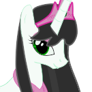
I'm going to redesign her muffler/hood on a next try-out. First picture looks strange even from my point but I suppose clothing a pony is bound to look strange regardless. Her eyelids are half-closed and that's why it looks really too small compared to her oval head; she doesn't sport an eyeshadow. Second picture I had to do it once I saw that MLP villain poster.


It was an... intriguing pose but I felt the forearm was little bit strange because based on my analysis it was detached from the shoulders like a human arm. So I did my own base sketch and tried my own version. I may add discord holding her up just for a hell of it in a future (before she mercilessly overpowers him and beats the daylight out of him until he screams in fear.)


Overall the first picture's vectoring took 3.5hour after I realized some nifty trick to save so much time and add a tremendous pace of efficiency.


Regardless... onto next picture... I need to get the request picture finished by tomorrow.

post-5710-0-74505700-1344468753_thumb.png

post-5710-0-39176100-1344468757_thumb.png

  • Brohoof 3
Link to comment
Share on other sites

Care to share that trick?

Anyways: Gorgeous work as usual.

The poor gal might need nostrils to breath though.

Maybe change the gem to some pale blue or something to break up the coloursheme a bit.

Also (and I'm aware you probably put way more thought in the perspective than me) think about adding a bit of flank/tail outline behind the wing, as it is, she looks a tad short.

  • Brohoof 1
Link to comment
Share on other sites

Care to share that trick?

Anyways: Gorgeous work as usual.

The poor gal might need nostrils to breath though.

Maybe change the gem to some pale blue or something to break up the coloursheme a bit.

Also (and I'm aware you probably put way more thought in the perspective than me) think about adding a bit of flank/tail outline behind the wing, as it is, she looks a tad short.


Thanks for pointing that out to me. The main reason why I went with gold brooch was because I didn't want to make the color scheme too compliated, been trying to keeep the colors fairly linear, but I may follow your suggestion and see what happens; her brooch may change in future because I'm going to change how the hood looks from the first place.

Link to comment
Share on other sites

Wow, this picture is awesome :)


But I agree I think the face needs a little bit of work, it looks kinda tired (and well aged, not sure if your going for that) with the eye and the cheek drawn the way it is.


Awesome detail though :)

Link to comment
Share on other sites

Wow, this picture is awesome :)


But I agree I think the face needs a little bit of work, it looks kinda tired (and well aged, not sure if your going for that) with the eye and the cheek drawn the way it is.


Awesome detail though :)


If that's how she looks then I've accomplished my goal I suppose. Her older version is supposed to give out a feeling that she's very old and tired.

  • Brohoof 1
Link to comment
Share on other sites

Create an account or sign in to comment

You need to be a member in order to leave a comment

Create an account

Sign up for a new account in our community. It's easy!

Join the herd!

Sign in

Already have an account? Sign in here.

Sign In Now
×
×
  • Create New...