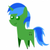
Zygen 6,066 December 6, 2012 Share December 6, 2012 (edited) So I was messing around in GIMP practicing drawing, and I decided to try something other then the default pose of my OC, so I decided to draw twilight, and I also drew her in a pose other then the default pony creator pose thing. Needless to say it was a big step for me to take since its my first time drawing anything other then my OC, and my first time drawing another pose. So... To be honest it turned out pretty bleh, It had alot of issues like I made the hair to small I think. And thus I am missing a stripe on her hair on one or two places, and her eyes look just.. Bleh. You'll see if you look at the picture(If you dare! MUHAHHA) Anyways I drew this in about 1 1/2 hours. Maybe a little more. This was done in GIMP with my mouse. So if you can offer any critique(Which i'm sure with all the errors you can) That would be nice, also anything that can help me to fix/ improve would be helpful aswell! Tips, tricks, resources all that jazz is always nice. Anyways without further ado, heres my first attempt at Twilight Sparkle. (I did use a reference, it was just a random picture from google images, I'm sure if you looked you'd find it.) So if your eyes are not bleeding enough after that.. Then if you wanna see some more of my art you can go to this thread. http://mlpforums.com/topic/40153-more-mediocre-art-by-me-now-with-mediocre-background/ Well I'm sure theres plenty critique to offer, so critique away! Thank you for your time(And the risk your eyes have taken.) (Oh and on a side note I got 1000 posts recently.. Sooo yay! Edited December 6, 2012 by Zygen 3 Thanks to Gone Airbourne for the awesome sig! My Oc's, Ponysona, Bella Vocal Covers Blog, MLP Covers Thread Link to comment Share on other sites More sharing options...
Radiance64 7,059 December 6, 2012 Share December 6, 2012 Well the body is fine, but the head... it needs to be flatter, more round, it's way too square. Still, it's a decent attempt, just keep practicing! 1 Link to comment Share on other sites More sharing options...
Jghx5 33 December 6, 2012 Share December 6, 2012 I would nit pick the hell out of this but a first timer I say good job. But for a little nit picky and more characters. You could have made it look a bit more stable instead of something that reminds me of Mario Party (1) BOO drawing mini game but it still looks very nice. 1 Link to comment Share on other sites More sharing options...
Fluttermena 1,224 December 6, 2012 Share December 6, 2012 Improving as always, Zygen. The eyes actually look better than what I can do without spending an unholy ammount of time fixing my mistakes...Every drawing that you make is better than the last, keep this up and I won't be able to post troll reactions anymore. Now, to find the right one... *Dives in kyrospawn's youtube channel* There, found it! 1 Link to comment Share on other sites More sharing options...
Skargon 6 December 6, 2012 Share December 6, 2012 Better than me! Although, I have yet to attempt drawing a Pony.. Hmm.. But I know atleast it is colored which is more than I would probably be able to achieve. 5/10 for effort 1 Link to comment Share on other sites More sharing options...
thegoodhen 698 December 6, 2012 Share December 6, 2012 It honestly looks to me like you drew a PERFECT Twilight and then warped it for comical effect. I LOVE the eyes and think with some... facial reconstruction, this'd be great! 1 Link to comment Share on other sites More sharing options...
Zygen 6,066 December 8, 2012 Author Share December 8, 2012 Well the body is fine, but the head... it needs to be flatter, more round, it's way too square. Still, it's a decent attempt, just keep practicing! Yeah I literally drew it forever, but to be honest I did this drawing so late that eventually I just got fed up with trying to draw the head. I could not get the shape right to save my life, either its to big, to small, to square to round. I swear I think the head gives me the most trouble overall. Not to say the rest is anywhere close to perfect though, I do plan to keep trying! One day I will draw atleast halfway decent art I would nit pick the hell out of this but a first timer I say good job. But for a little nit picky and more characters. You could have made it look a bit more stable instead of something that reminds me of Mario Party (1) BOO drawing mini game but it still looks very nice. Thats exactly what I thought when I saw the finished product of the head come together O_o. But feel free to nit pick, I honestly don't care. The more critique I have the more I can add to my list of things to improve on while practicing. Improving as always, Zygen. The eyes actually look better than what I can do without spending an unholy ammount of time fixing my mistakes...Every drawing that you make is better than the last, keep this up and I won't be able to post troll reactions anymore. Now, to find the right one... *Dives in kyrospawn's youtube channel* There, found it! Hehe, thanks. Flutters. If that ever does happen I'm going to miss being sent troll reactions though . Better than me! Although, I have yet to attempt drawing a Pony.. Hmm.. But I know atleast it is colored which is more than I would probably be able to achieve. 5/10 for effort Well theres a first time for everything, maybe you should try it sometime . Its actually kinda enjoyable and relaxing to do sometimes! Just turning on some music, and drawing away. It honestly looks to me like you drew a PERFECT Twilight and then warped it for comical effect. I LOVE the eyes and think with some... facial reconstruction, this'd be great! Hehe. please your making me blush . Its not really perfect in any regard even without the face messup, I mean theres alot of smaller errors scattered, but it is a bit hard to look at much else but the deformed face eh.? . Thanks for the compliment though . Maybe I'll try another one, or just work on my overall drawing of pony faces.. . Thanks to Gone Airbourne for the awesome sig! My Oc's, Ponysona, Bella Vocal Covers Blog, MLP Covers Thread Link to comment Share on other sites More sharing options...
Dusty Soul 2,614 December 8, 2012 Share December 8, 2012 The body is too long and a little slender, the ponies in the show have a more rounded body. The snout is really pointy, the snout is more curved then what you have here. Sorry if this seems nitpicky. Really, it's not bad other then a those and about 3 more other things. (no line defining the front, The ear is extremly curved, and the horn is pointy,) (I know you did it with a mouse, just saying) 1 Soundcloud-------------------Facebook---------------------------Youtube Link to comment Share on other sites More sharing options...
Zygen 6,066 December 8, 2012 Author Share December 8, 2012 The body is too long and a little slender, the ponies in the show have a more rounded body. The snout is really pointy, the snout is more curved then what you have here. Sorry if this seems nitpicky. Really, it's not bad other then a those and about 3 more other things. (no line defining the front, The ear is extremly curved, and the horn is pointy,) (I know you did it with a mouse, just saying) Don't worry about it dusty, I'm kinda glad you nitpicked it. Like I said it gives me a better idea of what I need to change specifically. And besides even if I was going to get all offended over critique I'd have to learn to accept it if I ever plan on getter better. That basically goes for everything. I really think alot of my problems come from not using enough of a rounded stroke overall. I have alot of places where I have really pointy strokes(Especially the hair.) Thank you for your critique! I'll work on those next time i decide to do some practicing!(Which hopefully being a weekend I'll get some chances to.) 1 Thanks to Gone Airbourne for the awesome sig! My Oc's, Ponysona, Bella Vocal Covers Blog, MLP Covers Thread Link to comment Share on other sites More sharing options...
thegoodhen 698 December 8, 2012 Share December 8, 2012 (edited) Hey man! I tried to fix the proportions a bit... Here ya go! ORIGINAL YOUR VERSION YOUR VERSION-FIXED BY ME PICASSO'S VERSION DÁLÍ'S VERSION Edited December 8, 2012 by thegoodhen 5 Link to comment Share on other sites More sharing options...
Zygen 6,066 December 9, 2012 Author Share December 9, 2012 Hey man! I tried to fix the proportions a bit... Here ya go! ORIGINAL 20110730233429!Twilight_Sparkle_hubworld_promotional.jpg YOUR VERSION Twilight sparkle art by me 1.jpg YOUR VERSION-FIXED BY ME Twilight sparkle art by me 1fixed2.jpg PICASSO'S VERSION Twilight sparkle art by me 1fixed2picasso.jpg DÁLÍ'S VERSION Twilight sparkle art by me 1fixed2dali.jpg Haha thanks for it! I'm sure i'll eventually learn to fix it to be correct. I laughed so hard at the Picasso version and Dali versions . The rediculously big horn is halarious. Anyways, I'm sure with enough practice I'll eventually learn to fix it. Thank you for your help though! I'll try and examine the angles on it a bit more. 1 Thanks to Gone Airbourne for the awesome sig! My Oc's, Ponysona, Bella Vocal Covers Blog, MLP Covers Thread Link to comment Share on other sites More sharing options...
Ashbad 969 December 9, 2012 Share December 9, 2012 I don't think there's any point in trying to simply trace this picture, or simply draw it from your eye, without understanding the anatomy behind it. Like always, the magical anatomy guide: http://fim.413chan.net/art/src/134253401649-130255119873.jpg I'm not a huge fan of this chart lately (It's not exact to the show in some aspects, but unless you're willing to watch the show and study anatomy frame by frame like that, it's a good resource) -- but it's important to know what the underlying shapes and forms are before drawing something. It would also be helpful to study the anatomy of actual horses as well so you can understand what the cartoon ponies' anatomy is based on. 1 What has fanfiction has Ashbad written lately? We should totally find out by clicking this link. (Protip, turn on "Show Mature" to see more) Link to comment Share on other sites More sharing options...
Zygen 6,066 December 9, 2012 Author Share December 9, 2012 I don't think there's any point in trying to simply trace this picture, or simply draw it from your eye, without understanding the anatomy behind it. Like always, the magical anatomy guide: http://fim.413chan.net/art/src/134253401649-130255119873.jpg I'm not a huge fan of this chart lately (It's not exact to the show in some aspects, but unless you're willing to watch the show and study anatomy frame by frame like that, it's a good resource) -- but it's important to know what the underlying shapes and forms are before drawing something. It would also be helpful to study the anatomy of actual horses as well so you can understand what the cartoon ponies' anatomy is based on. Oh ok thank you! However I have a question about the chart, its kinda confusing to me? Is it suppose to be to understand where all the joints are and how each line is drawn or each part is drawn? Or is there some deeper meaning to it? Sorry I'm a novice(And kinda slow lol.) Thanks to Gone Airbourne for the awesome sig! My Oc's, Ponysona, Bella Vocal Covers Blog, MLP Covers Thread Link to comment Share on other sites More sharing options...
Ashbad 969 December 9, 2012 Share December 9, 2012 Oh ok thank you! However I have a question about the chart, its kinda confusing to me? Is it suppose to be to understand where all the joints are and how each line is drawn or each part is drawn? Or is there some deeper meaning to it? Sorry I'm a novice(And kinda slow lol.) It's more of a piece-by-piece explanation of the 3 dimensional forms that would make up a My Little Pony (were they real), giving the general proportions of the pieces and how they relate to each other. 1 What has fanfiction has Ashbad written lately? We should totally find out by clicking this link. (Protip, turn on "Show Mature" to see more) Link to comment Share on other sites More sharing options...
Zygen 6,066 December 9, 2012 Author Share December 9, 2012 It's more of a piece-by-piece explanation of the 3 dimensional forms that would make up a My Little Pony (were they real), giving the general proportions of the pieces and how they relate to each other. Oh ok, that sorta makes a bit more sense. I'll try taking a look into it and using it a little when I decide to do some more art later. Thanks ! Thanks to Gone Airbourne for the awesome sig! My Oc's, Ponysona, Bella Vocal Covers Blog, MLP Covers Thread Link to comment Share on other sites More sharing options...
XUNUSEDXXX 3,459 December 10, 2012 Share December 10, 2012 It's decent for a first attempt, but there are definitely some proportional issues. The snout also looks a bit lopsided and it looks like a stallion snout. Good job though 1 Link to comment Share on other sites More sharing options...
Moon Rat 4,773 December 10, 2012 Share December 10, 2012 Not a bad attempt I will say that for sure at least it looks better that Picasso's version and a HELL of a lot better than Dali's version (which is probably my new nightmare feul) You just need to tweak it a little bit Make her more rounded instead of boxy 2 Thank you Nas for the sig :3 #HugWoona Link to comment Share on other sites More sharing options...
Nohbdy 4,108 December 10, 2012 Share December 10, 2012 Could have spent a few more minutes making sure that the proportions and lines fit with the original picture. That's not to say you didn't put any effort, of course, but this is a common issue that shouldn't be an issue at all. In all, good job, but I'd work on it a bit more. 1 Link to comment Share on other sites More sharing options...
RaptorART 258 December 10, 2012 Share December 10, 2012 ok than! lets try this from a more serious perspective drawing ponies CAN BE EASY...if, and ONLY if you break them down in shape! so here we go! No more of this drawing the outline first junk real pros use skeletons, until they are good enough to not need them check me out on FB or my DA! https://www.facebook.com/RaptorArtStudios?ref=hl http://raptor007.deviantart.com/ Link to comment Share on other sites More sharing options...
Ashbad 969 December 10, 2012 Share December 10, 2012 ok than! lets try this from a more serious perspective drawing ponies CAN BE EASY...if, and ONLY if you break them down in shape! so here we go! No more of this drawing the outline first junk real pros use skeletons, until they are good enough to not need them lets draw twilight.jpg That's a good way of thinking about it, but I think your example shapes need some tweaking -- sphere component of her cranium is far too small, and her neck is far too long. What has fanfiction has Ashbad written lately? We should totally find out by clicking this link. (Protip, turn on "Show Mature" to see more) Link to comment Share on other sites More sharing options...
RaptorART 258 December 10, 2012 Share December 10, 2012 That's a good way of thinking about it, but I think your example shapes need some tweaking -- sphere component of her cranium is far too small, and her neck is far too long. lol, i see what you mean I appear to still be in OC drawing mode, lol! i normally make the heads pop a bit more once i get the skeleton done I prefer the long body types myself :3 check me out on FB or my DA! https://www.facebook.com/RaptorArtStudios?ref=hl http://raptor007.deviantart.com/ Link to comment Share on other sites More sharing options...
Anadu Kune 668 December 10, 2012 Share December 10, 2012 (edited) That is pretty good for a first try. A suggestion I always have for people that helps me out is finding the line of action. Hope this helps out.http://artists.pixelovely.com/gesture-basics-1-line-of-action/ http://storyboardsecrets.com/blog/storyboard-drawing-tutorial-line-of-action/ Edited December 10, 2012 by Anadu Kune 2 Link to comment Share on other sites More sharing options...
Zygen 6,066 December 12, 2012 Author Share December 12, 2012 That is pretty good for a first try. A suggestion I always have for people that helps me out is finding the line of action. Hope this helps out. http://artists.pixelovely.com/gesture-basics-1-line-of-action/ http://storyboardsecrets.com/blog/storyboard-drawing-tutorial-line-of-action/ This is an interesting concept. I might try this sometime, Its just basically a line that goes through whatever your drawings spine. It would help a bit on the neck and parts of the body I'm sure(not totally sure on the head, but maybe it will who knows.) Thanks! It's decent for a first attempt, but there are definitely some proportional issues. The snout also looks a bit lopsided and it looks like a stallion snout. Good job though Yeah, there is certainly some issues with that darn snout. I think I was trying to make it look to much frontal view like, and I just ended up thinking about it to much and messing the whole thing up. And thanks Not a bad attempt I will say that for sure at least it looks better that Picasso's version and a HELL of a lot better than Dali's version (which is probably my new nightmare feul) You just need to tweak it a little bit Make her more rounded instead of boxy I've been trying to make her more rounded, Without making her seem fat almost. For somereason it is extreamly annoying to find the right balance between the two, but I'll work on it! Thanks! Could have spent a few more minutes making sure that the proportions and lines fit with the original picture. That's not to say you didn't put any effort, of course, but this is a common issue that shouldn't be an issue at all. In all, good job, but I'd work on it a bit more. I'll certainly agree that I could've been a bit more picky with details and spent more time on it, I can be bad with rushing things sometimes, especially since i think I finished this late or something. Part of it is just me getting really frustrated from drawing the same thing over and over and it never looking good, but I think part of it may just be I was rushing a bit. I might try to slow down a little next time. Thanks to Gone Airbourne for the awesome sig! My Oc's, Ponysona, Bella Vocal Covers Blog, MLP Covers Thread Link to comment Share on other sites More sharing options...
Bladewing 17 December 15, 2012 Share December 15, 2012 (edited) That's a good way of thinking about it, but I think your example shapes need some tweaking -- sphere component of her cranium is far too small, and her neck is far too long. Actually, the proportions he has are practically perfect (Mary Poppins anyone). He just adds a bit of style to it, particularly slenderness. That said, when I draw I just skip the skeleton part completely and freehand the whole thing. It takes a bit more trial-and-error, but in the end it works for better hand-coloring (especially with my crappy erasers ) Anyways, back to the OT. I personally find MS Paint to be a lot easier to use for just making ponies. That ease probably stems from my younger days when all I did on the computer was make stuff in Paint, but that curvy line tool is THE most useful tool of them all. So far all I've used GIMP for is adding color to my drawings. Otherwise, I'd go with what thegoodhen said, it looks like you replicated perfectly than warped it comically Edited December 15, 2012 by Bladewing Link to comment Share on other sites More sharing options...
Ashbad 969 December 15, 2012 Share December 15, 2012 Actually, the proportions he has are practically perfect (Mary Poppins anyone). He just adds a bit of style to it, particularly slenderness. That said, when I draw I just skip the skeleton part completely and freehand the whole thing. It takes a bit more trial-and-error, but in the end it works for better hand-coloring (especially with my crappy erasers ) So, by his choice of being stylistic, he has foregone correct proportions. Style is one thing, correct anatomy is another. My comment stands. What has fanfiction has Ashbad written lately? We should totally find out by clicking this link. (Protip, turn on "Show Mature" to see more) Link to comment Share on other sites More sharing options...


Recommended Posts
Create an account or sign in to comment
You need to be a member in order to leave a comment
Create an account
Sign up for a new account in our community. It's easy!
Join the herd!Sign in
Already have an account? Sign in here.
Sign In Now