FunkiiPanda 199 May 30, 2014 Share May 30, 2014 Hey guys have a suggestive twilight Other Work: http://mlpforums.com/topic/99032-super-saiyan-fluttershy/ http://mlpforums.com...ure-fluttershy/ http://mlpforums.com...gestive-pinkie/ http://mlpforums.com...leepy-rarity-3/ http://mlpforums.com...66-applejack-3/ http://mlpforums.com...rawing-again-3/ http://mlpforums.com...cess-cadence-3/http://mlpforums.com...ord-candyfloss/http://mlpforums.com.../32102-octavia/http://mlpforums.com...eness-overload/http://mlpforums.com...873-pinkie-pie/http://mlpforums.com...-vinyl-scratch/http://mlpforums.com...775-applebloom/http://mlpforums.com...azy-pinkie-pie/http://mlpforums.com...ebloom-heart-3/ 9 Thanks to Doctor-Whooves for the awesome sig Thanks to FayFoxeh for allowing me to use one of her artworks ^^ There was a crooked man and he walked a crooked mile. He found a crooked sixpence upon a crooked stile. He bought a crooked cat, which caught a crooked mouse. And they all lived together in a little crooked house. Link to comment Share on other sites More sharing options...
Justin ZW 396 May 30, 2014 Share May 30, 2014 Careful, there. I personally don't appreciate sexualized ponies, and I know that quite a few others don't, as well. Let's try not to get into "suggestive" themes, shall we? A Whovian Administrator of Zelda Wiki who loves Rainbow Dash and all her antics. Link to comment Share on other sites More sharing options...
Banul 3,831 May 30, 2014 Share May 30, 2014 Personally, I think that looks awesome. But like the guy above said, tread carefully. You might get a slap on the wrist from the mods for that. Link to comment Share on other sites More sharing options...
FunkiiPanda 199 May 30, 2014 Author Share May 30, 2014 Careful, there. I personally don't appreciate sexualized ponies, and I know that quite a few others don't, as well. Let's try not to get into "suggestive" themes, shall we? Personally, I think that looks awesome. But like the guy above said, tread carefully. You might get a slap on the wrist from the mods for that. Already checked it over with one of the mods says its fine not too revealing 4 Thanks to Doctor-Whooves for the awesome sig Thanks to FayFoxeh for allowing me to use one of her artworks ^^ There was a crooked man and he walked a crooked mile. He found a crooked sixpence upon a crooked stile. He bought a crooked cat, which caught a crooked mouse. And they all lived together in a little crooked house. Link to comment Share on other sites More sharing options...
~SadisticFluttershy~ 779 May 30, 2014 Share May 30, 2014 Looks great. Twilight may actually be the sexy type. As long as its clean, not revealing any gore. Totally fine. Thanks MiniKirby! It's soooooo awesome! "Enough Chitchat time is candy!".- Pinkie Pie. "Storm Chasing is a commitment. Not a choice". -Me "Never stop chasing!"- Reed Timmer Link to comment Share on other sites More sharing options...
ReverseFaller 2,484 May 30, 2014 Share May 30, 2014 That's a pretty good drawing. I wouldn't worry about it being too suggestive, since Tara Strong herself tweeted a suggestive Twilight image. 1 Credit for the signature goes to Kyoshi Link to comment Share on other sites More sharing options...
~Rule 63~ Lyeco 527 May 30, 2014 Share May 30, 2014 It's not rule 34, but it's sexy 1 Signature by Me Made with Word and Repix I want your request in my request shop Click Here-> http://mlpforums.com...p/#entry1729814 Link to comment Share on other sites More sharing options...
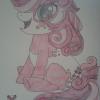
SweetJeans88 408 May 30, 2014 Share May 30, 2014 nice cheesecake, good crisp lines only wonky thing id say is her right shoulder/arm. it looks a little disjointed/disconnected, but i think its because her jawline is overlapping a bit far. so the head looks like its in front of the neck, but behind her shoulderblade, when it should be behind both. also it might be a little small, but its hard to tell--i do that da vinci arc test thing to get my lengths right.keep at it 1 GO CONTRIBUTE! my art: here, and tumblr Link to comment Share on other sites More sharing options...
ghostfacekiller39 23,882 May 30, 2014 Share May 30, 2014 (edited) Don't see what the problem is. Seriously, this isn't even really that suggestive. I wouldn't even place it borderline NSFW. This is just an overreaction, in my opinion. This isn't even close to R34 content. Not. Even. Close As for the drawing itself, the right arm/hoof thingy looks like it isn't connected to the body - erase the lines between her shoulder and the rest of her arm/hoof the next time around in order to make it look more realistic Shouldn't be too hard - other than that, the lines and shading are both done with a high quality to them, and I think those are two strong suits to be proud of in this picture Nice work! Edited May 30, 2014 by ghostfacekiller39 4 He who is Positively Obsessed With All Things Rarity!!! Check out the Rarity Fan Club! "Not everyone who is pretty is necessarily beautiful. For those two to come together is truly a Rarity" -Jacob G. Rosenberg Signature by @FadedSkies Link to comment Share on other sites More sharing options...
FunkiiPanda 199 May 30, 2014 Author Share May 30, 2014 Don't see what the problem is. Seriously, this isn't even really that suggestive. I wouldn't even place it borderline NSFW. This is just an overreaction, in my opinion. This isn't even close to R34 content. Not. Even. Close As for the drawing itself, the right arm/hoof thingy looks like it isn't connected to the body - erase the lines between her shoulder and the rest of her arm/hoof the next time around in order to make it look more realistic Shouldn't be too hard - other than that, the lines and shading are both done with a high quality to them, and I think those are two strong suits to be proud of in this picture Nice work! I agree with you on that one it's not exactly revealing in a sense, and myself I look at r34 from time to time doesnt even compare to some of that material With the drawing itself i agree that the arm looks a little odd :c should of gone over it before outlining with sharpie now that I look at it also I see the horn is a little out aswell with the top of the hairline but thanks for the feedback ^^ 2 Thanks to Doctor-Whooves for the awesome sig Thanks to FayFoxeh for allowing me to use one of her artworks ^^ There was a crooked man and he walked a crooked mile. He found a crooked sixpence upon a crooked stile. He bought a crooked cat, which caught a crooked mouse. And they all lived together in a little crooked house. Link to comment Share on other sites More sharing options...
Ribbonfree 2,384 May 30, 2014 Share May 30, 2014 Yep, it's definitely in the range of acceptable for the site, especially if you got mod permission. The bangs of her mane are a bit askew to her face, makes it look much larger than it actually is in the show, but that could be written off as a style of interpreting it anyways. Other than the things the others pointed out above it's really nice. Your drawing future looks bright. 2 Link to comment Share on other sites More sharing options...
Nulln 755 May 30, 2014 Share May 30, 2014 Well I think it's pretty cute. 1 Link to comment Share on other sites More sharing options...
FunkiiPanda 199 May 30, 2014 Author Share May 30, 2014 Well I think it's pretty cute. Thanks im glad that you appreciate it Thanks to Doctor-Whooves for the awesome sig Thanks to FayFoxeh for allowing me to use one of her artworks ^^ There was a crooked man and he walked a crooked mile. He found a crooked sixpence upon a crooked stile. He bought a crooked cat, which caught a crooked mouse. And they all lived together in a little crooked house. Link to comment Share on other sites More sharing options...
Onylex 2,838 May 30, 2014 Share May 30, 2014 (edited) I agree with @ghostfacekiller39 on this one. I created a similar thread like this a while back when I was still new to the forms. Nobody had a problem with it until one member went off the walls about it. After that a mod took it down even though it had been up for 3 days, gotten many brohoofs, as well as positive comments. On a note about the art piece itself, I would recommend you practice more. Specifically working on line variation and color. Your lines are just to much of one consistency there is no contrast between them, making it look a little boring. I'll put two art pieces that I did a while back which are pure line arts for an example of what I mean by line variation. You can see how I made the lines go from thin to thick in a lot of places, adding contrast and, variation thus; making it a bit more interesting to look at. Your coloring could use a bit more saturation to it. At the moment its very washed out and looks a little gray. I recommend studying color theory and opposing colors/harmonic colors. Iv also noticed that you seem to use a lot of reference to draw, using references isn't a bad thing but, there are good and bad ways to use it. Bad: looking and just trying to copy whats there and what you see doesn't help unless you are trying to render something. You will also get stuck when you want to try and draw something from your imagination because you will have nothing to reference. Good: Drawing what you see but also taking note, what are the over all shapes, how would this same object look in a different perspective, what is the relationship between each line etc. In the long run doing that will help build a visual library that you can look back on without having to look up a reference. Edited May 30, 2014 by Onylex 1 Link to comment Share on other sites More sharing options...
KoGy 187 May 30, 2014 Share May 30, 2014 I really like the rendering. It is well made. 1 Link to comment Share on other sites More sharing options...


Recommended Posts
Create an account or sign in to comment
You need to be a member in order to leave a comment
Create an account
Sign up for a new account in our community. It's easy!
Join the herd!Sign in
Already have an account? Sign in here.
Sign In Now