Jump to content
Banner by ~ Ice Princess Silky

Hmm That HUD Could Be Improved... | MLP:SH Devlog #9


Rikifive

1,728 views

Hello everypony! :D 

It's been a while, hasn't it? :P Last year turned out to be kind of busy for me, but hopefully this one won't be like this!

I've been wondering on which project I should be working on and to this moment I have no idea. I've decided to poke this one first, but I think I may be switching between this one and MLP: The Game, as I'd really love to get these two done. My priority project will always be the first one I have ever started - MLP: The Game, but it's good to work on different things once in a while to avoid getting bored. I'm also having 999 other ideas for games and I'm trying my best to not distract myself with these. ^_^ 

Okay, so let's get to the point.


Mooooonths ago in one of the updates@HereComesTom mentioned moving things in HUD:
Quote

"I'm a bit surprised you're putting the mana bar on one side of the screen and the health bar on the other side; I'd have thought they'd go better closer together."

For a reference, here is how it looked like so far:
4ENzDBI.png

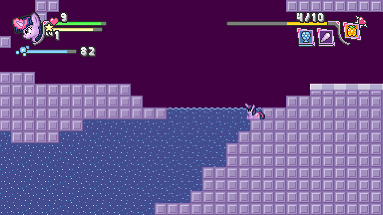
The 'mana bar' he mentioned is the energy bar with Elements of Harmony seen to the right.

For me it looked fine as it was, as I kinda didn't want to throw everything into one corner... until I realized how inconvenient it was in practice. You see, switching spells was confusing when these were on the right side, due to the order of them appearing mirrored. I thought players will eventually get used to that, but I couldn't really get used to it myself. Switching spells wasn't a big issue, but whenever I looked at HUD, it was confusing me. The order of icons wasn't really readable and I imagine it could get worse when more spells would become available. There was one thing I was sure of... That these have to be on the left side.

So today I've been working on redesigning the HUD ... the whole day. SB2bpHO.png

I was moving things around and finally came up with this:

flFkjy7.png

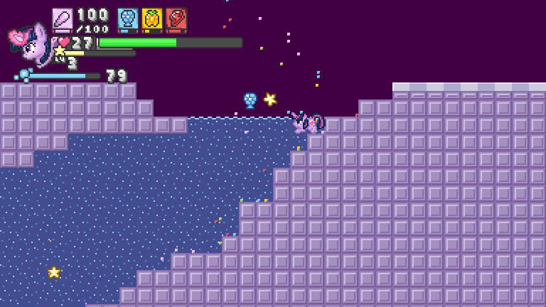
SOME OTHER CHANGES I'VE MADE:
HP bar is now thicker, because I wanted to make it stand out more, to make it more noticeable even without really looking at it.
- HP bar's length now grows along with maximum HP.
- Spell icons have less details in order to save some space and make the HUD less spammy.
- Spell icons have thicker energy bars, because I removed the long energy bar and used numbers only. I wanted to give those little bars more highlight and make these more readable.


...Though I had a feeling, that something was wrong. It seemed so... clogged. One of my fellow devs suggested me this:

Quote

"adding small amounts of space/padding between the elements would go a long way"

---and that made me realize, that it's all messy indeed. Colorful bars and icons, big numbers-- all over the place, yet so close to each other.

So I got to this again and decided to get rid of some details, as well as using smaller numbers to make it all look neater:

P0YG7sw.png

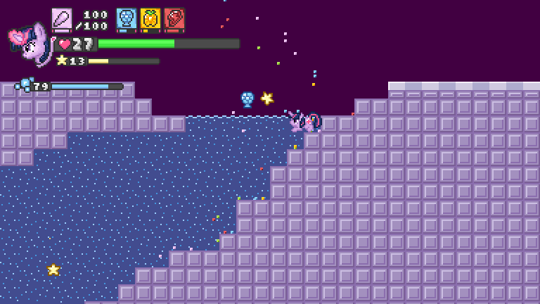
Now only HP has big numbers, as it's the most important part of the HUD.

I think it looks fine now, though knowing me, I'll probably end up redesigning it over and over again along with development. :mlp_icwudt:
I was also thinking of something like this:
zELqmCj.png

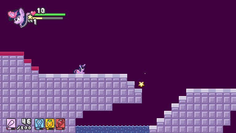
--- buuut decided to have it all in one place.


What are your thoughts? :mlp_grin:


And as always, thank you for visiting! ^_^ 

  • Brohoof 2

6 Comments


Recommended Comments

Are there some prototypes of the game that we can try out with the different display setups, so we can try them out and see how they compare in practice?

  • Brohoof 2
Link to comment

The one with smaller numbers looks good to me! :yay:

Also, I think I've said it before, but the game looks so cute and awesome! :D Good luck with the project, my friend! :kindness:

  • Brohoof 1
Link to comment

Some advice I had* once was that you can use up to three numbers in a paragraph before people just switch off and it all blurs together in a haze of meaningless figures. If you were to apply that to different sections of the HUD then the last image is the most accessible, and certainly that's the one that I think is easiest to look at. Have you tried putting anything around the cursor? I've seen a few games (especially fast-moving shooters) put ammo or energy around it - if you then tinted it the colour of the element you're using then you needn't have the elements on-screen at all. Scroll through with the mouse wheel for on-the-fly element changes without losing tracking on your target^.


One other question I have is why is Twilight's head there? It looks very nice,  but if you're having crowding problems in the HUD then maybe it needs to go?


Needless to say, don't attribute too much weight to this; I am no expert on displaying information effectively, although I do think that well-displayed information is a thing of beauty"".


*about how to write technical stuff for non-technical people, rather than game design, but the idea should still hold

^I'm trying to remember the games that did this. I know Half Life 2 did it with ammo, and I'm sure there have been a few top-down shooters that used it to good effect as well.

""One need only look at the magnificent graphs of the late Hans Rosling to get an intuitive grasp of what is a vast array of data points.

Edited by Once In A Blue Moon
  • Brohoof 2
Link to comment
9 hours ago, Usager said:

I like the bottom one, is not that invasive to the eye :3!

Heh yeah, I kept wondering on that one, as it makes the screen appear more balanced, rather than having one corner clogged like this.

How about this then? :darling:

3dv3UOM.png

Also just to be sure everyone knows - The blue air bar with bubbles obviously disappears when not submerged in water. You won't see it often. This applies to all designs I posted above and the ones I had so far. This is also why it is slightly further than the rest of HUD - it appears and disappears.

9 hours ago, HereComesTom said:

Are there some prototypes of the game that we can try out with the different display setups, so we can try them out and see how they compare in practice?

Hmm.. to avoid reprogramming things over and over again, I made only these concept arts of some sort. The animation of switching spells will have to be reprogrammed completely, due to different design, but the rest seem to be a matter of X/Y positions... I suppose I could provide some prototypes if that would help, but I'd need some time. :P 

8 hours ago, Tacodidra said:

The one with smaller numbers looks good to me! :yay:

Also, I think I've said it before, but the game looks so cute and awesome! :D Good luck with the project, my friend! :kindness:

Thank you very much Tacodidra! :squee:

7 hours ago, Once In A Blue Moon said:

Some advice I had* once was that you can use up to three numbers in a paragraph before people just switch off and it all blurs together in a haze of meaningless figures. (...)

Yeah, I imagine having everything in one corner may me kind of unreadable. There would be four numbers and that's how the HUD would appear most of the time:

iJnicdm.png

7 hours ago, Once In A Blue Moon said:

Have you tried putting anything around the cursor? (...)

That's a good idea and I'd consider it if not the fact... That there is no cursor. :twi: The game is designed for keyboard only or gamepad (-preferred). Mouse doesn't do anything in this game.

8 hours ago, Once In A Blue Moon said:

One other question I have is why is Twilight's head there? It looks very nice,  but if you're having crowding problems in the HUD then maybe it needs to go?

If not character's face, then I'll have to put some details somewhere else, because without any of this the HUD appears to be empty/sad; too simple:

7HkbbgV.png

Adding some brighter little elements here and there would help, but I think character's face fits better. Besides, that face doesn't take that much of space. :P 

8 hours ago, Once In A Blue Moon said:

Needless to say, don't attribute too much weight to this; I am no expert on displaying information effectively, although I do think that well-displayed information is a thing of beauty"".

Yeah.. the most important thing was to make switching spells better, the rest is rather cosmetic. I'll leave it that way for now, there always will be time to make changes in the future if I'll randomly get an idea for this. :P --or if for some reason I'll receive tons of complaints regarding how annoying the HUD is. :D 


Thank you all for feedback. :mlp_grin:

  • Brohoof 2
Link to comment

Create an account or sign in to comment

You need to be a member in order to leave a comment

Create an account

Sign up for a new account in our community. It's easy!

Join the herd!

Sign in

Already have an account? Sign in here.

Sign In Now
×
×
  • Create New...