Zanuark 5 July 12, 2012 Share July 12, 2012 I would have posted it by the previous afternoon central but my pencil sharpener broke and had to wait till qbout eight thirty central to start finishing but here it is. Shadoweye is on a hike in one of the wastelands near saddle arabia. during his hike, he falls into a strange hole. He discovers a finely crafted star made of pure ruby. and thats the story of the pic. btw I'll repost when i get sunlight. We'll I am bored right now so I decided to post and now I finished posting I'll do something else Link to comment Share on other sites More sharing options...
RippedOffMattress 314 July 12, 2012 Share July 12, 2012 Looks good! Just darken the coloring a little. It's a bit hard to see. 2 Formally known as Misselaineous97. Link to comment Share on other sites More sharing options...
Zweiterversuch 50 July 12, 2012 Share July 12, 2012 Mmm...mmm.... I think you'll become one of the best if you keep practicing! 2 Spike and rarity?Deerpy hooves and dr whooves?Discord and Celestia? Fridge yeah! Go here to read my fanfic: http://mlpforums.com/topic/23346-windgale-last-subordinate-of-discord-i-changed-the-name/ If you want to see the art I made for it: http://mlpforums.com/topic/23426-art-for-my-fanfic/ Go here if you want to see my MLP related art: http://mlpforums.com/topic/23012-fan-artkindameh/ Link to comment Share on other sites More sharing options...
MVC NVMXD JVRXD 2,406 July 12, 2012 Share July 12, 2012 Your art is very hard to see. I suggest shading darker, or bringing the camera closer to the paper. In better light. Now from what I can see, your anatomy is kind of off. The body is way to skinny, and it appears the back has an arch to it. The leg itself is awkwardly placed, and kind of skinny. You might wanna work on that. His neck seems too long, almost giraffe like (no offense.). Again, this is all in the anatomy. If you're trying to be show accurate then I suggest working on the eyes too, that shape seems wrong. That's the only part of the pony I cam make out through the picture. Now I am not trying to discourage you from making more fan art. I'm just trying to give you tips on how to better yourself. Keep practicing. 3 I HAD TO FALL TO LOSE IT ALL BUT IN THE END IT DOESN'T EVEN MATTER /WRISTS On 4/28/2013 at 8:13 PM, gooM said: Djenty...man you are crazy, but an awesome sort of crazy Link to comment Share on other sites More sharing options...
Zanuark 5 July 13, 2012 Author Share July 13, 2012 thanks for the opinions but the reason it seems the need to be shaded is because of my 3ds cam needs an upgrade I would have to do manually and I didn't get sunlight today. storms... But has anyone related the scenerio to indiana jones yet?(not sure if file decided to upload) here is the next best thing finally. 1 We'll I am bored right now so I decided to post and now I finished posting I'll do something else Link to comment Share on other sites More sharing options...
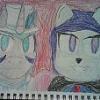
morethanicecream 117 July 13, 2012 Share July 13, 2012 The colors need to be more vibrant. The neck and eyes are a bit weird. And, which pony is it. I am still on season 1. Link to comment Share on other sites More sharing options...
Fluttermedic 86 July 13, 2012 Share July 13, 2012 Looks like Twilight Sparkle, or could be a fan made pony. "If you can't make the moon interesting, try setting it on fire"- Void Chicken Link to comment Share on other sites More sharing options...
morethanicecream 117 July 13, 2012 Share July 13, 2012 nevr mind, feel like an idiot, now know the ponies name Link to comment Share on other sites More sharing options...
Zanuark 5 July 14, 2012 Author Share July 14, 2012 Its a fan character ._. We'll I am bored right now so I decided to post and now I finished posting I'll do something else Link to comment Share on other sites More sharing options...
Princess Ariona 402 July 14, 2012 Share July 14, 2012 Not bad for a first fan art. The rest will be written by Crona. 1 Link to comment Share on other sites More sharing options...
Zanuark 5 July 14, 2012 Author Share July 14, 2012 thanks, it is my fourth attempt. the last three were female characters that I couldn't put color on. Nothing would fit. back to my wip drawing thanks, it is my fourth attempt. the last three were female characters that I couldn't put color on. Nothing would fit. back to my wip drawing We'll I am bored right now so I decided to post and now I finished posting I'll do something else Link to comment Share on other sites More sharing options...
Glaceon 793 July 14, 2012 Share July 14, 2012 Nice drawing. Previously: Mal (Starbolt) Eeveelutions: @Eevee: Eevee @Vaporeon: N-Harmonia : Ampharos @Flareon: Descant/Bard @Espeon: Locked @Umbreon: Lhee @Leafeon: Firebolt @Glaceon: Mal @Sylveon: DontDropThatDedenne Link to comment Share on other sites More sharing options...
Smokin'HotRarity 182 July 14, 2012 Share July 14, 2012 (edited) thanks for the opinions but the reason it seems the need to be shaded is because of my 3ds cam needs an upgrade I would have to do manually and I didn't get sunlight today. storms... But has anyone related the scenerio to indiana jones yet?(not sure if file decided to upload) here is the next best thing finally. kinda cute, looks a wolf kind of...reminds me of how i feel like when im high, so i think its good Edited July 14, 2012 by glitterlicious S.V.R. Stop. Violent. Recreation, I know it's tuff but let's all try to stop playing violent videogames, violent TV, violent thinking, and just violence in general. Put "SVR" in your signature if you support Stop Violent Recreation! Link to comment Share on other sites More sharing options...
Pulcinella 1,016 July 14, 2012 Share July 14, 2012 The colors need to be more vibrant. The neck and eyes are a bit weird. And, which pony is it. I am still on season 1. I thinkses it's an oc... Link to comment Share on other sites More sharing options...
morethanicecream 117 July 14, 2012 Share July 14, 2012 I thinkses it's an oc... Ya, I feel like an idiot on tht post. You probably didn't see my post where I say I felt like an idiot. Link to comment Share on other sites More sharing options...
Zanuark 5 July 15, 2012 Author Share July 15, 2012 dont worry, more ppl are worse than you in every day life. well my status on my next artwork is done but I need sunlight or it will appear too lightly shaded. btw the eyes are the way my oc should be. It is suppose to look like a purple eagle eye. I am tired of people with the anatomy. come on people, my 3ds cam saturates the colors unless sunlight balances the lens capability to detect light. And that is the first time I did a mlp drawing that wasn't an oc's look. Just give me time so I can work on drawing stuff in different colors and I only have abour thirteen different colors to work with. I will also work on my dsi or 3ds cam. So just stop with everything is bad about it. This is why my teacher got me to fail 2nd grade. all negative comments, no posotives are why I failed miserably. So stop or I will remove and possibly report. the first three comments not mine were enough to get me back on course. sorry this is long but I've had it. We'll I am bored right now so I decided to post and now I finished posting I'll do something else Link to comment Share on other sites More sharing options...
Finesthour 7,289 July 15, 2012 Share July 15, 2012 My critique: I'm not really sure what I am looking at. You need a much higher quality camera. Your Oc's eyes looks like a foreign aliens, not a pony. You need to fill your lines in with harder strokes, it looks like you lightly drew this, so I can barely tell what is going on. The horn doesn't look like a horn, just a purple extension. I can't tell what the other things are in the background. I would say practice a lot more. 1.5/5 dont worry, more ppl are worse than you in every day life. well my status on my next artwork is done but I need sunlight or it will appear too lightly shaded. btw the eyes are the way my oc should be. It is suppose to look like a purple eagle eye. I am tired of people with the anatomy. come on people, my 3ds cam saturates the colors unless sunlight balances the lens capability to detect light. And that is the first time I did a mlp drawing that wasn't an oc's look. Just give me time so I can work on drawing stuff in different colors and I only have abour thirteen different colors to work with. I will also work on my dsi or 3ds cam. So just stop with everything is bad about it. This is why my teacher got me to fail 2nd grade. all negative comments, no posotives are why I failed miserably. So stop or I will remove and possibly report. the first three comments not mine were enough to get me back on course. sorry this is long but I've had it. You are telling people to stop telling you what is bad about your photo, eh? Sorry you cannot handle criticism, when it is the only way you will get better. And you're comparing a teacher to people on a forum? The logic, there is none of it. Link to comment Share on other sites More sharing options...
Hazardus_Havard. 480 July 15, 2012 Share July 15, 2012 As your first piece I won't be extremely critical. I'd start on facial corrections though, starting there could help a long way. If that is the eye style you like to draw, then go for it. I'd like to recommend though that you hard line at least the top of the eye to give it a more steady place on the figure. The edge of the eye doesn't work too well either, may want to bring it inwards some. The horn doesn't feel right. Try placing it a bit more forward and back in the picture. Also add more hair. It'll help fill out the head and body, plus give the figure more personality to it. You should start with that right there to improve on your art. I of course agree with Crona. Any criticism, that is constructive and not detrimental to your work, is and always will be helpful in the long run so you know what to improve on, or even different ways to do something similar. Hope you take the criticism on your work in a fair manner and hope to see you improve. Practice makes perfect; but if nobody's perfect, why practice? http://hazardus-havard.deviantart.com/ Art http://www.fimfiction.net/story/70801/an-alien-walks-amongst-us Story Link to comment Share on other sites More sharing options...
TheBronyNextDoor 6 July 15, 2012 Share July 15, 2012 Looks good, I like it. Try placing the horn a little more forward. Link to comment Share on other sites More sharing options...
Dusty Soul 2,614 July 15, 2012 Share July 15, 2012 This is definitely better then my first try. Great job! Soundcloud-------------------Facebook---------------------------Youtube Link to comment Share on other sites More sharing options...
Zanuark 5 July 16, 2012 Author Share July 16, 2012 I made "the temple of the creeper god" before I destroyed my minecraft game. this is it with my oc shadoweye. with tweaks from ppl's conplaints. but here is my second artwork one more note please look at the other comments before you recommend other stuff that criticise me. crona and the first third comments covered about everything. So just stop critisizing my 3ds brightness is horrible like I said. so stop with till I get my own digital camera or a physical upgrade We'll I am bored right now so I decided to post and now I finished posting I'll do something else Link to comment Share on other sites More sharing options...
Pix3M 607 July 16, 2012 Share July 16, 2012 (edited) The colors need to be more vibrant. The neck and eyes are a bit weird. And, which pony is it. I am still on season 1. If I'm imagining how the art looks in person and not through difficult photography (TS/OP should have taken the picture with a LOT more light, I can tell that it was taken in a dark room because of the amount of noise you normally see with low-light photography), I don't think colors need to be more vibrant. In fact, too many vibrant colors can cause colors to clash and make a disharmonious composition. Edited July 16, 2012 by PixMeister My deviantArt page Link to comment Share on other sites More sharing options...


Recommended Posts
Create an account or sign in to comment
You need to be a member in order to leave a comment
Create an account
Sign up for a new account in our community. It's easy!
Join the herd!Sign in
Already have an account? Sign in here.
Sign In Now