Jump to content

First OC Vector Criticism?


Franksta

Recommended Posts

blargleflarglargle- bleh


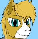
I just finished spent the whole night "vectoring" a drawing of my OCs 'profile'(I hope I'm using that term right(basically just a fancy way to say "his upper torso" or "face")) and now I finally have a respectable(well at least just respected my myself) avatar here. I'd love for a "Professional Opinion" using the word professional loosely, basically I'm wondering if I've made any obvious and amateur mistakes that the trained eye can see. But regular compliments are also welcome.


anyway here the slightly larger version than the one on the far left under my username:


post-7624-0-79014500-1348654198_thumb.png


Here is the drawing I made to make it,


Made on onion skin paper and coloured with pastel chalk, now hangs proudly above my computer.

I've changed the left eye to be wide open and scaled/moved some other things that are not worth mentioning. While I'm at it I also didn't make the eye vector, I just used one made by a guy whos name and link slips my mind so I can't credit him D:

I guess I'll have to make my own soon, derp

anyway here's the drawing:


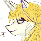
post-7624-0-96560000-1348654356_thumb.png


Here are all the previous versions/changes I've made while "perfecting" it (mostly just obsessing with the hair, ugh!!!)


post-7624-0-89660500-1348654394_thumb.pngpost-7624-0-93169500-1348654420_thumb.jpgpost-7624-0-53219000-1348654438_thumb.pngpost-7624-0-10503600-1348654449_thumb.jpg


I am defiantly gonna regret staying up all night during school :(

  • Brohoof 6
Link to comment
Share on other sites

^ What he said, they do look awesome for a first. I really like the creepy looking one down the bottom.

But yeah awesome job my friend.

Edited by zRevenantz
  • Brohoof 1
Link to comment
Share on other sites

Is very good comrade! Very good job indeed, if I was more talented in computer knowledge and drawing while sober I'd make my OC show realistic. Very good job Comrade! Excellent work!

  • Brohoof 1

comrade_dimitri_hammer_by_goneairbourne-


Created by the fabulous Gone ϟ Airbourne

Avatar by me
Link to comment
Share on other sites

It looks like you got the gist of vectoring basics down. I just started vectoring a few weeks ago myself so i'm probably not the best critic. but I got some advice from Bohtty you may wanna try out. avoiding the over use of strokes in favor of solid shapes to make more interesting stroke shapes is a good one. also its a good idea not to just flip the eye but to take the highlights of the eye and place them in different positions to look more like a different eye rather than just a reflection of the first. I've got a few Vectors of my own if you visit you can see some of the critisim i've gotten and the difference between strokes and stroke shapes.

http://mlpforums.com/topic/32084-derpy-in-deep-ponderment/#entry790874 swing by if you like. I could use some critique of my own. :)


blargleflarglargle- bleh


I just finished spent the whole night "vectoring" a drawing of my OCs 'profile'(I hope I'm using that term right(basically just a fancy way to say "his upper torso" or "face")) and now I finally have a respectable(well at least just respected my myself) avatar here.


a Profile generally refers to a side view of a person/pony. In sculpture this is a Bust in drawing I think it is just a portrait.

Check out my Art threads everypony

http://mlpforums.com...tor-art-thread/ and http://mlpforums.com/topic/35635-01s-traditional-art/#entry847552 I love getting critiques and such. Check back at my threads often for art will continually be updated on the first post of all my threads. ummm other than that... hmmm. MUFFINS FOR ALL!

Link to comment
Share on other sites

also its a good idea not to just flip the eye but to take the highlights of the eye and place them in different positions to look more like a different eye rather than just a reflection of the first.


you mean like this?

post-7624-0-34780900-1348795578_thumb.png

also I'm not sure what you mean by


avoiding the over use of strokes in favor of solid shapes to make more interesting stroke shapes is a good one.


and thanks for clarafication on the "profile"

thing, i'll definatly take a look at your art as soon as i get the chance :)

Link to comment
Share on other sites


you mean like this?

post-7624-0-34780900-1348795578_thumb.png

also I'm not sure what you mean by


and thanks for clarafication on the "profile"

thing, i'll definatly take a look at your art as soon as i get the chance :)


SWEET yes thats exactly what i meant... the shapes thing is a little more complicated. Basically you make the strokes transparent and make copies of the shapes you want to outline make them the color of the outline and make them slightly larger then places those shapes behind the rest and play with their size and positioning to make more interesting outlines. in my first 3 vectors on that thread you'll see me using the normal strokes and the last two you'll see the "outlining shapes" the difference is pretty interesting.


Check out my Art threads everypony

http://mlpforums.com...tor-art-thread/ and http://mlpforums.com/topic/35635-01s-traditional-art/#entry847552 I love getting critiques and such. Check back at my threads often for art will continually be updated on the first post of all my threads. ummm other than that... hmmm. MUFFINS FOR ALL!

Link to comment
Share on other sites

Create an account or sign in to comment

You need to be a member in order to leave a comment

Create an account

Sign up for a new account in our community. It's easy!

Join the herd!

Sign in

Already have an account? Sign in here.

Sign In Now
×
×
  • Create New...