


Leafeon
-
Posts
2,267 -
Joined
-
Last visited
Content Type
Profiles
Forums
Character Archive
Frequently Asked Questions
Equestrian Empire Character Archive
Golden Oaks Memorial Library
Pony Roleplay Characters
Events
Blogs
Everything posted by Leafeon
-
 No. It's a kids show. It would not make much sense to have one of the mane characters have a romantic interest. In my opinion at least. EDIT: A Canterlot Wedding existed to sell toys. But of Cadence more so then Shining Armour. Stallions are hard to sell, so that's another reason it won't happen.
 -

Ponyfying Existing RP Characters
Leafeon commented on Pripyat Pony's blog entry in Pripyat Pony's Blog
Just as a note, he's not Skewbald. Skewbald is an animal's coat that has patches of white on a color other then black, or vise versa depending on how you look at it. White and black would be Piebald. Anywho, I quite like the design. How many RP characters do you even have? -
mega thread Rate the Avatar of the User Above You!
Leafeon replied to EmbodimentOfCringe's topic in Forum Games
6/10 Cos can't really see it. But that's probably my poor vision -
I would suggest getting GIMP. It's free, so yea. Then just upload something drawn already and vector it. I do that sometimes, just not for this specific piece.
-
Ah, the shadow is a good point. Luckily Photoshop. Updated! Thanks! The lines are my personal preference, mostly from how I draw the skeletons. It's also easier in linework layers. The thickness is also my style/the show's style. It makes them look flat, yes, but I prefer it to no lines. I've tried that before. Failed terribly. Actually, I don't use a tablet. I have one. But never actually used it effectively enough for me to use it for all my drawings. So I rarely use it. I would suggest trying to draw it on paper first. I was quite lucky knowing how to draw horses before ponies became an internet thing. So if you slighly edit the skeleton for them, you pretty much have a pony. And I'm sure there are tutorials somewhere.
-
The lens flare corrupts Firebolt's left wing if I turn it up any more. Her cutie mark ended up being this, but I don't really like it. If you mean the heads having the little line, I always draw them like that. So they are just positioned forward. That's her mane style, but yes, I should fix that for future reference. And I always tend not to round my legs, though I probably should do that to be show faithful. Thanks!
- 26 replies
-
- 1
-

-
- critique wanted
- drawing
- (and 1 more)
-
mega thread Rate the Avatar of the User Above You!
Leafeon replied to EmbodimentOfCringe's topic in Forum Games
8.2/10 Because... because. -
Doesn't matter. The scarves are what matter. That was awful... :/
-
Yus. Firebolt's flank is what's on an angle, actually. So the cutie mark follows that. And I like ma cutie marks large.... Thanks for that!
- 26 replies
-
- 1
-
-
- critique wanted
- drawing
- (and 1 more)
-
Looks very good! And welcome back, of course. Seems like everytime you draw something you improve immensely On a side note, horn could be a bit bigger, but that's coming from me who thinks all unicorn horns should be bigger. Tablets are overrated.
-
Fighting is Magic is on Gamespot's front page!
Leafeon replied to Motion Spark's topic in Sugarcube Corner
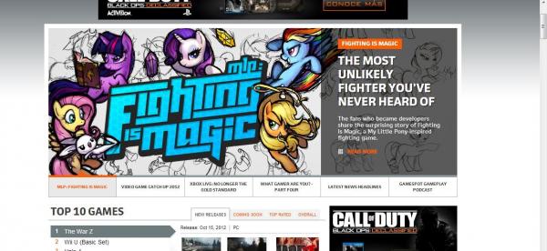 Whut. This may be the best thing ever. Can't wait for this game to come out. And yays, attention! I think this fighter is going to be very good indeed.
 -
 None of them. Not a single one. I would want to kill any of the marshmellow horses because of stupid ambitions. Seems quite silly.
 -
Sadly, that doesn't work because of how the left's tail is set up. Worked for the right though. I have an addiction to lens flares. So I'm leaving it in. Also added shadow which is poorly done. Yays!
-
I actually had a join me up for this one. It was in my status, but only one person came. I can message you next time if you want. Would do a speed paint, but I watch videos on half my screen. Plus not good with video software. As far as the tails go, I'm trying to fix it. But the shading is screwing me over. Will edit the original post when that is sorted.
- 26 replies
-
- 1
-
-
- critique wanted
- drawing
- (and 1 more)
-
 ...yes. I've once had to pay the cost 4x the product from Hasbro's site for Canadian shipping. And 2x for Ebays. Think Ebays was about $20 and Hasbros was $40. Then add the product. Probably maple syrup tax or something.
 -
Her wings are supposed to be multicolored, so yes, the outer feathers are supposed to be dark grey. I think my eyes should look at tails more often, doing the ground last is what screwed me over I think, layering it with the background. Thanks for the critique!
- 26 replies
-
- 1
-
-
- critique wanted
- drawing
- (and 1 more)
-
0/10 you Pinkie fan.
-
Don't know if I'm supposed to laugh or cry.
-
Thanks! I do like compliments too! Though not too many. Then my ego may become as big as Mic's. And then the world might explode.
- 26 replies
-
- 1
-
-
- critique wanted
- drawing
- (and 1 more)
-
I have found the purple room!
-
First of all, thanks for the good critism. I love when people nitpick at my work. I have a little note thing for this. And yes... the tails look somewhat painful. Generally doing stuff like this I crop that out. For that exact reason. The sunshine is mostly because the canvas is fairly small, and is meant for an avatar, which is 150x150. So it has to be fairly over the top to actually be see-able. Oh, and the last one totally has a cutie mark, I haven't just not designed it yet and took the easy route out.
- 26 replies
-
- 2
-
-
- critique wanted
- drawing
- (and 1 more)
-
mega thread Rate the Signature of the User Above You!
Leafeon replied to Soarin''s topic in Forum Games
9/10 because adorable. And because 10/10 is overrated. -
Something that makes me artistically HNNNGGGG
Leafeon commented on moved ♥'s blog entry in Azalea's Innermost Thoughts
This is my pet peeve too. Even worse is when you draw similar to the show's style and then people think you took a screen-shot, just because of your style... ugh. I have drawn over a base when I was getting used to ponies. That was the only time I have ever done that. And irritates me so much when people get tons of recognition for that. On another note, a guide is fine in my opinion. Like I sometimes use a wing guide if I'm drawing an allicorn so I don't screw up royally, but that's about it. -
Don't see the problem that much really. It's an interest in a show that is not targeted at you. If you act cool about it, no one will judge you. If you act like it's a big deal, it becomes one.
