Jump to content
Banner by ~ Discord The Overlord

Rarity Wallpaper


Dusty Soul

Recommended Posts

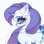
OOOOoooooooooOO! Purtty! That's pretty good in my opinion! I really like the glow you added around Rarity. That's one of the dresses she wear during Sweet and Elite right?

By the way:


Posted Image


  • Brohoof 1

"Friendship is unnecessary, like philosophy, like art... It has no survival value; rather it is one of those things that give value to survival."

-C.S. Lewis

Link to comment
Share on other sites

OOOOoooooooooOO! Purtty! That's pretty good in my opinion! I really like the glow you added around Rarity. That's one of the dresses she wear during Sweet and Elite right?

By the way:


Posted Image


Thank you! That is one of the dresses she wears during the episode. I was wondering about the glow, glad it looks good. Thank you!
  • Brohoof 1

                 Soundcloud-------------------Facebook---------------------------Youtube

Link to comment
Share on other sites

Hey, that's pretty sick. I really like her mane the sparkle effect you added. Also, that's a pretty original image of Rarity to use, which is kewl. A /) to you my good sir.


post-9058-0-97041300-1350784160.jpg

Here, I will just leave this here. In case you don't know what it is, its rarity sniping in vitenam. I don't know why, but it is. So take it.


post-6675-0-48138200-1350822700_thumb.png

post-6675-0-48138200-1350822700_thumb.png

  • Brohoof 1


Link to comment
Share on other sites

I love it! Nice and sparkly!


The only thing I have to say is that the diamonds of here cutie mark on the top right are a bit fuzzy on the inside, but I don't know anything about art so it doesn't matter really...


K9MQ1H.gif

OC's: Whirl Wake and Noon - Profile Picture Credit - Signature by Me

twilight sniper kill blue all tf2 wow map you see firend rianbow dsah,pinkie pie,applejack,rarity,fluttershy wow team red kill blue red win huh robox bad new


Link to comment
Share on other sites

this is absolutely fabulous! Rarity isn't even really one of my favorites, but you did a beautiful job on this wallpaper. Keep up the good work ;)


run_pinkie_pie___free_icon__by_shocka123-d4oa1jp.gifEvery pony has a dark side. The most cheerful often have the darkest and saddest secrets of all.
Link to comment
Share on other sites

I love it! Nice and sparkly!


The only thing I have to say is that the diamonds of here cutie mark on the top right are a bit fuzzy on the inside, but I don't know anything about art so it doesn't matter really...


Thank you. I knew someone was going to say something about that. They're supposed to look like that.

this is absolutely fabulous! Rarity isn't even really one of my favorites, but you did a beautiful job on this wallpaper. Keep up the good work ;)


Thank you! I will try making some more!

Hey, that's pretty sick. I really like her mane the sparkle effect you added. Also, that's a pretty original image of Rarity to use, which is kewl. A /) to you my good sir.


Thank you! I wanted to find a vector of Rarity that I haven't seen on many wallpapers, so yeah. :)

                 Soundcloud-------------------Facebook---------------------------Youtube

Link to comment
Share on other sites

I'll start off by saying that I like the concept you used for the background. Very sleek and modern which compliments Rarity very well.


I do have some suggestions, though. While the sparkly square pattern is nice, it's a bit overbearing. I think making it fade in transparency (layer mask) or playing around with different blending modes would definitely help with that.


Furthermore, having Rarity and her cutie mark in two different corners like that is considered a big no-no in graphic design. The reason for this is that it creates multiple focus points, confusing the eye on what exactly it SHOULD be focusing on. One thing you could do is place the cutie mark behind Rarity and make it very opaque. I would also raise the opacity of Rarity herself, increase the size of that vector, and remove the outer glow.


The final major point I'd like to touch on is the text. Text can be one of the hardest elements of design to master. There are so many things to take into account. What is the text going to say? What font should be used? How should the text be arranged? What sort of effects should it have? You already had an idea what you wanted the text to say, however, the font you used and the way it's conveyed don't really fit with the background well. When using a sleek/modern background like this, you usually want to use a nice sans-serif font such as the one used here (please excuse the self-insertion :P ). I would also try experimenting with different blend modes such as Overlay or Soft Light.


One last small suggestion. I would recommend making wallpapers in a resolution of 1920x1080 and saving the images as PNGs. Ensures that a good majority of people can use your wallpaper and that it is being saved in good high quality.


Damn, that was long-winded (at least for me).


Anyways, I really hope this is beneficial for you and don't be adverse to shooting me a message or adding me on Skype if you'd like some help with something! :)

  • Brohoof 2

rhJTOlr.png

Link to comment
Share on other sites

I'll start off by saying that I like the concept you used for the background. Very sleek and modern which compliments Rarity very well.


I do have some suggestions, though. While the sparkly square pattern is nice, it's a bit overbearing. I think making it fade in transparency (layer mask) or playing around with different blending modes would definitely help with that.


Furthermore, having Rarity and her cutie mark in two different corners like that is considered a big no-no in graphic design. The reason for this is that it creates multiple focus points, confusing the eye on what exactly it SHOULD be focusing on. One thing you could do is place the cutie mark behind Rarity and make it very opaque. I would also raise the opacity of Rarity herself, increase the size of that vector, and remove the outer glow.


The final major point I'd like to touch on is the text. Text can be one of the hardest elements of design to master. There are so many things to take into account. What is the text going to say? What font should be used? How should the text be arranged? What sort of effects should it have? You already had an idea what you wanted the text to say, however, the font you used and the way it's conveyed don't really fit with the background well. When using a sleek/modern background like this, you usually want to use a nice sans-serif font such as the one used here (please excuse the self-insertion :P ). I would also try experimenting with different blend modes such as Overlay or Soft Light.


One last small suggestion. I would recommend making wallpapers in a resolution of 1920x1080 and saving the images as PNGs. Ensures that a good majority of people can use your wallpaper and that it is being saved in good high quality.


Damn, that was long-winded (at least for me).


Anyways, I really hope this is beneficial for you and don't be adverse to shooting me a message or adding me on Skype if you'd like some help with something! :)


Thank you so much Vexx. I was hoping for some help in this. This post will definitely be helpful as I try more stuff, so I thank you for that. I was judging the size by the size of my computer, so I'll keep those dimensions in mind, as well as saving it as a PNG.

                 Soundcloud-------------------Facebook---------------------------Youtube

Link to comment
Share on other sites

Create an account or sign in to comment

You need to be a member in order to leave a comment

Create an account

Sign up for a new account in our community. It's easy!

Join the herd!

Sign in

Already have an account? Sign in here.

Sign In Now
×
×
  • Create New...